|
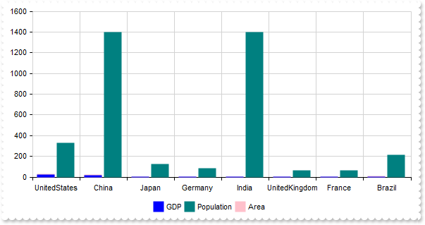
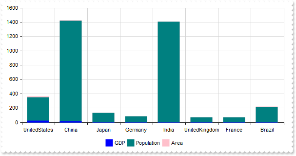
340
|
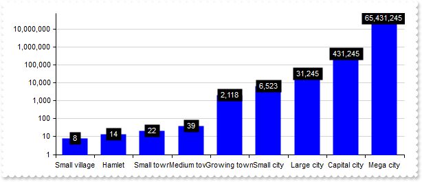
My data contains no values below 1. How can I prevent the logarithmic value axis from displaying the range between 0 and 1
with thisform.Graph1
	.BeginUpdate
	.AutoFit = .T.
	.MultiColorSerie = .F.
	.ValuePoint = ",,,,,,,black,transparent"
	.CategoryAxis.Format = "`<bgcolor white>` + value"
	with .ValueAxis
		.Type = 1
		.Min = 1
		.Format = "value format `0`"
	endwith
	var_s = "Small village(8),Hamlet(14),Small town(22),Medium town(39),Growing town(2118),Small city(6523),Large city(31245),Capital city(43"
	var_s = var_s + "1245),Mega city(65431245)"
	with .Series.Add(var_s)
		.ShowValue = 4
		.ValueFormat = "`<fgcolor white> ` + (value format `0`) + ` `"
	endwith
	.EndUpdate
endwith
|
|
339
|
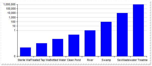
Display logarithmic scale
with thisform.Graph1
	.BeginUpdate
	.AutoFit = .T.
	.MultiColorSerie = .F.
	.CategoryAxis.Format = "`<bgcolor white>` + value"
	with .ValueAxis
		.Type = 1
		.Format = "value format `0`"
	endwith
	var_s = "Sterile Water(0.0001),Treated Tap Water(0.001),Bottled Water(0.01),Clean Pond(0.1),River(1),Swamp(100),Sewage(10000),Wastewater "
	var_s = var_s + "Treatment Inlet(1000000)"
	.Series.Add(var_s)
	.EndUpdate
endwith
|
|
338
|
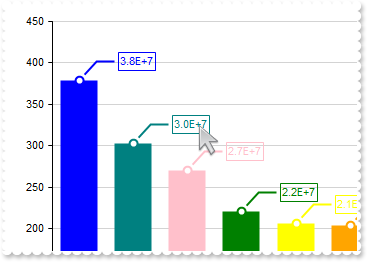
Can the values be shown in scientific notation (e.g., 1E+4, 5E-10) rather than full decimal form
with thisform.Graph1
.BeginUpdate
.AutoFit = .T.
.ValueAxis.Format = "value/100000"
var_s = "Tokyo(37833000), Delhi(30290000), Shanghai(27058000), S�o Paulo(22043000), Mumbai(20668000), Beijing(20384000), Karachi(20000000"
var_s = var_s + "), Dhaka(17072000), Istanbul(15029000), Los Angeles(13131000)"
with .Series.Add(var_s)
.ShowValue = -1 && 0xffffff78 Or ShowValueEnum.exHideIfEmpty Or ShowValueEnum.exValue Or ShowValueEnum.exLine Or ShowValueEnum.exPoint
.ValueFormat = "value format `%.1E` replace `+00` with `+`"
endwith
.EndUpdate
endwith
|
|
337
|
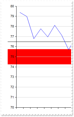
Highlight the value on both the chart and the axis
with thisform.Graph1
	.BeginUpdate
	.Import("C:\Program Files\Exontrol\ExGraph\Sample\Data/aapl.txt")
	.SerieType = "line"
	.Series.Add("open").Data = "AAPL (open)"
	.ValueAxis.Mark = "red[axis,chart](74.25-75.75),black[axis,chart](76.5)"
	.Refresh
	.EndUpdate
endwith
|
|
336
|
Highlight the categories on both the chart and the axis
with thisform.Graph1
	.BeginUpdate
	.Import("C:\Program Files\Exontrol\ExGraph\Sample\Data/aapl.txt")
	.SerieType = "line"
	.ValueSize = 6
	.Series.Add("open").Data = "AAPL (open)"
	with .CategoryAxes.Add("0")
		.Format = "value left 7"
		.Split = .T.
		.Mark = "#F8F8F8[axis,chart](label = `2014-02`)"
	endwith
	.Refresh
	.EndUpdate
endwith
|
|
335
|
Highlight values on axis only
with thisform.Graph1
	.BeginUpdate
	.Import("C:\Program Files\Exontrol\ExGraph\Sample\Data/aapl.txt")
	.SerieType = "line"
	.Series.Add("open").Data = "AAPL (open)"
	.ValueAxis.Mark = "red[axis](74.25-75.75),black[axis](76.5)"
	.Refresh
	.EndUpdate
endwith
|
|
334
|
Highlight the categories on axis only
with thisform.Graph1
	.BeginUpdate
	.Import("C:\Program Files\Exontrol\ExGraph\Sample\Data/aapl.txt")
	.SerieType = "line"
	.ValueSize = 6
	.Series.Add("open").Data = "AAPL (open)"
	with .CategoryAxes.Add("0")
		.Format = "value left 7"
		.Split = .T.
		.Mark = "#F8F8F8[axis](label = `2014-02`)"
	endwith
	.Refresh
	.EndUpdate
endwith
|
|
333
|
Highlight values
with thisform.Graph1
	.BeginUpdate
	.Import("C:\Program Files\Exontrol\ExGraph\Sample\Data/aapl.txt")
	.SerieType = "line"
	.Series.Add("open").Data = "AAPL (open)"
	.ValueAxis.Mark = "red(74.25-75.75),black[chart,axis](76.5)"
	.Refresh
	.EndUpdate
endwith
|
|
332
|
Highlight the categories using an expression
with thisform.Graph1
	.BeginUpdate
	.Import("C:\Program Files\Exontrol\ExGraph\Sample\Data/aapl.txt")
	.SerieType = "line"
	.Series.Add("open").Data = "AAPL (open)"
	with .CategoryAxes.Add("0")
		.Format = "`Wno<off-4>` + week(date(value left 10))"
		.Split = .T.
		.Mark = "#F8F8F8(index in (1,3))"
	endwith
	.Refresh
	.EndUpdate
endwith
|
|
331
|
Highlight the categories using an expression
with thisform.Graph1
	.BeginUpdate
	.Import("C:\Program Files\Exontrol\ExGraph\Sample\Data/aapl.txt")
	.SerieType = "line"
	.ValueSize = 6
	.Series.Add("open").Data = "AAPL (open)"
	with .CategoryAxes.Add("0")
		.Format = "value left 7"
		.Split = .T.
		.Mark = "#F8F8F8(label = `2014-02`)"
	endwith
	.Refresh
	.EndUpdate
endwith
|
|
330
|
Highlight the categories based on the index
with thisform.Graph1
	.BeginUpdate
	.Import("C:\Program Files\Exontrol\ExGraph\Sample\Data/aapl.txt")
	.SerieType = "line"
	.Series.Add("open").Data = "AAPL (open)"
	with .CategoryAxes.Add("0")
		.Format = "`Wno<off-4>` + week(date(value left 10))"
		.Split = .T.
		.Mark = "#F8F8F8(2)"
	endwith
	.Refresh
	.EndUpdate
endwith
|
|
329
|
IdemmM {string}, specifies the name of another value-axis to synchronize min, max, and major-unit values from when scrolling. If omitted or the value-axis with the given name is not found, these values are synchronized with the default value-axis
with thisform.Graph1
	.BeginUpdate
	.Import("C:\Program Files\Exontrol\ExGraph\Sample\Data/aapl.txt")
	with .Series.Add("open")
		.Data = "AAPL (open)"
		.Type = "line"
	endwith
	with .ValueAxes
		.Add("1st")
		with .Add("2nd")
			.Align = 2
			.IdemmM = "1st"
		endwith
		with .Add("3rd")
			.Format = "120 + value * 2.5"
			.MajorGridLines.Color = "transparent"
		endwith
	endwith
	.EndUpdate
endwith
|
|
328
|
Adds multiple value-axes
with thisform.Graph1
.BeginUpdate
.Import("C:\Program Files\Exontrol\ExGraph\Sample\Data/aapl.txt")
with .Series.Add("open")
.Data = "AAPL (close)"
.Type = "line"
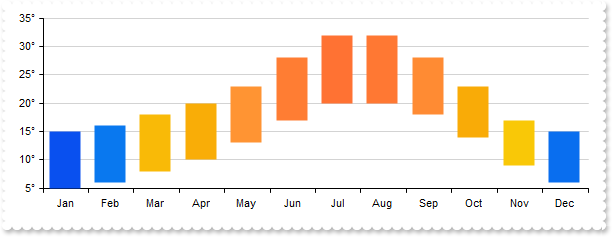
.Style = 1
endwith
with .ValueAxes
.Add("1st")
.Add("2nd").Align = 2
endwith
.EndUpdate
endwith
|
|
327
|
Split the chart in weeks
with thisform.Graph1
.BeginUpdate
.ValueSize = 18
.Import("C:\Program Files\Exontrol\ExGraph\Sample\Data/aapl.txt")
with .Series.Add("open")
.Data = "AAPL (open)"
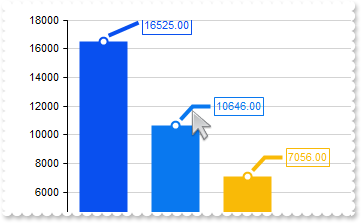
.Type = "line"
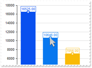
.Style = 1
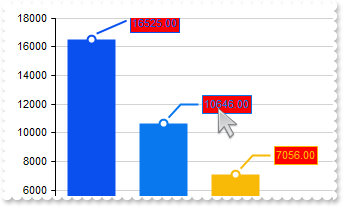
endwith
with .CategoryAxes.Add("0")
.Format = "value mid 9 left 2"
with .ChartGridLines
.Format = "`<fgcolor gray>Wno <off 4>` + week(date(value left 10))"
.Color = "gray"
.Align = 0
endwith
endwith
.EndUpdate
endwith
|
|
326
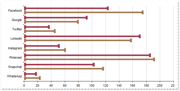
|
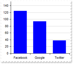
Resets the series, category axes and value axes without affecting the control's data
*** Click event - Occurs when the user presses and then releases the left mouse button over the control. ***
LPARAMETERS nop
with thisform.Graph1
.Reset()
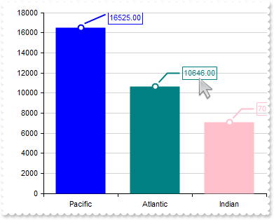
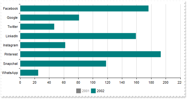
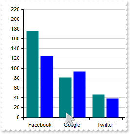
endwith
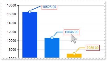
with thisform.Graph1
.BeginUpdate
.ValueSize = 18
.Import("C:\Program Files\Exontrol\ExGraph\Sample\Data/aapl.txt")
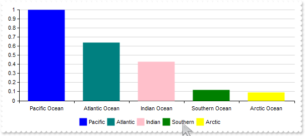
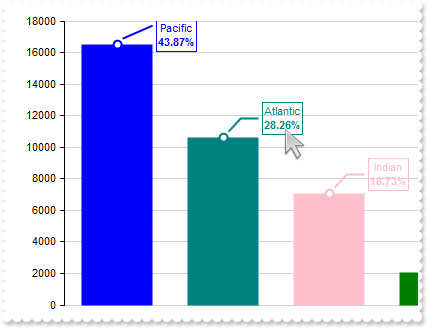
.SerieType = "line"
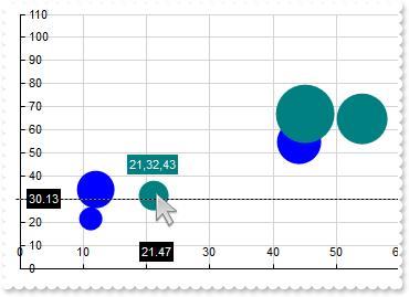
with .Series.Add()
.Name = "aapl"
.Data = "AAPL (open),AAPL (high),AAPL (low),AAPL (close)"
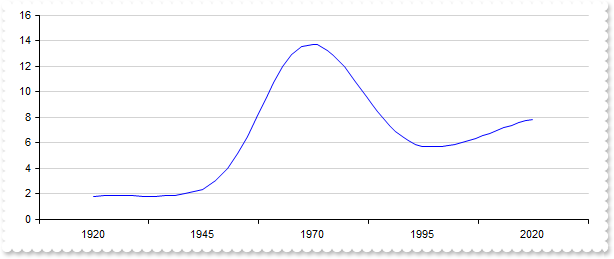
endwith
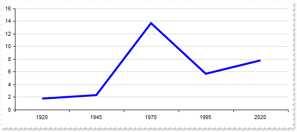
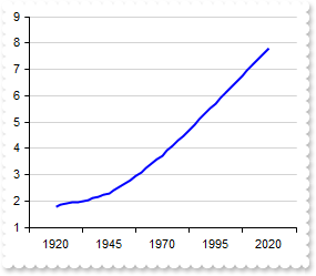
with .CategoryAxes.Add("0")
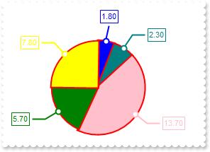
.Format = "value mid 9 left 2"
endwith
with .CategoryAxes.Add("0")
.Format = "value left 7"
.Split = .T.
endwith
.EndUpdate
endwith
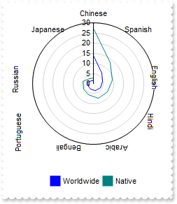
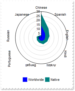
|
|
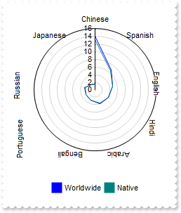
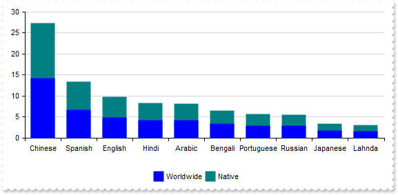
325
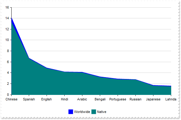
|
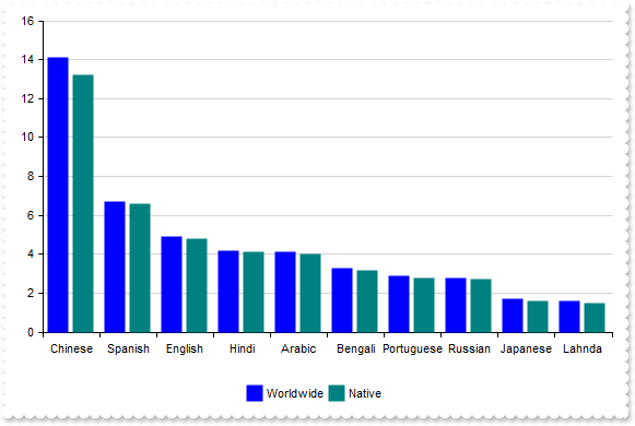
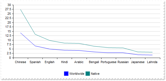
Defines the representation method for the data in all series where the type property is not specified, determining how these series are visually displayed
with thisform.Graph1
.BeginUpdate
.Pad = 18
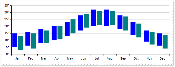
.AutoFit = .T.
.SerieType = "rangeArea"
with .Series
var_s = "Chinese(14.1),Spanish(6.7),English(4.9),Hindi(4.2),Arabic(4.1),Bengali(3.3),Portuguese(2.9),Russian(2.8),Japanese(1.7),Lahnda(1."
var_s = var_s + "6)"
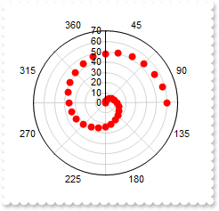
.Add(var_s,"Worldwide")
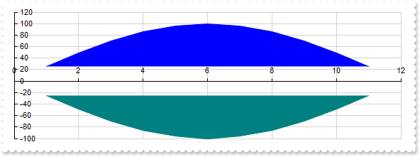
var_s1 = "Chinese(13.2),Spanish(6.6),English(4.8),Hindi(4.1),Arabic(4.0),Bengali(3.2),Portuguese(2.8),Russian(2.7),Japanese(1.6),Lahnda(1."
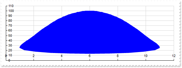
var_s1 = var_s1 + "5)"
.Add(var_s1,"Native")
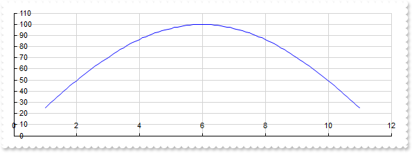
endwith
.Legend.Visible = .T.
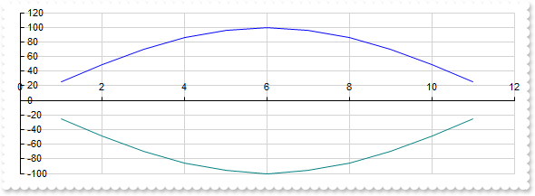
.EndUpdate
endwith
|
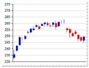
|
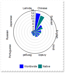
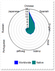
324
|
How can I prevent the labels from rotating around the chart when using the radarColumn type
with thisform.Graph1
.BeginUpdate
.Pad = 18
.AutoFit = .T.
.SerieType = "radarCol"
.Object.Misc(16) = .F.
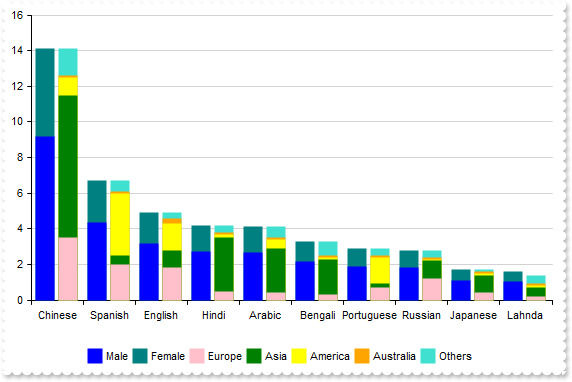
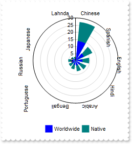
with .Series
var_s = "Chinese(14.1),Spanish(6.7),English(4.9),Hindi(4.2),Arabic(4.1),Bengali(3.3),Portuguese(2.9),Russian(2.8),Japanese(1.7),Lahnda(1."
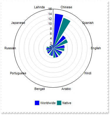
var_s = var_s + "6)"
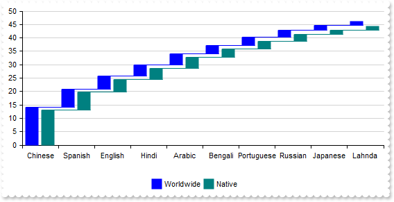
.Add(var_s,"Worldwide")
var_s1 = "Chinese(13.2),Spanish(6.6),English(4.8),Hindi(4.1),Arabic(4.0),Bengali(3.2),Portuguese(2.8),Russian(2.7),Japanese(1.6),Lahnda(1."
var_s1 = var_s1 + "5)"
.Add(var_s1,"Native")
endwith
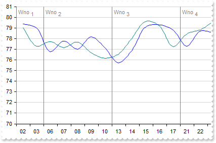
.Legend.Visible = .T.
.EndUpdate
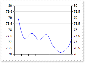
endwith
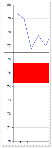
|
|
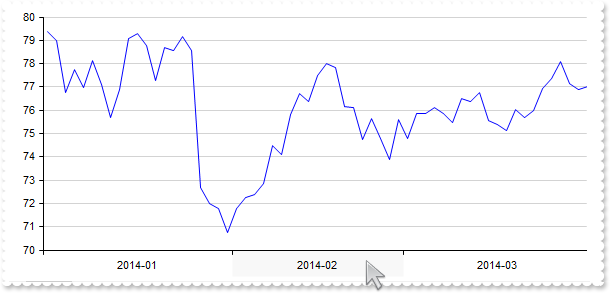
323
|
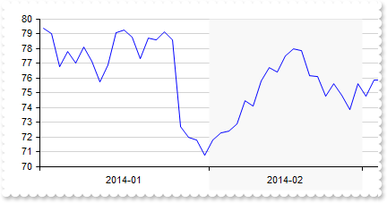
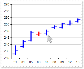
Disable stacking for all series at once
with thisform.Graph1
	.BeginUpdate
	.Pad = 18
	.AutoFit = .T.
	.AllowStack = .F.
	with .Series
		var_s = "Chinese(14.1),Spanish(6.7),English(4.9),Hindi(4.2),Arabic(4.1),Bengali(3.3),Portuguese(2.9),Russian(2.8),Japanese(1.7),Lahnda(1."
		var_s = var_s + "6)"
		.Add(var_s,"Worldwide").Stack = "group"
		var_s1 = "Chinese(13.2),Spanish(6.6),English(4.8),Hindi(4.1),Arabic(4.0),Bengali(3.2),Portuguese(2.8),Russian(2.7),Japanese(1.6),Lahnda(1."
		var_s1 = var_s1 + "5)"
		.Add(var_s1,"Native").Stack = "group"
	endwith
	.Legend.Visible = .T.
	.EndUpdate
endwith
|
|
322
|
How can I stack more than three data series across multiple columns
with thisform.Graph1
	.BeginUpdate
	.Pad = 18
	.AutoFit = .T.
	with .Series
		var_s = "Chinese(9.165),Spanish(4.355),English(3.185),Hindi(2.73),Arabic(2.665),Bengali(2.145),Portuguese(1.885),Russian(1.82),Japanese(1"
		var_s = var_s + ".105),Lahnda(1.04)"
		.Add(var_s,"Male").Stack = "G1"
		var_s1 = "Chinese(4.935),Spanish(2.345),English(1.715),Hindi(1.47),Arabic(1.435),Bengali(1.155),Portuguese(1.015),Russian(0.98),Japanese(0"
		var_s1 = var_s1 + ".595),Lahnda(0.56)"
		.Add(var_s1,"Female").Stack = "G1"
		var_s2 = "Chinese(3.5),Spanish(2.0),English(1.8),Hindi(0.5),Arabic(0.4),Bengali(0.3),Portuguese(0.7),Russian(1.2),Japanese(0.4),Lahnda(0.2"
		var_s2 = var_s2 + ")"
		.Add(var_s2,"Europe").Stack = "G2"
		var_s3 = "Chinese(8.0),Spanish(0.5),English(1.0),Hindi(3.0),Arabic(2.5),Bengali(2.0),Portuguese(0.2),Russian(1.0),Japanese(1.0),Lahnda(0.5"
		var_s3 = var_s3 + ")"
		.Add(var_s3,"Asia").Stack = "G2"
		var_s4 = "Chinese(1.0),Spanish(3.5),English(1.5),Hindi(0.2),Arabic(0.5),Bengali(0.1),Portuguese(1.5),Russian(0.1),Japanese(0.1),Lahnda(0.1"
		var_s4 = var_s4 + ")"
		.Add(var_s4,"America").Stack = "G2"
		var_s5 = "Chinese(0.1),Spanish(0.1),English(0.3),Hindi(0.1),Arabic(0.1),Bengali(0.1),Portuguese(0.1),Russian(0.1),Japanese(0.1),Lahnda(0.1"
		var_s5 = var_s5 + ")"
		.Add(var_s5,"Australia").Stack = "G2"
		var_s6 = "Chinese(1.5),Spanish(0.6),English(0.3),Hindi(0.4),Arabic(0.6),Bengali(0.8),Portuguese(0.4),Russian(0.4),Japanese(0.1),Lahnda(0.5"
		var_s6 = var_s6 + ")"
		.Add(var_s6,"Others").Stack = "G2"
	endwith
	.Legend.Visible = .T.
	.EndUpdate
endwith
|
|
321
|
How can I stack data more than three series

with thisform.Graph1
	.BeginUpdate
	.Pad = 18
	.AutoFit = .T.
	with .Series
		var_s = "Chinese(14.1),Spanish(6.7),English(4.9),Hindi(4.2),Arabic(4.1),Bengali(3.3),Portuguese(2.9),Russian(2.8),Japanese(1.7),Lahnda(1."
		var_s = var_s + "6)"
		.Add(var_s,"Worldwide").Stack = "group"
		var_s1 = "Chinese(13.2),Spanish(6.6),English(4.8),Hindi(4.1),Arabic(4.0),Bengali(3.2),Portuguese(2.8),Russian(2.7),Japanese(1.6),Lahnda(1."
		var_s1 = var_s1 + "5)"
		.Add(var_s1,"Native").Stack = "group"
		var_s2 = "Chinese(1.5),Spanish(10.2),English(2.1),Hindi(0.5),Arabic(0.8),Bengali(0.3),Portuguese(3.5),Russian(0.4),Japanese(0.2),Lahnda(0."
		var_s2 = var_s2 + "1)"
		.Add(var_s2,"Regional").Stack = "group"
	endwith
	.Legend.Visible = .T.
	.EndUpdate
endwith
|
|
320
|
I use the legend, but clicking a series mostly rearranges them instead of hiding it
with thisform.Graph1
	.BeginUpdate
	.AutoFit = .T.
	.Object.Misc(17) = .F.
	.Series.Add("50,150,150,300","A1")
	.Series.Add("180,40,60,160","A2")
	.Legend.Visible = .T.
	.EndUpdate
endwith
|
|
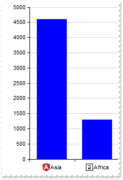
319
|
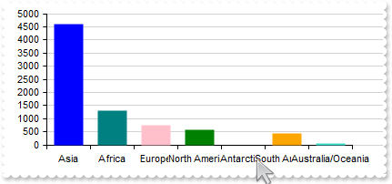
Adjusts the column/bar size so that the entire chart fits within the client rectangle
with thisform.Graph1
	.BeginUpdate
	.CategoryAxis.Categories = "Asia,Africa,Europe,North America,Antarctica,South America,Australia/Oceania"
	.Series.Add("4600,1300,747,579,0,422,42")
	.ValueAutoFit
	.EndUpdate
endwith
|
|
318
|
The categories overlap, making the text unreadable
with thisform.Graph1
	.BeginUpdate
	.ValueSize = 32
	with .CategoryAxis
		.Categories = "Asia,Africa,Europe,North America,Antarctica,South America,Australia/Oceania"
		.Format = "`<bgcolor white>` + value"
	endwith
	.Series.Add("4600,1300,747,579,0,422,42")
	.EndUpdate
endwith
|
|
317
|
Represents a single serie with single color (prevent multiple colors for single-serie)
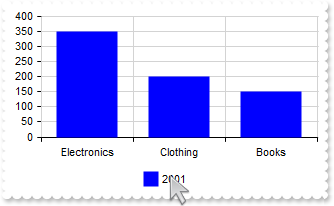
with thisform.Graph1
	.BeginUpdate
	.AutoFit = .T.
	.MultiColorSerie = .F.
	.CategoryAxis.MajorGridLines.Color = "lightgray"
	.Series.Add("Electronics(350),Clothing(200),Books(150)",2001)
	.Legend.Visible = .T.
	.EndUpdate
endwith
|
|
316
|
How can I replace or add an icon at runtime
with thisform.Graph1
	.BeginUpdate
	var_s = "gAAAABgYACEHgUJFEEAAWhUJCEJEEJggEhMCYEXjUbjkJQECj8gj8hAEjkshYEpk8kf8ClsulsvAExmcvf83js5nU7nkCeEcn8boMaocXosCB9Hn09pkzcEuoL/fE+Ok"
	var_s = var_s + "YB0gB9YhIHrddgVcr9aktZADAD8+P8CgIA=="
	.ReplaceIcon(var_s)
	.ReplaceIcon("C:\images\favicon.ico",0)
	.AutoFit = .T.
	var_s1 = "<img>1</img>Asia(4600),<img>2</img>Africa(1300),<img>3</img>Europe(747),<img>4</img>North America(579),<img>5</img>South America"
	var_s1 = var_s1 + "(433),<img>6</img>Australia/Oceania(42)"
	.Series.Add(var_s1)
	.SeriesColors = "blue"
	.EndUpdate
endwith
|
|
315
|
No grid lines are shown even I set the Color and Format properties of ChartGridLines/OverviewGridLines
with thisform.Graph1
	.Series.Add("100,200,200,400","S1")
	.Series.Add("210,20,20,120","S2")
	with .CategoryAxes.Add("A,B,C,D","1st").ChartGridLines
		.Color = "red"
		.Format = "value"
	endwith
	.CategoryAxes.Add("E,F","2nd")
	.Refresh
endwith
|
|
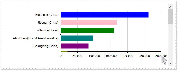
314
|
Occasionally, the margins of the axes may not align perfectly with the view
with thisform.Graph1
.BeginUpdate
.ValueSize = 18
.Pad = 24
.ValueAxis.Format = "value format `0`"
var_s = "Hulunbuir{China}(263068),Abu Dhabi{United Arab Emirates}(97200),Jiuquan{China}(167996),Altamira{Brazil}(159891),Bras�lia{Brazil}"
var_s = var_s + "(5784),Mumbai{India}(603.4),Delhi{India}(1484),Chongqing{China}(82400),Hulunbuir{China}(263068),Sao Paulo{Brazil}(1522),Linfen{C"
var_s = var_s + "hina}(20527),Santiago{Chile}(641),Mexico City{Mexico}(1485),Belo Horizonte{Brazil}(313),Hangzhou{China}(16817),Nairobi{Kenya}(69"
var_s = var_s + "6),Berlin{Germany}(891.68),Montreal{Canada}(431.5),Cordoba{Argentina}(576),Manaus{Brazil}(11401),Astana{Kazakhstan}(810),Goi�nia"
var_s = var_s + "{Brazil}(741),Cali{Colombia}(564),Sao Paulo{Brazil}(1522),Goiania{Brazil}(781)"
with .Series.Add(var_s)
.Type = "Col"
.Vertical = .T.
endwith
.Sort = "0:D"
.EndUpdate
endwith
|
|
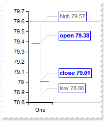
313
|
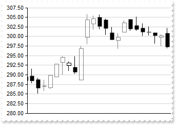
"candlestick" explained, an [open,high,low,close] chart
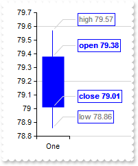
with thisform.Graph1
	.BeginUpdate
	.ValueSize = 32
	.ValuePoint = "0,,,,lightgray,1"
	.ValueAxis.MajorGridLines.Step = 4
	with .Series.Add("One(79.38 79.57 78.86 79.01)")
		.Type = "candlestick"
		.ShowValue = 7 && ShowValueEnum.exValue Or ShowValueEnum.exLine Or ShowValueEnum.exPoint
		.ValueFormat = "(inner array (`<b>open`,`<fgcolor gray>high`,`<fgcolor gray>low`,`<b>close`)) + ` ` + value"
	endwith
	.EndUpdate
endwith
|
|
312
|
"candlestick", a candlestick chart (also called Japanese candlestick chart or K-line) is a style of financial chart used to describe price movements of a security, derivative, or currency. While similar in appearance to a bar chart, each candleStick represents four important pieces of information for that day: open and close in the thick body, and high and low in the "candle wick". Being densely packed with information, it tends to represent trading patterns over short periods of time, often a few days or a few trading sessions. (data requires array of array of four-numbers, such as [[open, high, low and close]], supports vertical field, scrollable)
with thisform.Graph1
	.BeginUpdate
	.ValueSize = 18
	with .CategoryAxis
		.Categories = "Date"
		.Format = "value mid 9 left 2"
	endwith
	.Data = "C:\Program Files\Exontrol\ExGraph\Sample\Data/msft.csv"
	.Series.Add("Open,High,Low,Close","msft").Type = "candlestick"
	.EndUpdate
endwith
|
|
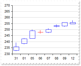
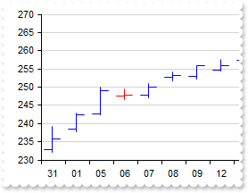
311
|
"ohlc" explained, an [open,high,low,close] chart
with thisform.Graph1
	.BeginUpdate
	.ValueSize = 32
	.ValuePoint = "0,,,,lightgray,1"
	.ValueAxis.MajorGridLines.Step = 4
	with .Series.Add("One(79.38 79.57 78.86 79.01)")
		.Type = "ohlc"
		.ShowValue = 7 && ShowValueEnum.exValue Or ShowValueEnum.exLine Or ShowValueEnum.exPoint
		.ValueFormat = "(inner array (`<b>open`,`<fgcolor gray>high`,`<fgcolor gray>low`,`<b>close`)) + ` ` + value"
	endwith
	.EndUpdate
endwith
|
|
310
|
"ohlc", an open-high-low-close chart (also OHLC) is a type of chart typically used to illustrate movements in the price of a financial instrument over time. Each vertical line on the chart shows the price range (the highest and lowest prices) over one unit of time, e.g., one day or one hour. Tick marks project from each side of the line indicating the opening price (e.g., for a daily bar chart this would be the starting price for that day) on the left, and the closing price for that time period on the right. The bars may be shown in different hues depending on whether prices rose or fell in that period. (data requires array of array of four-numbers, such as [[open, high, low and close]], supports vertical field, scrollable)
with thisform.Graph1
	.BeginUpdate
	.ValueSize = 18
	with .CategoryAxis
		.Categories = "Date"
		.Format = "value mid 9 left 2"
	endwith
	.Data = "C:\Program Files\Exontrol\ExGraph\Sample\Data/msft.csv"
	.Series.Add("Open,High,Low,Close","msft").Type = "ohlc"
	.EndUpdate
endwith
|
|
309
|
"bubble", a bubble chart or bubble plot is a type of chart that displays three dimensions of data (a bubble chart is an extension of the scatter plot used to look at relationships between three numeric variables.). Each entity with its triplet (v1, v2, v3) of associated data is plotted as a disk that expresses two of the vi values through the disk's xy location and the third through its size. Bubble charts can facilitate the understanding of social, economical, medical, and other scientific relationships. (data requires array of array of three-numbers, such as [[x, y, size]], supports vertical field, non-scrollable)
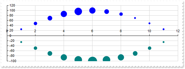
with thisform.Graph1
	.BeginUpdate
	.Pad = 18
	with .Series.Add("1 25 1,2 49 2,3 70 3,4 86 4,5 96 5,6 100 4,7 96 3,8 86 2,9 70 1,10 49 1,11 25 1","Bell<b>1")
		.Type = "bubble"
		.Misc(1) = 32
	endwith
	with .Series.Add("1 -25 1,2 -49 2,3 -70 3,4 -86 4,5 -96 5,6 -100 6,7 -96 5,8 -86 4,9 -70 3,10 -49 2,11 -25 1","Bell<b>2")
		.Type = "bubble"
		.Misc(1) = 32
	endwith
	.EndUpdate
endwith
|
|
308
|
"scatter", a scatter plot (also called a scatterplot, scatter graph, scatter chart, scattergram, or scatter diagram) is a type of plot or mathematical diagram using Cartesian coordinates to display values for typically two variables for a set of data. (data requires array of array of two-numbers, such as [[x, y]], supports vertical field, non-scrollable)
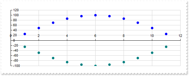
with thisform.Graph1
	.BeginUpdate
	.Pad = 18
	.Series.Add("1 25,2 49,3 70,4 86,5 96,6 100,7 96,8 86,9 70,10 49,11 25","Bell<b>1").Type = "scatter"
	.Series.Add("1 -25,2 -49,3 -70,4 -86,5 -96,6 -100,7 -96,8 -86,9 -70,10 -49,11 -25","Bell<b>2").Type = "scatter"
	.EndUpdate
endwith
|
|
307
|
"scatterline", curved
with thisform.Graph1
	.BeginUpdate
	.Pad = 18
	with .Series.Add("1 25,2 49,3 70,4 86,5 96,6 100,7 96,8 86,9 70,10 49,11 25","Bell")
		.Type = "scatterline"
		.Style = 1
	endwith
	.EndUpdate
endwith
|
|
306
|
"scatterline", a scatter line chart is similar with "scatter" type, excepts that lines are shown between scatter plots. (data requires array of array of two-numbers, such as [[x, y]], supports vertical field, non-scrollable)
with thisform.Graph1
	.BeginUpdate
	.Pad = 18
	.Series.Add("1 25,2 49,3 70,4 86,5 96,6 100,7 96,8 86,9 70,10 49,11 25","Bell<b>1").Type = "scatterline"
	.Series.Add("1 -25,2 -49,3 -70,4 -86,5 -96,6 -100,7 -96,8 -86,9 -70,10 -49,11 -25","Bell<b>2").Type = "scatterline"
	.EndUpdate
endwith
|
|
305
|
"scatterarea", curved
with thisform.Graph1
	.BeginUpdate
	.Pad = 18
	with .Series.Add("1 25,2 49,3 70,4 86,5 96,6 100,7 96,8 86,9 70,10 49,11 25","Bell")
		.Type = "scatterarea"
		.Style = 1
	endwith
	.EndUpdate
endwith
|
|
304
|
"scatterarea", a scatter area chart is similar with "scatterLine" type, excepts that scatter plots zone is filled. (data requires array of array of two-numbers, such as [[x, y]], supports vertical field, non-scrollable)
with thisform.Graph1
	.BeginUpdate
	.Pad = 18
	.Series.Add("1 25,2 49,3 70,4 86,5 96,6 100,7 96,8 86,9 70,10 49,11 25","Bell<b>1").Type = "scatterarea"
	.Series.Add("1 -25,2 -49,3 -70,4 -86,5 -96,6 -100,7 -96,8 -86,9 -70,10 -49,11 -25","Bell<b>2").Type = "scatterarea"
	.EndUpdate
endwith
|
|
303
|
"polarscatter", shows the serie as non-connected data points (data requires array of array of two-numbers, such as [[angle, value]], non-scrollable)
with thisform.Graph1
	.BeginUpdate
	.Object.Misc(16) = .F.
	with .CategoryAxis
		.Categories = "45,90,135,180,225,270,315,360"
		.MajorGridLines.Color = "lightgray"
	endwith
	var_s = "0 0,15 2,30 4,45 6,60 8,75 10,90 12,105 14,120 16,135 18,150 20,165 22,180 24,195 26,210 28,225 30,240 32,255 34,270 36,285 38,3"
	var_s = var_s + "00 40,315 42,330 44,345 46,360 48,15 50,30 52,45 54,60 56,75 58,90 60"
	with .Series.Add(var_s,"Spiral")
		.Type = "polarscatter"
		.Color = "red"
	endwith
	.EndUpdate
endwith
|
|
302
|
"polarline", represents data points connected with straight line segments (data requires array of array of two-numbers, such as [[angle, value]], non-scrollable)
with thisform.Graph1
	.BeginUpdate
	.Object.Misc(16) = .F.
	with .CategoryAxis
		.Categories = "45,90,135,180,225,270,315,360"
		.MajorGridLines.Color = "lightgray"
	endwith
	var_s = "0 0,15 2,30 4,45 6,60 8,75 10,90 12,105 14,120 16,135 18,150 20,165 22,180 24,195 26,210 28,225 30,240 32,255 34,270 36,285 38,3"
	var_s = var_s + "00 40,315 42,330 44,345 46,360 48,15 50,30 52,45 54,60 56,75 58,90 60"
	with .Series.Add(var_s,"Spiral")
		.Type = "polarLine"
		.Color = "red"
	endwith
	.EndUpdate
endwith
|
|
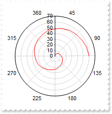
301
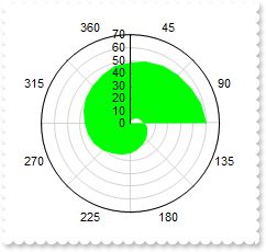
|
"polararea", represents data points connected with straight line segments that enclose a filled area together with the chart pole (data requires array of array of two-numbers, such as [[angle, value]], non-scrollable)
with thisform.Graph1
	.BeginUpdate
	.Object.Misc(16) = .F.
	with .CategoryAxis
		.Categories = "45,90,135,180,225,270,315,360"
		.MajorGridLines.Color = "lightgray"
	endwith
	var_s = "0 0,15 2,30 4,45 6,60 8,75 10,90 12,105 14,120 16,135 18,150 20,165 22,180 24,195 26,210 28,225 30,240 32,255 34,270 36,285 38,3"
	var_s = var_s + "00 40,315 42,330 44,345 46,360 48,15 50,30 52,45 54,60 56,75 58,90 60"
	with .Series.Add(var_s,"Spiral")
		.Type = "polarArea"
		.Color = "lime"
	endwith
	.EndUpdate
endwith
|
|
300
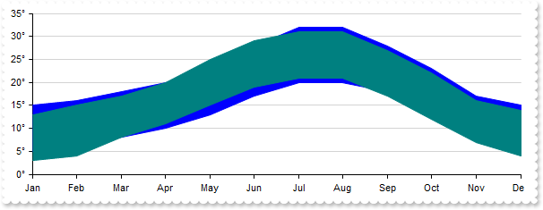
|
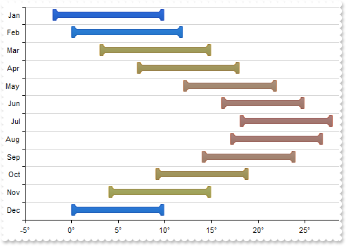
"rangearea", a range chart displays sets of data points, each of which is defined by multiple values for the same category, and emphasizes the distance between the two values. The category labels are displayed on the category axis. The plain Range chart fills in the area between the top and the bottom value for each data point. (data requires array of array of two-numbers, such as [[from, to]], supports vertical field, scrollable)
with thisform.Graph1
	.BeginUpdate
	.AutoFit = .T.
	.ValueAxis.Format = "value + `°`"
	var_s = "Jan(5 15), Feb(6 16), Mar(8 18), Apr(10 20), May(13 23), Jun(17 28), Jul(20 32), Aug(20 32), Sep(18 28), Oct(14 23), Nov(9 17), "
	var_s = var_s + "Dec(6 15)"
	.Series.Add(var_s,"Spain").Type = "rangearea"
	var_s1 = "Jan(3 13), Feb(4 15), Mar(8 17), Apr(11 20), May(15 25), Jun(19 29), Jul(21 31), Aug(21 31), Sep(17 27), Oct(12 22), Nov(7 16), "
	var_s1 = var_s1 + "Dec(4 14)"
	.Series.Add(var_s1,"Spain").Type = "rangearea"
	.EndUpdate
endwith
|
|
299
|
"rangecolumn", single
with thisform.Graph1
	.BeginUpdate
	.AutoFit = .T.
	.ValueAxis.Format = "value + `°`"
	var_s = "Jan(5 15), Feb(6 16), Mar(8 18), Apr(10 20), May(13 23), Jun(17 28), Jul(20 32), Aug(20 32), Sep(18 28), Oct(14 23), Nov(9 17), "
	var_s = var_s + "Dec(6 15)"
	.Series.Add(var_s,"Spain").Type = "RangeColumn"
	var_s1 = "RGB(9,80,239),RGB(9,120,239),RGB(249,186,7),RGB(249,173,7),RGB(255,148,51),RGB(255,125,51),RGB(255,114,51),RGB(255,120,51),RGB(2"
	var_s1 = var_s1 + "55,139,51),RGB(249,171,7),RGB(249,200,7),RGB(9,110,239)"
	.SeriesColors = var_s1
	.EndUpdate
endwith
|
|
298
|
"rangecolumn", a range column chart displays information as a range of data by plotting two Y-values (low and high) per data point. The vertical axis shows the values, and the horizontal axis shows the categories they belong to; in multiple-series range column charts, values are grouped by categories. (data requires array of array of two-numbers, such as [[from, to]], supports vertical field, scrollable)
with thisform.Graph1
	.BeginUpdate
	.AutoFit = .T.
	.ValueAxis.Format = "value + `°`"
	var_s = "Jan(5 15), Feb(6 16), Mar(8 18), Apr(10 20), May(13 23), Jun(17 28), Jul(20 32), Aug(20 32), Sep(18 28), Oct(14 23), Nov(9 17), "
	var_s = var_s + "Dec(6 15)"
	.Series.Add(var_s,"Spain").Type = "RangeColumn"
	var_s1 = "Jan(3 13), Feb(4 15), Mar(8 17), Apr(11 20), May(15 25), Jun(19 29), Jul(21 31), Aug(21 31), Sep(17 27), Oct(12 22), Nov(7 16), "
	var_s1 = var_s1 + "Dec(4 14)"
	.Series.Add(var_s1,"Spain").Type = "RangeColumn"
	.EndUpdate
endwith
|
|
297
|
"pie", a pie chart (or a circle chart) is a circular statistical graphic which is divided into slices to illustrate numerical proportion. In a pie chart, the arc length of each slice (and consequently its central angle and area) is proportional to the quantity it represents. While it is named for its resemblance to a pie which has been sliced, there are variations on the way it can be presented. (data requires array of numbers, non-scrollable)
with thisform.Graph1
	.BeginUpdate
	.Pad = 18
	.Object.Misc(18) = 2
	with .Series
		var_s = "Chinese(14.1),Spanish(6.7),English(4.9),Hindi(4.2),Arabic(4.1),Bengali(3.3),Portuguese(2.9),Russian(2.8),Japanese(1.7),Lahnda(1."
		var_s = var_s + "6)"
		.Add(var_s,"Worldwide").Type = "pie"
		var_s1 = "Chinese(13.2),Spanish(6.6),English(4.8),Hindi(4.1),Arabic(4.0),Bengali(3.2),Portuguese(2.8),Russian(2.7),Japanese(1.6),Lahnda(1."
		var_s1 = var_s1 + "5)"
		.Add(var_s1,"Native").Type = "pie"
	endwith
	.Legend.Visible = .T.
	.EndUpdate
endwith
|
|
296
|
"waterfall", a waterfall chart is a form of data visualization that helps in understanding the cumulative effect of sequentially introduced positive or negative values. These intermediate values can either be time based or category based. The waterfall chart is also known as a flying bricks chart or Mario chart due to the apparent suspension of columns (bricks) in mid-air. Often in finance, it will be referred to as a bridge. (data requires array of numbers, supports vertical field, scrollable)
with thisform.Graph1
	.BeginUpdate
	.Pad = 18
	.AutoFit = .T.
	with .Series
		var_s = "Chinese(14.1),Spanish(6.7),English(4.9),Hindi(4.2),Arabic(4.1),Bengali(3.3),Portuguese(2.9),Russian(2.8),Japanese(1.7),Lahnda(1."
		var_s = var_s + "6)"
		.Add(var_s,"Worldwide").Type = "waterfall"
		var_s1 = "Chinese(13.2),Spanish(6.6),English(4.8),Hindi(4.1),Arabic(4.0),Bengali(3.2),Portuguese(2.8),Russian(2.7),Japanese(1.6),Lahnda(1."
		var_s1 = var_s1 + "5)"
		.Add(var_s1,"Native").Type = "waterfall"
	endwith
	.Legend.Visible = .T.
	.EndUpdate
endwith
|
|
295
|
"radarcolumn", stacked
with thisform.Graph1
	.BeginUpdate
	.Pad = 18
	.AutoFit = .T.
	with .Series
		var_s = "Chinese(14.1),Spanish(6.7),English(4.9),Hindi(4.2),Arabic(4.1),Bengali(3.3),Portuguese(2.9),Russian(2.8),Japanese(1.7),Lahnda(1."
		var_s = var_s + "6)"
		with .Add(var_s,"Worldwide")
			.Type = "radarcolumn"
			.Stack = "group"
		endwith
		var_s1 = "Chinese(13.2),Spanish(6.6),English(4.8),Hindi(4.1),Arabic(4.0),Bengali(3.2),Portuguese(2.8),Russian(2.7),Japanese(1.6),Lahnda(1."
		var_s1 = var_s1 + "5)"
		with .Add(var_s1,"Native")
			.Type = "radarcolumn"
			.Stack = "group"
		endwith
	endwith
	.Legend.Visible = .T.
	.EndUpdate
endwith
|
|
294
|
"radarcolumn", displays data in radial columns starting from one center point. The circle is divided into equal portions depending on the number of columns and each column group occupies one portion (similar with "radarArea" type, data requires array of numbers, non-scrollable)
with thisform.Graph1
	.BeginUpdate
	.Pad = 18
	.AutoFit = .T.
	with .Series
		var_s = "Chinese(14.1),Spanish(6.7),English(4.9),Hindi(4.2),Arabic(4.1),Bengali(3.3),Portuguese(2.9),Russian(2.8),Japanese(1.7),Lahnda(1."
		var_s = var_s + "6)"
		.Add(var_s,"Worldwide").Type = "radarcolumn"
		var_s1 = "Chinese(13.2),Spanish(6.6),English(4.8),Hindi(4.1),Arabic(4.0),Bengali(3.2),Portuguese(2.8),Russian(2.7),Japanese(1.6),Lahnda(1."
		var_s1 = var_s1 + "5)"
		.Add(var_s1,"Native").Type = "radarcolumn"
	endwith
	.Legend.Visible = .T.
	.EndUpdate
endwith
|
|
293
|
"radarline", stacked
with thisform.Graph1
	.BeginUpdate
	.Pad = 18
	.AutoFit = .T.
	with .Series
		var_s = "Chinese(14.1),Spanish(6.7),English(4.9),Hindi(4.2),Arabic(4.1),Bengali(3.3),Portuguese(2.9),Russian(2.8),Japanese(1.7),Lahnda(1."
		var_s = var_s + "6)"
		with .Add(var_s,"Worldwide")
			.Type = "radarline"
			.Stack = "group"
		endwith
		var_s1 = "Chinese(13.2),Spanish(6.6),English(4.8),Hindi(4.1),Arabic(4.0),Bengali(3.2),Portuguese(2.8),Russian(2.7),Japanese(1.6),Lahnda(1."
		var_s1 = var_s1 + "5)"
		with .Add(var_s1,"Native")
			.Type = "radarline"
			.Stack = "group"
		endwith
	endwith
	.Legend.Visible = .T.
	.EndUpdate
endwith
|
|
292
|
"radarline" (data requires array of numbers, non-scrollable)
with thisform.Graph1
	.BeginUpdate
	.Pad = 18
	.AutoFit = .T.
	with .Series
		var_s = "Chinese(14.1),Spanish(6.7),English(4.9),Hindi(4.2),Arabic(4.1),Bengali(3.3),Portuguese(2.9),Russian(2.8),Japanese(1.7),Lahnda(1."
		var_s = var_s + "6)"
		.Add(var_s,"Worldwide").Type = "radarline"
		var_s1 = "Chinese(13.2),Spanish(6.6),English(4.8),Hindi(4.1),Arabic(4.0),Bengali(3.2),Portuguese(2.8),Russian(2.7),Japanese(1.6),Lahnda(1."
		var_s1 = var_s1 + "5)"
		.Add(var_s1,"Native").Type = "radarline"
	endwith
	.Legend.Visible = .T.
	.EndUpdate
endwith
|
|
291
|
"radararea", stacked
with thisform.Graph1
	.BeginUpdate
	.Pad = 18
	.AutoFit = .T.
	with .Series
		var_s = "Chinese(14.1),Spanish(6.7),English(4.9),Hindi(4.2),Arabic(4.1),Bengali(3.3),Portuguese(2.9),Russian(2.8),Japanese(1.7),Lahnda(1."
		var_s = var_s + "6)"
		with .Add(var_s,"Worldwide")
			.Type = "radararea"
			.Stack = "group"
		endwith
		var_s1 = "Chinese(13.2),Spanish(6.6),English(4.8),Hindi(4.1),Arabic(4.0),Bengali(3.2),Portuguese(2.8),Russian(2.7),Japanese(1.6),Lahnda(1."
		var_s1 = var_s1 + "5)"
		with .Add(var_s1,"Native")
			.Type = "radararea"
			.Stack = "group"
		endwith
	endwith
	.Legend.Visible = .T.
	.EndUpdate
endwith
|
|
290
|
"radararea", a radar chart is a graphical method of displaying multivariate data in the form of a two-dimensional chart of three or more quantitative variables represented on axes starting from the same point. The relative position and angle of the axes is typically uninformative, but various heuristics, such as algorithms that plot data as the maximal total area, can be applied to sort the variables (axes) into relative positions that reveal distinct correlations, trade-offs, and a multitude of other comparative measures. (data requires array of numbers, non-scrollable)
with thisform.Graph1
	.BeginUpdate
	.Pad = 18
	.AutoFit = .T.
	with .Series
		var_s = "Chinese(14.1),Spanish(6.7),English(4.9),Hindi(4.2),Arabic(4.1),Bengali(3.3),Portuguese(2.9),Russian(2.8),Japanese(1.7),Lahnda(1."
		var_s = var_s + "6)"
		.Add(var_s,"Worldwide").Type = "radararea"
		var_s1 = "Chinese(13.2),Spanish(6.6),English(4.8),Hindi(4.1),Arabic(4.0),Bengali(3.2),Portuguese(2.8),Russian(2.7),Japanese(1.6),Lahnda(1."
		var_s1 = var_s1 + "5)"
		.Add(var_s1,"Native").Type = "radararea"
	endwith
	.Legend.Visible = .T.
	.EndUpdate
endwith
|
|
289
|
"column", single
with thisform.Graph1
	.BeginUpdate
	.AutoFit = .T.
	var_s = "Chinese(14.1),Spanish(6.7),English(4.9),Hindi(4.2),Arabic(4.1),Bengali(3.3),Portuguese(2.9),Russian(2.8),Japanese(1.7),Lahnda(1."
	var_s = var_s + "6)"
	.Series.Add(var_s,"Worldwide").Type = "column"
	.EndUpdate
endwith
|
|
288
|
"column", stacked
with thisform.Graph1
	.BeginUpdate
	.Pad = 18
	.AutoFit = .T.
	with .Series
		var_s = "Chinese(14.1),Spanish(6.7),English(4.9),Hindi(4.2),Arabic(4.1),Bengali(3.3),Portuguese(2.9),Russian(2.8),Japanese(1.7),Lahnda(1."
		var_s = var_s + "6)"
		with .Add(var_s,"Worldwide")
			.Type = "column"
			.Stack = "group"
		endwith
		var_s1 = "Chinese(13.2),Spanish(6.6),English(4.8),Hindi(4.1),Arabic(4.0),Bengali(3.2),Portuguese(2.8),Russian(2.7),Japanese(1.6),Lahnda(1."
		var_s1 = var_s1 + "5)"
		with .Add(var_s1,"Native")
			.Type = "column"
			.Stack = "group"
		endwith
	endwith
	.Legend.Visible = .T.
	.EndUpdate
endwith
|
|
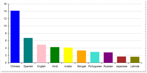
287
|
"column", a column chart or column graph is a chart or graph that presents categorical data with rectangular columns with heights proportional to the values that they represent. A horizontal column chart is called a bar chart. (data requires array of numbers, supports vertical field, scrollable)
with thisform.Graph1
	.BeginUpdate
	.Pad = 18
	.AutoFit = .T.
	with .Series
		var_s = "Chinese(14.1),Spanish(6.7),English(4.9),Hindi(4.2),Arabic(4.1),Bengali(3.3),Portuguese(2.9),Russian(2.8),Japanese(1.7),Lahnda(1."
		var_s = var_s + "6)"
		.Add(var_s,"Worldwide").Type = "column"
		var_s1 = "Chinese(13.2),Spanish(6.6),English(4.8),Hindi(4.1),Arabic(4.0),Bengali(3.2),Portuguese(2.8),Russian(2.7),Japanese(1.6),Lahnda(1."
		var_s1 = var_s1 + "5)"
		.Add(var_s1,"Native").Type = "column"
	endwith
	.Legend.Visible = .T.
	.EndUpdate
endwith
|
|
286
|
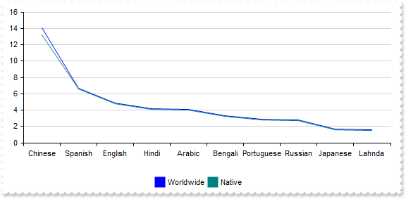
"line", stacked
with thisform.Graph1
	.BeginUpdate
	.Pad = 18
	.AutoFit = .T.
	with .Series
		var_s = "Chinese(14.1),Spanish(6.7),English(4.9),Hindi(4.2),Arabic(4.1),Bengali(3.3),Portuguese(2.9),Russian(2.8),Japanese(1.7),Lahnda(1."
		var_s = var_s + "6)"
		with .Add(var_s,"Worldwide")
			.Type = "line"
			.Stack = "group"
		endwith
		var_s1 = "Chinese(13.2),Spanish(6.6),English(4.8),Hindi(4.1),Arabic(4.0),Bengali(3.2),Portuguese(2.8),Russian(2.7),Japanese(1.6),Lahnda(1."
		var_s1 = var_s1 + "5)"
		with .Add(var_s1,"Native")
			.Type = "line"
			.Stack = "group"
		endwith
	endwith
	.Legend.Visible = .T.
	.EndUpdate
endwith
|
|
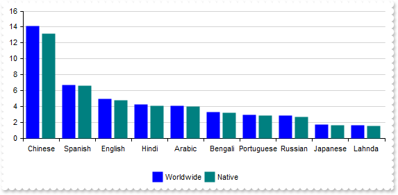
285
|
"line", a line chart or line graph, also known as curve chart is a type of chart which displays information as a series of data points called 'markers' connected by straight line segments. It is a basic type of chart common in many fields. It is similar to a scatter plot except that the measurement points are ordered (typically by their x-axis value) and joined with straight line segments. A line chart is often used to visualize a trend in data over intervals of time - a time series - thus the line is often drawn chronologically. In these cases they are known as run charts. (data requires array of numbers, supports vertical field, scrollable)
with thisform.Graph1
	.BeginUpdate
	.Pad = 18
	.AutoFit = .T.
	with .Series
		var_s = "Chinese(14.1),Spanish(6.7),English(4.9),Hindi(4.2),Arabic(4.1),Bengali(3.3),Portuguese(2.9),Russian(2.8),Japanese(1.7),Lahnda(1."
		var_s = var_s + "6)"
		.Add(var_s,"Worldwide").Type = "line"
		var_s1 = "Chinese(13.2),Spanish(6.6),English(4.8),Hindi(4.1),Arabic(4.0),Bengali(3.2),Portuguese(2.8),Russian(2.7),Japanese(1.6),Lahnda(1."
		var_s1 = var_s1 + "5)"
		.Add(var_s1,"Native").Type = "line"
	endwith
	.Legend.Visible = .T.
	.EndUpdate
endwith
|
|
284
|
"area", stacked
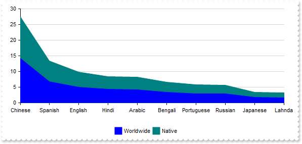
with thisform.Graph1
	.BeginUpdate
	.Pad = 18
	.AutoFit = .T.
	with .Series
		var_s = "Chinese(14.1),Spanish(6.7),English(4.9),Hindi(4.2),Arabic(4.1),Bengali(3.3),Portuguese(2.9),Russian(2.8),Japanese(1.7),Lahnda(1."
		var_s = var_s + "6)"
		with .Add(var_s,"Worldwide")
			.Type = "area"
			.Stack = "group"
		endwith
		var_s1 = "Chinese(13.2),Spanish(6.6),English(4.8),Hindi(4.1),Arabic(4.0),Bengali(3.2),Portuguese(2.8),Russian(2.7),Japanese(1.6),Lahnda(1."
		var_s1 = var_s1 + "5)"
		with .Add(var_s1,"Native")
			.Type = "area"
			.Stack = "group"
		endwith
	endwith
	.Legend.Visible = .T.
	.EndUpdate
endwith
|
|
283
|
"area", an area chart or area graph displays graphically quantitative data. It is based on the line chart. The area between axis and line are commonly emphasized with colors, textures and hatchings. Commonly one compares two or more quantities with an area chart. (data requires array of numbers, supports vertical field, scrollable)
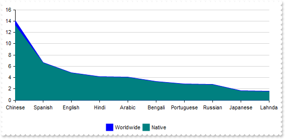
with thisform.Graph1
	.BeginUpdate
	.Pad = 18
	.AutoFit = .T.
	with .Series
		var_s = "Chinese(14.1),Spanish(6.7),English(4.9),Hindi(4.2),Arabic(4.1),Bengali(3.3),Portuguese(2.9),Russian(2.8),Japanese(1.7),Lahnda(1."
		var_s = var_s + "6)"
		.Add(var_s,"Worldwide").Type = "area"
		var_s1 = "Chinese(13.2),Spanish(6.6),English(4.8),Hindi(4.1),Arabic(4.0),Bengali(3.2),Portuguese(2.8),Russian(2.7),Japanese(1.6),Lahnda(1."
		var_s1 = var_s1 + "5)"
		.Add(var_s1,"Native").Type = "area"
	endwith
	.Legend.Visible = .T.
	.EndUpdate
endwith
|
|
282
|
Defines the color to show the frame around the pies
with thisform.Graph1
	.BeginUpdate
	.AutoFit = .T.
	with .Series.Add("1920(1.8),1945(2.3),1970(13.7),1995(5.7),2020(7.8)","Population")
		.Type = "Pie"
		.ShowValue = 7 && ShowValueEnum.exValue Or ShowValueEnum.exLine Or ShowValueEnum.exPoint
		.Misc(7) = 255
		.Misc(6) = 4
	endwith
	.EndUpdate
endwith
|
|
281
|
Defines the width of the line to show the serie
with thisform.Graph1
	.BeginUpdate
	.AutoFit = .T.
	with .Series.Add("1920(1.8),1945(2.3),1970(13.7),1995(5.7),2020(7.8)","Population")
		.Type = "Line"
		.Misc(6) = 4
	endwith
	.EndUpdate
endwith
|
|
280
|
Changes the spline's tension and alpha curves
with thisform.Graph1
	.BeginUpdate
	.AutoFit = .T.
	with .Series.Add("1920(1.8),1945(2.3),1970(13.7),1995(5.7),2020(7.8)","Population")
		.Type = "Line"
		.Style = 1
		.Misc(4) = 0
		.Misc(5) = 1
	endwith
	.EndUpdate
endwith
|
|
279
|
Enables or disables the presentation of hollow representations. This indicates instances where the closing price exceeds the opening price, resulting in candlesticks characterized by unfilled bodies
with thisform.Graph1
	.BeginUpdate
	.ValueSize = 6
	.Data = "C:\Program Files\Exontrol\ExGraph\Sample\Data/msft.csv"
	with .Series.Add()
		.Name = "msft"
		.Data = "Open,High,Low,Close"
		.Type = "candle"
		.Misc(3) = .F.
	endwith
	.EndUpdate
endwith
|
|
278
|
Defines the size to display the candle stick
with thisform.Graph1
	.BeginUpdate
	.ValueSize = 18
	with .CategoryAxis
		.Categories = "Date"
		.Format = "value mid 9 left 2"
	endwith
	.Data = "C:\Program Files\Exontrol\ExGraph\Sample\Data/msft.csv"
	with .Series.Add()
		.Name = "msft"
		.Data = "Open,High,Low,Close"
		.Type = "ohlc"
		.Misc(2) = 2
	endwith
	.EndUpdate
endwith
|
|
277
|
Defines the radius to show the plot on scatter-type charts
with thisform.Graph1
	.BeginUpdate
	with .Series.Add("11 22 33,44 55 66,77 88 99,12 34 56,78 90 23")
		.Type = "bubble"
		.Misc(1) = 64
	endwith
	with .Series.Add("21 32 43,54 65 76,87 98 09,45 67 89,90 23 45")
		.Type = "bubble"
		.Misc(1) = 64
	endwith
	with .Cursor
		.Visible = .T.
		.ShowCursorXLine = .F.
	endwith
	.EndUpdate
endwith
|
|
276
|
Customizes the captions to be shown within the legend
with thisform.Graph1
	.BeginUpdate
	.AutoFit = .T.
	.ValueAxis.AsPercent = .T.
	.Series.Add("Pacific Ocean(16525), Atlantic Ocean(10646), Indian Ocean(7056), Southern Ocean(2033), Arctic Ocean(1406)").LegendFormat = "trim(label replace `Ocean` with ``)"
	.Legend.Visible = .T.
	.EndUpdate
endwith
|
|
275
|
Stacked (data points within a series are stacked on top of each other rather than plotted side by side)
with thisform.Graph1
	.BeginUpdate
	.AutoFit = .T.
	.CategoryAxis.MajorGridLines.Color = "lightgray"
	with .Series
		.Add("Electronics(350),Clothing(200),Books(150)",2001).Stack = "A"
		.Add("Electronics(500),Clothing(150),Books(180)",2002).Stack = "A"
	endwith
	.Legend.Visible = .T.
	.EndUpdate
endwith
|
|
274
|
Draws a curved line
with thisform.Graph1
	.BeginUpdate
	.AutoFit = .T.
	with .Series.Add("1920(1.8),1945(2.3),1970(3.7),1995(5.7),2020(7.8)","Population")
		.Type = "Line"
		.Style = 1
		.Misc(6) = 2
	endwith
	.EndUpdate
endwith
|
|
273
|
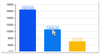
Customizes the values to display on the chart (showValue property includes the exValue)
with thisform.Graph1
.BeginUpdate
.AutoFit = .T.
.CategoryAxis.Visible = .F.
with .Series.Add("Pacific(16525), Atlantic(10646), Indian(7056), Southern(2033), Arctic(1406)")
.ShowValue = 7 && ShowValueEnum.exValue Or ShowValueEnum.exLine Or ShowValueEnum.exPoint
.ValueFormat = "category + `<br><b>` + (percent format ``) + `%`"
endwith
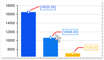
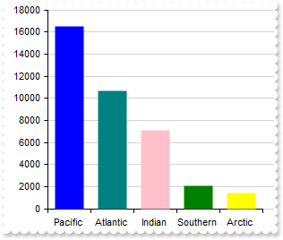
.EndUpdate
endwith
|
|
272
|
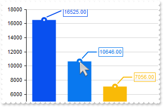
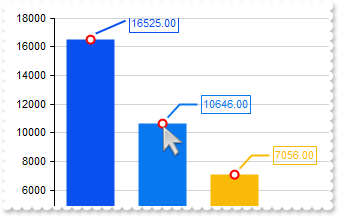
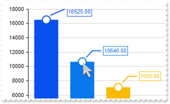
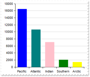
Shows or hides the serie's value-points, value-lines and values
with thisform.Graph1
	.BeginUpdate
	.AutoFit = .T.
	.Series.Add("Pacific(16525), Atlantic(10646), Indian(7056), Southern(2033), Arctic(1406)").ShowValue = 7 && ShowValueEnum.exValue Or ShowValueEnum.exLine Or ShowValueEnum.exPoint
	.EndUpdate
endwith
|
|
271
|
Shows or hides the serie
with thisform.Graph1
	.BeginUpdate
	.AutoFit = .T.
	with .Series
		with .Add("Facebook(125),Google(94),Twitter(38),LinkedIn(172),Instagram(53),Pinterest(187),Snapchat(104),WhatsApp(19)")
			.Visible = .F.
			.Vertical = .T.
			.Name = 2001
		endwith
		.Add("Facebook(176),Google(81),Twitter(47),LinkedIn(159),Instagram(62),Pinterest(193),Snapchat(118),WhatsApp(25)").Name = 2002
	endwith
	.Legend.Visible = .T.
	.EndUpdate
endwith
|
|
270
|
Show bars graph (the serie is showing the data vertically or horizontally)
with thisform.Graph1
	.BeginUpdate
	.AutoFit = .T.
	var_s = "gBFLBCJwBAEHhEJAAEhABUQDg6AADACAxRDAMgBQKAAzAJBIYhiGgcYCgMZBSDeCYXABCEYRXBIZQ7BKNIxjSJwFiCCQwSDKEjyCKsGRHF6MI6gOYpCgOIYjRJNIASVA"
	var_s = var_s + "ceAAHCUZrjSgobAiCYlTZCIBQS5oOBIACmabiegZLgmQInUrMEggVDgJSPuTWNQUdYdJQTHIZBpEWyLKjkNQwWrCNr3DTUEyNDauIDpCKLCpGZYYVRPOAgAKldxhGCaJ"
	var_s = var_s + "okGkgc4HHyrcCwfDAMraCQQWAAF62Jb1JyrSSBchnOwpDpuCaVQLXUB5RRNQyZTiyIrtS5AAqnNJzW5cE46Li0B5QAC8QA1S7NPo/HaZT5kGB7ZDddzuADfcLlfD5BxE"
	var_s = var_s + "DCUhQmEPAbl6K4hlKQ5snwNwtleDxpBeMRIHmd4+A8R4/BuRZvEABQDEmDJoHUOQZEYMgVjQSIEE0fwRjCWQJAoEIXHWQxCAGBBggAbpemOCJaDaRowkQKwfgSEJCBQD"
	var_s = var_s + "AGnCWAsDYTJTLSBwOlgfghggIgohYIA3A0Iw8GcCxCigZAsguB4hBwQ4HAyZAMjMJhJjIPBdA0SZxkAOoPEOIhMGEDYJHGSB0gmIg5CYSAokgAZggME4DCkAhACbIhgi"
	var_s = var_s + "oIwImQDhXCOCQRHgNwogcIJyGCGImBGMAyAqYxJCISINAcAJcC0JxGmCbIiByQ5Zk4dYdCWORqFgJJGACYIkB0A5pn6AYgAmcY8DwHRDlCOg3CaZIKCwfgSgOOgUDwKR"
	var_s = var_s + "HFCfoUiWKRaF4eQACWMhUGEDoKHGWBAigag6gqJIpCmYJogMExDEqLA0ioah6giKAdkQGpOjWLQrGobjfEYMJwioHhEDqfpBjACohmAQoxGwewakiMpsisNBCCqbALEA"
	var_s = var_s + "Q40i0KtjCYRhQnSLQekQWxul2NwKlGaBEjgbg7gqZI5m4a4kEQK4tkuMBFjuLprFiDgnAYYJ8jAHxEHuXp5j4L4rnafI/m+PAGnoLBvgwEBH5Aa5Ih8GhEBKUIABKMJs"
	var_s = var_s + "EMDwtAecQnBSRYxFwXwakYcZBCSNZDnGcQrCGlIigQagQkscgIEyShyjyKI3CARI8j8MZMDMLJXDSTZEjKYwqk6BJMnMPI8goMYwEQLoIEEOxElGNBdB8SpSHSTQjE6U"
	var_s = var_s + "ZLj0FxRBONQ9E6cgpEaUQYj0IYFA0bxdlcNZilwfwTEiYRUDwHZDkCSxoAyNhQnMYgTHWYp4gcFB3C2Uxzl0N4IoQBvAjEwAQIApRfDvH2PELgOhEhUDwI0GgxBIgEDQ"
	var_s = var_s + "EMRQ4hPgGBKBgEgSBTjIHkHwS4KQ8siEQJIMIkQxCvBwCoS4hAQCkBuIYcIuRrBzE6BMK4Eg7D0HOEAewIgDilFwPwE4mBODvDUCoew9BsiMCyJYQg+BlAiEwMQNArxw"
	var_s = var_s + "CKH6PARYLR6hSCuFYMYFRSgZBMCwA45gfiFHSAocomB5AnCmGcH4tAkgNFGHkFQNAGAEHAN4GQERhgQF0GsDIxg/iTHIJwMw4RVA2EMCEOA9APgGE+JgNATBHE4F6AcU"
	var_s = var_s + "AZwuAYAAAgBBAQ=="
	.VisualAppearance.Add(1,var_s)
	with .Series
		with .Add("Facebook(125),Google(94),Twitter(38),LinkedIn(172),Instagram(53),Pinterest(187),Snapchat(104),WhatsApp(19)")
			.Color = 16777216
			.Vertical = .T.
		endwith
		.Add("Facebook(176),Google(81),Twitter(47),LinkedIn(159),Instagram(62),Pinterest(193),Snapchat(118),WhatsApp(25)").Color = 16777216
	endwith
	.SeriesColors = "red,RGB(255,128,0)"
	.EndUpdate
endwith
|
|
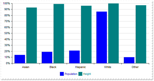
269
|
Defines the name of the chart serie which is visible in the legend
with thisform.Graph1
	.BeginUpdate
	.AutoFit = .T.
	with .ValueAxis
		.AsPercent = .T.
		.Format = "(value  * 100 format `0`) + `%`"
	endwith
	with .Series
		.Add("Asian(10),Black(13),Hispanic(15),White(60),Other(7)","<fgcolor blue>Population")
		.Add("Asian(65),Black(69),Hispanic(67),White(70),Other(68)").Name = "<fgcolor teal>Height"
	endwith
	.Legend.Visible = .T.
	.EndUpdate
endwith
|
|
268
|
Defines the visual appearance of the serie using EBN colors (method 3,mixt)
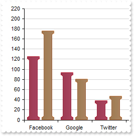
with thisform.Graph1
	.BeginUpdate
	.AutoFit = .T.
	var_s = "gBFLBCJwBAEHhEJAAEhABVoDg6AADACAxRDAMgBQKAAzAJBIYhiGgcYCgMZBSDeCYXABCEYRXBIZQ7BKNIxjSJwFgmEgADIOAzyPAsVwSGobRpkEaIMiONoYR5Ac4yFA"
	var_s = var_s + "cQxHE6TZRGeQRRiGModT5HFIxXIsBgRECEQChFzQcCQAJUVZFdAyVQlDRCGSpJrkEC4cBCCZPTzUNR1LS9WS1DoaRJoG4ZHDUMJyS7dcjyHINGwxMinJrwKA6bi6BAwY"
	var_s = var_s + "YAEwUPAYcT9QaRZznOQaLhiQIdVxDNbURgWKgVBK/AiqCA7Bq2VpYZZmFB5VJ9P5LPiEcE+fAdTQHUS0dItPR7OiacJ4TpdF48BhVdY7UCEdoADYtYxCP6qSxiFDUDA/"
	var_s = var_s + "CsF5KloAAXm4VBfEuKJUFuZxSi6DouAY34NDWdItg2HgTjaWZHDuVpPAae4DkQGRwjyXBvlcE47iMdoelQDYyHcHJkGGFIAEAARAGkGJHEGVByBkVBUCSFhEgQIQ2BMR"
	var_s = var_s + "pDGQJAoHuEIXDUCAGBGAYBHsc4NhMNJOCqCJCDoKIKiKGIuC6CxjAiMgyguYw4iSXg2g2MZoEcEJJjGLA4CiBwwnSJQdEOcogHcEBKjGZBDCuB4xBSMQfEQcpUgAEoLg"
	var_s = var_s + "ICBMC6SBBDiPghkUEwEgkFJMEILBVCyR4RDiGQckcIY8DYCwJnGQA6hAJApBIRoSCSKQyE6FAlCkUhWhYJYpHIXoYCYIwcg0FZHiCeA0hqJpJjocIQmQWQeEmEpklkPh"
	var_s = var_s + "RhSZRZF4WYWmWWR+GEFRoCoEoGBmQpQiiAwTgMIh0G4DpokmToPh2KQpmaFYfCmCZ8jcH4EnITBYA+RpQkQLg3A0Iw8iMIAHgGQA3AsSZxjwPApkcYS5h4BAijQegRAs"
	var_s = var_s + "CRAjQH5EhKXIBBKS4pGSPQhgUAo4HUEtHhAPQxgqUoMmNjRQhAHA7G6I42CUM4HmEKA7jILIrDKTo0C0KxSlaNglhKXB/BMSBxFwUw6k4c4im2QZujwIJtCySYSGyFQY"
	var_s = var_s + "EOKwuk2M5tBEHpTjUbR7GQTgjgUUJym+QoyAwJwiDsSAxDQNJEi8fBXBePpxiGXA8AyMgbjMI5MHIXIenaRQvhwYp8BOMpskMM5PnMLQHAyQ4xAyIw4kWL4sGZDoxmiG"
	var_s = var_s + "wxkKLpxlQPQLi8TQaniUgziwap+BMbwRBsBJBjIO48hcHIHEGMAyAqbBbB6SZVjKLQnDuNptlsfBvA2Qx4iyKwM4GR6BBBMDAQwxQIDkA8BQQYoA+iqGSEUNgmxKhKDK"
	var_s = var_s + "LwVojQ3AGACBAFIFxCAgFIE8RgogUgcBiAsUY8BJAYCaLMPw/xgDwD2F8BYwxtBcCeBcNoWxOBwFIGEZgRgagGCcA0cYJwajOCiFwf4BRhAID4DARYxAEhcCgJkYwdQe"
	var_s = var_s + "B/CwCoeowhcgqBoAwAYWAxAVEiOIdAagkCLGCLmAoBwMB4DoEsRgYRwgyBkIcUg4BmAfZKEgQQUBGhCeGDYBAhQUDaBGBUAYeBHBVAcCIJ4KARCSCGGgbwcQjgaA4Gkf"
	var_s = var_s + "oxgfjkDUV8GAswLCDE8AIBwtAjAAAQAggIA="
	.VisualAppearance.Add(1,var_s)
	with .Series
		.Add("Facebook(125),Google(94),Twitter(38),LinkedIn(172),Instagram(53),Pinterest(187),Snapchat(104),WhatsApp(19)").Color = 16777216
		.Add("Facebook(176),Google(81),Twitter(47),LinkedIn(159),Instagram(62),Pinterest(193),Snapchat(118),WhatsApp(25)").Color = 16777216
	endwith
	.SeriesColors = "red,RGB(255,128,0)"
	.EndUpdate
endwith
|
|
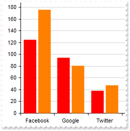
267
|
Defines the color to show the serie (method 2)
with thisform.Graph1
	.BeginUpdate
	.AutoFit = .T.
	with .Series
		.Add("Facebook(125),Google(94),Twitter(38),LinkedIn(172),Instagram(53),Pinterest(187),Snapchat(104),WhatsApp(19)")
		.Add("Facebook(176),Google(81),Twitter(47),LinkedIn(159),Instagram(62),Pinterest(193),Snapchat(118),WhatsApp(25)")
	endwith
	.SeriesColors = "red,RGB(255,128,0)"
	.EndUpdate
endwith
|
|
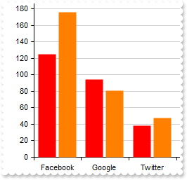
266
|
Defines the color to show the serie (method 1)
with thisform.Graph1
	.BeginUpdate
	.AutoFit = .T.
	with .Series
		.Add("Facebook(125),Google(94),Twitter(38),LinkedIn(172),Instagram(53),Pinterest(187),Snapchat(104),WhatsApp(19)").Color = "red"
		.Add("Facebook(176),Google(81),Twitter(47),LinkedIn(159),Instagram(62),Pinterest(193),Snapchat(118),WhatsApp(25)").Color = 33023
	endwith
	.EndUpdate
endwith
|
|
265
|
Changes the position of the serie
with thisform.Graph1
	.BeginUpdate
	.AutoFit = .T.
	with .Series
		.Add("Facebook(125),Google(94),Twitter(38),LinkedIn(172),Instagram(53),Pinterest(187),Snapchat(104),WhatsApp(19)")
		.Add("Facebook(176),Google(81),Twitter(47),LinkedIn(159),Instagram(62),Pinterest(193),Snapchat(118),WhatsApp(25)")
	endwith
	.Series.Item(1).Position = 0
	.EndUpdate
endwith
|
|
264
|
Referencing a series by its key
with thisform.Graph1
	.BeginUpdate
	.AutoFit = .T.
	with .Series
		.Add("Facebook(125),Google(94),Twitter(38),LinkedIn(172),Instagram(53),Pinterest(187),Snapchat(104),WhatsApp(19)").Key = "1st"
		.Add("Facebook(176),Google(81),Twitter(47),LinkedIn(159),Instagram(62),Pinterest(193),Snapchat(118),WhatsApp(25)").Key = "2nd"
	endwith
	.Series.Item("2nd").Visible = .F.
	.EndUpdate
endwith
|
|
263
|
Removes the serie (click to remove the serie)
*** Click event - Occurs when the user presses and then releases the left mouse button over the control. ***
LPARAMETERS nop
	with thisform.Graph1
		.Series.Remove(0)
	endwith

with thisform.Graph1
	.BeginUpdate
	.AutoFit = .T.
	.Series.Add("Pacific(16525), Atlantic(10646), Indian(7056), Southern(2033), Arctic(1406)")
	.EndUpdate
endwith
|
|
262
|
Clears the series (click to remove all series)
*** Click event - Occurs when the user presses and then releases the left mouse button over the control. ***
LPARAMETERS nop
	with thisform.Graph1
		.Series.Clear
	endwith

with thisform.Graph1
	.BeginUpdate
	.AutoFit = .T.
	.Series.Add("Pacific(16525), Atlantic(10646), Indian(7056), Southern(2033), Arctic(1406)")
	.EndUpdate
endwith
|
|
261
|
Add multiple series (mixt)
with thisform.Graph1
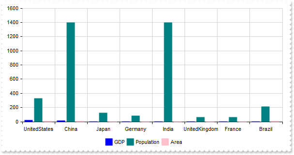
.BeginUpdate
.AutoFit = .T.
.Object.Misc(1) = "1,5"
.CategoryAxis.MajorGridLines.Color = "lightgray"
with .ValueAxes
with .Add("g+a")
.End = 0.66
.MajorGridLines.Step = 1000
endwith
with .Add("p")
.Start = 0.66
.MajorGridLines.Step = 1000
endwith
endwith
with .Series
with .Add("UnitedStates(22.7),China(17.6),Japan(5.0),Germany(4.4),India(3.2),UnitedKingdom(3.1),France(3.0),Brazil(2.5)","GDP")
.Axis = "g+a"
.Stack = "g+a"
endwith
.Add("UnitedStates(331),China(1400),Japan(126),Germany(83),India(1400),UnitedKingdom(68),France(67),Brazil(213)","Population").Axis = "p"
with .Add("UnitedStates(9.8),China(9.6),Japan(0.377),Germany(0.357),India(3.3),UnitedKingdom(0.610),France(0.695),Brazil(8.5)","Area")
.Axis = "g+a"
.Stack = "g+a"
endwith
endwith
.Legend.Visible = .T.
.EndUpdate
endwith
|
|
260
|
Add multiple series (same value-axis, stacked)
with thisform.Graph1
	.BeginUpdate
	.AutoFit = .T.
	.CategoryAxis.MajorGridLines.Color = "lightgray"
	with .Series
		.Add("UnitedStates(22.7),China(17.6),Japan(5.0),Germany(4.4),India(3.2),UnitedKingdom(3.1),France(3.0),Brazil(2.5)","GDP").Stack = "g+a"
		.Add("UnitedStates(331),China(1400),Japan(126),Germany(83),India(1400),UnitedKingdom(68),France(67),Brazil(213)","Population")
		.Add("UnitedStates(9.8),China(9.6),Japan(0.377),Germany(0.357),India(3.3),UnitedKingdom(0.610),France(0.695),Brazil(8.5)","Area").Stack = "g+a"
	endwith
	.Legend.Visible = .T.
	.EndUpdate
endwith
|
|
259
|
Add multiple series (same value-axis, all stacked)
with thisform.Graph1
	.BeginUpdate
	.AutoFit = .T.
	.CategoryAxis.MajorGridLines.Color = "lightgray"
	with .Series
		.Add("UnitedStates(22.7),China(17.6),Japan(5.0),Germany(4.4),India(3.2),UnitedKingdom(3.1),France(3.0),Brazil(2.5)","GDP").Stack = "all"
		.Add("UnitedStates(331),China(1400),Japan(126),Germany(83),India(1400),UnitedKingdom(68),France(67),Brazil(213)","Population").Stack = "all"
		.Add("UnitedStates(9.8),China(9.6),Japan(0.377),Germany(0.357),India(3.3),UnitedKingdom(0.610),France(0.695),Brazil(8.5)","Area").Stack = "all"
	endwith
	.Legend.Visible = .T.
	.EndUpdate
endwith
|
|
258
|
Add multiple series (same value-axis)
with thisform.Graph1
	.BeginUpdate
	.AutoFit = .T.
	.CategoryAxis.MajorGridLines.Color = "lightgray"
	with .Series
		.Add("UnitedStates(22.7),China(17.6),Japan(5.0),Germany(4.4),India(3.2),UnitedKingdom(3.1),France(3.0),Brazil(2.5)","GDP")
		.Add("UnitedStates(331),China(1400),Japan(126),Germany(83),India(1400),UnitedKingdom(68),France(67),Brazil(213)","Population")
		.Add("UnitedStates(9.8),China(9.6),Japan(0.377),Germany(0.357),India(3.3),UnitedKingdom(0.610),France(0.695),Brazil(8.5)","Area")
	endwith
	.Legend.Visible = .T.
	.EndUpdate
endwith
|
|
257
|
Add multiple series (different value axes)
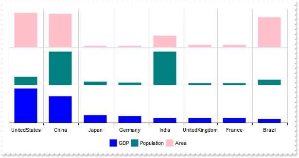
with thisform.Graph1
	.BeginUpdate
	.AutoFit = .T.
	.CategoryAxis.MajorGridLines.Color = "lightgray"
	with .ValueAxes
		with .Add("g")
			.End = 0.33
			.Visible = .F.
			.MajorGridLines.Step = 1000
		endwith
		with .Add("p")
			.Start = 0.33
			.End = 0.66
			.Visible = .F.
			.MajorGridLines.Step = 1000
		endwith
		with .Add("a")
			.Start = 0.66
			.Visible = .F.
			.MajorGridLines.Step = 1000
		endwith
	endwith
	with .Series
		.Add("UnitedStates(22.7),China(17.6),Japan(5.0),Germany(4.4),India(3.2),UnitedKingdom(3.1),France(3.0),Brazil(2.5)","GDP").Axis = "g"
		.Add("UnitedStates(331),China(1400),Japan(126),Germany(83),India(1400),UnitedKingdom(68),France(67),Brazil(213)","Population").Axis = "p"
		.Add("UnitedStates(9.8),China(9.6),Japan(0.377),Germany(0.357),India(3.3),UnitedKingdom(0.610),France(0.695),Brazil(8.5)","Area").Axis = "a"
	endwith
	.Legend.Visible = .T.
	.EndUpdate
endwith
|
|
256
|
Display the values over the columns
with thisform.Graph1
	.BeginUpdate
	.AutoFit = .T.
	.ValuePoint = "0,,,,,,0"
	.Series.Add("Pacific(16525), Atlantic(10646), Indian(7056), Southern(2033), Arctic(1406)").ShowValue = 7 && ShowValueEnum.exValue Or ShowValueEnum.exLine Or ShowValueEnum.exPoint
	var_s = "RGB(9,80,239),RGB(9,120,239),RGB(249,186,7),RGB(249,173,7),RGB(255,148,51),RGB(255,125,51),RGB(255,114,51),RGB(255,120,51),RGB(2"
	var_s = var_s + "55,139,51),RGB(249,171,7),RGB(249,200,7),RGB(9,110,239)"
	.SeriesColors = var_s
	.EndUpdate
endwith
|
|
255
|
Defines the pad, distance between value-label and its frame (the number indicated by the ValuePoint property in the 11-th position)
with thisform.Graph1
	.BeginUpdate
	.ValueSize = 48
	.ValuePoint = ",,,,,,,,,,8"
	.Series.Add("Pacific(16525), Atlantic(10646), Indian(7056), Southern(2033), Arctic(1406)").ShowValue = 7 && ShowValueEnum.exValue Or ShowValueEnum.exLine Or ShowValueEnum.exPoint
	var_s = "RGB(9,80,239),RGB(9,120,239),RGB(249,186,7),RGB(249,173,7),RGB(255,148,51),RGB(255,125,51),RGB(255,114,51),RGB(255,120,51),RGB(2"
	var_s = var_s + "55,139,51),RGB(249,171,7),RGB(249,200,7),RGB(9,110,239)"
	.SeriesColors = var_s
	.EndUpdate
endwith
|
|
254
|
Defines the size of the frame around the value-label (the number indicated by the ValuePoint property in the 10-th position)
with thisform.Graph1
	.BeginUpdate
	.ValueSize = 48
	.ValuePoint = ",,,,,,,,,4"
	.Series.Add("Pacific(16525), Atlantic(10646), Indian(7056), Southern(2033), Arctic(1406)").ShowValue = 7 && ShowValueEnum.exValue Or ShowValueEnum.exLine Or ShowValueEnum.exPoint
	var_s = "RGB(9,80,239),RGB(9,120,239),RGB(249,186,7),RGB(249,173,7),RGB(255,148,51),RGB(255,125,51),RGB(255,114,51),RGB(255,120,51),RGB(2"
	var_s = var_s + "55,139,51),RGB(249,171,7),RGB(249,200,7),RGB(9,110,239)"
	.SeriesColors = var_s
	.EndUpdate
endwith
|
|
253
|
Defines the color of the frame around the value-label (the color indicated by the ValuePoint property in the 9-th position)
with thisform.Graph1
	.BeginUpdate
	.ValueSize = 48
	.ValuePoint = ",,,,,,,,red"
	.Series.Add("Pacific(16525), Atlantic(10646), Indian(7056), Southern(2033), Arctic(1406)").ShowValue = 7 && ShowValueEnum.exValue Or ShowValueEnum.exLine Or ShowValueEnum.exPoint
	var_s = "RGB(9,80,239),RGB(9,120,239),RGB(249,186,7),RGB(249,173,7),RGB(255,148,51),RGB(255,125,51),RGB(255,114,51),RGB(255,120,51),RGB(2"
	var_s = var_s + "55,139,51),RGB(249,171,7),RGB(249,200,7),RGB(9,110,239)"
	.SeriesColors = var_s
	.EndUpdate
endwith
|
|
252
|
Defines the background color of the value-label (the color indicated by the ValuePoint property in the 8-th position)
with thisform.Graph1
	.BeginUpdate
	.ValueSize = 48
	.ValuePoint = ",,,,,,,red"
	.Series.Add("Pacific(16525), Atlantic(10646), Indian(7056), Southern(2033), Arctic(1406)").ShowValue = 7 && ShowValueEnum.exValue Or ShowValueEnum.exLine Or ShowValueEnum.exPoint
	var_s = "RGB(9,80,239),RGB(9,120,239),RGB(249,186,7),RGB(249,173,7),RGB(255,148,51),RGB(255,125,51),RGB(255,114,51),RGB(255,120,51),RGB(2"
	var_s = var_s + "55,139,51),RGB(249,171,7),RGB(249,200,7),RGB(9,110,239)"
	.SeriesColors = var_s
	.EndUpdate
endwith
|
|
251
|
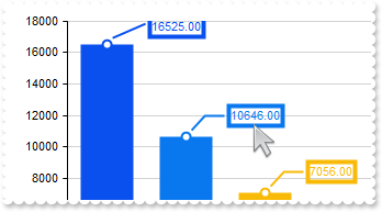
Defines the length of the line (the number indicated by the ValuePoint property in the 7-th position)
with thisform.Graph1
	.BeginUpdate
	.ValueSize = 48
	.ValuePoint = ",,,,,,0"
	.Series.Add("Pacific(16525), Atlantic(10646), Indian(7056), Southern(2033), Arctic(1406)").ShowValue = 7 && ShowValueEnum.exValue Or ShowValueEnum.exLine Or ShowValueEnum.exPoint
	var_s = "RGB(9,80,239),RGB(9,120,239),RGB(249,186,7),RGB(249,173,7),RGB(255,148,51),RGB(255,125,51),RGB(255,114,51),RGB(255,120,51),RGB(2"
	var_s = var_s + "55,139,51),RGB(249,171,7),RGB(249,200,7),RGB(9,110,239)"
	.SeriesColors = var_s
	.EndUpdate
endwith
|
|
250
|
Defines the size of the line from the value point to its label (the number indicated by the ValuePoint property in the 6-th position)
with thisform.Graph1
	.BeginUpdate
	.ValueSize = 48
	.ValuePoint = ",,,,,4"
	.Series.Add("Pacific(16525), Atlantic(10646), Indian(7056), Southern(2033), Arctic(1406)").ShowValue = 7 && ShowValueEnum.exValue Or ShowValueEnum.exLine Or ShowValueEnum.exPoint
	var_s = "RGB(9,80,239),RGB(9,120,239),RGB(249,186,7),RGB(249,173,7),RGB(255,148,51),RGB(255,125,51),RGB(255,114,51),RGB(255,120,51),RGB(2"
	var_s = var_s + "55,139,51),RGB(249,171,7),RGB(249,200,7),RGB(9,110,239)"
	.SeriesColors = var_s
	.EndUpdate
endwith
|
|
249
|
Defines the color of the line from the value point to its label (the color indicated by the ValuePoint property in the 5-th position)
with thisform.Graph1
	.BeginUpdate
	.ValueSize = 48
	.ValuePoint = ",,,,red"
	.Series.Add("Pacific(16525), Atlantic(10646), Indian(7056), Southern(2033), Arctic(1406)").ShowValue = 7 && ShowValueEnum.exValue Or ShowValueEnum.exLine Or ShowValueEnum.exPoint
	var_s = "RGB(9,80,239),RGB(9,120,239),RGB(249,186,7),RGB(249,173,7),RGB(255,148,51),RGB(255,125,51),RGB(255,114,51),RGB(255,120,51),RGB(2"
	var_s = var_s + "55,139,51),RGB(249,171,7),RGB(249,200,7),RGB(9,110,239)"
	.SeriesColors = var_s
	.EndUpdate
endwith
|
|
248
|
Defines the size of the frame around the value point (the number indicated by the ValuePoint property in the 4-th position)
with thisform.Graph1
	.BeginUpdate
	.ValueSize = 48
	.ValuePoint = ",,,4"
	.Series.Add("Pacific(16525), Atlantic(10646), Indian(7056), Southern(2033), Arctic(1406)").ShowValue = 7 && ShowValueEnum.exValue Or ShowValueEnum.exLine Or ShowValueEnum.exPoint
	var_s = "RGB(9,80,239),RGB(9,120,239),RGB(249,186,7),RGB(249,173,7),RGB(255,148,51),RGB(255,125,51),RGB(255,114,51),RGB(255,120,51),RGB(2"
	var_s = var_s + "55,139,51),RGB(249,171,7),RGB(249,200,7),RGB(9,110,239)"
	.SeriesColors = var_s
	.EndUpdate
endwith
|
|
247
|
Defines the color of the frame around the value point (the color indicated by the ValuePoint property in the 3-rd position)
with thisform.Graph1
	.BeginUpdate
	.ValueSize = 48
	.ValuePoint = ",,red"
	.Series.Add("Pacific(16525), Atlantic(10646), Indian(7056), Southern(2033), Arctic(1406)").ShowValue = 7 && ShowValueEnum.exValue Or ShowValueEnum.exLine Or ShowValueEnum.exPoint
	var_s = "RGB(9,80,239),RGB(9,120,239),RGB(249,186,7),RGB(249,173,7),RGB(255,148,51),RGB(255,125,51),RGB(255,114,51),RGB(255,120,51),RGB(2"
	var_s = var_s + "55,139,51),RGB(249,171,7),RGB(249,200,7),RGB(9,110,239)"
	.SeriesColors = var_s
	.EndUpdate
endwith
|
|
246
|
Defines the color of the value point (the color indicated by the ValuePoint property in the 2-nd position)

with thisform.Graph1
	.BeginUpdate
	.ValueSize = 48
	.ValuePoint = ",red"
	.Series.Add("Pacific(16525), Atlantic(10646), Indian(7056), Southern(2033), Arctic(1406)").ShowValue = 7 && ShowValueEnum.exValue Or ShowValueEnum.exLine Or ShowValueEnum.exPoint
	var_s = "RGB(9,80,239),RGB(9,120,239),RGB(249,186,7),RGB(249,173,7),RGB(255,148,51),RGB(255,125,51),RGB(255,114,51),RGB(255,120,51),RGB(2"
	var_s = var_s + "55,139,51),RGB(249,171,7),RGB(249,200,7),RGB(9,110,239)"
	.SeriesColors = var_s
	.EndUpdate
endwith
|
|
245
|
Defines the size of the value point (the number indicated by the ValuePoint property in the first position)
with thisform.Graph1
	.BeginUpdate
	.ValueSize = 48
	.ValuePoint = "16"
	.Series.Add("Pacific(16525), Atlantic(10646), Indian(7056), Southern(2033), Arctic(1406)").ShowValue = 7 && ShowValueEnum.exValue Or ShowValueEnum.exLine Or ShowValueEnum.exPoint
	var_s = "RGB(9,80,239),RGB(9,120,239),RGB(249,186,7),RGB(249,173,7),RGB(255,148,51),RGB(255,125,51),RGB(255,114,51),RGB(255,120,51),RGB(2"
	var_s = var_s + "55,139,51),RGB(249,171,7),RGB(249,200,7),RGB(9,110,239)"
	.SeriesColors = var_s
	.EndUpdate
endwith
|
|
244
|
Disables resizing the chart by drag and drop (resize the chart's value by clicking and dragging with the middle mouse button)
with thisform.Graph1
	.BeginUpdate
	.ValueSize = 64
	.AllowValueResize = .F.
	.Series.Add("Asia(4600), Africa(1300), Europe(747), North America(579), South America(431), Australia/Oceania(42)")
	.Series.Add("Asia(4458), Africa(3037), North America(2470), South America(1784), Antarctica(1400), Europe(1018), Australia/Oceania(856)")
	.Cursor.Visible = .T.
	.EndUpdate
endwith
|
|
243
|
Scrolls programatically the chart
with thisform.Graph1
	.BeginUpdate
	.ValueSize = 8
	.Data = "C:\Program Files\Exontrol\ExGraph\Sample\Data/msft.csv"
	.ValueAxis.Format = "value format ``"
	with .Series.Add()
		.Name = "msft"
		.Data = "Open,High,Low,Close"
		.Type = "candle"
	endwith
	.Object.ScrollPos(1) = 256
	.EndUpdate
endwith
|
|
242
|
Disables scrolling the chart by clicking and dragging the chart
with thisform.Graph1
	.BeginUpdate
	.ValueSize = 8
	.AllowScroll = .F.
	.Data = "C:\Program Files\Exontrol\ExGraph\Sample\Data/msft.csv"
	.ValueAxis.Format = "value format ``"
	with .Series.Add()
		.Name = "msft"
		.Data = "Open,High,Low,Close"
		.Type = "candle"
	endwith
	.EndUpdate
endwith
|
|
241
|
Disables the scroll bars
with thisform.Graph1
	.BeginUpdate
	.ValueSize = 8
	.Data = "C:\Program Files\Exontrol\ExGraph\Sample\Data/msft.csv"
	.ValueAxis.Format = "value format ``"
	with .Series.Add()
		.Name = "msft"
		.Data = "Open,High,Low,Close"
		.Type = "candle"
	endwith
	.ScrollBars = 0
	.AllowScroll = .F.
	.EndUpdate
endwith
|
|
240
|
Hides the scroll bars
with thisform.Graph1
	.BeginUpdate
	.ValueSize = 8
	.Data = "C:\Program Files\Exontrol\ExGraph\Sample\Data/msft.csv"
	.ValueAxis.Format = "value format ``"
	with .Series.Add()
		.Name = "msft"
		.Data = "Open,High,Low,Close"
		.Type = "candle"
	endwith
	.ScrollBars = 0
	.EndUpdate
endwith
|
|
239
|
The maximum value of the axis does not fit the view. Is there anything I can do to ensure that it fits the view
with thisform.Graph1
	.BeginUpdate
	.AutoFit = .T.
	.Series.Add("Pacific Ocean(16525), Atlantic Ocean(10646), Indian Ocean(7056), Southern Ocean(2033), Arctic Ocean(1406)")
	.Pad = 24
	.EndUpdate
endwith
|
|
238
|
Customizes the "no or invalid data" message
with thisform.Graph1
	.Invalid = "<fgcolor red>no or invalid data"
	.FormatText = 9 && DrawTextFormatEnum.exTextAlignBottom Or DrawTextFormatEnum.exTextAlignCenter
endwith
|
|
237
|
Sorts descending the serie
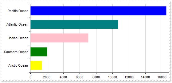
with thisform.Graph1
	.BeginUpdate
	.AutoFit = .T.
	.Series.Add("Pacific Ocean(16525), Atlantic Ocean(10646), Indian Ocean(7056), Southern Ocean(2033), Arctic Ocean(1406)").Vertical = .T.
	.Sort = "0:D"
	.EndUpdate
endwith
|
|
236
|
Sorts ascending the serie
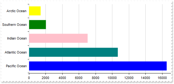
with thisform.Graph1
	.BeginUpdate
	.AutoFit = .T.
	.Series.Add("Pacific Ocean(16525), Atlantic Ocean(10646), Indian Ocean(7056), Southern Ocean(2033), Arctic Ocean(1406)").Vertical = .T.
	.Sort = "0"
	.EndUpdate
endwith
|
|
235
|
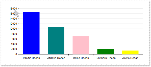
I changed the ValueSize property but it appears that it has no effect
with thisform.Graph1
	.BeginUpdate
	.ValueSize = 32
	.AutoFit = .F.
	.CategoryAxis.Format = "value replace `Ocean` with ``"
	.Series.Add("Pacific Ocean(16525), Atlantic Ocean(10646), Indian Ocean(7056), Southern Ocean(2033), Arctic Ocean(1406)").Type = "Column"
	.EndUpdate
endwith
|
|
234
|
Defines the size to show a column or a bar within the chart
with thisform.Graph1
	.BeginUpdate
	.ValueSize = 32
	.CategoryAxis.Format = "value replace `Ocean` with ``"
	.Series.Add("Pacific Ocean(16525), Atlantic Ocean(10646), Indian Ocean(7056), Southern Ocean(2033), Arctic Ocean(1406)")
	.EndUpdate
endwith
|
|
233
|
Customizes the tooltip (shown while the cursor hovers value-points of the chart)
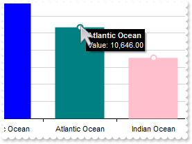
with thisform.Graph1
	.BeginUpdate
	.Object.Background(65) = RGB(1,0,0)
	.Object.Background(66) = RGB(255,255,255)
	.ToolTipFormat = "`<b>` + category + `</b><br>Value: ` + (value format ``)"
	.AutoFit = .T.
	.Series.Add("Pacific Ocean(16525), Atlantic Ocean(10646), Indian Ocean(7056), Southern Ocean(2033), Arctic Ocean(1406)").ShowValue = 1
	.EndUpdate
endwith
|
|
232
|
Resizes the elements of the series to fit the control's content
with thisform.Graph1
	.BeginUpdate
	.Series.Add("1,2,3,4")
	.AutoFit = .T.
	.EndUpdate
endwith
|
|
231
|
Defines the preset color scheme for the chart's series, encompassing both regular and reduced values
with thisform.Graph1
	.BeginUpdate
	.ValueSize = 8
	.Data = "C:\Program Files\Exontrol\ExGraph\Sample\Data/msft.csv"
	.ValueAxis.Format = "value format ``"
	with .Series.Add()
		.Name = "msft"
		.Data = "Open,High,Low,Close"
		.Type = "candle"
	endwith
	.SeriesColors = "gray"
	.SeriesColorsDecrease = "black"
	.EndUpdate
endwith
|
|
230
|
Defines the default colors for the chart's series
with thisform.Graph1
	.BeginUpdate
	var_s = "gBFLBCJwBAEHhEJAAEhABUQDg6AADACAxRDAMgBQKAAzAJBIYhiGgcYCgMZBSDeCYXABCEYRXBIZQ7BKNIxjSJwFiCCQwSDKEjyCKsGRHF6MI6gOYpCgOIYjRJNIASVA"
	var_s = var_s + "ceAAHCUZrjSgobAiCYlTZCIBQS5oOBIACmabiegZLgmQInUrMEggVDgJSPuTWNQUdYdJQTHIZBpEWyLKjkNQwWrCNr3DTUEyNDauIDpCKLCpGZYYVRPOAgAKldxhGCaJ"
	var_s = var_s + "okGkgc4HHyrcCwfDAMraCQQWAAF62Jb1JyrSSBchnOwpDpuCaVQLXUB5RRNQyZTiyIrtS5AAqnNJzW5cE46Li0B5QAC8QA1S7NPo/HaZT5kGB7ZDddzuADfcLlfD5BxE"
	var_s = var_s + "DCUhQmEPAbl6K4hlKQ5snwNwtleDxpBeMRIHmd4+A8R4/BuRZvEABQDEmDJoHUOQZEYMgVjQSIEE0fwRjCWQJAoEIXHWQxCAGBBggAbpemOCJaDaRowkQKwfgSEJCBQD"
	var_s = var_s + "AGnCWAsDYTJTLSBwOlgfghggIgohYIA3A0Iw8GcCxCigZAsguB4hBwQ4HAyZAMjMJhJjIPBdA0SZxkAOoPEOIhMGEDYJHGSB0gmIg5CYSAokgAZggME4DCkAhACbIhgi"
	var_s = var_s + "oIwImQDhXCOCQRHgNwogcIJyGCGImBGMAyAqYxJCISINAcAJcC0JxGmCbIiByQ5Zk4dYdCWORqFgJJGACYIkB0A5pn6AYgAmcY8DwHRDlCOg3CaZIKCwfgSgOOgUDwKR"
	var_s = var_s + "HFCfoUiWKRaF4eQACWMhUGEDoKHGWBAigag6gqJIpCmYJogMExDEqLA0ioah6giKAdkQGpOjWLQrGobjfEYMJwioHhEDqfpBjACohmAQoxGwewakiMpsisNBCCqbALEA"
	var_s = var_s + "Q40i0KtjCYRhQnSLQekQWxul2NwKlGaBEjgbg7gqZI5m4a4kEQK4tkuMBFjuLprFiDgnAYYJ8jAHxEHuXp5j4L4rnafI/m+PAGnoLBvgwEBH5Aa5Ih8GhEBKUIABKMJs"
	var_s = var_s + "EMDwtAecQnBSRYxFwXwakYcZBCSNZDnGcQrCGlIigQagQkscgIEyShyjyKI3CARI8j8MZMDMLJXDSTZEjKYwqk6BJMnMPI8goMYwEQLoIEEOxElGNBdB8SpSHSTQjE6U"
	var_s = var_s + "ZLj0FxRBONQ9E6cgpEaUQYj0IYFA0bxdlcNZilwfwTEiYRUDwHZDkCSxoAyNhQnMYgTHWYp4gcFB3C2Uxzl0N4IoQBvAjEwAQIApRfDvH2PELgOhEhUDwI0GgxBIgEDQ"
	var_s = var_s + "EMRQ4hPgGBKBgEgSBTjIHkHwS4KQ8siEQJIMIkQxCvBwCoS4hAQCkBuIYcIuRrBzE6BMK4Eg7D0HOEAewIgDilFwPwE4mBODvDUCoew9BsiMCyJYQg+BlAiEwMQNArxw"
	var_s = var_s + "CKH6PARYLR6hSCuFYMYFRSgZBMCwA45gfiFHSAocomB5AnCmGcH4tAkgNFGHkFQNAGAEHAN4GQERhgQF0GsDIxg/iTHIJwMw4RVA2EMCEOA9APgGE+JgNATBHE4F6AcU"
	var_s = var_s + "AZwuAYAAAgBBAQ=="
	.VisualAppearance.Add(1,var_s)
	.Object.Misc(4) = 1
	.AutoFit = .T.
	.DataOptions = "hdr=1 eor=';' eof=' '"
	var_s1 = "Month Min Max;Jan -2 10;Feb 0 12;Mar 3 15;Apr 7 18;May 12 22;Jun 16 25;Jul 18 28;Aug 17 27;Sep 14 24;Oct 9 19;Nov 4 15;Dec 0 10"
	.Data = var_s1
	with .ValueAxis
		.Format = "value + `°`"
		.MajorGridLines.Color = "transparent"
	endwith
	with .CategoryAxis
		.Categories = "Month"
		.MajorGridLines.Color = "lightgray"
	endwith
	with .Series.Add()
		.Data = "Min,Max"
		.Type = "RangeColumn"
		.Vertical = .T.
		.Color = 16777216
	endwith
	var_s2 = "RGB(9,80,239),RGB(9,120,239),RGB(249,186,7),RGB(249,173,7),RGB(255,148,51),RGB(255,125,51),RGB(255,114,51),RGB(255,120,51),RGB(2"
	var_s2 = var_s2 + "55,139,51),RGB(249,171,7),RGB(249,200,7),RGB(9,110,239)"
	.SeriesColors = var_s2
	.EndUpdate
endwith
|
|
229
|
Updates the x-axis, y-axis
with thisform.Graph1
	with .XAxis.AxisLine
		.Width = 2
		.Color = "red"
	endwith
	with .YAxis.AxisLine
		.Width = 2
		.Color = "red"
	endwith
	with .Series.Add()
		.Data = "1 99 1,2 96 2,3 92 3,4 86 4,5 79 5,6 70 6,7 60 7,8 50 8,9 38 9,10 25 10,11 13 11"
		.Type = "bubble"
		.Misc(1) = 96
	endwith
endwith
|
|
228
|
Updates the default/first value-axis
with thisform.Graph1
	with .ValueAxis
		.Tfi = "<fgcolor red>"
	endwith
	var_s = "Friendster(121111111),Facebook(979750000),Flickr(79664888),Google Buzz(170000000),Google+(107319100),Hi5(900202990),Instagram(80"
	var_s = var_s + "202990),MySpace(80202990),Orkut(45067022),Pinterest(197319100),Reddit(360250000),Snapchat(280250000),TikTok(860250000),Tumblr(14"
	var_s = var_s + "6890156),Twitter(160250000),WeChat(118123370),Weibo(79195730),Whatsapp(1160250000),YouTube(844638200)"
	.Series.Add(var_s)
endwith
|
|
227
|
Updates the default/first category-axis
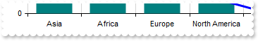
with thisform.Graph1
	.BeginUpdate
	.AutoFit = .T.
	with .CategoryAxis
		.Categories = "Asia,Africa,Europe,North America,Antarctica,South America,Australia/Oceania"
		.MajorGridLines.Color = "lightgray"
	endwith
	with .Series
		with .Add("4600,1300,747,579,0,422,42")
			.Name = "Population"
			.Type = "Line"
			.Misc(6) = 3
		endwith
		with .Add("4458,3037,1018,2470,1784,1018,856")
			.Name = "Area"
			.Type = "Column"
		endwith
	endwith
	.Legend.Visible = .T.
	.EndUpdate
endwith
|
|
226
|
Add multiple series into the same view
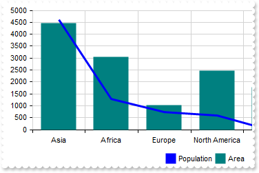
with thisform.Graph1
	.BeginUpdate
	.AutoFit = .T.
	with .CategoryAxis
		.Categories = "Asia,Africa,Europe,North America,Antarctica,South America,Australia/Oceania"
		.MajorGridLines.Color = "lightgray"
	endwith
	with .Series
		with .Add("4600,1300,747,579,0,422,42")
			.Name = "Population"
			.Type = "Line"
			.Misc(6) = 3
		endwith
		with .Add("4458,3037,1018,2470,1784,1018,856")
			.Name = "Area"
			.Type = "Column"
		endwith
	endwith
	.Legend.Visible = .T.
	.EndUpdate
endwith
|
|
225
|
Do do I get the DAO version I have installed
with thisform.Graph1
	DEBUGOUT( CreateObject("DAO.DBEngine.35").Version.Version )
	DEBUGOUT( CreateObject("DAO.DBEngine.36").Version.Version )
	DEBUGOUT( CreateObject("DAO.DBEngine.120").Version.Version )
endwith
|
|
224
|
How do I get a list of interfaces the object implemenets
with thisform.Graph1
	.BeginUpdate
	with CreateObject("DAO.DBEngine.120")
		rs = .OpenDatabase("C:\Program Files\Exontrol\ExGraph\Sample\Access\sample.accdb").OpenRecordset("MSFT")
	endwith
	DEBUGOUT( CreateObject("Exontrol.PropertiesList") )
	.DataSource = rs
	.EndUpdate
endwith
|
|
223
|
Do do I get the ADO version I have installed
with thisform.Graph1
	DEBUGOUT( "ADO Version:" )
	DEBUGOUT( CreateObject("ADODB.Connection").Version.Version )
endwith
|
|
222
|
DAO, ACCDB, 120
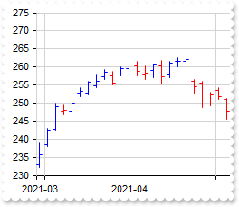
with thisform.Graph1
	.BeginUpdate
	.ValueSize = 6
	with CreateObject("DAO.DBEngine.120")
		rs = .OpenDatabase("C:\Program Files\Exontrol\ExGraph\Sample\Access\sample.accdb").OpenRecordset("MSFT")
	endwith
	.DataSource = rs
	with .CategoryAxis
		.Categories = "Date"
		with .ChartGridLines
			.Format = "value left 7"
			.Align = 1024
			.Color = "lightgray"
		endwith
		.Format = "value left 7"
		.Split = .T.
	endwith
	with .Series.Add()
		.Data = "Open,High,Low,Close"
		.Type = "ohlc"
	endwith
	.EndUpdate
endwith
|
|
221
|
DAO, MDB, 120
with thisform.Graph1
	.BeginUpdate
	.ValueSize = 6
	with CreateObject("DAO.DBEngine.120")
		rs = .OpenDatabase("C:\Program Files\Exontrol\ExGraph\Sample\Access\sample.accdb").OpenRecordset("MSFT")
	endwith
	.DataSource = rs
	with .CategoryAxis
		.Categories = "Date"
		with .ChartGridLines
			.Format = "value left 7"
			.Align = 1024
			.Color = "lightgray"
		endwith
		.Format = "value left 7"
		.Split = .T.
	endwith
	with .Series.Add()
		.Data = "Open,High,Low,Close"
		.Type = "ohlc"
	endwith
	.EndUpdate
endwith
|
|
220
|
DAO, MDB
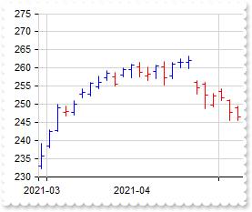
with thisform.Graph1
	.BeginUpdate
	.ValueSize = 6
	with CreateObject("DAO.DBEngine.36")
		rs = .OpenDatabase("C:\Program Files\Exontrol\ExGraph\Sample\Access\sample.mdb").OpenRecordset("MSFT")
	endwith
	.DataSource = rs
	with .CategoryAxis
		.Categories = "Date"
		with .ChartGridLines
			.Format = "value left 7"
			.Align = 1024
			.Color = "lightgray"
		endwith
		.Format = "value left 7"
		.Split = .T.
	endwith
	with .Series.Add()
		.Data = "Open,High,Low,Close"
		.Type = "ohlc"
	endwith
	.EndUpdate
endwith
|
|
219
|
ADODB, ACCDB, x64
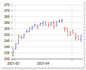
with thisform.Graph1
	.BeginUpdate
	.ValueSize = 6
	rs = CreateObject("ADODB.Recordset")
	with rs
		.Open("MSFT","Provider=Microsoft.ACE.OLEDB.12.0;Data Source=C:\Program Files\Exontrol\ExGraph\Sample\Access\sample.accdb",1,1)
	endwith
	.DataSource = rs
	with .CategoryAxis
		.Categories = "Date"
		with .ChartGridLines
			.Format = "value left 7"
			.Align = 1024
			.Color = "lightgray"
		endwith
		.Format = "value left 7"
		.Split = .T.
	endwith
	with .Series.Add()
		.Data = "Open,High,Low,Close"
		.Type = "ohlc"
	endwith
	.EndUpdate
endwith
|
|
218
|
ADOR, ACCDB
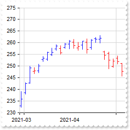
with thisform.Graph1
	.BeginUpdate
	.ValueSize = 6
	rs = CreateObject("ADOR.Recordset")
	with rs
		.Open("MSFT","Provider=Microsoft.ACE.OLEDB.12.0;Data Source=C:\Program Files\Exontrol\ExGraph\Sample\Access\sample.accdb",3,3)
	endwith
	.DataSource = rs
	with .CategoryAxis
		.Categories = "Date"
		with .ChartGridLines
			.Format = "value left 7"
			.Align = 1024
			.Color = "lightgray"
		endwith
		.Format = "value left 7"
		.Split = .T.
	endwith
	with .Series.Add()
		.Data = "Open,High,Low,Close"
		.Type = "ohlc"
	endwith
	.EndUpdate
endwith
|
|
217
|
ADODB, MDB
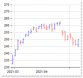
with thisform.Graph1
	.BeginUpdate
	.ValueSize = 6
	rs = CreateObject("ADODB.Recordset")
	with rs
		.Open("MSFT","Provider=Microsoft.ACE.OLEDB.12.0;Data Source=C:\Program Files\Exontrol\ExGraph\Sample\Access\sample.accdb",3,3)
	endwith
	.DataSource = rs
	with .CategoryAxis
		.Categories = "Date"
		with .ChartGridLines
			.Format = "value left 7"
			.Align = 1024
			.Color = "lightgray"
		endwith
		.Format = "value left 7"
		.Split = .T.
	endwith
	with .Series.Add()
		.Data = "Open,High,Low,Close"
		.Type = "ohlc"
	endwith
	.EndUpdate
endwith
|
|
216
|
ADOR, MDB
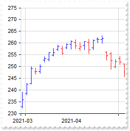
with thisform.Graph1
	.BeginUpdate
	.ValueSize = 6
	rs = CreateObject("ADOR.Recordset")
	with rs
		.Open("MSFT","Provider=Microsoft.ACE.OLEDB.12.0;Data Source=C:\Program Files\Exontrol\ExGraph\Sample\Access\sample.accdb",3,3)
	endwith
	.DataSource = rs
	with .CategoryAxis
		.Categories = "Date"
		with .ChartGridLines
			.Format = "value left 7"
			.Align = 1024
			.Color = "lightgray"
		endwith
		.Format = "value left 7"
		.Split = .T.
	endwith
	with .Series.Add()
		.Data = "Open,High,Low,Close"
		.Type = "ohlc"
	endwith
	.EndUpdate
endwith
|
|
215
|
The value-axis gets updated as soon as the control is scrolled. It is possible to prevent that
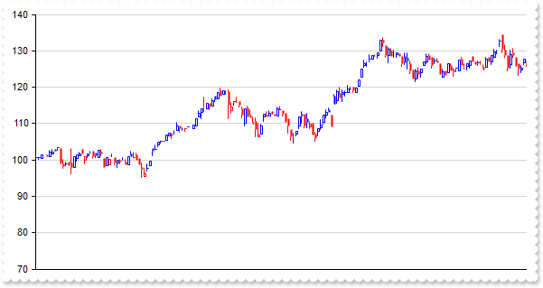
with thisform.Graph1
	.BeginUpdate
	.ValueSize = 2
	.Object.Misc(10) = 0
	.Data = "C:\Program Files\Exontrol\ExGraph\Sample\Data/aapl.txt"
	DEBUGOUT( .DataSample )
	.Series.Add("AAPL (open),AAPL (high),AAPL (low),AAPL (close)").Type = "candle"
	.EndUpdate
endwith
|
|
214
|
Debug the data I loaded, or gatter a data sample
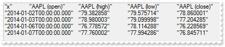
with thisform.Graph1
	.BeginUpdate
	.ValueSize = 6
	.Data = "C:\Program Files\Exontrol\ExGraph\Sample\Data/aapl.txt"
	DEBUGOUT( .DataSample )
	.EndUpdate
endwith
|
|
213
|
Imports the control's data from a safe array (array, method 3)
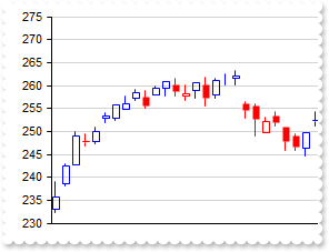
with thisform.Graph1
	.BeginUpdate
	.ValueSize = 6
	rs = CreateObject("ADOR.Recordset")
	with rs
		.Open("MSFT","Provider=Microsoft.ACE.OLEDB.12.0;Data Source=C:\Program Files\Exontrol\ExGraph\Sample\Access\sample.accdb",3,3)
	endwith
	.Data = rs.GetRows()
	DEBUGOUT( .DataSample )
	with .Series.Add()
		.Data = "Column 2,Column 3,Column 4,Column 5"
		.Type = "candle"
	endwith
	.EndUpdate
endwith
|
|
212
|
Imports the control's data from a CSV format (file, method 2)
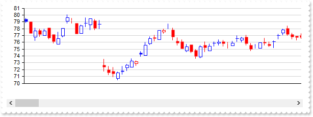
with thisform.Graph1
	.BeginUpdate
	.ValueSize = 6
	.Data = "C:\Program Files\Exontrol\ExGraph\Sample\Data/aapl.txt"
	with .Series.Add()
		.Name = "aapl"
		.Data = "AAPL (open),AAPL (high),AAPL (low),AAPL (close)"
		.Type = "candle"
	endwith
	.EndUpdate
endwith
|
|
211
|
Imports the control's data from a CSV format (content, string, method 2)
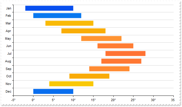
with thisform.Graph1
	.BeginUpdate
	.Object.Misc(4) = 1
	.AutoFit = .T.
	.DataOptions = "hdr=1 eor=';' eof=' '"
	var_s = "Month Min Max;Jan -2 10;Feb 0 12;Mar 3 15;Apr 7 18;May 12 22;Jun 16 25;Jul 18 28;Aug 17 27;Sep 14 24;Oct 9 19;Nov 4 15;Dec 0 10"
	.Data = var_s
	with .ValueAxis
		.Format = "value + `°`"
		.MajorGridLines.Color = "transparent"
	endwith
	with .CategoryAxis
		.Categories = "Month"
		.MajorGridLines.Color = "lightgray"
	endwith
	with .Series.Add()
		.Data = "Min,Max"
		.Type = "RangeColumn"
		.Vertical = .T.
	endwith
	var_s1 = "RGB(9,80,239),RGB(9,120,239),RGB(249,186,7),RGB(249,173,7),RGB(255,148,51),RGB(255,125,51),RGB(255,114,51),RGB(255,120,51),RGB(2"
	var_s1 = var_s1 + "55,139,51),RGB(249,171,7),RGB(249,200,7),RGB(9,110,239)"
	.SeriesColors = var_s1
	.EndUpdate
endwith
|
|
210
|
Imports the control's data from a CSV format (file, method 1)
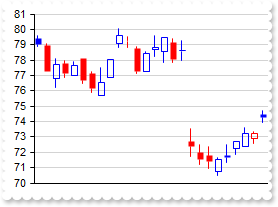
with thisform.Graph1
	.BeginUpdate
	.ValueSize = 6
	.Import("C:\Program Files\Exontrol\ExGraph\Sample\Data/aapl.txt")
	with .Series.Add()
		.Name = "aapl"
		.Data = "AAPL (open),AAPL (high),AAPL (low),AAPL (close)"
		.Type = "candle"
	endwith
	.EndUpdate
endwith
|
|
209
|
Imports the control's data from a CSV format (content, string, method 1)
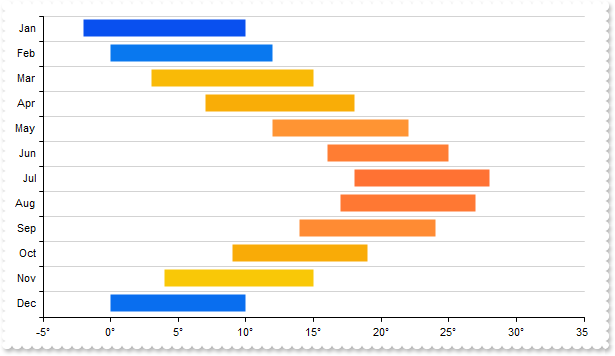
with thisform.Graph1
	.BeginUpdate
	.Object.Misc(4) = 1
	.AutoFit = .T.
	var_s = "Month Min Max;Jan -2 10;Feb 0 12;Mar 3 15;Apr 7 18;May 12 22;Jun 16 25;Jul 18 28;Aug 17 27;Sep 14 24;Oct 9 19;Nov 4 15;Dec 0 10"
	.Import(var_s,"hdr=1 eor=';' eof=' '")
	with .ValueAxis
		.Format = "value + `°`"
		.MajorGridLines.Color = "transparent"
	endwith
	with .CategoryAxis
		.Categories = "Month"
		.MajorGridLines.Color = "lightgray"
	endwith
	with .Series.Add()
		.Data = "Min,Max"
		.Type = "RangeColumn"
		.Vertical = .T.
	endwith
	var_s1 = "RGB(9,80,239),RGB(9,120,239),RGB(249,186,7),RGB(249,173,7),RGB(255,148,51),RGB(255,125,51),RGB(255,114,51),RGB(255,120,51),RGB(2"
	var_s1 = var_s1 + "55,139,51),RGB(249,171,7),RGB(249,200,7),RGB(9,110,239)"
	.SeriesColors = var_s1
	.EndUpdate
endwith
|
|
208
|
Defines the field delimitators, such as eor(end of record), eof(end of field) and hdr(header)
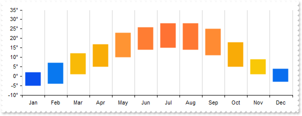
with thisform.Graph1
	.BeginUpdate
	.Object.Misc(4) = 1
	.AutoFit = .T.
	.DataOptions = "hdr=1 eor=';' eof=' '"
	.Data = "Month Min Max;Jan -5 2;Feb -4 7;Mar 1 12;Apr 5 17;May 10 23;Jun 14 26;Jul 15 28;Aug 14 28;Sep 11 25;Oct 5 18;Nov 1 9;Dec -3 4"
	with .ValueAxis
		.Format = "value + `°`"
		.MajorGridLines.Color = "transparent"
	endwith
	with .CategoryAxis
		.Categories = "Month"
		.MajorGridLines.Color = "lightgray"
	endwith
	with .Series.Add()
		.Data = "Min,Max"
		.Type = "RangeColumn"
	endwith
	var_s = "RGB(9,80,239),RGB(9,120,239),RGB(249,186,7),RGB(249,173,7),RGB(255,148,51),RGB(255,125,51),RGB(255,114,51),RGB(255,120,51),RGB(2"
	var_s = var_s + "55,139,51),RGB(249,171,7),RGB(249,200,7),RGB(9,110,239)"
	.SeriesColors = var_s
	.EndUpdate
endwith
|
|
207
|
Defines the size of the control's tooltip margins
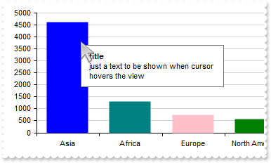
*** MouseMove event - Occurs when the user moves the mouse. ***
LPARAMETERS Button,Shift,X,Y
	with thisform.Graph1
		.ShowToolTip("just a text to be shown when cursor hovers the view","title")
	endwith

with thisform.Graph1
	.BeginUpdate
	.AutoFit = .T.
	.ToolTipMargin = "16,16"
	.Series.Add("Asia(4600),Africa(1300),Europe(747),North America(579),South America(433),Australia/Oceania(42)")
	.EndUpdate
endwith
|
|
206
|
Sets the size of icons the control displays
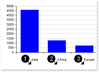
with thisform.Graph1
	.BeginUpdate
	.ImageSize = 32
	var_s = "gBJJgBAIDAAGAAEAAQhYAf8Pf4hh0QihCJo2AEZjQAjEZFEaIEaEEaAIAkcbk0olUrlktl0vmExmUzmk1m03nE5nU7nk9n0/oFBoVDolFo1HpFJpVLplNp1PqFRqVTql"
	var_s = var_s + "Vq1XrFZrVbrldr1fsFhsVjslls1ntFptVrtltt1vuFxuVzul1u13vF5vV7vl9v1/wGBwWDwmFw2HxGJxWLxmNx0xiFdyOTh8Tf9ZymXx+QytcyNgz8r0OblWjyWds+m0"
	var_s = var_s + "ka1Vf1ta1+r1mos2xrG2xeZ0+a0W0qOx3GO4NV3WeyvD2XJ5XL5nN51aiw+lfSj0gkUkAEllHanHI5j/cHg8EZf7w8vl8j4f/qfEZeB09/vjLAB30+kZQAP/P5/H6/yN"
	var_s = var_s + "AOAEAwCjMBwFAEDwJBMDwLBYAP2/8Hv8/gAGAD8LQs9w/nhDY/oygIA="
	.Images(var_s)
	.AutoFit = .T.
	var_s1 = "<img>1</img>Asia(4600),<img>2</img>Africa(1300),<img>3</img>Europe(747),<img>4</img>North America(579),<img>5</img>South America"
	var_s1 = var_s1 + "(433),<img>6</img>Australia/Oceania(42)"
	.Series.Add(var_s1)
	.SeriesColors = "blue"
	.EndUpdate
endwith
|
|
205
|
Prevents the control to fire any event
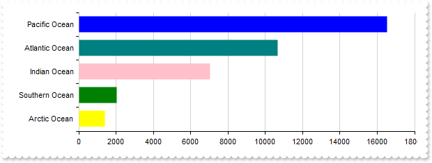
with thisform.Graph1
	.FreezeEvents(.T.)
	.BeginUpdate
	.AutoFit = .T.
	.Series.Add("Pacific Ocean(16525), Atlantic Ocean(10646), Indian Ocean(7056), Southern Ocean(2033), Arctic Ocean(1406)").Vertical = .T.
	.EndUpdate
	.FreezeEvents(.F.)
endwith
|
|
204
|
Display columns using EBN colors (BASE64)
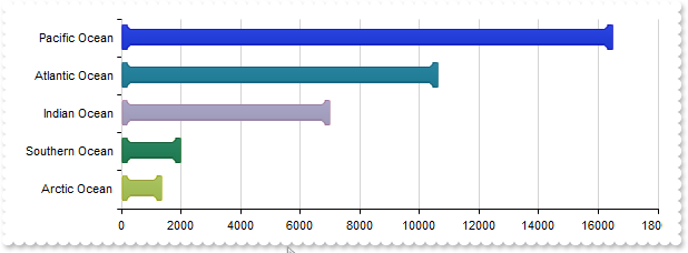
with thisform.Graph1
	.BeginUpdate
	var_s = "gBFLBCJwBAEHhEJAAEhABUQDg6AADACAxRDAMgBQKAAzAJBIYhiGgcYCgMZBSDeCYXABCEYRXBIZQ7BKNIxjSJwFiCCQwSDKEjyCKsGRHF6MI6gOYpCgOIYjRJNIASVA"
	var_s = var_s + "ceAAHCUZrjSgobAiCYlTZCIBQS5oOBIACmabiegZLgmQInUrMEggVDgJSPuTWNQUdYdJQTHIZBpEWyLKjkNQwWrCNr3DTUEyNDauIDpCKLCpGZYYVRPOAgAKldxhGCaJ"
	var_s = var_s + "okGkgc4HHyrcCwfDAMraCQQWAAF62Jb1JyrSSBchnOwpDpuCaVQLXUB5RRNQyZTiyIrtS5AAqnNJzW5cE46Li0B5QAC8QA1S7NPo/HaZT5kGB7ZDddzuADfcLlfD5BxE"
	var_s = var_s + "DCUhQmEPAbl6K4hlKQ5snwNwtleDxpBeMRIHmd4+A8R4/BuRZvEABQDEmDJoHUOQZEYMgVjQSIEE0fwRjCWQJAoEIXHWQxCAGBBggAbpemOCJaDaRowkQKwfgSEJCBQD"
	var_s = var_s + "AGnCWAsDYTJTLSBwOlgfghggIgohYIA3A0Iw8GcCxCigZAsguB4hBwQ4HAyZAMjMJhJjIPBdA0SZxkAOoPEOIhMGEDYJHGSB0gmIg5CYSAokgAZggME4DCkAhACbIhgi"
	var_s = var_s + "oIwImQDhXCOCQRHgNwogcIJyGCGImBGMAyAqYxJCISINAcAJcC0JxGmCbIiByQ5Zk4dYdCWORqFgJJGACYIkB0A5pn6AYgAmcY8DwHRDlCOg3CaZIKCwfgSgOOgUDwKR"
	var_s = var_s + "HFCfoUiWKRaF4eQACWMhUGEDoKHGWBAigag6gqJIpCmYJogMExDEqLA0ioah6giKAdkQGpOjWLQrGobjfEYMJwioHhEDqfpBjACohmAQoxGwewakiMpsisNBCCqbALEA"
	var_s = var_s + "Q40i0KtjCYRhQnSLQekQWxul2NwKlGaBEjgbg7gqZI5m4a4kEQK4tkuMBFjuLprFiDgnAYYJ8jAHxEHuXp5j4L4rnafI/m+PAGnoLBvgwEBH5Aa5Ih8GhEBKUIABKMJs"
	var_s = var_s + "EMDwtAecQnBSRYxFwXwakYcZBCSNZDnGcQrCGlIigQagQkscgIEyShyjyKI3CARI8j8MZMDMLJXDSTZEjKYwqk6BJMnMPI8goMYwEQLoIEEOxElGNBdB8SpSHSTQjE6U"
	var_s = var_s + "ZLj0FxRBONQ9E6cgpEaUQYj0IYFA0bxdlcNZilwfwTEiYRUDwHZDkCSxoAyNhQnMYgTHWYp4gcFB3C2Uxzl0N4IoQBvAjEwAQIApRfDvH2PELgOhEhUDwI0GgxBIgEDQ"
	var_s = var_s + "EMRQ4hPgGBKBgEgSBTjIHkHwS4KQ8siEQJIMIkQxCvBwCoS4hAQCkBuIYcIuRrBzE6BMK4Eg7D0HOEAewIgDilFwPwE4mBODvDUCoew9BsiMCyJYQg+BlAiEwMQNArxw"
	var_s = var_s + "CKH6PARYLR6hSCuFYMYFRSgZBMCwA45gfiFHSAocomB5AnCmGcH4tAkgNFGHkFQNAGAEHAN4GQERhgQF0GsDIxg/iTHIJwMw4RVA2EMCEOA9APgGE+JgNATBHE4F6AcU"
	var_s = var_s + "AZwuAYAAAgBBAQ=="
	.VisualAppearance.Add(1,var_s)
	.AutoFit = .T.
	with .Series.Add("Pacific Ocean(16525), Atlantic Ocean(10646), Indian Ocean(7056), Southern Ocean(2033), Arctic Ocean(1406)")
		.Color = 16777216
		.Vertical = .T.
	endwith
	.EndUpdate
endwith
|
|
203
|
Display columns using EBN colors
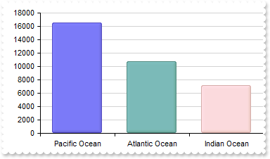
with thisform.Graph1
	.BeginUpdate
	.VisualAppearance.Add(1,"c:\exontrol\images\normal.ebn")
	.AutoFit = .T.
	.Series.Add("Pacific Ocean(16525), Atlantic Ocean(10646), Indian Ocean(7056), Southern Ocean(2033), Arctic Ocean(1406)").Color = 16777216
	.EndUpdate
endwith
|
|
202
|
Show images
with thisform.Graph1
	.BeginUpdate
	.Object.HTMLPicture("china") = "c:\exontrol\images\zipdisk.gif"
	.Object.HTMLPicture("india") = "c:\exontrol\images\auction.gif"
	.Object.HTMLPicture("usa") = "c:\exontrol\images\colorize.gif"
	.Object.Misc(29) = 0
	.Object.Misc(28) = 0
	.ValueSize = 32
	with .CategoryAxis
		.Categories = "<img>china</img>,<img>india</img>,<img>usa</img>"
		.MajorGridLines.Color = "lightgray"
	endwith
	.Series.Add("1410,1390,331")
	.EndUpdate
endwith
|
|
201
|
Shows a custom tooltip
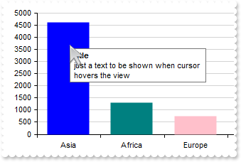
*** MouseMove event - Occurs when the user moves the mouse. ***
LPARAMETERS Button,Shift,X,Y
	with thisform.Graph1
		.ShowToolTip("just a text to be shown when cursor hovers the view","title")
	endwith

with thisform.Graph1
	.BeginUpdate
	.AutoFit = .T.
	.Series.Add("Asia(4600),Africa(1300),Europe(747),North America(579),South America(433),Australia/Oceania(42)")
	.EndUpdate
endwith
|