property RadialMenu.CustomPicture as Variant
Indicates the picture to be shown on the custom's background.

TypeDescription
Variant A VARIANT expression that specifies the icon/picture/image to be displayed as described:
  • A String expression indicates:
    • a name of a picture file in the PicturePath folder. For instance, CustomPicture = "favorites.png", loads the favorites.png file if found in the PicturePath folder.
    • a picture file including its absolute path. For instance, CustomPicture = "C:\Program Files\Exontrol\ExRadialMenu\Sample\Images\favorites.png", loads the favorites.png file from absolute path
    • a key of the HTML picture, previously loaded by the HTMLPicture method. For instance, CustomPicture = "pic1", loads the HTML picture with the key pic1, so the pic1 should be load previously with a HTMLPicture call like HTMLPicture("pic1") = "C:\Program Files\Exontrol\ExRadialMenu\Sample\Images\favorites.png"
    • an encode BASE64 string of a picture file. The Exontrol's ExImages Tool encode/decode BASE64 strings from/to pictures. In this case, the string starts with "gB..", "gC.." and so on.
  • A Picture object that indicates the picture to be displayed. For instance, CustomPicture = LoadPicture("picture.jpg")

If no picture/image is found, the items section displays no picture/image.

By default, The CustomPicture property is empty. The CustomPicture property indicates the picture to be shown on the custom's background. The BrowseType property specifies what the item displays, when the user clicks/browses it.  The BrowseCustomType property indicates the custom object to be shown when the user clicks/browses the item ( child, radial-slider or gauge ). The BrowseCustom property gets or sets a value for specified property, when browsing custom control. The CustomBackColor / CustomBackAlpha property Specifies the color to show the custom portion of the radial menu.

The ItemsPicture property indicates the picture to be shown on the items's background. The BackgroundPicture property indicates the picture to be shown on the radial menu's background. The BackColor property specifies the control's background color. The ParentBackColor / ParentBackAlpha property specifies the color / transparency to show the parent portion of the radial menu. The ParentSize property specifies the size to display the parent zone.  The SubItemsBackColor / SubItemsBackAlpha property specifies the color to show the sub-items zone of the radial menu. The SubItemsSize property specifies the size to display the sub-items zone. The ItemsBackColor / ItemsBackAlpha property Specifies the color to show the items portion of the radial menu.

The following screen shot shows control with no background picture ( default ):

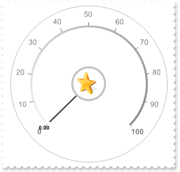
The following screen shot shows control with a background picture, for the custom section: