The BackgroundPartEnum type indicates parts in
the control. Use the
Background property to
specify a background color or a visual appearance for specific parts in the
control. A Color expression that indicates the background color for a
specified part. The last 7 bits in the high significant byte of the color to
indicates the identifier of the skin being used. Use the
Add
method to add new skins to the control. If you need to remove the skin
appearance from a part of the control you need to reset the last 7 bits in the
high significant byte of the color being applied to the background's part.
| | Name | Value | Description | |
| |
exToolTipAppearance | 64
|
Specifies the visual appearance of the borders of the tooltips.
| |
| |
exToolTipBackColor | 65
|
Specifies the tooltip's background color.
| |
| |
exToolTipForeColor | 66
|
Specifies the tooltip's foreground color.
| |
| |
exCheckBoxState0 | 70
|
Specifies the visual appearance for the check box in 0 state (unchecked).
| |
| |
exCheckBoxState1 | 71
|
Specifies the visual appearance for the check box in 1 state (checked).
| |
| |
exCheckBoxState2 | 72
|
Specifies the visual appearance for the check box in 2 state (partial, not used).
| |
| |
exRadioButtonState0 | 73
|
Specifies the visual appearance for the radio button in 0 state (unchecked).
| |
| |
exRadioButtonState1 | 74
|
Specifies the visual appearance for the radio button in 1 state (checked).
| |
| |
exMenuFlatLineColor | 100
|
Specifies the color to show the vertical line on flat appearance.
| |
| |
exMenuScrollBackColor | 101
|
Specifies the background color to show the menu's scroll bars.
| |
| |
exMenuSelBorderColor | 102
|
Specifies the color to show the frame arround the selected item.
| |
| |
exMenuSeparatorItem | 103
|
Specifies the color to show the separator item.
| |
| |
exMenuButtonItem | 104
|
Specifies the visual appearance for an item, when the Appearance property is Button.
| |
| |
exGroupPopupFrameSingle | 105
|
Specifies the visual appearance/solid color of the frame around the grouping items, when its group includes a single item.
The GroupPopup property specifies the way the
item's submenu are grouped. Use the
exGroupPopupFrameSingle,
exGroupPopupFrameHStart,
exGroupPopupFrameHIntermediate and
exGroupPopupFrameHEnd to specify a different visual appearance for the frame around
grouping items (horizontally).
The following screen shot shows the grouping items with an EBN frame:

which has been created using the following 4 EBNs (exGroupPopupFrameSingle,
exGroupPopupFrameHStart,
exGroupPopupFrameHIntermediate,
exGroupPopupFrameHEnd ):
 
 
| |
| |
exGroupPopupFrameHStart | 106
|
Specifies the visual appearance/solid color of the frame around the first item ( horizontally arranged ), when the its group includes more items.
The GroupPopup property specifies the way the
item's submenu are grouped. Use the
exGroupPopupFrameSingle,
exGroupPopupFrameHStart,
exGroupPopupFrameHIntermediate and
exGroupPopupFrameHEnd to specify a different visual appearance for the frame around
grouping items (horizontally).
| |
| |
exGroupPopupFrameHIntermediate | 107
|
Specifies the visual appearance/solid color of the frame around an intermediate item ( not start or end item, horizontally arranged ), when the its group includes more items.
The GroupPopup property specifies the way the
item's submenu are grouped. Use the
exGroupPopupFrameSingle,
exGroupPopupFrameHStart,
exGroupPopupFrameHIntermediate and
exGroupPopupFrameHEnd to specify a different visual appearance for the frame around
grouping items (horizontally).
| |
| |
exGroupPopupFrameHEnd | 108
|
Specifies the visual appearance/solid color of the frame around the last item ( not start or intermediate item, horizontally arranged ), when the its group includes more items.
The GroupPopup property specifies the way the
item's submenu are grouped. Use the
exGroupPopupFrameSingle,
exGroupPopupFrameHStart,
exGroupPopupFrameHIntermediate and
exGroupPopupFrameHEnd to specify a different visual appearance for the frame around
grouping items (horizontally).
| |
| |
exGroupPopupFrameSolid | 109
|
Specifies the solid color of the frame around the grouping items.
| |
| |
exMenuHotBackColor | 110
|
Specifies the visual appearance/color to show the item from the cursor.
| |
| |
exMenuHotForeColor | 111
|
Specifies the foreground color to show the item from the cursor.
| |
| |
exMenuSelHotBackColor | 112
|
Specifies the visual appearance/color to show the selected item from the cursor.
| |
| |
exMenuSelHotForeColor | 113
|
Specifies the foreground color to show the selected item from the cursor.
| |
| |
exMenuSeparatorSelectButton | 114
|
Specifies the visual appearance/color to show the separator between select and drop down button.
| |
| |
exMenuSeparatorSelectButtonBottom | 115
|
Specifies the visual appearance/color to show the separator between select and drop down button ( show the drop-down button to the bottom ).
| |
| |
exGroupPopupFrameVStart | 116
|
Specifies the visual appearance/solid color of the frame around the first item ( vertically arranged ), when the its group includes more items.
The GroupPopup property specifies the way the
item's submenu are grouped. Use the exGroupPopupFrameVStart,
exGroupPopupFrameVIntermediate and exGroupPopupFrameVEnd to specify a different
visual appearance for the frame around grouping items (vertically).
The following screen shot shows the grouping items with an EBN frame:

which has been created using the following 4 EBNs (
exGroupPopupFrameSingle,
exGroupPopupFrameVStart,
exGroupPopupFrameVIntermediate,
exGroupPopupFrameVEnd):


| |
| |
exGroupPopupFrameVIntermediate | 117
|
Specifies the visual appearance/solid color of the frame around an intermediate item ( not start or end item, vertically arranged ), when the its group includes more items.
The GroupPopup property specifies the way the
item's submenu are grouped. Use the exGroupPopupFrameVStart,
exGroupPopupFrameVIntermediate and exGroupPopupFrameVEnd to specify a different
visual appearance for the frame around grouping items (vertically).
| |
| |
exGroupPopupFrameVEnd | 118
|
Specifies the visual appearance/solid color of the frame around the last item ( not intermediate or end item, vertically arranged ), when the its group includes more items.
The GroupPopup property specifies the way the
item's submenu are grouped. Use the exGroupPopupFrameVStart,
exGroupPopupFrameVIntermediate and exGroupPopupFrameVEnd to specify a different
visual appearance for the frame around grouping items (vertically).
| |
| |
exScrollViewBorder | 119
|
Specifies the visual appearance of the control's border that cuts the scrolling portion of the control.
The
exScrollViewBorder option has effect only if the ArrangeItemsAs
property includes the
exArrangeItemsScroll flag. The ArrangeItemsAs
property specifies how the items are arranged on the toolbar.
The
exScrollViewBorder option could be any of the following values:
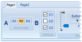
- 0 (default), the unscrolled margins appear cut off (as illustrated in the image
below)
- -1, the unscrolled margins are not displayed as cut off
- Solid color (e.g., 0xFFFFFF), displays as is
- EBN color (e.g., 0x1000000), shows the margins as defined by the EBN
object

| |
| |
exMenuHotBorderColor | 139
|
Specifies the color to show the frame around around the item from the cursor.
| |
| |
exMenuSelHotBorderColor | 140
|
Specifies the color to show the frame around around the selected item from the cursor.
| |
| |
exShortcutKeyAppearance | 143
|
Specifies the visual appearance of the shortcut keys.
| |
| |
exShortcutKeyBackColor | 144
|
Specifies the shortcut keys background color.
| |
| |
exShortcutKeyForeColor | 145
|
Specifies the shortcut keys foreground color.
| |
| |
exScrollBackColor | 213
|
Defines the visual appearance or solid color of the toolbar's menu scroll buttons.
The
exScrollBackColor option has effect only if the ArrangeItemsAs
property includes the
exArrangeItemsScroll flag. The ArrangeItemsAs
property specifies how the items are arranged on the toolbar.
The
exScrollBackColor option could be any of the following values:
- 0 (default), scroll buttons are shown on the margin where the control's content can be scrolled, using the control's background color
- -1, scroll buttons are hidden, but scrolling is still possible via drag and drop
- Solid color (e.g., 0xFFFFFF), displays as is
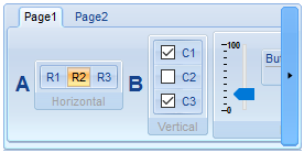
- EBN color (e.g., 0x1000000), shows the scroll buttons' background as defined by the EBN object (as illustrated in the image below)

| |

![]()


