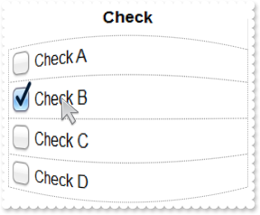
By default, the CheckBoxWidth property is 16. The CheckBoxWidth / CheckBoxHeight property specifies the size of the check-box. The FaceTreeStateChanged event notifies when the state of the check-box or a radio-button is changed. The Def(exCellHasCheckBox) property of the Column, assign check-boxes to all cells in the column. The PartialCheck property indicates whether the column supports three-state check-boxes ( unchecked, checked and partial states). The HasCheckBox property shows or hides the cell's check-box. The State property of the Item indicates the state of the check-box. The Background(exCheckBoxState0) / Background(exCheckBoxState1) / Background(exCheckBoxState2) property specifies the visual appearance of the check-box. The Def(exCellHasRadioButton) property of the Column, assign radio-buttons to all cells in the column. The HasRadioButton property shows or hides the cell's radio-button. The State property of the Item indicates the state of the radio-button. The RadioGroup property arranges multiple radio-buttons to the same group. The RadioButtonWidth / RadioButtonHeight property specifies the size of the radio-button. The Background(exRadioButtonState0) / Background(exRadioButtonState1) property specifies the visual appearance of the radio-button.