

By default, the control's toolbar shows as:

The visual appearance of the control's toolbar depends on your current theme / windows. The TollBarSize specifies the size / visibility of the control's toolbar. The ToolBarEvent event notifies your application that the user selects, edits, checks or un-checks an item in the control's toolbar. The ToolBarAnchor property gets or sets the edge of the control to which the toolbar is bound and determines how the toolbar is resized with its control. The ToolBarHTMLPicture property adds/removes custom-size pictures to be shown on the control's tollbar. The ToolBarImages / ToolBarReplaceIcon methods defines the icons to be displayed on the control's toolbar. The ToolBarBorderSize property specifies the size of the border of the control's toolbar. The Background(exToolBarAppearance) property specifies the visual appearance / background color of the control's toolbar. The Background(exToolBarPopupAppearance) / Background(exToolBarLocalAppearance) property specifies the visual appearance / background color of the popup to be shown from the control's toolbar.
The ToolBarItems syntax in BNF notation:
<ToolBarItems> ::= <ITEMS>
<ITEMS> ::= <ITEM>["("<ITEMS>")"][","<ITEMS>]
<ITEM> ::= <CAPTION>[<OPTIONS>]
<OPTIONS> ::= "["<OPTION>"]"["["<OPTIONS>"]"]
<OPTION> ::= <PROPERTY>["="<VALUE>]
<PROPERTY> ::= "img" | "himg" | "sep" | "id" |
"typ" | "group" | "chk" | "button" | "align" |
"spchk" | "show" | "rad" | "dis" | "showdis" |
"bld" | "itl" | "stk" | "und" | "bg" |
"fg" | "edittype" | "edit" | "mask" | "border" |
"editwidth" | "captionwidth" | "height" |
"grp" | "tfi" | "ttp" | "min" | "max" | "tick" | "freq" |
"ticklabel" | "small" | "large"
| "spin" | "ettp" | "float"
| "close" | "local"
| "popupapp"
| "itemspad"
| "itemsbg"
| "itemsbghot"
| "itemsbgext"
| "visible"
| "tab"
| "pad"
| "bghot"
| "bgsel"
| "bgselhot"
| "arrow"
| "popupalign"
| "popupoffset"
| "popupat"
where the <CAPTION> is the HTML caption to be shown on the context menu item. The <VALUE> indicates the value of giving property.
- id=<VALUE>, where <VALUE> is an integer expression, that indicates the identifier of the item.
- bg=<VALUE>, specifies the item's background color, where <VALUE> could be a RGB expression ( RGB(RR,GG,BB), where RR is the red value, the GG is the green value, and the BB is the blue value), or an integer expression to that refers an EBN object.
- bghot=<VALUE>, specifies the item's background color, while the cursor hovers the item, where <VALUE> could be a RGB expression ( RGB(RR,GG,BB), where RR is the red value, the GG is the green value, and the BB is the blue value), or an integer expression to that refers an EBN object.
- bgsel=<VALUE>, specifies the item's background color, while the item is checked/selected, where <VALUE> could be a RGB expression ( RGB(RR,GG,BB), where RR is the red value, the GG is the green value, and the BB is the blue value), or an integer expression to that refers an EBN object.
- bgselhot=<VALUE>, specifies the item's background color, while the item is checked/selected and the cursor hovers it, where <VALUE> could be a RGB expression ( RGB(RR,GG,BB), where RR is the red value, the GG is the green value, and the BB is the blue value), or an integer expression to that refers an EBN object.
- fg=<VALUE>, specifies the item's foreground color, where <VALUE> could be a RGB expression ( RGB(RR,GG,BB), where RR is the red value, the GG is the green value, and the BB is the blue value), or a integer expression.
- sep, specifies an separator item
- dis, specifies a disabled item
- showdis=<VALUE>, where <VALUE> could be 0 for regular or not zero to specify whether the item shows as disabled, but it is still enabled
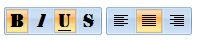
- bld, specifies that the item appears in bold
- itl, specifies that the item appears in italics
- stk, specifies that the item appears as strikeout
- und, specifies that the item is underlined
- align=<VALUE>, where <VALUE> could be
one of the following:
- 0 ( left ), to align the item's caption to the left
- 1 ( center ), to center the item's caption
- 2 ( right ), to align the item's caption to the right
- captionwidth=<VALUE>, specifies the width to show the HTML caption of the item. where <VALUE> could be a integer expression. A negative value indicates that no limitation is applied to the item's caption, so no truncate caption is shown
- height=<VALUE>, specifies the height to show the item, where <VALUE> could be a positive integer expression
- pad=<VALUE>, specifies the padding (space between the menu border and the item content) to display the item. The <VALUE> is a list of coordinates such as left,top,right,bottom
- img=<VALUE>, where <VALUE> is an integer expression, that indicates the index of the icon being displayed for the item.
- himg=<VALUE>, where <VALUE> indicates the key of the picture to be displayed for the item.
- typ=<VALUE>, where <VALUE> could be
one of the following:
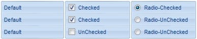
- 0 for default/regular items ( no check/radio button is associated with the item ),
- 1 for items that display a check/box (chk),
- 2 to display radio buttons (rad)
- chk[=<VALUE>], where <VALUE> could be 0 for unchecked, or not zero for checked. The chk option makes the item to display a check box. If the <VALUE> is missing the item still displays an un-checked check box.
- rad=<VALUE>, where <VALUE> could be 0 for unchecked radio button or not zero to for checked radio button. Use the grp option to define the group of radio where this button should be associated, If no group of radio buttons is required, the grp could be ignored.
- grp=<VALUE>, defines the radio group. It should be used when you define more groups of radio buttons. A group of radio buttons means that only one item could be checked at one time. The rad option specifies that the item displays a radio button. Use the grp option to define the group of radio where this button should be associated, If no group of radio buttons is required, the grp could be ignored. The <VALUE> could be any integer expression.
- show=<VALUE>, where <VALUE> could be 0 for regular or not zero to specify whether the checked item shows as selected
- spchk=<VALUE>, where <VALUE> could be 0 for regular or not zero to specify whether the item's sub menu is shown only if the item is checked.
- group=<VALUE>, where <VALUE> could be a bit-or
combination (+) of the following values:
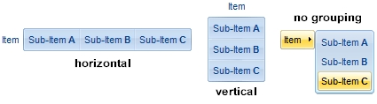
- 0 (exNoGroupPopup), No grouping is performed on the sub-menu, so the sub-items are shown to a float popup,
- 1 (exGroupPopup), Groups and displays the sub-menu items on the current item, arranged from left to right/horizontally
- 2 (exNoGroupPopupFrame), Prevents showing the frame around each grouping item.
- 4 (exGroupPopupCenter), Shows the grouping popup aligned to the center of the current item.
- 8 (exGroupPopupRight), Shows the grouping popup aligned to the right of the current item.
- 16 (exGroupPopupEqualWidth), Shows the items that make the group of the same width
- 32 (exGroupPopupEqualHeight), Shows the items that make the group of the same height
- 64 (exGroupPopupFrameSolidBox), Shows a solid frame around the grouped items
- 128 (exGroupPopupFrameThickBox), Shows a solid thick-frame around the grouped items
- 256 (exGroupPopupVertical), Groups and displays the sub-menu items on the current item, arranged from top to bottom/vertically
- button=<VALUE>, where <VALUE> could be a bit-or
combination (+) of the following values.
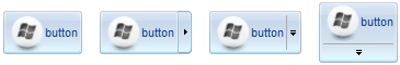
- 0 (exShowAsButtonNone), No button is shown,
- 1 (exShowAsButton), Shows the item as a button
- 2 (exShowAsButtonAutoSize), Fits the button to cover the item's caption instead showing on the entire item
- 17 (exShowAsSelectButton), Shows the item as a select button, which is composed by two-fields, one indicates the default button, while the second field specifies the drop down button that displays the items in the current's sub-menu collection. The drop down button is shown to the right-side of the default button. The item must have a submenu, else no drop down is displayed.
- 273 (exShowAsSelectButtonBottom), Shows the item as a select button, which is composed by two-fields, one indicates the default button, while the second field specifies the drop down button that displays the items in the current's sub-menu collection. The drop down button is shown to the bottom-side of the default button. The item must have a submenu, else no drop down is displayed.
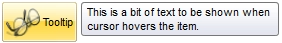
- ttp=<VALUE>, defines the item's tooltip. The <VALUE> could be any HTML string expression. The item's tooltip is shown when the user hovers the item.
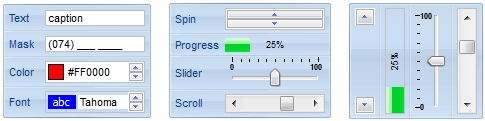
- edittype=<VALUE>,
associates an edit field to the item, where <VALUE> could be a combination
of one or more of the
following values:
- 0 ( exItemDisableEdit ), No editor is assigned to the current item.
- 1 ( exItemEditText ), A text-box editor is assigned to the current item.
- 2 ( exItemEditMask ), A masked text-box editor is assigned to the current item.
- 3 ( exItemEditSlider ), A slider editor is assigned to the current item. This can be combined with 1024.
- 4 ( exItemEditProgress ), A progress editor is assigned to the current item. This can be combined with 1024.
- 5 ( exItemEditScrollBar ), A scrollbar editor is assigned to the current item. This can be combined with 1024.
- 6 ( exItemEditColor), A color editor is assigned to the current item.
- 7 ( exItemEditFont ), A font editor is assigned to the current item.
- 256 (exItemEditReadOnly), specifies that the item's editor is shown as disabled. This value could be combined with one of the values from 0 to 7 or 512
- 512 ( exItemEditSpin ), A spin editor is assigned to the current item. This value could be combined with one of the values from 0 to 7 or 256
- 1024 ( exItemEditVertical ), The editor is shown vertically rather than horizontally. This value has effect for exItemEditSlider, exItemEditProgress or exItemEditScrollBar
- edit=<VALUE>, specifies the caption to be shown in the item's edit field, where <VALUE> could be any string
- mask=<VALUE>, specifies the mask to be applied on a masked editor. This option is valid for exItemEditMask edit. Use the float option to allow masking floating point numbers.
- float=<VALUE>, Specifies whether the mask field masks a floating point number. This option is valid for exItemEditMask edit.
- border=<VALUE>,
specifies the border to be shown on the item's edit field,
where <VALUE> could be one of the following:
- 0 ( exEditBorderNone), No border is shown.
- -1 (exEditBorderInset), shows an inset border
- 1 (exEditBorderSingle), shows a frame border
- editwidth=<VALUE>, specifies the width to show the edit field inside the item, where <VALUE> could be a integer expression. A negative value indicates that the field goes to the end of the item
- min=<VALUE>, defines the minimum value of the edit field. The <VALUE> could be any integer expression, and specifies the minimum value for any slider, progress, scroll, spin, or range editor.
- max=<VALUE>, defines the maximum value of the edit field. The <VALUE> could be any integer expression, and specifies the maximum value for any slider, progress, scroll, spin, or range editor.
- tick=<VALUE>,
defines where the ticks of the slider edit appear. This option is valid
for exItemEditSlider edit. The <VALUE> could be one of the following
values:
- 0 ( exBottomRight ), The ticks are displayed on the bottom/right side.
- 1 ( exTopLeft ), The ticks are displayed on the top/left side.
- 2 ( exBoth ), The ticks are displayed on the both side.
- 3 ( exNoTicks ), No ticks are displayed.
- freq=<VALUE>, indicates the ratio of ticks on the slider edit. This option is valid for exItemEditSlider edit. The <VALUE> could be a positive integer expression.
- ticklabel=<VALUE>, indicates the HTML label to be displayed on slider's ticks. This option is valid for exItemEditSlider edit.
- small=<VALUE>, indicates the amount by which the edit's position changes when the user presses the arrow key ( left, right, or button ). This option is valid for exItemEditSlider, exItemEditScrollBar edit. The <VALUE> could be a positive integer expression.
- large=<VALUE>, indicates the amount by which the edit's position changes when the user presses the CTRL + arrow key ( CTRL + left, CTRL + right). This option is valid for exItemEditSlider, exItemEditScrollBar edit. The <VALUE> could be a positive integer expression.
- spin=<VALUE>, specifies the step to advance when user clicks the editor's spin.. This option is valid for exItemEditSpin edit. The <VALUE> could be a positive integer expression.
- ettp=<VALUE>, specifies the HTML tooltip to be shown when the item's value is changed. This option is valid for exItemEditSlider/exItemEditScrollBar edit. The <VALUE> could be any string expression, including built-in HTML tags
- arrow=<VALUE>. The <VALUE> could be 0 for hiding the arrow or not zero to show the arrow. Indicates whether an item that has a sub-menu shows or hides its popup arrow. If the <VALUE> is missing, the item shows no arrow.
- local=<VALUE>. The <VALUE> could be 0 for standard popup or not zero to specify that the field is a local popup. Specifies whether the item's popup is shown as local. Clicking any item inside a local popup makes the popup itself to close including all its descendent sub-menus, without closing any ascendant sub-menus.
- close=<VALUE>, Specifies the way the hosting menu is closed when the user clicks the item. If the close flag is missing, the <VALUE> is 3
(exCloseOnNonClickable), by default. The <VALUE> could be one of the following values:
- 0 ( exCloseOnClick ), The popup menu is closing when the user clicks the item.
- 1 ( exCloseOnDblClick ), The popup menu is closing when the user double clicks the item.
- 2 ( exCloseOnClickOutside ), The popup menu is closing when the user clicks outside of the menu.
- 3 ( exCloseOnNonClickable ), The popup menu is closing when the user clicks a non-clickable item ( regular items ). The non-clickable items is any item that's not a separator, popup, disabled or check or radio items, clicking a check-box item will makes the check box to change its state instead closing the context menu.
- popupapp=<VALUE> indicates the visual
appearance of the item's submenu when the popup is shown. The
<VALUE> could be a predefine value like shown bellow, or an integer
expression that refers an EBN object.
- 0 ( NoBorder )
- 1 ( FlatBorder )
- 2 ( SunkenBorder )
- 3 ( RaisedBorder )
- 4 ( EtchedBorder )
- 5 ( BumpBorder )
- 6 ( ShadowBorder )
- 7 ( InsetBorder )
- 8 ( SingleBorder )
- itemsbg=<VALUE>, specifies the items background color, where <VALUE> could be a RGB expression ( RGB(RR,GG,BB), where RR is the red value, the GG is the green value, and the BB is the blue value), or an integer expression to that refers an EBN object.
- itemsbghot=<VALUE>, specifies the items background color, while the cursor hovers the items, where <VALUE> could be a RGB expression ( RGB(RR,GG,BB), where RR is the red value, the GG is the green value, and the BB is the blue value), or an integer expression to that refers an EBN object.
- popupalign=<VALUE>, Indicates how the
item's sub-menu is aligned relative to the parent item. The popupalign has
no effect for an item that displays a select- button. The <VALUE> could be
a combination of one or more of the
following values:
- 0 ( exShowPopupAlignNone ), The popup menu is shown on top of the item, aligned to the left ( no down and right, so up and left )
- 1 ( exShowPopupAlignDown ), The popup menu is shown down. If missing, the popup menu is shown up.
- 2 ( exShowPopupAlignRight ), The popup menu is shown aligned to the right, else if missing, the popup menu is shown aligned to the left.
- popupat=<VALUE>, specifies the identifier of the item where the current item's submenu/popup is displayed. The <VALUE> could be any integer expression. If there is no identifier with giving value, the option has no effect.
- popupoffset=<VALUE>, specifies the offset (horizontal,vertical) to display the item's submenu/popup relative to its default position.
- itemspad=<VALUE>, specifies the padding (space between the menu border and the item content) to display the items. The <VALUE> is a list of coordinates such as left,top,right,bottom
- visible=<VALUE>, specifies the maximum number of visible items at one time, where the <VALUE> could be any integer expression.
- tab=<VALUE>, specifies the identifier of the item/tab where the current group-popup is shown instead. The <VALUE> could be any integer expression. If there is no identifier with giving value, the option has no effect.
- itemsbgext=<VALUE>, indicates additional colors, text, images that can be displayed on the items background using the EBN String Format. The <VALUE> should be in EBN String Format. For instance, [itemsbgext=bottom[2],bottom[16,text=`</fgcolor><fgcolor 6D6AAA>Views</fgcolor><fgcolor A0A0A0>`,align=0x21]], shows the Views aligned to the bottom, with a different foreground color.