The eXGauge / eXLayers library provides graphics capabilities to visually display and edit the amount, level, or contents of something. The view can show one or more layers, where each layer can display one or more transparent pictures, HTML captions which can be clipped, moved, rotated or combination of them, by dragging the mouse, rolling the mouse wheel, or using the keyboard. Using the eXGauge / eXLayers library you can can easily simulate any gauges, thermometers, meters, clocks, buttons, sliders, scales, knobs, dials, switches, progress, status, indicators, LEDs, and so on. As usual, there are no dependencies to MFC, VB, VCL, or anything else.
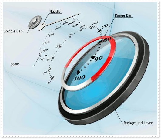
The following screen shot shows the idea of having multiple layers that are transparent and you can adjust the offset of the images, the transparency levels and rotate each image to create different types of gauges simple by changing the layer
graphics:
The following table shows how you can create / access different type of objects ( red items indicates the name of the property/method ):
EXGAUGELib.Gauge
	"Layers" -> EXGAUGELib.Layers
	"VisualAppearance" -> EXGAUGELib.Appearance
EXGAUGELib.Layers
	"Add(Variant)" -> EXGAUGELib.Layer
	"Item(Variant)" -> EXGAUGELib.Layer
	"VisibleItem(Long)" -> EXGAUGELib.Layer
EXGAUGELib.Layer
	"Background" -> EXGAUGELib.Background
	"Clip" -> EXGAUGELib.Clip
	"Foreground" -> EXGAUGELib.Foreground
EXGAUGELib.Background
	"Color" -> EXGAUGELib.Color
	"ExtraPicture(Variant)" -> EXGAUGELib.Picture
	"Picture" -> EXGAUGELib.Picture
EXGAUGELib.Clip
	"Ellipse" -> EXGAUGELib.ClipEllipse
	"Picture" -> EXGAUGELib.ClipPicture
	"Pie" -> EXGAUGELib.ClipPie
	"Polygon" -> EXGAUGELib.ClipPolygon
	"Rectangle" -> EXGAUGELib.ClipRectangle
	"RoundRectangle" -> EXGAUGELib.ClipRoundRectangle
The following table shows how you can create / access different type of objects ( red items indicates the name of the property/method ):
EXGAUGELib.Appearance <- "VisualAppearance" of EXGAUGELib.Gauge
EXGAUGELib.Background <- "Background" of EXGAUGELib.Layer
EXGAUGELib.Clip <- "Clip" of EXGAUGELib.Layer
EXGAUGELib.ClipEllipse <- "Ellipse" of EXGAUGELib.Clip
EXGAUGELib.ClipPicture <- "Picture" of EXGAUGELib.Clip
EXGAUGELib.ClipPie <- "Pie" of EXGAUGELib.Clip
EXGAUGELib.ClipPolygon <- "Polygon" of EXGAUGELib.Clip
EXGAUGELib.ClipRectangle <- "Rectangle" of EXGAUGELib.Clip
EXGAUGELib.ClipRoundRectangle <- "RoundRectangle" of EXGAUGELib.Clip
EXGAUGELib.Color <- "Color" of EXGAUGELib.Background
EXGAUGELib.Foreground <- "Foreground" of EXGAUGELib.Layer
EXGAUGELib.Layer <- "Add(Variant)" of EXGAUGELib.Layers
EXGAUGELib.Layer <- "Item(Variant)" of EXGAUGELib.Layers
EXGAUGELib.Layer <- "VisibleItem(Long)" of EXGAUGELib.Layers
EXGAUGELib.Layers <- "Layers" of EXGAUGELib.Gauge
EXGAUGELib.Picture <- "ExtraPicture(Variant)" of EXGAUGELib.Background
EXGAUGELib.Picture <- "Picture" of EXGAUGELib.Background
The Gauge object supports the following properties and methods:
| | Name | Description | |
| | AllowCopyTemplate | Specifies whether the Shift + Ctrl + Alt + Insert sequence copies the control's content to the clipboard, in template form. | |
| | AllowMoveOnClick | Allows moving the window that contains the control to a new position, as you would do by clicking the form's title/caption. | |
| | AllowSmoothChange | Specifies the properties of the layers that support smooth change. | |
| | AnchorFromPoint | Retrieves the identifier of the anchor from point. | |
| | Appearance | Retrieves or sets the control's appearance. | |
| | AttachTemplate | Attaches a script to the current object, including the events, from a string, file, a safe array of bytes. | |
| | BackColor | Specifies the control's background color. | |
| | Background | Returns or sets a value that indicates the background color for parts in the control. | |
| | BeginUpdate | Maintains performance when items are added to the control one at a time. This method prevents the control from painting until the EndUpdate method is called. | |
| | Caption | Specifies the caption on the control. | |
| | CopyTo | Exports the control's view to an EMF file. | |
| | Debug | Displays the control in debug mode. | |
| | DefaultLayer | Defines the default value for properties of the layers to be created. | |
| | Enabled | Enables or disables the control. | |
| | EndUpdate | Resumes painting the control after painting is suspended by the BeginUpdate method. | |
| | EventParam | Retrieves or sets a value that indicates the current's event parameter. | |
| | ExecuteTemplate | Executes a template and returns the result. | |
| | ExtraCaption | Specifies any extra caption on the control. | |
| | Font | Retrieves or sets the control's font. | |
| | ForeColor | Specifies the control's foreground color. | |
| | FormatABC | Formats the A,B,C values based on the giving expression and returns the result. | |
| | FormatAnchor | Specifies the visual effect for anchor elements in HTML captions. | |
| | FreezeEvents | Prevents the control to fire any event. | |
| | HTMLPicture | Adds or replaces a picture in HTML captions. | |
| | hWnd | Retrieves the control's window handle. | |
| | Images | Sets at runtime the control's image list. The Handle should be a handle to an Images List Control. | |
| | ImageSize | Retrieves or sets the size of icons the control displays.. | |
| | LayerAutoSize | Specifies the index of the layer that determines the size to display all layers. | |
| | LayerClipTo | Specifies the index of the layer that clips the entire control to. | |
| | LayerClipToParent | Indicates if the LayerClipTo method clips the control itself, parent or the owner of the control. | |
| | LayerDragAny | Specifies the index of the layer to drag (rotate or move) once the user clicks anywhere on the control. | |
| | LayerFromPoint | Retrieves the index of the layer from the point ( only visible and selectable objects are included ). | |
| | LayerOfValue | Specifies the index of the layer whose value represents the control's Value property. | |
| | Layers | Returns the Layers collection. | |
| | LayerUpdate | Specifies where the control updates its content. | |
| | PicturesName | Specifies the expression that indicates the name of the picture to be loaded on each layer. | |
| | PicturesPath | Specifies the path to load the pictures from. | |
| | Refresh | Refreses the control. | |
| | ReplaceIcon | Adds a new icon, replaces an icon or clears the control's image list. | |
| | ShowImageList | Specifies whether the control's image list window is visible or hidden. | |
| | ShowLayers | Indicates the only layers to be shown on the control. | |
| | ShowToolTip | Shows the specified tooltip at given position. | |
| | Template | Specifies the control's template. | |
| | TemplateDef | Defines inside variables for the next Template/ExecuteTemplate call. | |
| | TemplatePut | Defines inside variables for the next Template/ExecuteTemplate call. | |
| | TimerInterval | Returns or sets the number of milliseconds between calls of control's Timer event. | |
| | ToolTipDelay | Specifies the time in ms that passes before the ToolTip appears. | |
| | ToolTipFont | Retrieves or sets the tooltip's font. | |
| | ToolTipPopDelay | Specifies the period in ms of time the ToolTip remains visible if the mouse pointer is stationary within a control. | |
| | ToolTipWidth | Specifies a value that indicates the width of the tooltip window, in pixels. | |
| | ToTemplate | Generates the control's template. | |
| | TransparentColorFrom | Specifies the transparent color for all pictures in all layers, to define transparency part (from). | |
| | TransparentColorTo | Specifies the transparent color for all pictures in all layers, to define transparency part (to). | |
| | Value | Specifies the control's value. | |
| | Version | Retrieves the control's version. | |
| | VisualAppearance | Retrieves the control's appearance. | |

