| | Name | Value | Description | |
| |
exToolTipAppearance | 64
|
Indicates the visual appearance of the borders of the tooltips. Use the ToolTipPopDelay
property specifies the period in ms of time the ToolTip remains visible if the
mouse pointer is stationary within a control. The ToolTipDelay
property specifies the time in ms that passes before the ToolTip appears. Use
the ToolTip property of the Element object to specify the
element's tooltip. Use the ToolTipWidth
property to specify the width of the tooltip window. Use the ToolTip
property of the Link objct to specify the tooltip to be shown when the cursor hovers the link. Use
the ShowToolTip method to display a custom
tooltip
| |
| |
exToolTipBackColor | 65
|
Specifies the tooltip's background color.
| |
| |
exToolTipForeColor | 66
|
Specifies the tooltip's foreground color.
| |
| |
exCheckBoxState0 | 70
|
Specifies the visual appearance for the check box in 0 state (unchecked). Use
the ShowCheckBox property to show or hide
the element's checkbox. Use the Checked
property to specify the state of the element's checkbox.
| |
| |
exCheckBoxState1 | 71
|
Specifies the visual appearance for the check box in 1 state (checked). Use the
ShowCheckBox property to show or hide the
element's checkbox. Use the Checked
property to specify the state of the element's checkbox.
| |
| |
exCheckBoxState2 | 72
|
Specifies the visual appearance for the check box in 2 state (partial,
reserved).
Use the ShowCheckBox property to show or
hide the element's checkbox. Use the Checked
property to specify the state of the element's checkbox.
| |
| |
exRadioButtonState0 | 73
|
(reserved) Specifies the visual appearance for the radio button in 0 state (unchecked).
| |
| |
exRadioButtonState1 | 74
|
(reserved) Specifies the visual appearance for the radio button in 1 state (checked).
| |
| |
exCreateObjectColor | 75
|
Specifies the color to show the creation rectangle when the user creates a new object. The
AllowCreateElement property specifies the combination of keys that allows the user to create objects on the surface.
| |
| |
exSelectObjectRectColor | 76
|
Specifies the color to show the selection rectangle when the objects are selected by dragging. The
AllowSelectObjectRect
property specifies the keys combination so the user can select the elements
from the dragging rectangle. The SelectObjectColor
/ SelectObjectTextColor property
specifies the colors to show the selected elements ( while the control has the
focus ). The SelectObjectColorInactive
/ SelectObjectTextColorInactive
property specifies the color to show the selected elements ( while the control
is not focused ). The SelectObjectStyle property specifies the style to show the
selected elements ( like changing the element's background/foreground colors,
showing a border around the selected elements, and so on ).
| |
| |
exElementHostWindowBackColor | 77
|
Specifies the visual appearance of the element of window/control type while
dragging.
| |
| |
exEditBackColor | 78
|
Specifies the background color while element is editing. Use the Edit
method to allow inline editing of the element's caption or extracaption.
| |
| |
exEditForeColor | 79
|
Specifies the foreground color while element is editing. Use the Edit
method to allow inline editing of the element's caption or extracaption.
| |
| |
exEditSelBackColor | 80
|
Specifies the selection background color while element is editing. Use the Edit
method to allow inline editing of the element's caption or extracaption.
| |
| |
exEditSelForeColor | 81
|
Specifies the selection foreground color while element is editing. Use the Edit
method to allow inline editing of the element's caption or extracaption.
| |
| |
exLinkObjectsInvalidColor | 82
|
Specifies the color to display an invalid link, when the user links two objects.
The AllowLink event notifies your
application that the user links two elements on the surface.
| |
| |
exLinkObjectsValidColor | 83
|
Specifies the color to display a valid link, when the user links two objects.
The AllowLink event notifies your
application that the user links two elements on the surface.
| |
| |
exElementBorderColor | 88
|
Specifies the color or the visual appearance of the element's border. If the
property is set on -1, no border is shown. The exElementBorder defines the
border to show around the elements. The BorderColor
property specifies the color to show the border for a specific element. The BorderPadding
property specifies the border padding.
| |
| |
exElementStatusColor | 89
|
Specifies the color or the visual appearance of the element's status. If the
property is set on -1, no status is shown. Still, the element's StatusSize
should be set on 0. The StatusColor
property specifies the color or the visual appearance to show the element's
status part. The StatusPattern property
specifies the pattern to show the element's status part. The StatusAlign
property indicates the alignment of the element's status.
| |
| |
exElementBackColor | 90
|
Specifies the color or the visual appearance of the element's background. If
-1, the element's background is transparent. The BackColor
property defines the element's background color or visual appearance.
| |
| |
exElementForeColor | 91
|
Specifies the element's foreground color. The ForeColor
property defines the element's foreground color or visual appearance.
| |
| |
exElementBorder | 92
|
Specifies the element's border. The Border
property specifies the border for giving element. The exElementBorder value
could be any of the LinesStyleEnum type.
| |
| |
exPoolBackColor | 93
|
Specifies the pool's visual appearance ( EBN ) or background color. If
-1, the pool's background is transparent. The Color
property specifies the background color/visual appearance of the giving
pool.
| |
| |
exPoolBorderColor | 94
|
Specifies the color or the visual appearance of the pool's border. If the
property is set on -1, no border is shown. The exPoolBorder defines the style of
the border to show around the pool. The BorderColor
property specifies the color to show the border for a specific pool.
| |
| |
exPoolBorder | 95
|
Specifies the pool's border. The Border
property specifies the border for giving pool. The exPoolBorder value
could be any of the LinesStyleEnum type.
| |
| |
exElementShape | 96
|
Specifies the shape to show the element. The Shape
property specifies the shape to show the giving element. The
exElementShape value
could be any of the ShapeEnum type.
| |
| |
exContextMenuAppearance | 99
|
Specifies the visual appearance of the control's context menu.
| |
| |
exContextMenuBackColor | 100
|
Specifies the solid background color for the control's context menu.
| |
| |
exContextMenuForeColor | 101
|
Specifies the text foreground color for the control's context menu.
| |
| |
exContextMenuSelBackColor | 102
|
Specifies the solid/EBN selection's background color in the control's context menu.
| |
| |
exContextMenuSelBorderColor | 103
|
Specifies the solid color to show the selection in the control's context menu.
| |
| |
exContextMenuSelForeColor | 104
|
Specifies the selection's text foreground color in the control's context menu.
| |
| |
exContextMenuGroupPopupFrameSingle | 105
|
Specifies the visual appearance/solid color of the frame around the grouping items, when its group includes a single item.
| |
| |
exContextMenuGroupPopupFrameHStart | 106
|
Specifies the visual appearance/solid color of the frame around the first item ( horizontally arranged ), when the its group includes more items.
| |
| |
exContextMenuGroupPopupFrameHIntermediate | 107
|
Specifies the visual appearance/solid color of the frame around an intermediate item ( not start or end item, horizontally arranged ), when the its group includes more items.
| |
| |
exContextMenuGroupPopupFrameHEnd | 108
|
Specifies the visual appearance/solid color of the frame around the last item ( not start or intermediate item, horizontally arranged ), when the its group includes more items.
| |
| |
exContextMenuGroupPopupFrameSolid | 109
|
Specifies the solid color of the frame around the grouping items.
| |
| |
exContextMenuHotBackColor | 110
|
Specifies the visual appearance/color to show the item from the cursor.
| |
| |
exContextMenuHotForeColor | 111
|
Specifies the foreground color to show the item from the cursor.
| |
| |
exContextMenuSelHotBackColor | 112
|
Specifies the visual appearance/color to show the selected item from the cursor.
| |
| |
exContextMenuSelHotForeColor | 113
|
Specifies the foreground color to show the selected item from the cursor.
| |
| |
exContextMenuSeparatorSelectButton | 114
|
Specifies the visual appearance/color to show the separator between select and drop down button.
| |
| |
exContextMenuSeparatorSelectButtonBottom | 115
|
Specifies the visual appearance/color to show the separator between select and drop down button ( show the drop-down button to the bottom ).
| |
| |
exContextMenuGroupPopupFrameVStart | 116
|
Specifies the visual appearance/solid color of the frame around the first item ( vertically arranged ), when the its group includes more items.
| |
| |
exContextMenuGroupPopupFrameVIntermediate | 117
|
Specifies the visual appearance/solid color of the frame around an intermediate item ( not start or end item, vertically arranged ), when the its group includes more items.
| |
| |
exContextMenuGroupPopupFrameVEnd | 118
|
Specifies the visual appearance/solid color of the frame around the last item ( not intermediate or end item, vertically arranged ), when the its group includes more items.
| |
| |
exPoolHorizontalHeaderBackColor | 120
|
Specifies the visual appearance ( EBN ) or background color for the horizontal header of the pool. If
-1, the background is transparent. The HeaderColor(exHeaderHorizontal)
property specifies the background color/visual appearance of the horizontal
header for the giving pool.
| |
| |
exPoolHorizontalHeaderForeColor | 121
|
Specifies the foreground color for the horizontal header of the pool. If
-1, the foreground is transparent, so the control's ForeColor specifies the foreground color for the horizontal header of the
pool. The CaptionColor property
specifies the foreground color for caption's header of specified lane.
| |
| |
exPoolHorizontalHeaderBorderColor | 122
|
Specifies the color to show the border for horizontal header of the pool. If the
property is set on -1, no border is shown. The
exPoolHorizontalHeaderBorder defines the style of the
border to show around the header. The HeaderBorderColor(exHeaderHorizontal)
property specifies the color to show the border for a specific header.
| |
| |
exPoolHorizontalHeaderBorder | 123
|
Specifies the type of the border for horizontal header of the pool. The HeaderBorder
property specifies the border for horizontal header for giving pool. The
exPoolHorizontalHeaderBorder value could be any of the LinesStyleEnum
type.
| |
| |
exPoolVerticalHeaderBackColor | 124
|
Specifies the visual appearance ( EBN ) or background color for the vertical header of the pool. If
-1, the background is transparent. The HeaderColor(exHeaderVertical)
property specifies the background color/visual appearance of the vertical
header for the giving pool.
| |
| |
exPoolVerticalHeaderForeColor | 125
|
Specifies the foreground color for the vertical header of the pool. If
-1, the foreground is transparent, so the control's ForeColor specifies the foreground color for the
vertical header of the pool. The CaptionColor
property specifies the foreground color for caption's header of specified lane.
| |
| |
exPoolVerticalHeaderBorderColor | 126
|
Specifies the color to show the border for vertical header of the pool. If the
property is set on -1, no border is shown. The exPoolVerticalHeaderBorder defines the
style of the
border to show around the header. The HeaderBorderColor(exHeaderVertical)
property specifies the color to show the border for a specific header.
| |
| |
exPoolVerticalHeaderBorder | 127
|
Specifies the type of the border for vertical header of the pool. The HeaderBorder
property specifies the border for vertical header for giving pool. The exPoolVerticalHeaderBorder value
could be any of the LinesStyleEnum type.
| |
| |
exPoolHorizontalLaneBorderColor | 128
|
Specifies the color to show the border for horizontal lanes of the pool. If the
property is set on -1, no border is shown. The property has effect if the pool
contains horizontal lanes ( Count property ). The BorderColor
property (of the HeaderLane) specifies the color to show the border for horizontal lanes
of a specified pool, inside the header. The BorderColor
property (of the Lane) specifies the color to show the border for horizontal lanes
of a specified pool, outside of the header.
| |
| |
exPoolHorizontalLaneBorder | 129
|
Specifies the type of the border for horizontal lanes of the pool. The property
has effect if the pool contains horizontal lanes ( Count
property ). The Border property (of the
HeaderLane) specifies the type of the border for horizontal lanes of a specified
pool, inside the header. The Border property (of
the Lane) specifies the type of the border for horizontal lanes of a specified
pool, outside of the header.
| |
| |
exPoolHorizontalSubLaneBorderColor | 130
|
Specifies the color to show the border for horizontal sub-lanes of the pool. If the
property is set on -1, no border is shown. The property has effect if the pool
contains horizontal sub-lanes ( Count property ).
The BorderColor property (of the
HeaderLane) specifies the color to show the border for horizontal sub-lanes of a
specified pool, inside the header. The BorderColor
property (of the Lane) specifies the color to show the border for horizontal sub-lanes
of a specified pool, outside of the header.
| |
| |
exPoolHorizontalSubLaneBorder | 131
|
Specifies the type of the border for horizontal sub-lanes of the pool. The
property has effect if the pool contains horizontal sub-lanes ( Count
property ). The Border property (of the
HeaderLane) specifies the type of the border for horizontal sub-lanes of a
specified pool, inside the header. The Border
property (of the Lane) specifies the type of the border for horizontal sub-lanes
of a specified pool, outside of the header.
| |
| |
exPoolVerticalLaneBorderColor | 132
|
Specifies the color to show the border for vertical lanes of the pool. If the
property is set on -1, no border is shown. The property has effect if the pool
contains vertical lanes ( Count property ). The BorderColor
property (of the HeaderLane) specifies the color to show the border for vertical lanes
of a specified pool, inside the header. The BorderColor
property (of the Lane) specifies the color to show the border for vertical lanes
of a specified pool, outside of the header.
| |
| |
exPoolVerticalLaneBorder | 133
|
Specifies the type of the border for vertical lanes of the pool. The property
has effect if the pool contains vertical lanes ( Count
property ). The Border property (of the
HeaderLane) specifies the type of the border for vertical lanes of a specified
pool, inside the header. The Border property (of
the Lane) specifies the type of the border for vertical lanes of a specified
pool, outside of the header.
| |
| |
exPoolVerticalSubLaneBorderColor | 134
|
Specifies the color to show the border for vertical sub-lanes of the pool. If the
property is set on -1, no border is shown. The property has effect if the pool
contains vertical sub-lanes ( Count property ).
The BorderColor property (of the
HeaderLane) specifies the color to show the border for vertical sub-lanes of a
specified pool, inside the header. The BorderColor
property (of the Lane) specifies the color to show the border for vertical sub-lanes
of a specified pool, outside of the header.
| |
| |
exPoolVerticalSubLaneBorder | 135
|
Specifies the type of the border for vertical sub-lanes of the pool. The
property has effect if the pool contains vertical sub-lanes ( Count
property ). The Border property (of the
HeaderLane) specifies the type of the border for vertical sub-lanes of a
specified pool, inside the header. The Border
property (of the Lane) specifies the type of the border for vertical sub-lanes
of a specified pool, outside of the header.
| |
| |
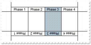
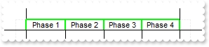
exHeaderLaneInheritLane | 136
|
Specifies the visual properties of the lane that its header inherits from. By
default, the
exHeaderLaneInheritLane property is exDrawPoolPropsNone (0), so the lane and its
header can display different background color/visual appearance, pattern and
border. The HeaderLaneInheritLane property specifies the visual properties of the lane that its header inherits
from ( HeaderLane object ).
The
exHeaderLaneInheritLane property can be a combination of the following flags:
- exDrawPoolPropsNone(0), no property is inherited.
- exDrawPoolPropsBackColor(1), the Color
property of the Lane object is applied to its header.
- exDrawPoolPropsPattern(2), the Pattern
property of the Lane object is applied to its header.
- exDrawPoolPropsBorder(256), the Border
property of the Lane object is applied to its header.
- exDrawPoolPropsBorder(512), the BorderColor
property of the Lane object is applied to its header.
- exDrawPoolPropsAll(-1), all above properties are applied to the
header.
The following screen shot shows the lane Phase 3 with a different Color
and Pattern, while the
exHeaderLaneInheritLane is exDrawPoolPropsNone(0):
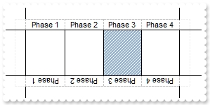
while the next screen shot shows the same lane, with exDrawPoolPropsAll(-1):
| |
| |
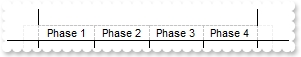
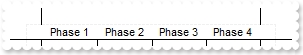
exHeaderLaneBorder | 137
|
Specifies the style of the border to be shown on the lane's header ( horizontal
and vertical ). If the
property is set on -1, no border is shown. The property has effect if the pool
contains horizontal sub-lanes ( Count property ).
The following screen shot shows the pool with
exHeaderLaneBorder on default:
The following screen shot shows the pool with
exHeaderLaneBorder on -1:
The following screen shot shows the pool with
exHeaderLaneBorder on RGB(0,255,0):
| |
| |
exHeaderLaneBorderColor | 138
|
Specifies the color to show the borders in the header of the lane ( horizontal
and vertical ). The property has effect if the pool contains horizontal sub-lanes
( Count property ).
| |
| |
exToolBarAppearance | 148
|
Specifies the visual appearance / background color of the surface's toolbar panel.
| |
| |
exToolBarBackColor | 149
|
Specifies the background color of the surface's toolbar panel.
| |
| |
exToolBarForeColor | 150
|
Specifies the foreground color of the surface's toolbar panel.
| |
| |
exToolBarButtonUpBackColor | 151
|
Specifies the visual appearance of the toolbar's button while it is up.
| |
| |
exToolBarButtonUpForeColor | 152
|
Specifies the foreground color of the toolbar's button while it is up.
| |
| |
exToolBarButtonDownBackColor | 153
|
Specifies the visual appearance of the toolbar's button while it is down.
| |
| |
exToolBarButtonDownForeColor | 154
|
Specifies the foreground color of the toolbar's button while it is down.
| |
| |
exToolBarButtonHotBackColor | 155
|
Specifies the visual appearance of the toolbar's button while the cursor hovers it.
| |
| |
exToolBarButtonHotForeColor | 156
|
Specifies the foreground color of the toolbar's button while the cursor hovers it.
| |

