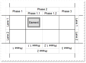
The following screen shot marks an element:
The Element object supports the following properties and methods:
The following screen shot marks an element:
The Element object supports the following properties and methods:


| Name | Description | |||
| AutoHeight | Gets the height of the element to fit its content ( as if the AutoSize property is True ). | |||
| AutoSize | Specifies if the element computes its size automatically. | |||
| AutoWidth | Gets the width of the element to fit its content ( as if the AutoSize property is True ). | |||
| BackColor | Gets or sets a value that indicates the element's background color. | |||
| BackgroundExt | Indicates additional colors, text, images that can be displayed on the element's background using the EBN string format. | |||
| BackgroundExtValue | Specifies at runtime, the value of the giving property for specified part of the background extension. | |||
| Border | Specifies the style to display the element's border. | |||
| BorderColor | Gets or sets a value that indicates the element's border color. | |||
| BorderPadding | Returns or sets a value that indicates the padding of the element's borders. | |||
| BringToFront | Brings the element to front. | |||
| Caption | Gets or sets a value that indicates the HTML caption to be displayed on the element. | |||
| CaptionAlign | Indicates the alignment of the element's caption. | |||
| CaptionSingleLine | Specifies if the element's caption is displayed on single or multiple lines. | |||
| CenterOnLane | Centers the element on its lane. | |||
| CheckBoxAlign | Indicates the alignment of the element's checkbox. | |||
| Checked | Gets or sets a value that indicates the element's check-box state. | |||
| ClientPadding | Returns or sets a value that indicates the padding of the element's client. | |||
| Control | Specifies the identifier of the inner control hosted by the current element. | |||
| Copy | Creates a new copy of the current element. | |||
| Edit | Edits the element. | |||
| ElementFormat | Specifies the way the control shows the parts of the element. | |||
| Enabled | Gets or sets a value that indicates whether the element is enabled or disabled. | |||
| EndUpdateElement | Adds programmatically updated properties of the element to undo/redo queue. | |||
| EnsureVisible | Scrolls the surface to ensure that the current element fits the control's visible area. | |||
| ExtraCaption | Gets or sets a value that indicates the extra HTML caption to be displayed on the element. | |||
| ExtraCaptionAlign | Indicates the alignment of the element's extra caption. | |||
| ExtraCaptionSingleLine | Specifies if the element's extra caption is displayed on single or multiple lines. | |||
| ExtraPictures | Specifies the list of extra pictures to be displayed on the element. | |||
| ExtraPicturesAlign | Indicates the alignment of the element's extra picture. | |||
| FitToClient | Resizes or/and moves the entire chart to fit the element. | |||
| ForeColor | Gets or sets a value that indicates the element's foreground color. | |||
| Height | Specifies the height of the element. | |||
| ID | Specifies the element's unique identifier. | |||
| IncomingLinks | Returns a safe array of incoming links. | |||
| InflateSize | Increases or decreases the width and height of the element. | |||
| InvokeContextMenu | Invokes programmatically the element's default or customized context menu, and returns the identifier of the selected item. | |||
| LaneID | Returns or sets the identifier of the lane from the element. | |||
| License | Indicates the runtime license required to create the inner control. | |||
| MaxHeight | Specifies the maximum height of the element. | |||
| MaxWidth | Specifies the maximum width of the element. | |||
| MinHeight | Specifies the minimum height of the element. | |||
| MinWidth | Specifies the minimum width of the element. | |||
| MoveTo | Moves the element to a new position. | |||
| Object | Returns the inner object hosted by the current element. | |||
| OutgoingLinks | Returns a safe array of outgoing links. | |||
| OverviewColor | Gets or sets a value that indicates the element's overview color. | |||
| Padding | Returns or sets a value that indicates the padding of the element's background. | |||
| PathTo | Determines if there is any path from the current element to the specified element. | |||
| Pattern | Specifies the pattern to be shown on the element's background. | |||
| Picture | Retrieves or sets a graphic to be displayed in the control. | |||
| PictureDisplay | Retrieves or sets a value that indicates the way how the graphic is displayed on the element's background | |||
| Pictures | Specifies the list of pictures to be displayed on the element. | |||
| PicturesAlign | Indicates the alignment of the element's picture. | |||
| Resizable | Gets or sets a value that indicates whether the user can resize the element. | |||
| ScrollTo | Moves or scrolls the surface, so the current element aligns to the specified corner. | |||
| Selectable | Indicates if the element is selectable. | |||
| Selected | Indicates if the element is selected or unselected. | |||
| SendToBack | Sends the element to the back. | |||
| Shape | Specifies the shape to display the element. | |||
| ShowCheckBox | Gets or sets a value that indicates whether the element shows or hides the check-box. | |||
| ShowHandCursorOn | Specifies whether the hand cursor is shown when hovering the element. | |||
| StartUpdateElement | Starts changing properties of the element, so EndUpdateElement method adds programmatically updated properties to undo/redo queue. | |||
| StatusAlign | Specifies the alignment of the status inside the element. | |||
| StatusColor | Gets or sets a value that indicates the element's status color. | |||
| StatusPadding | Returns or sets a value that indicates the padding of the element's status. | |||
| StatusPattern | Specifies the pattern of the element's status | |||
| StatusSize | Specifies the size of the status inside the element. | |||
| ToolTip | Gets or sets a value (tooltip) that's displayed once the cursor hovers the element. | |||
| ToolTipTitle | Gets or sets a value (title) that's displayed once the cursor hovers the element. | |||
| Type | Specifies the element's type. | |||
| UserData | Indicates any extra data associated with the element. | |||
| Visible | Shows or hides the element. | |||
| Width | Specifies the width of the element. | |||
| Window | Returns or sets the handle of the window to be hosted by the element. | |||
| X | Specifies the element's x-position. | |||
| Y | Specifies the element's y-position. |