The Exontrol Tab library installs the TabBuilder component (
Exontrol.TabBuilder is the control's identifier ) that helps you to build new
tab controls. Before showing how you can build your own tab control, we
have to review for a bit how the TabBuilder can be used. If you already know how
to use the TabBuilder component click here to see how to
start your own tab control.
- If you are a VB developer, click the 'Toolbox' panel, and choose the
'Components' from the panel's context menu. Once that you check and
apply the 'ExTab 1.0 Control Library' from the opened dialog, your 'Toolbox'
panel will include two new components: Tab
 and TabBuilder
  .
.
- If you are a VC developer, select the dialog where you want to insert the
component, select 'Insert ActiveX Control' from its context menu, and dbl
click the 'ExTabBuilder ActiveX Control' item in the opened dialog.
Once that you have inserted a TabBuilder component to a form or dialog, you
are ready to build new tab controls. Of course, you can use the TabBuilder
component to load and change already saved tab controls. When the form that
contains a TabBuilder component is opened, the TabBuilder component
automatically shows the 'Zoom' and 'Properties' panels. The 'Zoom' panel helps
user to magnify different portions of the screen. The 'Properties' panel
contains information like, background color, background picture for the selected
object.
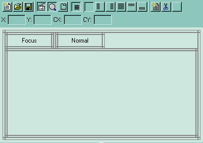
The TabBuilder component looks like following:
The TabBuilder's toolbox contains the following buttons:

|
New Tab
|
Creates a new file.
|

|
Open
|
Opens a file.
|

|
Save
|
Saves the content to a file, or update the component when
the builder was opened using 'Edit tab' context item menu. ''Save As ,
if you are pressing the 'Shift' key while clicking the 'Save'
button you can choose a new file where to save the tab's content.
|

|
Properties
|
A check button that indicates whether the 'Properties'
panel is visible or hidden. The 'Properties' panel holds information
about background of the selected object. Also, the the 'Properties'
panel contains the entire list of pictures used by the skin. Details here.
|

|
Zoom
|
A check button that specifies whether the 'Zoom' panel is
visible or hidden. You can use the 'Zoom' panel to magnify different
portions of screen. In order to visualize a specified portion of the
screen you can press "CTRL" key while moving the mouse, or you
can click into the 'Zoom' window and drag the focused rectangle to the
area being magnified.
|

|
Test
|
A simple button that opens a new window where you can see
the tab control in runtime mode. If you are doing changes to the tab's
content you can click the Test button to see how the Tab control will
act in runtime environment.
|

|
Lines
|
A check button that indicates whether the TabBuilder draws
the grid lines around different objects. The grid lines are not painted
in the Tab control when it is running.
|

|
Alignment
|
A set of six radio buttons that indicates the object's
alignment relative to its parent. The list of radio buttons in their
listed order is: None, Left, Right, Client, Top and Bottom. For
instance, if an object has the Left Alignment, that means that the
object shares the left area of the parent with itself. The object's
coordinates are defined in the edit controls labeled: X, Y, CX and CY.
The edit controls that handle coordinates are enabled based on the
object's alignment. For instance, if the object's alignment is left,
only the CX coordinate will be enabled, or if the object's alignment is
Client, then all coordinates are enabled. The coordinates are relative
to the parent object, and they may contain arithmetic expressions, and %
sign as well.
|

|
New Object
|
Creates a new child object. The newly created object is
child of the selected object. By default, the newly created object has
no picture or color associated to it. You have to define the object's
background using the 'Properties' panel. You can also, insert a new
child object whild TabBuilder is focused by pressing the 'Insert'
key.
|

|
Delete
|
Deletes an object. Also, you can remove the selected
object by pressing the 'Delete' key. Note, that some objects are not
allowed to be deleted, because they define how the TAB control looks
like.
|
The TabBuilder's client area shows the main objects that define a tab control
like follows:

|
Area where the TAB control draws the pages of the Tab
control. The area must define the looks for the FOCUS page as well for a
NORMAL page. The TAB control uses the FOCUS page when painting the
focused ( activated ) page of the tab control. The NORMAL page is used
by the control when painting all other pages that are not focused or
activated. The way how you define these objects is how your TAB control
will look like. Important to note is that the FOCUS and NORMAL objects (
pages ) are separated by an object that defines the distance between
pages. The distance is used by the TAB control when painting the pages.
The width of this object may contain negative numbers as well, if you
have some kind of overriding in your tab control.
|

|
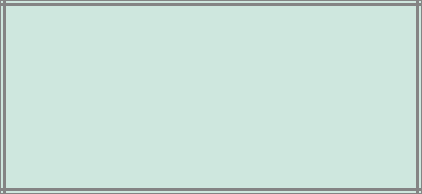
The TAB's client area. The top and bottom borders define
also the height of the overriding area when TAB is running. The way how
you define this object is the way how the TAB's client area will look
like in the runtime mode.
|
Notes:
- the selected object is always marked using markers.
- any change in the 'Properties' panel will be reflected in the selected
object.
- use 'Up' key to select the parent of the selected object, while the
TabBuilder is focused.
- use the 'Down' key to select the first child of the selected object, while
the TabBuilder is focused.
- use the 'Left' or 'Right' key to move through the objects that have the
same parent as selected object.
- you can change the order of the objects ( that have the same parent )
using combination of CTRL + PgUp or CTRL + PgDn key.
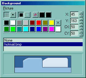
The 'Properties' panel is a resizable window that's
visible only if the  button is pressed. The caption of its window is 'Background'. The 'Properties'
panel is always updated when the selected object is changed. The 'Properties'
panel defines the list of pictures used by the skin. The 'Properties' panel
looks like follows:
Use the Picture menu to insert, delete a picture object from the
skin file. Note that all picture files are saved to the skin file ( tab file ),
no matter if they are used or not. The TabBuilder compresses the file, so even
if you are using a bitmap file or a gif file, the file of the tab will be
compressed! The 'Properties''s toolbox contains the following buttons ( in
their order ):

|
A set of two radio buttons that defines the way how the
picture is displayed on the selected object: tiled or stretched.
|

|
A set of three radio buttons that defines the picture's
transparency. If the first button is pressed, the picture is opaque, so
no transparent colors are used. If the second button is pressed, the
picture is transparent. No picture or background is applied to the
selected object. If the third button is pressed, the last two buttons
defines the transparent color from and transparent color to. In
order to select a new transparent color, you have to click on the one of
the last two buttons and drag to the desired color. Once that you have
selected a transparency color, you have to presses the button
again to apply the transparent color to the selected object.
|

|
Defines a set of predefined colors. The X button clears
the background color of the selected object. The bottom-right button (
bellow to X button ), helps user to add a custom color. How? Click the
button and drag to desired color. Once that you have selected a custom
color, you can presses the button again to apply the color to the
selected object.
|

|
The X, Y, CX, CY edit controls define the coordinates of
the picture on the background of the selected object.
|
Now, that we are ready to go, we will show you how to
create a new TAB control that looks like follows using the TabBuilder component:
Run the form that contains the TabBuilder, and click the file
new button in order to create a new tab file.
Step 1. Processing the picture. So, before starting we need to
work on the picture to eliminate all things that we don't need it, like texts,
colors, tabs and so on. We used mspaint application, but you can use any image
processing tool that you want. So, the template picture becomes:
We have used red color, because we want to use RED color as a
transparent color, but you can pick up any color that you want.
Step 2. Load the picture. Click the Picture menu on the
'Properties' panel, select the Add New menu item, and select the file saved to
Step 1. Click the 'Open' button, and the TabBuiler will load the picture. Click
the 'None' item in the 'Properties' panel, because the selected object is
exactly the client area of the TAB control, and the picture is tiled on its
background. We changed the main object's background color, using the 'Up' key
until we reached the root object, and after that we have selected the menu color
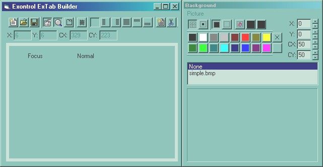
in the custom color button. After all these your builder should look like
follows:
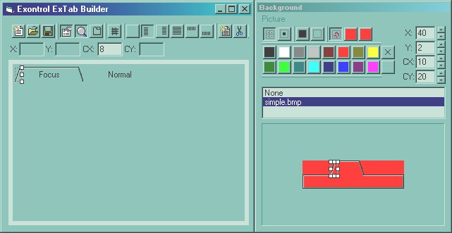
Step 3. Building the FOCUS page. Now, we have to work on
how the FOCUS page should look like. We will use the RED color as transparent
color, and after we done the FOCUS object the builder should look like:
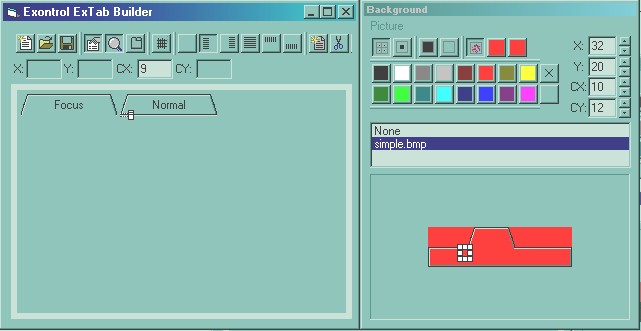
Step 3. Building the NORMAL page. Because in that case
the FOCUS and NORMAL page look the same, we just do the same thing as we did for
the FOCUSED page. SO, the next step should look like follows:
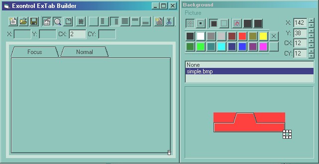
Step 4. Building the borders for the client area. The
client area is designed like follows:
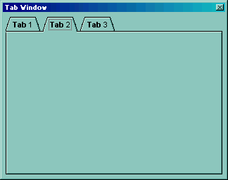
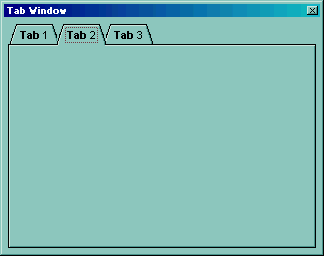
Step 4. Test. We are ready now to check our tab control.
All that we need to do is to click the  button, and we have now the:
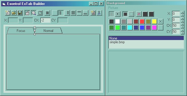
Step 5. Correction and adjustments. As we can see the
distance between pages is a bit larger, and we have a distortion on the top-left
side. We are going to select the object between FOCUS and NORMAL pages and we
have to set the distance to -2 like follows:
Finally our TAB control will look like follows:
Of course, between steps it is recommended saving the skin file,
using the  (save) button. Here's the simple.etb
file that was obtained by doing the steps mentioned above.

