On the right side of each product's home page, you'll find the icon, which displays all
available prices.
If you'd like to order the eXSuite package but can't make the full payment at once,
please contact us.
We'll provide separate links for multiple payments. Once all payments are completed,
you'll receive the full download details along with all your development license keys.
Prices on the website are displayed in both EUR and USD. USD and other currencies may vary according to the
daily exchange rate set by our official reseller. VAT and other taxes are not included on the website and will
be calculated during checkout by our reseller, based on the delivery country.
Definitely Yes. All Exontrol products are available for an unlimited time evaluation. Customers are encouraged to fully evaluate the software prior to purchasing a software license. Evaluation software may be downloaded from the Exontrol web site, is fully functional, and includes complete online documentation. During the evaluation period, you can contact
technical support here.
Exontrol believes strongly that no customer should have to buy software in order to find out how well it
works. Software purchases should be based on thorough evaluation of the most current, fully functional technology. Users should be able to test every feature of a software package for functionality and compatibility. Exontrol software can be evaluated with no limitations in capabilities.
Yes. All of our controls are completely royalty-free and do not require any run-time license fees.
This means that when you purchase a copy of a control for a developer on your project, you are free to distribute that control with your applications.
You do not need to pay any additional run-time fees to us.
You are entitled to get the the latest released version ( not including the source code, unless you do not have a subscription for it ), free of charge, for 1 Year from the purchase date. Our development team is committed to keeping in step with new technology, and Exontrol' subscription service is a convenient way to ensure your developers are always using the latest versions of our products.
If your subscription is not expired, you can renew the products you purchased from us here.
Once you renew the products before expiration date you get:
a new year is added to your account ( starting from the date the product will expire )
during this time you are notified by e-mail about the latest changes of the products you subscribed for
your subscription gives access to all versions since your first purchase, including the latest and any new ones while active. A new license gives access to the latest and future releases.
In case you are registered for eXSuite package:
you will receive the development license keys for the new products that has been included in the eXSuite package.
You can proceed with a renewal if you already own one or more development license keys for the specific product you want to renew.
Renewals do not allow changing the license type (for example, from /Team to /Site or /Infinite, or from /Site to /Team or /Single) or switching between 32-bit and 64-bit editions, because the development license key generated at purchase time is specific to the selected license type and configuration. However, a renewal for the same 32-bit or 64-bit edition may be upgraded to the /ANY edition. Any other upgrade or downgrade requires purchasing a new development license key. If you selected the wrong option, we can provide payment links to cover the price difference for the correct product, configuration, or license type. For special requests or custom configurations, please contact us.
You are entitled to get the the latest released version ( not including the source code, unless you do not have a
subscription for it ), free of charge, for 1 Year from the purchase date. Our development team is committed to
keeping in step with new technology, and Exontrol' subscription service is a convenient way to ensure your developers
are always using the latest versions of our products.
If your subscription is expired, you can renew the products you purchased from us here.
Once you renew the products after expiration you get:
your subscription starts once we receive the payment for the renewal
during this time you are notified by e-mail about the latest changes of the products you subscribed for
your subscription gives access to all versions since your first purchase, including the latest and any new ones while active. A new license gives access to the latest and future releases.
In case you are registered for eXSuite package:
you will receive the development license keys for the new products that has been included in the eXSuite package.
You can proceed with a renewal if you already own one or more development license keys for the specific product you want to renew.
Renewals do not allow changing the license type (e.g., from /Single to /Team, /Site, or /Infinite) or switching the platform (e.g., from 32-bit to 64-bit or /ANY).
In such cases, upgrading or downgrading requires purchasing a new development license key.
If you've selected the wrong option, we will provide payment links to cover the difference for the correct product, configuration, or license type.
For any special requests or custom configurations, feel free to contact us.
All our controls are royalty-free and require no run-time license fees. When you purchase our products (one license per developer on the project), you may distribute the components with your applications without paying any additional run-time fees. Shortly, the license is per developer, not per machine or run-time.
/COM, /NET, /WPF Controls
Licensed per developer. One license is required for each developer on the project.
Single Developer License: One developer, one licensed copy.
Developer Team License (3+): Multiple developers, up to the number of licenses purchased.
Site License: Unlimited installations and developers within the purchasing company.
Source License (add-on): Requires a Single, Team, or Site License. Includes source code for one developer. Source code may not be redistributed or reused. Exontrol retains copyright.
/JS Controls
Licensed per developer / per domain. Royalty-free with no run-time fees. Our licenses are perpetual: pay once, use forever.
Single Developer License: One developer, one domain.
Developer Team License (3+): Three or more developers, three or more domains.
Site / Unlimited License: Unlimited developers and domains within the company.
Source License: The Source License provides the readable, fully commented source code for debugging, customization, and learning. A Single, Team, or Site / Unlimited License must be purchased separately and provides the minified version for distribution. The Source License is an additional license that provides access to the readable source code for licensed developers only. Exontrol retains the copyright to the source code. The source code must not be distributed or made accessible outside the Licensee's company.
Yes. We definitely can confirm this. The controls are written from scratch, which
means that there is NO dependency to third runtime libraries such
as MFC, VB, Delphi or anything else. We provide independent components, so no
matter of what programming language you are using for your application,
our component requires the dll files only, nothing else, on a Windows
system
The Dependency Walker tool from Microsoft which is
a free utility that scans any 32-bit or 64-bit Windows module (exe, dll,
ocx, sys, etc.) and builds a hierarchical tree diagram of all dependent modules. For each module found, it lists all the functions that are exported by that module, and which of those functions are actually being called by other modules. Another view displays the
minimum set of required files, along with detailed information about each file including a full path to the file, base address, version numbers, machine type, debug information, and more.
Let's take the Exontrol's eXG2antt/COM component and scan it using the Dependency Walker, and we get the following:
The required files are standard system files that come with any Windows installation - if they're missing, the OS wouldn't
run and you'd need a reinstall. Therefore, the components have no external dependencies, ensuring they work on any client machine
without requiring additional libraries or setups.
Yes. The concept of Isolated COM solves the problem,
so you have to be familiar with. In other words, it means you can use
the /COM version, and your application can use only the DLL you provide,
without being affected by any other application that could install a
newer or older version of the component.
Developers are encouraged to design isolated applications and to
update existing applications into isolated applications for the
following reasons:
Isolated applications are more stable and reliably updated because
they are unaffected by the installation, removal, or upgrading of
other applications on the system.
Isolated applications can be designed so that they always run
using the same assembly versions with which they were built and
tested.
Isolated applications can use functionality provided by the
side-by-side assemblies made available by Microsoft. For more
information, see Supported Microsoft Side-by-side Assemblies.
Isolated applications are not tied to the shipping schedule of
their side-by-side assemblies because applications and
administrators can update the configuration after deployment without
having to reinstall the application. This would not apply in the
case where only one version of the assembly is being made available.
A fully isolated application may be installed by using the xcopy
command. Windows Installer can also be used to install an isolated
application without impact to the registry. For more information,
see Installation of Win32 Assemblies.
Shortly, the Isolated COM allows your application to use ActiveX
components without having to register them.
Currently, we have the following samples that uses exg2antt/com as
isolated ( Registration-less COM Activation ):
Yes. All of our components/products ( excepts
eXMaskEdit ) are
written from scratch. Our components do NOT wrap or subclass
any Microsoft objects or windows such as ListBox, SysTreeView32, SysTabControl32, and so
on.
All /COM components except exTab component can be used in a
VBA environment like MS Access Excel, Word and so on. The exTab component
requires a container that implements ISimpleFrameSite interface.
Unfortunately, the VBA environment doesn't support ISimpleFrameSite
interface.
A Site license provides an easy, cost effective way to
give all of your developers access to the component. A Site
is defined as all computers owned by an individual company
at one physical mailing address. The site version of the control is
not requiring the IClassFactory2 interface. What that means? It means
that you can create or use the control in runtime mode as well in design
mode on a client machine. The retail version doesn't allow using the
control in design mode on the client machine. The site license allows
unlimited developers to use on the development machine, in the same
company. The site version encrypts information about the registered
owner, in the distributable file. The retail version is recommended for
single developers. The team version is recommended for the companies
that have less than 8 developers. The site version is recommended for
companies that has more than 8 developers, or for companies that develop
container applications that require design mode running on the client
machine.
For instance, the System.Windows.Forms.ListBox component uses
the "LISTBOX" window. As you already know sending the
LB_ADDSTRING message to a listbox window adds a new item. Here's a
simple sample that can be used in c#. All that you need to do
before copying the code is to create a new c# application, and to
insert a listbox component to the main form.
[DllImport("User32.DLL")]
public static extern long SendMessage( int hWnd, int Msg, int wParam, string lParam );
private void Form1_Load(object sender, System.EventArgs e)
{
    SendMessage( listBox1.Handle.ToInt32(), 0x0180 /*LB_ADDSTRING*/, 0, "test");
}
Obviously, if you call listBox1.Items.Add("test") the last
thing that listbox does is to call SendMessage function. The things
are the same for ListView, TreeView, ComboBox components, and so on.
In your .NET application, all these mean that you are safe to use an
ActiveX control. Using the ActiveX version will be faster than using
the same version built using c#.
The answer is definitely yes. For instance, if
you know some VB and you have some knowledge about ActiveX programming, it
is enough to know how to use any of our components. If you know C++, you
need to know how to insert an ActiveX control, and how to add a member of
ActiveX type.
Now, few words about why we are using ATL. ATL is the ActiveX Template
Library, a set of template-based C++ classes with which we can easily
create small, fast Component Object Model (COM) objects. ATL gives several
important features like:
All of the power of C++.
No run-time library
A relatively high-level way of abstracting objects and interfaces.
Automatic handling of class factory, object creation, reference
counting, and QueryInterface.
Stock implementations of standard interfaces
ATL is the Active Template Library, a set of template-based C++
classes with which you can easily create small, fast Component Object
Model (COM) objects.
The OLE View tool allows users to inspect a control's type library. To do this, OLE View attempts to create the control using the DllGetClassObject method and the IClassFactory interface.
Licensed ActiveX controls require the IClassFactory2 interface. Since IClassFactory cannot handle licensed controls, OLE View will show an error when trying to create them.
You can safely use OLE View on the development machine without issues. On a client machine, the proper way to verify that a control is registered is to check that DllRegisterServer returns S_OK (or that regsvr32 completes without errors).
Note: Components with a Site Wide License do not use the IClassFactory2 interface.
This issue occurs when the logged-in user lacks access to the OLE registry keys.
Each .OCX control used by VB has a corresponding .OCA file, which acts as a type library and cache. When inserting an ActiveX control, VB writes to:
That means that the setup copies the files but it
wasn't able to register the component(s). In order to make sure that
the component is registered go to your system folder, and run the
regsvr32
, and make sure that the registration process was successfully. When
you are installing an Exontrol product make sure that you have
permission to write to OLE registry, and you have write-access to
disk. We recommend installing the software using Administrator
accounts.
Usually, the samples of the component goes to: C:\Program Files\Exontrol\COMPONENT\Sample, where COMPONENT is the
name of the product like: ExG2antt, ExG2antt.NET, ExG2antt.WPF, and so on.
If this folder is missing or empty one of the following could happen:
you installed the registered version, which comes with only required stuff only (no samples)
you installed the product with SAMPLE Pack unchecked
If this is happen, you should:
download and install the trial/evaluation version from the website
make sure that the SAMPLE Pack is checked on the setup
if you are a registered user, reinstall the registered setup.
This will NOT remove the samples or the documentation of the
control, so only required files of registered product are installed.
Any of Exontrol setups install and register one or
more ActiveX controls. Registration of an ActiveX control requires
write permission to the HKEY_CLASSES_ROOT OLE registry key. This is a
general rule, and it is not an Exontrol rule. Make sure that you
install the Exontrol software using an Administrator account.
The evaluation version always installs all files required to run the component, including:
required library files
samples
documentation files
additional tools (such as ExHelper, ExCRD, ExBTN, ExETB, etc.)
In contrast, the retail version installs only:
required library files
and does not include samples, documentation, or additional tools.
If you have purchased the registered version or your intention is to install a newer version, uninstalling the previous version is not required. Simply re-run the setup and it will install the component by overriding the existing version (if any), including any new properties, methods, events, samples, and documentation.
Before installing, make sure to close any applications or projects that use the component you want to reinstall. Otherwise, an error message may be displayed, as shown in the screenshot below:
If this happens, just click the Retry button after closing all projects or applications that may be using the component. This is the most common error you may encounter during reinstallation.
If you really want to uninstall the component, locate the file uninstall.exlog in the folder where the component is installed. By default, this path is: C:\Program Files\Exontrol\ControlName.
Once you have found the file, you have the following options to perform the uninstallation:
Drag and drop the uninstall.exlog file over the installer
executable
Run the installer again using the uninstall.exlog file as an
argument
Associate .exlog files with the installer program and double-click the uninstall.exlog file in Windows
Explorer
When you run the installer with uninstall.exlog as an argument, a window like the one below will appear, indicating that the uninstallation process is about to begin:
We use our own installer, called the Exontrol Installer/Uninstaller Tool (formerly Exontrol ExInstall Setup Generator). This installer only copies the samples, documentation, and the control's DLL to your machine. The uninstall.exlog file contains the complete list of files and folders that were copied or created during installation, and running it with the installer ensures that all of these are properly removed.
/silent option performs the installation of the product without displaying the user interface.
For example, running print.net.exe /silent installs the eXPrint/NET component without showing the default UI.
You can create your own batch file to install components one by one, without having to click the Install button for any of them.
The /silent option is supported by Exontrol installers starting from version 6.1.0.1.
To check the installer version, locate the EXE file in Windows Explorer and hover the mouse over it; the version appears in the `File version:` field.
The installer can be identified as "Exontrol ExInstall Setup Generator" in the `File description:` field.
The eXSuite package includes batch files such as _silent_install_all_.bat or _silent_update_all_.bat,
which allow you to silently install or update all components without user interaction. Here's how you can silently install all components using the provided batch file:
Download and extract the eXSuite package to a folder on your machine
Navigate to the folder where you extracted the eXSuite package
To silently install or update all components, simply double-click _silent_install_all_.bat or _silent_update_all_.bat
Press Y when asked "Do you want to install all components at once (y/n)?"
The batch file will install all components silently, without displaying any user interface (except during the first installation, when the license key must be provided as explained below).
When prompted for the License Key during first installation, you can simply copy the entire email you received after purchase once, and then paste it each time the installer asks for the license key.
The installer will automatically extract and use the correct license key from your email every time you paste it.
The first argument or option that does not start with the / character specifies the path to the exlog file. The exlog file is used to uninstall the component.
For example, the command
print.exe "C:\Program Files\Exontrol\ExPrint\uninstall.exlog"
will uninstall the eXPrint/COM component.
Locate the file uninstall.exlog in the folder where the component was installed. By default, the control's path is:
C:\Program Files\Exontrol\ControlName.
Once you have located the file, you can either:
Run the installer program again using this exlog file as an argument, or
Associate .exlog files with the installer program and double-click the file in Windows Explorer.
You MUST use the development installer only on the development machine. You MUST NOT use the registered installer on the client machine.
If you get any error like:
"The system cannot execute the specified program" error message, make sure you do not have any antivirus solutions or security restrictions (e.g., AppLocker) that might prevent the executable from running.
Currently all of our UI components are DEP compatible
Named NX by AMD, DEP by Microsoft, and XD by Intel, this technology
requires CPU support that helps prevent code from executing in data
segments. Most modern Intel CPUs support this capability today and all
current AMD CPUs support NX. DEP support was first introduced in
Windows XP SP2 and is a critically important defense in Windows Vista.
Data Execution Prevention may accidentally shut down legitimate process from valid applications or services, particularly third-party installers used by software developers that release their products for download through the
Web. To make thing worse, DEP normally does not or fails to display or show any warning or information or acknowledgment message prompt that can let you know that DEP has shut down a process, thus causing you unaware of the reason why your setup file cannot run, or why your computer cannot start a service and etc.
Verify the DEP setting in your Windows Vista:
1. Click Start
2. Click All Programs
3. Click Accessories
4. Right Click on Command Prompt
5. Left click on Run as Administrator
6. Click the Allow button if it asks you for permission
7. Type or copy and paste this into the command prompt window:
bcdedit.exe
8. Hit enter and the output displays the status of your DEP in Windows
Bool Loader named nx. For instance: nx Always On
Disable DEP in Windows Vista:
1. Click Start
2. Click All Programs
3. Click Accessories
4. Right Click on Command Prompt
5. Left click on Run as Administrator
6. Click the Allow button if it asks you for permission
7. Type or copy and paste this into the command prompt window:
bcdedit.exe /set {current} nx AlwaysOff
8. Hit enter and you should see the confirmation: Operation Completed Successfully
9. Reboot and DEP should be off.
Enable DEP in Windows Vista:
1. Click Start
2. Click All Programs
3. Click Accessories
4. Right Click on Command Prompt
5. Left click on Run as Administrator
6. Click the Allow button if it asks you for permission
7. Type or copy and paste this into the command prompt window:
bcdedit.exe /set {current} nx AlwaysOn
8. Hit enter and you should see the confirmation: Operation Completed Successfully
9. Reboot and DEP should be on.
I have installed the trial version of eXTree/COM,
eXEdit/COM, but I am
still not able to place the control to a form/dialog as it gets:
Microsoft Visual Basic, License information for this component not found. You do not have an appropriate license to use this functionality in the design environment.
Microsoft Visual C++, The Active X control cannot be instantiated.
Microsoft Visual C++, The ActiveX control could not be instantiated because it requires a design-time license.
Microsoft Visual Studio, Failed to create component 'AxHost'. The error message follows:
'System.ComponentModel.LicenseException: You must have a license to use this ActiveX control.
Microsoft Visual FoxPro, OLE error code: 0x80040112: Class is not licensed for use
In order to avoid this problem run regsvr32 /u extree.dll or
regsvr32 /u exedit.dll before installing, or in other words
uninstall any previous version of eXTree / eXEdit controls. This could
happen if you previously installed another component from us, that
installs the eXHelper
tool, that uses and installs the eXTree and eXEdit registered
versions.
In order to avoid this problem run regsvr32 /u extree.dll
AND regsvr32 /u exedit.dll before installing the exhelper tool, or in other words
uninstall any previous version of eXTree / eXEdit controls. This could
happen if you previously installed another component from us.
This occurs because the DLL on your PC is still an evaluation version. The registered DLL does not display a logo or the message "This message doesn't appear in the registered version"; only the evaluation DLL does.
You should do the following:
If this happen on your development machine, you need to
reinstall the setup you have received when you purchased the
component.
If this is happen on the client machine, copy the dll from Your
development machine, on the client machine. Please check the "What files do I need to install on the client machine?",
that shows the steps you need to follow in order to include the
component on your setup.
Please pay attention to:
your application configuration, whether you are running a 32-bit or 64-bit application,
and which version of the control (32-bit or 64-bit) you are using. For example, you might have
bought and installed the 32-bit version of the control but you are using the control with a 64-bit
application. In a 64-bit operating system, there are separate directories for storing 64-bit
and 32-bit binaries (executables and DLLs). A 64-bit application runs in its own memory space, separate
from 32-bit processes. As a result, a 64-bit application cannot directly load or use 32-bit DLLs because
they are not compatible due to differences in memory addressing and calling conventions.
the fact that any evaluation setup cannot be transformed into a registered version.
Shortyl, it's impossible to convert an evaluation DLL into a registered DLL.
When installing any version, it replaces the previous one. For example, if you've already installed your
development setup and later install the evaluation version, it will override the registered version.
A dynamic link library (DLL) is a collection of small programs, any of which can be called when needed by a larger program that is running in the computer.
An assembly is the unit of deployment and identity for managed code programs. Although assemblies can span one or more files, typically an assembly maps one-to-one with a DLL.
Exontrols' dll name convention is:
/COM/ActiveX/OCX
The ActiveX/COM component is implemented in DLLs such as ex<control>.dll,
where the <control> is the name of the component. For
instance: exgrid.dll, exgantt.dll, exg2antt.dll, and so on. A new
version of the ActiveX/COM component does not change the name of
the DLL, instead the Version property returns the version of the
file/component you are running.
/NET Assemblies
/NET component is implemented in DLLs such as exontrol.ex<control>.dll,
where the <control> is the name of the component. For
instance: exontrol.exgrid.dll, exontrol.exgantt.dll,
exontrol.exg2antt.dll, and so on. A new version of the /NET
component does not change the name of the DLL, instead the Version
property returns the version of the file/component you are
running.
/WPF Assemblies
/WPF component is implemented in DLLs such as wpf.exontrol.ex<control>.dll,
where the <control> is the name of the component. For
instance: wpf.exontrol.exgrid.dll, wpf.exontrol.exgantt.dll,
wpf.exontrol.exg2antt.dll, and so on. A new version of the /WPF
component does not change the name of the DLL, instead the Version
property returns the version of the file/component you are
running.
The eXInstaller Online is a lightweight bootstrap installer that downloads and installs Exontrol products directly from Exontrol servers. It always retrieves and installs the latest available version of the selected product.
All Exontrol product installers are based on eXInstaller, so any installer can be used to install any other Exontrol product.
To do this, launch ANY product installer, then hold SHIFT and click the installer form until the message "Select files to load or drag and drop .lzw files" appears.
This opens eXInstaller Online, allowing you to select and install any other Exontrol product.
Run ExInstaller.x64.exe to continue installing a component for 64-bit systems or ExInstaller.exe for 32-bit systems.
Click "Select files to load or drag and drop .lzw files"
Select the product you want to install. For instance, if you select the exswimlane.net file in ExInstaller.x64.exe, it indicates that you are about to install eXSwimlane/NET x64; selecting it in ExInstaller.exe will install the 32-bit version.
Click Open and wait until the download completes (do not click Cancel or Close)
When the download finishes, the Install and Cancel buttons appear in the lower-right corner. Click Install to continue the installation
After the installation completes, the folder where the component is installed opens automatically, giving you access to samples, documentation, and other resources
The following movie shows how to use eXInstaller Online to install any Exontrol product:
use MSI Installer
Download and install the /MSI package, which installs the same product using Microsoft's Windows Installer instead of our custom installer. Currently, the MSI installer installs only the 32-bit (x86) version of the control.
For instance, if you are looking for eXG2antt control, please go here:
and Choose 4 ( MSI : This installs the ActiveX and .NET Assembly on your machine, as MSI ( Windows Installer File ). The MSI setup comes with samples, documentation for both versions ).
Changes the solution platform from "Any
CPU" to "x86". This is required, because the MSI
installer installs the 32-bits version of the component. Click the
"Configuration Manager", click "<New...>"
from "Active solution platform" field, and select
"x86" platform. Letting "Any CPU" on a 64-bits
machine, builds a x64 application, which requires 64-bits version of
the components. If you have installed the x64 version of the
component, the application will run, else the exception "Unable to load DLL : The specified module could not be found. (Exception from
HRESULT: 0x8007007E)" occurs.
If you plan to deploy your application for 64-bits platforms, you
need to install both versions of the component: 32 and 64-bits
versions.
The 32-bit version is for 32-bit applications. The 32-bit
applications can run on a 64-bit Windows operating system under WOW64.
The 64-bit version is for 64-bit applications only, and the x64
application can use only 64-bit version of the component.
On Windows 64-bit edition, the most probably is that
you are running the form that contains a 32-bit edition of the
component, while the project's configuration is Any CPU
A). Install the 64-bit version of the component, and run the form
again. The devenv is a 32-bit process, there is no devenv on 64-bit,
so when you are running the form in design mode, the devenv sees the
32-bit edition of the component. Once you build and run the project (
for 64-bit or Any CPU on Windows 64 ), the 64-bit process sees only
the 64-bit edition of the component, not the 32-bit edition, so the
IDE gives the error as "Class not registered".
B) Change the project's configuration to x86 platform and run the form
again. In this case, you are running the built project as 32-bit, so
the component is visible at runtime. If your intention is porting your
application on 64-bit, you need to install both 32 and 64-bit editions
of the component on the development machine. The 32-bit is required
for development in devenv 32-bit, while the 64-bit edition is required
only for running the project in 64-bit. Your installer should include
only the 64-bit edition the client machine.
By default, the 32-bit edition of the component goes to
\windows\SysWOW64, while the 64-bit edition of the component goes to
\windows\system32. The \Windows\SysWOW64 directory is where 32-bit
system files are installed. 64-bit system files are in the
\Windows\system32 directory for compatibility reasons. The samples of
the component under 32-bit go to \Program Files(x86) directory, while
the samples of the 64-bit edition go to \Program Files. Windows x64
Edition redirects the \Program Files directory for all programs that
are 32-bit during the installation to the \Program Files(x86)
directory. Programs that 64-bit are installed into the \Program Files
directory.
On Windows 64-bit edition, the most probably is that you are running the form that contains a 32-bit edition of the component, while the project's configuration is Any CPU.
A). Install the 64-bit version of the component, and run the form again. The devenv is a 32-bit process, there is no devenv on 64-bit, so when you are running the form in design mode, the devenv sees the 32-bit edition of the component. Once you build and run the project ( for 64-bit or Any CPU on Windows 64 ), the 64-bit process sees only the 64-bit edition of the component, not the 32-bit edition, so the IDE gives the error as "Unable to load DLL".
B) Change the project's configuration to x86 platform and run the form again. In this case, you are running the built project as 32-bit, so the component is visible at runtime. If your intention is porting your application on 64-bit, you need to install both 32 and 64-bit editions of the component on the development machine. The 32-bit is required for development in devenv 32-bit, while the 64-bit edition is required only for running the project in 64-bit. Your 64-bit installer should include only the 64-bit edition the client machine.
By default, the 32-bit edition of the component goes to \windows\SysWOW64, while the 64-bit edition of the component goes to \windows\system32. The \Windows\SysWOW64 directory is where 32-bit system files are installed. 64-bit system files are in the \Windows\system32 directory for compatibility reasons. The samples of the component under 32-bit go to \Program Files(x86) directory, while the samples of the 64-bit edition go to \Program Files. Windows x64 Edition redirects the \Program Files directory for all programs that are 32-bit during the installation to the \Program Files(x86) directory. Programs that 64-bit are installed into the \Program Files directory.
A). Install the 64-bit edition of the component also. The devenv is a 32-bit process, there is no devenv on 64-bit, so when you are running the form in design mode, the devenv sees the 32-bit edition of the component. Once you build and run the project ( for 64-bit or Any CPU on Windows 64 ), the 64-bit process sees only the 64-bit edition of the component, not the 32-bit edition, so the IDE gives the error as
"System.BadImageFormatException: An attempt was made to load a program with an incorrect format. (Exception from
HRESULT: 0x8007000B)".
B) Change the project's configuration to x86 platform and run the form again. In this case, you are running the built project as 32-bit, so the component is visible at runtime. If your intention is porting your application on 64-bit, you need to install both 32 and 64-bit editions of the component on the development machine. The 32-bit is required for development in devenv 32-bit, while the 64-bit edition is required only for running the project in 64-bit. Your 64-bit installer should include only the 64-bit edition files on the client machine.
If your intention is porting your application on 64-bit, you need to install both 32 and 64-bit editions of the component on the development machine. The 32-bit is required for development in devenv 32-bit, while the 64-bit edition is required only for running the project in 64-bit. Your installer should include only the 64-bit edition the client machine.
The most probably you have installed the 32-bit component on a Windows 64-bit system.
There are 2 options to fix this problem:
A). Changes the solution platform from "Any CPU"
to "x86", so your application is 32-bits.
B). Installs both versions of the component: 32-bit and the 64-bit version. This is valid for /COM, /NET or /WPF setup. Even if you are running a Windows 64-bit system, the 32-bit version of the component is not visible for
64-bits applications as it can gives: Class not registered or
"Cannot find file .net".
You need to install both setups (32 and 64-bits of the component)
on the Windows 64-bit system:
For programming you may still need the 32-bit version. For instance, Visual Studio 2010 is a 32-bit application and when installed on a 64-bit Windows operating system will run under WOW64
The 64-bit version is for 64-bit applications only
In conclusion:
you require 64-bit version of the component, if your application
is 64-bit. If your project is set to Any CPU and running on
Windows 64-bit, the application is actually a 64-bit, so it
requires the 64-bit version of the component.
you require 32-bit version of the component, if your application
is 32-bit. The 32-bit applications can run on a 64-bit Windows
operating system under WOW64. If your project is set to Any CPU
and running on Windows 64-bit, the application is actually a
64-bit, so it requires the 64-bit version of the component. If the
project's platform is set on x86, the 64-bit version is not
required.
On Windows 64-bit edition, the most probably is that you have installed the 64-bit edition of the component, while the VS IDE requires the 32-bit edition. The devenv is a 32-bit process, there is no devenv on 64-bit, so when you are running the form in design mode, the devenv sees the 32-bit edition of the component.
A) Install the 32-bit edition of the component, and you will be able to insert the component on the form.
If your intention is porting your application on 64-bit, you need to install both 32 and 64-bit editions of the component on the development machine. The 32-bit is required for development in devenv 32-bit, while the 64-bit edition is required only for running the project in 64-bit. Your installer should include only the 64-bit edition the client machine.
Use the depends tool (Dependency Walker) to load the library. Dependency Walker is part of several Microsoft products, such as Visual Studio, Visual C++, Visual Basic, Windows 2000/XP/2003 support tools (on the Windows CD), Windows 98/NT/2000/XP/2003 Resource Kits, Platform SDK, Windows
DDK, Windows SDK, and MSDN. There are also several places on the Microsoft web site that it can be downloaded from for free. The depends will give you all information about the loaded library, including third library that the library requires If we are speaking of our components, you must know that there is no third library as
mfc, vb, or any runtime library is required, as they are built from scratch. Only system libraries are required. Anyway without them, there is no system.
By default, the 32-bit edition of the component goes to \windows\SysWOW64, while the 64-bit edition of the component goes to \windows\system32. The \Windows\SysWOW64 directory is where 32-bit system files are installed. 64-bit system files are in the \Windows\system32 directory for compatibility reasons. The samples of the component under 32-bit go to \Program Files(x86) directory, while the samples of the 64-bit edition go to \Program Files. Windows x64 Edition redirects the \Program Files directory for all programs that are 32-bit during the installation to the \Program Files(x86) directory. Programs that 64-bit are installed into the \Program Files directory.
Yes, the control works on Windows 64-bit as follows:
The 32-bit version of the component can work with 32-bit
application only, on Windows 32-bit or Windows 64-bit, under
WOW64.
The 64-bit version of the component can work with 64-bit
application only, on Windows 64-bit.
We provide 32-bit and 64-bit configurations for almost of our
components. In conclusion, you require the 32 or/and 64-bit version of
the component based on the type of your application. For instance, if
you plan to have only 32-bit application, you need only the 32-bit
version of the component, you do not need the 64-bit version of the
component. If your application is for 64-bit, you require the 64-bit
version of the component too. For programming you may still need the
32-bit version. For instance, Visual Studio 2010 is a 32-bit
application and when installed on a 64-bit Windows operating system
will run under WOW64.
We provide 32-bit and 64-bit configurations for almost of our
components. In conclusion, you require the 32 or/and 64-bit version of
the component based on the type of your application.
For Development:
if
you plan to have only 32-bit application, you need only the 32-bit
version of the component, you do not need the 64-bit version of the
component.
if your application is for 64-bit, you require the 64-bit
version of the component too. For programming you may still need the
32-bit version. For instance, Visual Studio 2010 is a 32-bit
application and when installed on a 64-bit Windows operating system
will run under WOW64.
For Distribution:
if you plan to distribute your application on Windows 32-bit
only, you need only the 32-bit version of the component
if you plan to distribute your application on Windows 64-bit
only, you need only the 64-bit version of the component
if you plan to distribute your application on Windows 32/64-bit
you need the both or choose the /ANY configuration.
This is applicable to /COM, /NET or /WPF components.
We provide 32-bit and 64-bit configurations for all of our components.
The type of the configuration you need is based on your
configuration/type of your application as follow:
32-bit application, requires 32-bit version of the control. This will work on x64 machines as well.
64-bit application, requires 64-bit version of the control. This will not work on x32 machines.
For instance,
Let's say you are using Access on a 32-bit machine, you need
32-bit version of the /COM component. Now, if you run your
database on a Access x64, you need the 64-bit version of the
component. In case you are using the Access x32 on a Windows x64
machine, you need the 32-bit version of the /COM component.
Imagine you're utilizing the 64-bit version of Visual Code, yet require your application to function in 32-bit mode. You'll need a /COM/ANY version that encompasses both 32-bit and 64-bit variants of the control. Since the Visual Code 64-bit version operates exclusively with files of 64-bit nature, even if you've installed the 32-bit control version, Visual Studio won't recognize the /COM object. If you installed both version you will be able to deploy your 32-bit version (and 64-bit version as well)
Let's say you are developing your application on /NET
Framework using /NET assemblies. If you plan to distribute your application on any Windows 32/64-bit,
you need the /ANY or both 32 and 64-bit version of the /NET
component. If you plan to distribute your application as x86 (
32-bit version ), you need only the 32 version of the /NET
component. If you plan to distribute your application as x64 (
64-bit version ), you need only the 64 version of the /NET
component. Please check also: I get "cannot find file" for /NET or /WPF / "Class not registered (Exception from HRESULT: 0x80040154 (REGDB_E_CLASSNOTREG))" for /COM. What can I do?
In conclusion, you need the 32-bit or/and 64-bit configurations based on the type/configuration of the application/machine you are running your application.
Gantt chart is a time-phased graphic display of activity durations. Activities are listed with other tabular information on the left side with time intervals over the bars. Activity durations are shown in the form of horizontal bars.
The eXG2antt is a superset of eXGantt, so everything that eXGantt supports the eXG2antt supports too.
The eXG2Host is an extension of the eXG2antt ( Exontrol's Grid-Gantt component ) with full database support (ADO, DAO, XML). In other words, the eXG2Host loads and saves automatically the host's data (including the hierarchy) to one or more databases. You can map a data field from the data-source, to a property of one object in the host/gantt control, and the control automatically updates the field when it is required. In the same manner, you can automatically save the control's layout, so next time the control is running it automatically get displayed the same way as it was closed. By default, the eXG2Host component let you add/remove/edit items, child-items, tasks, links and so on without having to code anything. The eXG2Host component supports all features of the eXG2antt component.
A LZW file is a binary file that compress data required by a product /
component, including executables, DLLs, images, documentation, and so on.
Internally, the LZW file can start with LZW or LZM. The eXInstaller
tool is able to view, unpack and install a LZW file. The ExInstaller is a software component and application
programming interface (API) for Microsoft Windows OS used for the installation, maintenance, and removal of our software.
The ExInstaller is the base tool that installs / uninstalls any of our software products. The installation information and the files themselves, are packaged in
installation packages ( .LZW files ).
An EBN file is a binary file that holds information about a skin object. The EBN file provides skin capabilities for almost all of our UI components.
The skin method, in it's simplest form, uses a single graphic file assigned to the client area of the painting object. By using a collection of objects laid over the graphic, it is possible to
define which sections of the graphic will be used as borders, corners and other possible elements, fixing them to their proper position regardless of the size of the painting object.
The skin file ( EBN ) is organized as a hierarchical list of objects. Each object can display a portion of picture with attributes like tile, stretch or transparent or a background color.
The position for each child object is relative to its parent, and can be aligned to any side of the parent's client area. Internally, the EBN file can start with EXBN.
ExButton is designed to enhance applications by providing modern and classic GUI button styles, including predefined skins for Windows XP, Windows 95/98, and Mac 8.x, with support for custom skins via a WYSIWYG builder, full control over graphical elements such as transparent skins and HTML captions, and compatibility with standard button properties, methods, and events.
ExCalc is a calculator component that provides basic arithmetic operations such as addition, subtraction, multiplication, and division, allows full layout customization including additional mathematical operations, and supports both flat and drop-down versions for embedding into different user interface scenarios.
ExCalcEdit is an easy-to-use edit control that supports arithmetic operations and provides results on the fly, displaying the calculated output as the user types the expression, while handling double constants and basic operations such as addition, subtraction, division, and multiplication, and it is fully implemented in C++ using ATL without requiring additional files or external libraries such as MFC.
ExCalendar is a library that contains two components, a simple version and a drop-down version, both allowing users to select a date through a user-friendly graphical interface within the range from 1/1/100 to 12/31/9999, and both versions support images, colors, font attributes, and tooltips for any date.
ExCascadeTree is a multiple-columns tree view component that uses Miller Columns visualization to display data, where Miller Columns (also known as Cascading Lists) are a browsing and visualization technique applied to tree structures for easier navigation of hierarchical information.
ExComboBox represents an advanced combo box component that combines a drop-down list or list box with a single-line text box, allowing the user to either type a value directly into the control or choose from a list of existing options, providing flexible data entry through both manual input and selection from predefined values within the same interface.
ExContextMenu is a component that displays and handles context menus, also known as contextual, shortcut, or popup menus, in graphical user interfaces, appearing upon user interaction such as a right-click mouse operation, and providing context-specific commands and actions to improve usability, navigation, and workflow efficiency within applications.
ExDialog is a control similar to the Microsoft Office Assistant that allows attaching pictures to forms or dialogs, enabling developers to add interactive visual personalities to applications or websites and enhance user interaction through customizable dialog-based elements.
ExEdit is an easy-to-use edit control that supports a built-in HTML-like formatting system and syntax highlighting, allowing custom keywords and expressions to be defined using HTML-style tags interpreted internally by the control, enabling flexible and extensible text editing within applications without requiring external libraries or dependencies.
ExEditors is a library that contains 16 data edit controls, where each editor can have an associated three-state check box and an unlimited number of buttons on the left or right side, with each button capable of displaying an icon or picture and having its own tooltip, while most of the editors are mask-based to support structured and validated data input within applications.
ExEMail is an email component that enables applications to support full mail and file attachment transfers, providing SMTP RFC-compliant functionality with support for binary MIME attachments, HTML email, and SMTP authentication, and it does not require external email clients such as Outlook, Outlook Express, or Exchange to be installed.
ExFileView is a component that provides rich display of file and folder information within applications by offering Windows Explorer-style functionality, and it can also simulate a FolderView control, enabling users to browse and interact with directory structures in a familiar and structured interface.
ExFolderView is a folder tree-list view component that provides a hierarchical navigation structure identical to the left pane of Windows Explorer, allowing users to browse and manage folders in a familiar tree-based interface within applications.
ExG2antt is an editable tree-grid component that includes Gantt chart features, combining the exGrid and exGantt components into a single standalone component, and it allows users to modify its visual appearance using skins, each providing an enhanced visual experience that improves data visualization and usability.
ExG2Host is an extension of the ExG2antt Grid-Gantt component with full database support including ADO, DAO, and XML, allowing it to automatically load and save host data including hierarchy to one or more databases, map data fields from the data source to properties of objects within the control with automatic updates when required, and also save the control's layout so that it is restored automatically the next time the control is run, maintaining the same visual structure as when it was closed.
ExGantt is a component for creating timeline charts, also known as Gantt charts, which provide a time-phased graphic display of activity durations where activities are listed with tabular information on the left side and time intervals are represented as horizontal bars, showing activity durations visually, and it also allows users to change its appearance using skins that enhance the visual experience.
ExGauge is a graphics component library that provides capabilities to visually display and edit the amount, level, or contents of an element, where the view can contain one or more layers, each layer supporting one or more transparent images and HTML captions that can be clipped, moved, rotated, or combined, and manipulated through mouse dragging, mouse wheel interaction, or keyboard input.
ExGraph is a versatile data visualization component designed to meet diverse charting needs, supporting numerous chart types from simple line charts to complex radar charts within the same view, and providing seamless printing and print preview functionality for generating accurate hard copies of charts, while also allowing users to change its visual appearance using skins that enhance the overall viewing experience.
ExGrid is an easy-to-implement tree-grid control that provides fast and robust performance along with a wide range of formatting features, and it acts as a multi-purpose data visualization system capable of displaying information as a tree, a grid or list, or a combination of both in either data-bound or unbound mode, combining traditional grid and treeview behavior to enable flexible and visually rich application interfaces.
ExICalendar is a library that implements the iCalendar data format according to the Internet Calendaring and Scheduling Core Object Specification (RFC 5545), representing a standard for exchanging calendaring and scheduling information such as events, to-dos, journal entries, and free/busy information independent of any particular calendar service or protocol, and designed as an exchange format between applications and systems based on a defined MIME content type.
ExLabel is a component that provides HTML labels for forms or dialogs, allowing applications to display formatted text within user interface elements such as forms and dialog windows.
ExList is an advanced list control that allows you to display and edit tabular data within your application, and it supports customizable skins that can be applied to any part of the control, each skin providing an additional visual experience that enhances the overall appearance, while also making it easy to design and apply different visual styles.
ExListBar is a component that reproduces the Microsoft Outlook Bar interface, providing an intuitive user interface for presenting large amounts of information, supporting both horizontal and vertical orientation, and offering a rich and intuitive object model for flexible integration into applications.
ExMaskEdit is a masked edit control that allows you to define how users must enter data in specific fields, enforcing structured input formats to help maintain consistency across applications and databases, for example restricting entries to predefined patterns such as telephone numbers or address formats, so that data is entered in a controlled and predictable way.
ExMenu is a complete new type of control that displays and handles more than a traditional menu, simulating menu bars, popup menus, options buttons, toolbars, pick lists, and more, helping make applications more intuitive by providing flexible and unified menu-based interaction within a single component.
ExMiller is a file-folder view component that uses Miller Columns visualization to display system folders and files, where Miller Columns (also known as Cascading Lists) are a browsing and visualization technique applied to tree structures to provide structured and efficient navigation of hierarchical data.
ExXMLGrid is a grid view component that handles data in an XML-style manner, providing an innovative grid interface with swift and robust performance and a wide range of formatting features, and it can be seen as a generalized tree control that allows runtime adjustment of node indentation, while also supporting skins that can be applied to any part of the control to enhance its visual appearance and user experience.
ExNAVHost /NET assembly is a Control-AddIn for Microsoft Dynamics NAV environment that can extend NAV fields with any UI element from the .NET framework by using x-script code, enabling enhanced customization and integration of user interface components within NAV applications.
ExNETHost is a control that allows you to use any .NET Windows Forms user control within COM-based Windows applications, forms, or dialogs, enabling seamless integration between .NET UI components and COM environments.
ExOrgChart is a component that permits the totally automatic generation of organigrams, providing a clear hierarchical display of nodes that represent the positions of various actors, where each node can include an HTML caption, pictures, and icons aligned to any side of the node to visually represent organizational structures and relationships.
ExplorerBar is a component that reproduces the Microsoft Windows XP Explorer Bar, providing an intuitive user interface for presenting large amounts of information, with a rich and intuitive object model designed to simplify integration and usage within applications.
ExplorerTree is a component that adds structured navigation functionality to applications, providing simple information structuring and easy navigation within the user interface to improve how users browse and interact with application data.
ExPivot is a data summarization tool designed to provide pivot table functionality, where a pivot table can automatically sort, count, total, or calculate averages of data stored in a table or spreadsheet, and the user can set up and modify the structure of the summary by dragging and dropping fields in a graphical interface.
ExPopupMenu is a component that allows you to display and handle shortcut menus (window popup menus) or a window's menu bar, and it also includes a MenuButton object that enables attaching a popup menu to a push button, while providing a WYSIWYG editor at design time to make menu creation more intuitive.
ExPrint is an advanced printing system designed to bring your user interface to the printed page, adding powerful print and print preview capabilities to forms, dialog boxes, and other windows, and providing support for components such as exGrid, exTree, exList, exCalendar, exComboBox, exPropertiesList, exEdit, exFileView, exOrgChart enabling consistent printing of application UI elements.
Expression is a syntax editor component that helps you define, view, edit, and evaluate expressions, providing an integrated environment for working with expressions directly within applications and enabling efficient expression processing and evaluation.
ExPropertiesList is a control similar to the one used in Visual Studio for manipulating properties, providing an efficient, intuitive, and visually compact way to handle data input with minimal coding and user interface design, enabling structured property editing within applications.
ExRadialMenu is a radial or pie menu component similar to the Microsoft OneNote radial menu, providing customizable appearance and functionality, and it is designed using a tree structure of tools and tool collections organized within the menu to support flexible and intuitive user interaction.
ExRibbon is a component similar to the Microsoft Office Fluent User Interface (Ribbon) that allows you to display graphical control elements as a set of toolbars organized into multiple tabs, providing a structured and modern way to access application features and improve user navigation and usability.
ExRecord is a container component that displays a set of editors that can be added manually or bound to a table in a database, providing a structured way to handle data input and management within applications.
ExResizer is a component that allows you to resize controls in a form proportionally or maintain the components' anchored sizes and positions, automatically altering the sizes and positions of controls as the form is resized without requiring any code, simply by dropping the control onto the form and using anchor properties to define how each control is attached to one or more container edges in an intuitive way.
ExRolList is an innovative list control that handles and displays lists on an elliptic shape, rotating the list so that items remain visible and no scrolling is required, creating a new and attractive user interface that enhances the visual experience and provides a different way of navigating list content.
ExSchedule is a tool designed to provide scheduling of appointments within applications, enabling users to manage, organize, and plan appointments in a structured way through integrated scheduling functionality.
ExScrollBar is a control that simulates vertical or horizontal scroll bars, sliders, tracks, volume controls, or gauge-style interfaces, providing a flexible component for implementing various scrolling and value-adjustment behaviors within applications.
ExSlider is a component that allows you to add skinnable sliders to your forms or dialogs, providing customizable slider controls that can be integrated into applications for selecting values through an interactive user interface.
ExShellView is a component that provides a file list view identical to the right pane of Windows Explorer, enabling shell-based browsing and display of files within applications.
ExSkin is a control that enables you to change the visual appearance of your project's forms by providing skin support, allowing customization of window captions, frames, client and non-client areas and more, and it includes a builder component that helps create new skins, making it easy to integrate into projects and enabling applications to adopt different visual styles such as MacOS, BeOS, Unix, or Winamp-like interfaces.
ExSkinBox is a skinnable message and input box component that allows you to display dialogs with customizable appearance, supporting HTML-formatted content and custom images, enabling more flexible and visually enhanced message and input box presentation within applications.
ExStatusBar is a fully customizable status bar component for applications, offering flexible layout of panels using CRD strings, skinning support, built-in HTML formatting, tooltip support, owner draw functionality, icons, custom-size pictures, a WYSWYG template editor, semi-transparent colors, progress bar support, and many additional features for building rich and adaptable user interfaces.
ExSurface is a component that lets you organize your objects on a surface, enabling you to generate organigrams, diagrams, graphs, flowcharts, and other structured visual representations within applications.
ExSwimLane is a component that lets you draw swim lane diagrams, where a swim lane (or swimlane diagram) is a visual element used in process flow diagrams or flowcharts to distinguish job sharing and responsibilities for sub-processes of a business process, and swim lanes may be arranged either horizontally or vertically.
ExSplitBar is a component that helps automatically resize left/right or top/bottom controls while the user drags the split bar to a new position, allowing splitter-based resizing of docked controls at runtime, and it is commonly used in forms where controls display varying amounts of data, such as explorer-style interfaces with resizable panes.
ExTab is a skin-based tab control that allows you to organize interface content using tabs, where a tab control is analogous to the dividers in a notebook or the labels in a file cabinet, providing a structured way to navigate between different sections within an application.
ExTexture is a cube map texturing component that performs environment texture mapping using a viewing direction represented as a 3D vector to map into a view plane with six 2D textures arranged like the faces of a cube, enabling cube map based rendering within applications.
ExThumbnail is a component that provides thumbnail views for files, where thumbnails are reduced-size versions of pictures or shell items used to make it easier to scan and recognize them, serving the same role for images as a normal text index does for words, enabling efficient visual browsing within applications.
ExToolBar is a component that arranges and groups graphical control elements such as buttons, icons, dropdowns, editors, and other controls into rows or columns to allow users to quickly choose which function or procedure to run, and it is built from scratch using EBN technology, supports skin-based visual customization, and does not require dependencies on any third-party libraries.
ExToolBar.CRD is a graphical control element on which on-screen buttons, icons, menus, and other input or output elements are placed, providing a structured toolbar layout for organizing and accessing application functionality.
ExToolTip is a component that provides featured tooltips for applications, where a tooltip is a common graphical user interface element used in conjunction with a cursor such as a mouse pointer, and when the user hovers over an item without clicking it, a small box appears displaying supplementary information about the item being hovered over.
ExTree is an enhanced tree component that provides the full range of capabilities expected from a state-of-the-art tree control, allowing it to simulate a simple tree, a multi-column tree, a list, or a listview control for flexible display and management of hierarchical data within applications.
ExTreeCube is a library that provides fisheye representation and cube map texturing for different components such as calendars and multiple-column tree views, and other similar controls, enabling enhanced visualization and data exploration within applications.
No extra-fee will be charged or asked if you as a customer or not report a bug or a
problem. By a bug we mean a situation that produces a freeze / lock or a crash
within your application, due one or more of our components. By a problem
we mean a mall-function of one or more or our components, not a wish. If you consider that
you have found a bug or a problem, please contact us,
and give us detailed information on how we can replicate the bug or the problem.
In order to confirm that what you report is a bug or a problem, you have to
provide steps to reproduce it, so we can replicate it. As soon as we receive the
bug or problem-request, we will confirm or not that we have been able or not to
replicate it. Once we confirmed that we have been able to replicate it, we will
fix / update the component in NO time. In case you want to test us, just give us
a try, to see how fast we can be! Once again, we need to be able to replicate
it, else it's looking for a needle...
In conclusion, we do not want to have bug(s) or problem(s) with any of our
components, as you wish also for your application, that's why we keep, maintain and improve our products every day, as you can see in
our main page. As a customer, you are entitled to get the the latest released version ( not including the source code, unless you do not have a subscription for it ), free of charge, for 1 Year from the purchase date.
After 1 Year from the purchase date, an annual subscription should be purchased before proceeding to get the latest version of the product you are registered for.
After placing your order and completing payment, you will receive an email containing a link to download your invoice in PDF format.
If you need the invoice in advance, you can choose the Purchase Order option as follows:
This option is generally available to established businesses, corporations, and government agencies (not to private customers).
To use it, enter your details, select "Purchase order - prepayment" under Payment options, and click "Proceed to checkout."
Within one business day, you will receive the invoice by email, which you can forward to your accounting department for processing.
Once the payment is received, all selected products - including download links and development license keys - will be sent to your registered email address.
Aplicable to /ALL components, excepts eXSuite/JS library
Yes. A perpetual software license is a type of software license that authorizes an individual to use a program indefinitely. Generally, outside of termination, a perpetual software license allows the holder to use a specific version of a given software program continually with payment of a single fee.
All of our controls are royalty-free and run-time license-fee free. This means that when you purchase our products (one copy per developer on your project), you may distribute the component you purchased with your applications without paying any run-time fees to us.
What's happen before 1 Year:
you are entitled to get the the latest released version ( not including the source code, unless you do not have a subscription for it ), free of charge, for 1 Year from the purchase date
priority support
What's happen after 1 Year:
your application built using one or more of our components will continue to work after 1 year, without any subscription
the component installed on your development machine will continue to be operable, while your OS or programming environment was not reinstalled
After 1 Year, you need a newer subscription if:
you lost your development license key(s)
reinstall the component(s)
request for any version
request for any change
request for support
After you subscribed you have:
priority support
Your subscription gives access to all versions since your first purchase, including the latest and any new ones while active. A new license gives access to the latest and future releases.
Aplicable to eXSuite/JS library
Yes. The purchased license allows you to use the /JS library or any previously released version forever, as explained below:
/Single allows using the eXSuite/JS library on a single dơmain (1 developer)
/Group allows using the eXSuite/JS library on three or more dơmains (3 developers)
/Unlimited allows using the eXSuite/JS library on unlimited dơmains (unlimited developers inside your company)
The /JS license is per dơmain/developer. In other words, once you licensed the eXSuite/JS library, you can use any component of the eXSuite/JS library free of charge, without paying any run-time fees to us, locally or on your registered dơmain(s).
If you use a newer version of eXSuite/JS, you may see the message: "The license does not cover versions released after ...". You can use newer versions of the /JS library only if you have an active subscription.
To continue using the latest versions of the eXSuite/JS library, you must choose one of the following renewal options:
before renewal, a new year is added to your account starting after 1 year from your last purchase time (cumulative). For instance, your last purchase time is Mar 22, 2021. A "before renewal" on Feb 11, 2022, indicates that the time of your license is extended to Mar 22, 2023. A "before renewal" on Feb 11, 2023, indicates that the time of your license is extended only to Mar 22, 2023. In conclusion, a "before renewal" should be chosen if your license is not expired.
after renewal, a new year is added to your account, starting from the renewal time. For instance, your last purchase time is Mar 22, 2021. An "after renewal" on Feb 11, 2022, indicates that the time of your license is extended to Feb 11, 2023. An "after renewal" on Feb 11, 2023, indicates that the time of your license is extended to Feb 11, 2024. In conclusion, an "after renewal" should be chosen if your license is expired.
You can change the type of license (/Single, /Group, /Unlimited) to renew. For /Single or /Group license type you need to provide the dơmain(s) where the eXSuite/JS library will run.
No. No GUID of any object is changed once a new version is released. Once a new version of the product is released, the Version property is increased. No property, method or event is removed once a new version is released. A new version overrides the old version. You can run a specific version using isolated applications.
The template/x-script code is a simple way of calling control/object's properties, methods/events using strings. Exontrol owns the x-script implementation in its easiest way and it does not require any VB engine to get executed. In order to run the x-script code, please do the following:
insert the eXNETHost component to your form (you can follow the tutorial, on how to add the control to your window, form or dialog)
add the following code
The following VB6 sample shows how you can play the animated GIF using the eXNETHost component:
With NETHost1
	.Create "C:\Windows\assembly\GAC_MSIL\System.Windows.Forms\2.0.0.0__b77a5c561934e089\System.Windows.Forms.dll","System.Windows.Forms.Label"
	.Host.Template = "Image = LoadPicture(`c:/wait.gif`)"
End With
You need to change the c:/wait.gif to point to your GIF file, else the following exception may be thrown:
If you are using a different programming language, you can use the eXHelper to translate the following template:
Once you run the project you should get your animated GIF as shown next:
This is applicable only to .NET assemblies.
You can display animated GIFs by setting the Image property of a Button, Label or PictureBox to the GIF file. At runtime, you can call label1.Image = Image.FromFile("c:/wait.gif") which makes the label's background to play the animated.gif file.
An EBN file is a binary file that holds information about a skin object. The EBN file provides skin capabilities (visual appearance) for almost all of our UI components.
The visual appearance of the EBN files can be viewed within Windows Explorer, as thumbnail view, if the ExButton/COM/ActiveX component is installed.
In order to provide thumbail support for EBN files you must:
download and install the ExButton/COM/ActiveX here, /COM/ActiveX/32 for Windows 32-bit and /COM/ActiveX/64 for Windows 64-bit
open Windows Explorer and browse for the folder that display EBN files, such as C:\Program Files\Exontrol\ExButton\Sample\EBN\Assorted
select thumbnail View\Medium icons, View\Large icons or View\Extra large icons
The following screen shot shows the folder (ExButton/COM/ActiveX installed):
The following screen shot shows the folder (no ExButton/COM/ActiveX installed):
Every website requires a domain to run on. Domain names are often used to identify services provided through the Internet, such as websites, email services and more.
For instance, the following URLs show the domain name in bold:
The eXSuite/JS library is licensed to run on the domain(s) you provide at purchase time. No domain is required for /Unlimited(site) licence of the eXSuite/JS. In other words, /Unlimited license allows using the eXSuite/JS library on unlimited domains (unlimited developers inside your company). The eXSuite/JS library can run unlicensed but the message "the license is missing" may show up, and unlicensed eXSuite/JS is not fully functionable.
For the first 6 months, the price to upgrade to the configuration you need is the difference between your last purchase price and the price of the full package.
Please contact us, to provide you the link you need to pay the difference only. Please provide us the product(s) you already have and the new configuration you need.
If your last purchase time is more than 6 months ago, you can get the configuration you need by getting a renewal license using the following link
The same rule is applied if you need to upgrade from:
single component to the full suite
single to team version, team version to site version, single to site version
/COM to /ANY or /ALL, /NET to /ANY or /ALL, /WPF to /ANY or /ALL
The rule is not applicable if you need to upgrade from:
You are entitled to get the the latest released
version ( not including the source code, unless you do not have a
subscription for it ), free of charge, for 1 Year from the purchase date.
If you're happy with the product as it is, without the need for further updates,
and wish to use the installer indefinitely (/Infinite License), we offer a special pricing option for
a setup that grants perpetual usage (∞). Feel free to contact us, and we'll be happy to provide you a quote for /Infinite setup.
/Infinite License, The Infinite version of the product grants you lifetime usage and installation rights. The infinite version of the product incorporates a specific version of the component, developed up until the purchase date. This copy may not be copied or lend.
Can I request an update for my /Infinite version in the future? Yes. To receive an updated /Infinite license, you need to purchase a 1-year renewal for the same configuration for which you previously purchased the /Infinite license. For instance, if you purchased an eXSuite/COM[Infinite-License], you must renew eXSuite as a whole, not individual components, using the following link:
After the renewal, we will provide you with a new /Infinite license for the updated version. Your current /Infinite license will remain valid and continue to work as before.
There are several ways to get the version of the product, but all query the same ProductVersion field of the DLL's resource-module. The ProductVersion and FileVersion fields are automatically increased each time a new version is released. Binary version number for the product with which the file is distributed. The version parameter is two 32-bit integers, defined by four 16-bit integers. Binary version number for the file. The version consists of two 32-bit integers, defined by four 16-bit integers. For example, "FILEVERSION 24,0,0,5"
Here are a few ways to determine the version of the product:
Using the Version property of the control (recommended). This property is accessible in both design and runtime modes. This method provides the version of the currently running control. It's worth noting that although multiple versions of the product may coexist, only one version can be active at any given time.
When utilizing the control's installer, you'll notice that its title consistently incorporates the version of the product being installed.
Locate the DLL file in Windows Explorer (such as "exg2antt.dll"), and a tooltip will pop up, revealing the product version. This method doesn't ensure that you're actually running the specified version.
Right Click the DLL (such as "exg2antt.dll") within the Windows Explorer and select Properties\Details page. This method doesn't ensure that you're actually running the specified version.
Every product offers a detailed list of changes included in each version, typically accessible through the Release Notes or What's New section. For instance, here you can find the eXG2antt's release notes.
All of our UI controls provides methods like BeginUpdate/EndUpdate. The BeginUpdate method prevents updating the control while populating it,
while EndUpdate method resumes the updating once the populating is done. It's crucial to call EndUpdate after every BeginUpdate; otherwise,
control updates may fail during resizing, scrolling, or cursor movement. For example, if you invoke BeginUpdate three times, EndUpdate must
be called three times correspondingly.
Memory integrity is a security feature that protects Windows systems by preventing code execution from certain high-risk processes in kernel memory. It aims to safeguard against vulnerabilities like exploits and rootkits that manipulate system memory. When memory integrity is enabled, it ensures that only trusted code can run in the kernel, thereby enhancing system security. This feature is particularly important for protecting against sophisticated attacks that target system memory for malicious purposes. Memory integrity in Windowsâalso known as Hypervisor-protected code integrity (HVCI)âis a Windows security feature that makes it difficult for malicious programs to use low-level drivers to hijack computers.
Our components are designed exclusively as GUI components and do not incorporate any low-level functions for accessing drivers or interacting directly with the Windows kernel. They are specifically developed to operate within the user interface layer of the system, ensuring they do not need to engage with lower system layers such as kernel-level operations or direct driver access. This design approach prioritizes stability, security, and compatibility with the overall system environment, focusing solely on providing intuitive graphical interfaces without the need for deeper system integration.
The eXHelper tool is a standalone application designed to assist users in quickly finding answers to HOW-TO questions. It loads and runs several of our controls. You can run the eXHelper tool with Core Isolation enabled and verify that it functions properly. It's worth noting that our testing is conducted on physical machines rather than virtual machines.
Currently, we do not digitally sign the DLLs we ship. Many customers integrate our components into their own packaging or deployment workflows, and pre-signing the DLLs could interfere with their internal signing policies or require them to re-sign the files anyway. Maintaining and distributing signed binaries also introduces additional overhead and may create trust conflicts with organizations that require exclusive use of their own certificates.
Signing the DLLs ourselves could cause issues, such as:
Customers may be forced to remove or override our signature because some organizations require all binaries to be signed only with their internal certificate.
Corporate build or security pipelines may flag mixed signatures (ours + theirs) as suspicious, leading to warnings or automatic rejection.
Any repackaging, obfuscation, merging, or embedding of the DLLs would break our signature, requiring customers to re-sign the files anyway.
Certificate expiration, renewal, or revocation on our side could cause applications to fail validation later, even if the customer's own certificate is valid.
Certain enterprise deployment environments may reject third-party signed DLLs entirely, relying instead on their controlled trust stores.
For these reasons, we provide all DLLs unsigned. You can digitally sign your entire application package - including the DLLs it uses - using your own code-signing certificate. This ensures full compatibility with your internal security policies and maintains a consistent, predictable deployment process.
This FAQ applies to all Exontrol UI components, /COM, /NET, /WPF, and /JS. The following questions and answers address common security concerns related to the use of Exontrol UI components in applications.
Do Exontrol UI components connect to the Internet?
No. Exontrol UI components are designed to operate entirely within the local environment of your application. They do not initiate any outbound connections to the Internet, nor do they send or receive data over the network. All operations are performed locally, ensuring that your application's data remains secure and private.
Do Exontrol UI components send data to Exontrol?
No. Exontrol UI components do not transmit any data to Exontrol or any external servers. All processing and data handling occur within your application, and no information is shared externally. This design ensures that your application's data remains confidential and under your control.
Do Exontrol UI components require an Internet connection?
No. Exontrol UI components do not require an Internet connection to function. They are fully self-contained and operate independently of any network connectivity. You can use them in offline environments without any loss of functionality.
Do Exontrol UI components use third-party services or libraries?
No. Exontrol UI components are built using proprietary code and do not rely on third-party services or libraries that could introduce external dependencies. This ensures that the components are stable, secure, and free from potential vulnerabilities associated with external services.
Do Exontrol UI components open network ports?
No. Exontrol UI components do not open any network ports or listen for incoming connections. They operate entirely within the context of your application and do not expose any network interfaces that could be exploited by external entities.
Do Exontrol UI components collect usage information?
No. Exontrol UI components do not collect or transmit any usage information. They do not track user interactions, log events, or send analytics data to any external servers. All user activity remains within the scope of your application.
Do Exontrol UI components store or send data outside the application?
No. Exontrol UI components do not store or send any data outside of your application. All data processed by the components remains within the application's memory space and is not transmitted to any external locations. This ensures that sensitive information remains secure and private.
Can an Exontrol UI component have security vulnerabilities?
While no software can be guaranteed to be completely free of vulnerabilities, Exontrol UI components are designed with security best practices in mind. However, it is always recommended to keep your software up to date and follow secure coding practices when integrating third-party components into your applications.
How can I report a security issue?
If you discover a potential security issue with an Exontrol UI component, please report it to us immediately. You can contact our support team through the support page.
In conclusion, Exontrol UI components are designed to operate securely within your application without any external communication or data transmission. They do not connect to the Internet, send data to Exontrol, or rely on third-party services. All operations are performed locally, ensuring that your application's data remains secure and private.
Each component provides the documentation in following formats:
HTML format (web documentation)
CHM file, contains the control's help documentation compiled and saved in a compressed HTML format. It may include text, images, and hyperlinks. CHM files are used by Windows programs as an online help solution.
PDF format, (portable document format)
You can download the control's CHM/PDF files on your computer by:
This is mostly related to Windows security and
happen when the CHM file is copied from the internet or from one
computer to another.
After opening a CHM documentation file, a topic may not appear when you click a link from the Table of Contents.
In order to prevent this, do the following:
locate the CHM file in your Windows Explorer
right click the file, and open the Properties page
click the Unblock button, where it should say
something as: This file came from another computer and
might be locked to help protect this computer.
click the Apply button, and then click OK
Once the security message is not showing anymore, you can open the CHM file.
By default, any retail, team, site or source version of the control
installs on your development machine, the DLL that
should be redistributed with your application as described bellow. For
instance, if you have installed the eXGrid/COM, then the required DLL is
exgrid.dll could be located in your system folder, since if you have
installed the eXGrid/NET assembly, the required DLL is
exontrol.exgrid.dll which goes to the folder where the component and
samples has been installed. Shortly, the /COM require just registration
on the client machine unless you are not using it on an Isolated
Application, while the /NET assembly requires just copying it to the
same folder where the EXE application is.
!!! The development setup you have received when purchased
any of our
components must be used ONLY on your development machine, NEVER on the
client's machine.
This is applicable only
to COM objects (excepts eXNETHost).
Your package must copy and register the DLL on the client machine,
using the regsvr32 tool.
You must include all required DLLs. For instance, if you are using the
Print and Print Preview for the eXGrid, the eXPrint's DLL must be
included in the package as well. Nothing else is required. You can use
any deployment tool ( as VS 2005 ) to build your package including all
dependencies. The regsvr32 tool do register a COM object. If succeeded
the "DllRegisterServer in .... succeeded." message is
displayed. There are several alternatives to register a
component but all of them do the exactly the same: The DLL is loaded
using LoadLibrary method, the GetProcAddress is used to find the entry
for DllRegisterServer function, and once that it is found, the
DllRegisterServer function is called. If the function retrieves S_OK,
the registration is ok. For instance: regsvr32 exgrid.dll
For instance, if you are using the eXGrid/COM and eXComboBox/COM
components in your project, the required files are: exgrid.dll and
excombobox.dll. In case your application includes Print and Print
Preview feature using the eXPrint component, the exprint.dll file is
required too. So, your setup must include the files exgrid.dll,
excombobox.dll and exprint.dll. They need to be copied and registered on
the client's machine.
This is applicable only
to COM objects (eXNETHost).
Your package must copy and register the DLL on the client machine,
using the regasm tool. The Assembly Registration Tool (regasm.exe) reads the metadata within an assembly and adds the necessary entries to the registry, which allows COM clients to create .NET Framework classes transparently. Once a class is registered, any COM client can use it as though the class were a COM class. The class is registered only once, when the assembly is installed. Instances of classes within the assembly cannot be created from COM until they are actually registered. For
instance: regasm /codebase /register exontrol.NETHost.dll
This is applicable only
to COM objects in Isolated Applications (require no registration).
Your package needs to copy the DLL, without registration, in the
same folder where the EXE is installed. An Isolated COM does NOT
require registrations, so you just need to copy the DLL in the same
folder where the EXE is. An application is considered an isolated application if all of its components are side-by-side assemblies. A side-by-side assembly is a collection of resources?a group of DLLs, windows classes, COM servers, type libraries, or interfaces?available for an application to use at
runtime.
This is applicable only
to /NET assemblies (require no
registration).
The /NET Assemblies does NOT require registration ( regsvr32 ).
All you need to do is to copy the assembly files in the application folder or any other library path where they can
be located by your application. You must read the redist.txt file for more
information about files that need to be included in your package.
This is applicable only
to /WPF components (require no
registration).
The /WPF Components does NOT require registration ( regsvr32 ).
All you need to do is to copy the assembly files in the application folder or any other library path where they can
be located by your application. You must read the redist.txt file for more
information about files that need to be included in your package.
An assembly manifest is an XML file that describes a side-by-side assembly. Assembly manifests describe the names and versions of side-by-side assemblies, files, and resources of the assembly, as well as the dependence of the assembly on other side-by-side assemblies. Isolated COM allows your application to use ActiveX components without having to register them. The original vision of this was to allow copy deployment of the application, but Isolated COM has many benefits. You can have a private copy of the DLL without worrying that another application will install an older or newer copy that breaks your application. Isolated COM also allows you to successfully install and run on non-Administrator accounts.
Run the Exontrol's eXHelper (10.1) tool, select the
control/component, right-click the middle / template panel, select the
"Generate Assembly Manifest" item which generates the assembly manifest you can use in your application to use the component/assembly as Isolated
COM.
Here's a movie
that shows you how to generate the assembly manifest file (Registration-Free),
for different controls.
Starting with the installer 9.8, the registered setup provides the REDIST
node, that shows where the redistributable files are copied.
By
default, the redistributable files go to: %ProgramFiles%\Exontrol\Redistributable
folder. You can directly access this folder by paste and run the %ProgramFiles%\Exontrol\Redistributable
into your Run dialog. Please pay attention to this folder as:
if you are installing x32-version of the component on a Windows 64-bit,
the folder may be: Program Files (x86)\Exontrol\Redistributable
if you are installing x64-version of the component on a Windows 64-bit,
the folder may be: Program Files\Exontrol\Redistributable
if you are installing x32-version of the component on a Windows 32-bit,
the folder may be: Program Files\Exontrol\Redistributable
The redistributable files are also placed in your system folder
You can change the path of redistributable files, by right
clicking the REDIST node. The following screen shot shows the REDIST
node of the installer:
COM, We didn't use OCX ( Object Linking and Embedding (OLE)
) extension because it could
suggest that the product uses MFC (Microsoft Foundation Class Library). All
of our products are implemented into DLL
files. All of our products have NO dependencies to third party libraries
like mfc42.dll, msvcrt.dll, vb, and so on. For instance, the eXG2antt control's file is
ExG2antt.dll, not ExG2antt.ocx. If you like, you can rename the
ExG2antt.dll to ExG2antt.ocx, do a regsvr32 on it, and now you have an
OCX.
By default, the DLL, NET or WPF file goes
to the system folder, unless you haven't change the CONTROL
pack. The following screen shot shows the CONTROL node of the
installer:
The following samples shows how you can check if the specified
component is installed. The IsAxInstalled function has two parameters.
The szID parameter indicates the control's program identifier, while the szLicense
parameter is the control's runtime license, as explained bellow.
The szID parameter indicates the control's program identifier.
The object's program identifier is found on the control's help file. You
can search for "object's program identifier" in the control's
CHM file. The information is shown in the following format:
Tip The /COM object can be placed on a HTML page
(with usage of the HTML object tag: <object classid="clsid:...">)
using the class identifier: {101EE60F-7B07-48B0-A13A-F32BAE7DA165}. The
object's program identifier is: "Exontrol.Grid". The
/COM object module is: "ExGrid.dll"
The szLicense parameter indicates the control's runtime
license key. This key is NOT your development license key. Please check
the How do I find my
runtime license key?, or you can contact us to request your runtime
license key. If you run a runtime-less version such as a Site version,
the szLicense parameter can be empty string. The runtime license key can
not be shared.
The following samples provides the IsAxInstalled function for
different programming languages. For instance, you can check if the
exontrol's eXG2antt is installed using a code like IsAxInstalled("Exontrol.G2antt","").
C++
BOOL IsAxInstalled( LPCTSTR szID, LPCTSTR szLicense )
{
	USES_CONVERSION;
	CLSID clsid = CLSID_NULL;
	HRESULT hResult = E_POINTER;
	CoInitialize( NULL );
	if (SUCCEEDED( hResult = CLSIDFromProgID( T2OLE(szID), &clsid ) ))
	{
		CComPtr<IDispatch> spAx;
		// Checks first if we can instanciate the control using IClassFactory interface.
		if ( FAILED( hResult = CoCreateInstance( clsid, NULL, CLSCTX_ALL, IID_IDispatch, reinterpret_cast<void**>(&spAx) ) ) )
			if ( szLicense != NULL && *szLicense != NULL )
			{
				// Checks first if we can instanciate the control using IClassFactory2 interface.
				spAx = NULL;
				CComPtr<IClassFactory2> pCF2;
				if (SUCCEEDED(CoGetClassObject(clsid, CLSCTX_ALL, NULL, IID_IClassFactory2, reinterpret_cast<void**>(&pCF2))))
					hResult = pCF2->CreateInstanceLic(NULL, NULL, IID_IDispatch, T2OLE(szLicense), reinterpret_cast<void**>(&spAx));
			}
		spAx = NULL;
	}
	CoUninitialize();
	return SUCCEEDED( hResult );
}
C#
public bool IsAxInstalled(string szID, string szLicense)
{
    try
    {
        AxInstall n = new AxInstall(szID);
        if (n != null)
        {
            System.Reflection.FieldInfo f = typeof(AxHost).GetField("licenseKey",
                                    System.Reflection.BindingFlags.NonPublic |
                                    System.Reflection.BindingFlags.Instance);
            f.SetValue(n, szLicense);
            Controls.Add(n);
            Controls.Remove(n);
            n = null;
            return true;

        }
    }
    catch (Exception e)
    {
    }
    finally
    {
    }
    return false;
}
where the AxInstall class definition is:
public class AxInstall : AxHost
{
    public AxInstall( string szID )
        : base(Type.GetTypeFromProgID(szID).GUID.ToString())
    {
    }
}
or if you are using site/runtime-less version, you can use the
following code:
public bool IsAxInstalled(string szID, string szLicense)
{
    try
    {
        object o = null;
        o = Activator.CreateInstance(System.Type.GetTypeFromProgID(szID));
        if ( o != null )
            return true;
    }
    catch (Exception e)
    {
    }
    finally
    {
    }
    return false;
}
Private Function IsAxInstalled(ByVal szID As String, ByVal szLicense As String) As Boolean
On Error GoTo fail
    If Not (Len(szLicense) = 0) Then
        Licenses.Add szID, szLicense
    End If
    Dim o As Object
    Set o = Controls.Add(szID, "oTest")
    Controls.Remove oTest
    IsAxInstalled = True
    Exit Function
fail:
    IsAxInstalled = False
End Function
Instead Controls.Add method can be replaced by CreateObject method.
The VB6's CreateObject creates and returns a reference to a COM object.
VB/NET
Private Function IsAxInstalled(ByVal szID As String, ByVal szLicense As String) As Boolean
    Try
        Dim n As New AxInstall(szID)
        If Not (n Is Nothing) Then
            Dim f As System.Reflection.FieldInfo
            f = GetType(AxHost).GetField("licenseKey", Reflection.BindingFlags.NonPublic Or Reflection.BindingFlags.Instance)
            f.SetValue(n, szLicense)
            Controls.Add(n)
            Controls.Remove(n)
            IsAxInstalled = True
            Exit Function
        End If
    Catch e As Exception
    End Try
    IsAxInstalled = False
End Function
where the AxInstall class definition is:
Public Class AxInstall
    Inherits AxHost

    Public Sub New(ByVal szID As String)
        MyBase.New(Type.GetTypeFromProgID(szID).GUID.ToString())
    End Sub
End Class
or if you are using site/runtime-less version, you can use the
following code:
Private Function IsAxInstalled(ByVal szID As String, ByVal szLicense As String) As Boolean
    On Error GoTo fail
    Dim o As Object = Nothing
    o = Activator.CreateInstance(System.Type.GetTypeFromProgID(szID))
    If Not (o Is Nothing) Then
        IsAxInstalled = True
        Exit Function
    End If
fail:
    IsAxInstalled = False
End Function
You must set the RuntimeKey property as explained in
the redist.txt file in the section: B> Runtime License Key. You can find
your registered key in the e-mail you received initially when purchased
the component as follows: Your runtime license key is "...".
Please read the redist.txt file for more information about using your
runtime license key.
Usually it is happen when using the license key from
another products, or when using the runtime license key instead your
development license key. The development key can be found on your
registration email in xxxx-xxxx-xxxx-xxxx format. The development
license key is always generated based on your registration details at
purchasing time. The development license key and runtime license key are
different and can not be used one with another. The development license
key is only required when you install the product on your development
license key. The runtime license key is required when inserting
components at runtime ( by code ), or when running /NET Assemblies.
You are entitled to get the the latest released version (not including the source code, unless you do not have a subscription for it ), free of charge, for 1 Year from the purchase date. You can find more details here.
The process of releasing a new version of the control involves the following steps:
we gather feature requests and issue reports from visitors and customers
we develop a beta version to implement new features or fix reported issues
the beta version is provided to five registered customers who use the product in real applications (beta testers)
testers evaluate the version in their applications, and if any issues arise, we address them and resend the updated beta
once testers confirm that the changes do not negatively impact their applications, we finalize and release the new version
Shortly, this problem is ALWAYS related to the runtime
license key that's missing on the client machine. When you purchased the
component you received a development license key, that helps you to
install the development setup on your machine. Let's call it the
development machine. On the client machine, you need to copy
and register the component. Never install the development setup, on
the client machine, please check the license issue. The major difference
between the client machine and the development machine is that on the
client machine you will not be able to open the form that contains the
component, in design mode.
Now, why the runtime license key is missing
on the client's machine, so I can't run my application?
Often it is
happen because you started the application using the demo version, and
you didn't replace the old instances of the component like explained here
you have created the control at runtime, without using runtime
license key explained here
On the development machine, please do the following :
The Microsoft Visual DevStudio setup installs in the
C:\Program Files\Microsoft Visual Studio\Common\Tools ( C:\Program
Files\Microsoft Visual Studio .NET\Common7\Tools\Bin ) a tool called
Dependency Walker ( depends.exe ). If you want to find the control
dependencies you need to run the Dependency Walker tool, and to open the
control's DLL The tool opens a new window where the control dependencies
are displayed.
Once that you have purchased an Exontrol product, you
will receive a new setup that contains the retail, source, or site
version for the product. You have to use the development license key only with
version you received. You cannot use the development license key for demo/trieal
setup file.
The registered setup that you receive when you
purchase a component, doesn't contain any CAB file. In order to build
your own CAB file, you need to check the "Packaging ActiveX
Controls" article.
Shortly, a CAB file contains the components and a INI file that holds
information about components. See Also: Using
Exontrol components in Internet Explorer.
The CAxWnd class calls OnEvent callback function each time when
hosted control fires an event. The OnEvent function carries the
following arguments:
LPARAM lParam. An application extra data. The value of lParam is
the same with the value passed to lParam when the
CAxWnd::AxCreateControl function is called.
DISPID event. The event argument identifies the control's event
identifier. Each event is represented by an unique identifier. You
can use the OLE View tool to inspect the control's type library
where you can find all events, their identifier and their
definitions.
DISPPARAMS* pParameters. The pParameters argument carries
information about the parameters of the event.
For instance, let's say that we want to handle the MouseMove event
of the exComboBox control. The definition for the MouseMove event in
the control's type library is:
[id(0xfffffda2), helpstring("Occurs when the user moves the mouse."),helpcontext(0x00000324)] void MouseMove(
                short Button,
                short Shift,
                OLE_XPOS_PIXELS X,
                OLE_YPOS_PIXELS Y);
The id defines the event's identifier so, for MouseMove event the
event's identifier is 0xfffffda2. Also, we can deduce that the number
of arguments of the MouseMove event is 4 ( four ). So, when OnEvent
callback function is invoked the event argument is 0xfffffda2, and the
pParameters argument holds information about the parameters of the
MouseMove event. The pParameters->cArgs gets the count of event
parameters. In this case it is 4. The pParameters->rgvarg[0] points
to the last parameter from event's definition, in this case
pParameters->rgvarg[0] stores the Y parameter of the MouseMove
event. The the pParameters->rgvarg[1] points to the X parameter of
the MouseMove event, the the pParameters->rgvarg[2] points to Shift
argument of the MouseMove event, and the the pParameters->rgvarg[3]
points to the Button parameter of the MouseMove event. The following
OnEvent callback handler displays the event's identifier and the list
of its parameters to dialog's title ( the lParam parameter points to
owner dialog ) :
Yes, you may start developing your application
using any DEMO/TRIAL version. If you are doing a test application, you are
free to do anything that you want. Instead, we do not recommend
starting developing a real application using the DEMO version.
The main difference and the most important, between
DEMO and RETAIL configurations is that the DEMO version doesn't contain any runtime
license information, and the RETAIL version does. And so what?
Here's a scenario. If you start using the DEMO version to build
your application, the container won't save the control's runtime
information (simple because the DEMO version doesn't not contain the
runtime license information) into container's persistence. Once that
you have decided that the product matches your requirements and you
get the RETAIL version, the application won't work because the
RETAIL version requires runtime license information, and the DEMO
version didn't save such of information in the container's
persistence.
If you started the application using the DEMO
version before you purchased it, you need to REPLACE ALL instances of the control
so the control's runtime license key is saved in the container's persistence, else
your application won't work on the client's machine. Your application MUST be built on the development
machine, on the machine where you have installed the registered setup using your development license key.
In conclusion, in order to integarte properly the purchased component to your application do the following on your development machine:
install the component, using the development license key you
received ( make sure that no error occurs during installing,
such as a project is using one of the component you are trying
to install )
open each form the component has been placed during your
evaluation, remove it, and places it again ( this way you ensure
that the new registered version is properly added to the form )
save the project
build the EXEcutable.
Now, go to the client machine and to the following:
copy the EXEcutable among with the DLL(s) of the component(s)
you purchased
(VB) HOW TO: Dynamically Add ActiveX Controls that Require
Run-Time Licenses in VB.
Private Sub Form_Load()
    Dim obj As Object
    Licenses.Add "Exontrol.Tree", "xxxxxxxxxx"
    Set obj = Controls.Add("Exontrol.Tree", "tree", Me)
    obj.Visible = True
End Sub
(VB.NET) HOW TO: Dynamically Add ActiveX Controls that
Require Run-Time Licenses in VB.NET (326651).
Imports System.Windows.Forms

Public Class AxTree
    Inherits AxHost

    Public Sub New()
        MyBase.New("3C5FC763-72BA-4B97-9985-81862E9251F2")
    End Sub
End Class

Public Class Form1

    Private Sub Form1_Load(ByVal sender As System.Object, ByVal e As System.EventArgs) Handles MyBase.Load
        Dim n As New AxTree
        Dim f As System.Reflection.FieldInfo
        f = GetType(AxHost).GetField("licenseKey", _
            Reflection.BindingFlags.NonPublic _
            Or Reflection.BindingFlags.Instance)
        f.SetValue(n, "xxxxxxxxxx")
        Controls.Add(n)
    End Sub
End Class
(C#) HOW TO: Dynamically Add ActiveX Controls that Require
Run-Time Licenses in C# (326652)
using System;
using System.Collections.Generic;
using System.ComponentModel;
using System.Data;
using System.Drawing;
using System.Text;
using System.Windows.Forms;

namespace WindowsApplication2
{
	public partial class Form1 : Form
	{
		public class AxTree : AxHost
		{
			public AxTree() : base("3C5FC763-72BA-4B97-9985-81862E9251F2")
			{
			}
		}

		public Form1()
		{
			InitializeComponent();
		}

		private void Form1_Load(object sender, EventArgs e)
		{
			AxTree n = new AxTree();
			System.Reflection.FieldInfo f =
			typeof(AxHost).GetField("licenseKey",
			System.Reflection.BindingFlags.NonPublic |
			System.Reflection.BindingFlags.Instance);
			f.SetValue(n, "xxxxxxxxxx");
			Controls.Add(n);
		}
	}
}
(C++) HOW TO: Dynamically Add ActiveX Controls that
Require Run-Time Licenses in C++.
a) MFC: This code is applied to VC++ 6.0 and
prior version. The code is NOT applicable on greater versions of
VC++, such as 2005, 2008, ... On these the VS environment knows
to handle runtime-licensed controls. So, on C++ 6.0 you need to
use the Create definition with bstrLicKey parameter (
from the control's wrapper class ) as shown bellow:
You need to add the following code to your OnInitDialog
function.
if ( m_control.GetControlUnknown() == NULL )
{
	// creates the control at runtime
	CRect rtClient; GetClientRect( &rtClient );
	m_control.Create( _T(""), WS_VISIBLE + WS_CHILD, rtClient, this, IDC_CONTROL, NULL, FALSE, L"xxxxxxxxxx" );
}
where the m_control is the control, and the IDC_CONTROL is the
identifier of the control in the dialog that hosts it. Attention! the runtime license string
is
provided by us free of charge, at your request. Your development
license key is NOT the control's runtime license key! The 'xxxxxxxxxx'
is not a valid runtime license key!.
Let's say that you are using the eXG2antt/COM component on a
VC++ project with MFC support. So, the code to be added on the
OnInitDialog looks as follow:
if ( m_g2antt.GetControlUnknown() == NULL )
{
	// creates the control at runtime
	CRect rtClient; GetClientRect( &rtClient );
	m_g2antt.Create( _T(""), WS_VISIBLE + WS_CHILD, rtClient, this, IDC_G2ANTT1, NULL, FALSE, L"xxxxxxxxxx" );
}
The m_g2antt is of CG2antt type, where the CG2antt was
generated by the MFC Class Wizard.
The control's wrapper contains two definitions for Create
function and the code being added on OnInitDialog is using the
following definition:
b) ATL:
AtlAxWinLic7 is the name of a window class that helps provide
ATL's control-hosting functionality for licensed controls.
When you create an instance of this class, the window
procedure will automatically use the control-hosting API to
create a host object associated with the window and load it
with the control that you specify as the title of the window.
If you are not familiar with the IClassfactory2 interface, you
might read first the article Q151771.
Anyway, we can provide a class CAxWnd ( C++ based, no MFC ), that helps
users to create and host licensed or unlicensed ActiveX controls
in C++ projects ( please contact us in order to get the source
code for the CAxWnd class ). The CAxWnd class is able to handle
control' events too. You need to insert the axwnd.h and
axwnd.cpp files into your C++ project, and to call
CAxWnd::AxCreateControl function, like in the following sample.
The AxCreateControl function takes the following parameters: the
handle to the parent window, the rectangle where the ActiveX
should be created, the control's identifier( like MSCAL.Calendar
), the license string (Attention! the runtime license string is
provided by us free of charge, at your request. Your development
license key is NOT the control's runtime license key! The 'xxxxxxxxxx'
is not a valid runtime license key! ), an extra data and a callback function that is
invoked when the hosted ActiveX control fires an event.
(Delphi) HOW TO: Dynamically Add ActiveX Controls that
Require Run-Time Licenses in Delphi
Opens the control's wrapper declaration ( TLB file ) of the
control's type library. Let's say you are using the exontrol's
exg2antt control. Delphi generates a class wrapper in the unit EXG2ANTTLib_TLB,
so open this unit. Inside the file, search for LicenseKey
field.
Generally, the Delphi environment generates a code such as: LicenseKey: nil (*HR:$80004002*);
This definition must be replaced as follows:
CLicenseKey: array[0..X] of Word = ( xxxxxxxxxx );
This is usually happen when the user that makes
the registration doesn't have access to the OLE registry key. In
this case you have to make sure that you have access to the
HKEY_CLASSES_ROOT registry key. The HKEY_CLASSES_ROOT (HKCR) key
contains file extension associations and COM class registration
information such as ProgIDs, CLSIDs, and IIDs. In order to make sure
that you have access to that key, open the regedit tool ( of course
if you have access to regedit:), and tries to create a new key. On
32-bit Microsoft Windows systems, a user must have the correct
permissions for access to the system registry. Change your
permissions or have them changed by the system administrator.
This is happen because the component is not able
to read the encrypted license key, from the OLE registry. You must
be sure that the user has the full access to HKEY_USERS key. You can
use the regedt32 editor to change the rights of the user on the
machine.
Symptoms: A Visual Basic program runs properly on the
development computer. The executable file, along with the
associated control (.OCX) and .DLL files, are copied to another
computer. Attempting to run the program on the other computer
results in the error 424 with the following message: You do not
have an appropriate license to use functionality.
Cause:
- The controls or DLLs used by the program were not registered
in the system registry of the other computer.
- Some controls used by the program require dependency files
that need to be installed and registered in the other computer.
- Some files, such as those for JET, are required to be in
specific directories.
MORE INFORMATION
- Visual Basic uses substantially more OLE components. These
components have dependency files and require system registry
modifications. Even if another setup program is used, Setup
Wizard should be run on your application to allow the Wizard to
determine all the necessary files needed by your program.
- A simple way to your project dependencies is to open the vbp
file using the notepad. Check each Reference or Object values.
Make sure that you will include these files on the setup, or
make sure that these files exist on the test machine.
- You have to build your application on the computer where the
Exontrol products were installed! Don't try to build the
application on a computer where an Exontrol product was only
copied and registered!
Yes. All of our components implement the
IObjectSafety interface as safe for initialization and safe for
scripting. The IObjectSafety interface should be implemented by
objects that have interfaces that support untrusted clients (for
example, scripts). This allows the owner of the object to specify
which interfaces need to be protected from possible untrusted use.
The Retail or Source Code version requires a
runtime license key on the client machine. The Demo or Site Wide
version doesn't require a runtime license key on the client machine.
You've got the message because the control is not allowed to be used
in design environment on the client machines. Your application
includes the runtime license key of the component, so that's why
your application is working. Your application uses the runtime mode
on the client machine, but it includes a runtime license key that
was saved on the development machine. Let's suppose that a control
has no runtime license key. What that means? That means that any
customer that installs your application will be able to use and
build application using the components that your application
installs, and it is not allowed. If your application fails to run on
the client machine due to a license problem, you have to be sure
that the application itself doesn't use the component in design
mode.
We can provide the requested items, including setup files, development or runtime license keys, and updates to your registered email address, as long as your maintenance subscription is still active.
If your maintenance has expired, please renew it before requesting any of these items. You can find renewal options and pricing here.
After renewing, send us any details that will help us locate your purchase (for example: order number, registered email, full name, company, purchase date, or any previous email addresses you may have used).
The license is per developer, not machine. All of our controls are royalty-free and run-time license-fee free.
For instance: I am a single-developer company and work with 3 computers, one
at home, one at work, safety reserve (laptop). In this case you need to lookup
for Single-Developer license.
For instance: In my project it works 3-developers, but each developer is
using the project on different machines. In this case you need to lookup for
Team-Developer license.
In conclusion, you need to purchase one copy per developer on the project. This means "one for EVERY developer on the project.", not " one copy per developer using the control".
All of our controls are royalty-free and run-time license-fee free. This means that when you purchase our products, you may distribute the component you purchased with your
applications without paying any run-time fees to us. The Site-Developer license allows you to use the component by any developer, on any machine, inside your company (single-mail-address).
An assembly manifest is an XML file that describes a side-by-side assembly. Assembly manifests describe the names and versions of side-by-side assemblies, files,
and resources of the assembly, as well as the dependence of the assembly on other side-by-side assemblies. Isolated COM allows your application to use ActiveX components
without having to register them. The original vision of this was to allow copy deployment of the application, but Isolated COM has many benefits. You can have a private
copy of the DLL without worrying that another application will install an older or newer copy that breaks your application. Isolated COM also allows you to successfully
install and run on non-Administrator accounts.
Shortly, you need to generate the manifest assembly file for all \ components you use in your project, and create a global manifest file that includes
all <file> and <comInterfaceExternalProxyStub> fields as explained
bellow.
You can use the eXHelper tool to generate the assembly manifest for each component.
This message occurs once your maintenance period ends. We would like to remind
that the application already built using any of our components will continue to
work, no matter if your maintenance is expired.
Once you renew the product(s) after expiration you get:
your subscription starts once we receive your renewal order ( placed and paid )
during this time you are notified by e-mail about the latest changes of the products you subscribed for
your subscription provides product releases, updates (major and minor) while your subscription is active
In addition, in case you are forced to use a specific version of the product,
you need to send us the last development setup you used. Based on the internal-information we get from the development setup
you sent, we will re-build the development
setup to compile the version as you used, and we send you back the new
development setup that allows you to install and use the version you require.
The license key you received must be used with the development setup that installs the retail version of the component. The license key cannot be applied in evaluation setups, as trial versions cannot be converted to retail versions. The license key must be entered into the License field as depicted in the image below:
You may see the message "Unfortunately, the link you are using is invalid. Our system automatically generates temporary random links." when clicking the download link after purchasing or updating the product.
Incomplete link, the link you are using is not fully copied. It should start with https:// and end with -xx. Please return to your email(attachement), copy the entire link, and paste it into your browser.
Expired or old link, you are trying to download the update using an outdated link. You can request a new update link using the email address you used for the original purchase.
Different location or device, you are attempting to download the registered setup from a different location, IP address, or computer. Please note that repeated attempts from new locations may result in automatic blacklisting without prior notice.
We would like to remind you that you are entitled to receive the latest version of the retail product free of charge for one year from the date of purchase
(this does not include the source code, unless you already have a subscription for it). After one year from the purchase date, an annual subscription should be
purchased in order to receive further updates for the product you are registered for.
Usually when you click the link to download a new update or product, your browser should start downloading the file. However, in some cases, instead of downloading the file, the browser may display the file's content directly within the browser window.
This behavior can occur due to several reasons:
Browser Settings, some browsers have settings that determine how certain file types are handled
MIME Type Configuration, the web server may be sending the wrong MIME type for the file
To resolve this issue, you can try the following solutions:
Use another browser such as Chrome, Brave, Edge, etc.
Use Save Page As (Ctrl+S) as explained below:
Select and copy the entire link
Paste it into the address bar
Press Ctrl+S (or right click and select Save Page As) to save the file instead of viewing it
Use wget directly in a terminal or command prompt as shown below:
Open a terminal or command prompt
Type the wget command followed by the download link, such as wget "https://exontrol·com/register.jsp?path=downloads/product.type.ex_&upd=userset-xx"
This will download the file to your current directory. The wget tool is available by default on Linux and MacOS systems. For Windows, you may need to install it separately or use the Windows Subsystem for Linux (WSL).
The registration email contains the registration link both in the email body and in the attached 'links.txt' file. You can use the link from 'links.txt' directly.
Some email security systems, such as Proofpoint, rewrite links in the email body to scan and protect them. For example, `https://exontrol.com/register...` may appear as `https://urldefense.proofpoint.com/v2/url?u=https-3A__exontrol.com_register...`.
In such cases, the rewritten link may not work correctly, leading to errors when trying to access the registration page. To avoid this issue, you can use the original link provided in the 'links.txt' attachment, which contains the correct URL for registration, bypassing any email security rewriting.
Most of our UI components provide a Template page that's accessible in design
mode. No matter what programming language you are using, you can have a quick
view of the component's features using the WYSWYG Template editor.
Place the control to your form or dialog.
Locate the Properties item, in the control's context menu, in design mode.
If your environment doesn't provide a Properties item in the control's
context menu, please try to locate in the Properties browser.
Click it, and locate the Template page.
Click the Help button. In the left side, you will see the component, in
the right side, you will see a x-script code that calls methods and
properties of the control.
The following picture shows the control's Template page:
where the running panel shows the control's itself once the
x-script ( from xcript panel ) code is executed. You can use the Exontrol's eXHelper
tool to get more x-script code for different how to questions. Also using the
eXHelper you can generate the source code in different programming languages
from VB6 to C++.
The control's Template page helps user to initialize the control's look
and feel in design mode, using the x-script language that's easy and powerful. The Template page displays the control on the
left side of the page. On the right side of the Template page, a simple editor
is displayed where user writes the initialization code. The control's look
and feel is automatically updated as soon as the user types new instructions. The
Template script is saved to the container persistence ( when Apply button is pressed
), and it is executed when the control is initialized at runtime. Any component
that provides a WYSWYG Template page, provides a Template property. The Template
property executes code from a string ( template string ).
The Template/x-script code is a simple way of calling
control/object's properties, methods/events using strings. Exontrol owns the x-script implementation in its easiest way and it does not require any VB engine to get executed. Our simple rule is using the
component alone without any other dependency than the Windows system.
The Template/x-script syntax in BNF notation is defined like follows:
<identifier> indicates an identifier of the variable, property or method,
and should start with a letter.
<type> indicates the type the CreateObject function creates, as a progID
<text> any string of characters
The Template or x-script is composed by lines of instructions. Instructions are separated by "\n\r" ( newline
characters ) or ";" character. The ; character may be available only for newer versions of the
components
An x-script instruction/line can be one of the following:
Dim variable[, variable, ...] declares the variables in the
context. Multiple variables are separated by commas. ( Sample: Dim h, h1,
h2 )
variable = [object.][property/method(
arguments ).]property/method( arguments )assigns the result of
the property/method call to the variable. ( Sample:
h =
InsertItem(0,"New Child") )
[object.][property/method( arguments ).]property(
arguments ) =
valueassigns the value to the property. ( Sample:
Columns.Add(`Hidden`).Visible = False )
{context }delimits the object's context. The
properties/fields or methods called between { and } are related to the last
object returned by the property/method prior to { declaration. (Sample: Nodes{Add(`Child
1`);Add(`Child 2`)} )
. delimits the object than its property or method. (Sample: Nodes.Add(`Element`),
or Nodes.Add(`Element`) and
Nodes{Add(`Element`)} are equivalents )
where
variable is the name of a variable declared with Dim command or
previously defined using the TemplateDef method.
property is the name of a property/field of the current object
in the current context.
method is the name of a method of the current object in the
current context.
arguments include constants and/or variables and/or
property/method calls separated by comma character.
object can be a variable of an Object type, Me or CreateObject
call.
The x-script may uses constant expressions as follow:
boolean expression with possible values as True or False.
The True value is equivalent with -1, while False with 0. (Sample: Visible
= False )
numeric expression may starts with 0x which indicates a hexa
decimal representation, else it should starts with digit, or +/- followed by
a digit, and . is the decimal separator. Sample: 13 indicates the integer
13, or 12.45 indicates the double expression 12,45 ( Sample: BackColor
= 0xFF0000 )
date expression is delimited by # character in the format #MM/dd/yyyy
hh:mm:ss#. For instance, #31/12/1971# indicates the December 31, 1971
( Sample: Chart.FirstVisibleDate = #1/1/2001# )
string expression is delimited by " or `
characters. If using the ` character, please make sure that it is different
than ' which allows adding comments inline. Sample: "text" or
`text` indicates
the string text, while the ' text , specifies the comment text ( Sample: Columns.Add(`Column`).HTMLCaption
= "<b>caption</b>" )
Also , the template or x-script code may support general functions as
follows:
Meproperty indicates the original object, and it is defined as
a predefined variable. ( Sample: Me.Nodes.Add(`Element`)
)
RGB(R,G,B) property retrieves an RGB value, where the R,
G, B are byte values that indicates the Red Green Blue bytes for the color
being specified. ( Sample: Nodes.Add(`Root
1`).BackColor = RGB(255,0,0) )
LoadPicture(file)property loads a picture from a file
and returns a Picture object required by the picture properties. (Sample: Picture
= LoadPicture(`C:\exontrol\images\auction.gif`)
CreateObject(progID)
property creates and retrieves a single uninitialized object of the class associated with a specified
program identifier. For instance, the following code creates an
ADOR.Recordset and pass it to the control using the DataSource property:
The sample calls twice the Add method of the Columns object, and in the Items
context it calls the AddItem property and pass the result to the CellValue
property as the first parameter.
The user can display the list of methods and properties of the control by
pressing the CTRL + SPACE key, in the Template's editor. Let's say that we have
the exTree's Template page displayed. For instance, the following sample is a
Template script that adds few columns and items to an exTree control:
BackColor = RGB(255,255,255)			'Changes the control's background color.
ForeColor = RGB(0,0,255)				'Changes the control's foreground color.
MarkSearchColumn = False				'Hides the mark of the searching column.
Columns									'Calls the Columns property, to add new columns.
{											'Beginning the context of Columns object. The context is exTree.Columns
	"Column 1"					'Adds a new column "Column 1".
	Add("Column 2")				'Adds a new column "Column 2", and gets the last Column object.
	{											'Opens the context of the Column object. The context is exTree.Columns.Column
		HTMLCaption = "Caption "<b>2</b>"	'Assigns an HTML caption to last added column.
		Position = 0													'Changes the position.
	}											'Ends the context of the Column object
}										'Ends the context of the Columns object
Items									'Calls the Items property, and opens the context of the Items object
{										'Opens the context of the Items object. The context is exTree.Items
	Dim h									'Declares the 'h' variable for later use
	h = AddItem("Root")			'Adds a new item, and assigns the handle of the item to the 'h' variable
	InsertItem(h,,"Child")		'Inserts a child item.
	ExpandItem(h) = True					'Expands an item.
}										'Ends the context of Items object
How can I check this sample?
Creates a new project
Adds an exTree instance to the project's form
Select the exTree component in design mode
Select the 'Properties' item of the exTree's context menu.
Select the 'Template' page
Copy and Paste the sample in the Template's editor that's on the right
side of the page.
Presses the 'Apply' button.
Closes the 'Property Pages' dialog
Run your project
Some controls provide the AllowCopyTemplate property which can be used to generate the x-script code from the control's content.
On .NET Framework the exontrol.NETObjectTemplate object ( part of the
exontrol.NETHost.dll ) can be used to run / execute x-script code
for .NET assemblies/objects. For instance: (new
exontrol.NETObjectTemplate(this)).Template
= "Dim c; c =
CreateObject(`System.Windows.Forms.TextBox, System.Windows.Forms,
Version=2.0.0.0, Culture=neutral, PublicKeyToken=b77a5c561934e089`){Text=`Edit`;Dock=5};
Controls.Add(c)"; adds a new control of
TextBox type to this.Controls collection
The Template/ x-script code is a simple way of calling
control/object's properties, methods/ events using strings. Exontrol owns the x-script implementation in its easiest way and it does not require any VB engine to get executed. Our simple rule is using the
component alone without any other dependency than the Windows system.
The Template/x-script syntax in BNF notation is defined like follows:
<identifier> indicates an identifier of the variable, property or method,
and should start with a letter.
<type> indicates the type the CreateObject function creates, as the assembly-qualified name of the type to
create.
<text> any string of characters
The Template / x-script is composed by lines of instructions. Instructions
are separated by "\r\n" ( new line characters ) or ";"
character. The TemplateThrowError property specifies whether the control fires
an exception/error when the Template call fails. The TemplateError /
TemplateException gets the error if the Template calls fails. The TemplateResult
property returns the result of the last instruction into a Template call, as a
NETObjectTemplate object.
An x-script instruction/line can be one of the
following:
Dim variable[, variable, ...] declares the variables in the
context. Multiple variables are separated by commas. The SetTemplateDef
method can declare new variables to be available for the main context. (
Sample: Dim h, h1, h2 )
variable = [object.][property/method(
arguments ).]property/method( arguments )assigns the result of
the property/method call to the variable. ( Sample: h
= Nodes.Add(`Node`) )
[object.][property/method( arguments ).]property(
arguments ) =
valueassigns the value to the property. ( Sample: Nodes.Add(`Node`).BackColor
= RGB(255,0,0) )
{context }delimits the object's context. The
properties/fields or methods called between { and } are related to the last
object returned by the property/method prior to { declaration. (Sample: Nodes{Add(`Child
1`);Add(`Child 2`)} )
. delimits the object than its property or method. (Sample: Nodes.Add(`Element`),
or Nodes.Add(`Element`) and
Nodes{Add(`Element`)} are equivalents )
where
variable is the name of a variable declared with Dim command or
previously defined using the SetTemplateDef
method.
property is the name of a property/field of the current object
in the current context.
method is the name of a method of the current object in the
current context.
arguments include constants and/or variables and/or
property/method calls separated by comma character.
object can be a variable of an Object type, Me or CreateObject
call.
The x-script uses constant expressions as follows:
boolean expression with possible values as True or False.
The True value is equivalent with -1, while False with 0. (Sample: Visible
= False )
numeric expression may starts with 0x which indicates a hexa
decimal representation, else it should starts with digit, or +/- followed by
a digit, and . is the decimal separator. Sample: 13 indicates the integer
13, or 12.45 indicates the double expression 12,45. ( Sample: BackColor
= 0xFF0000 )
date expression is delimited by # character in the format #MM/dd/yyyy
hh:mm:ss#. For instance, #31/12/1971# indicates the December 31, 1971
( Sample: Chart.FirstVisibleDate = #1/1/2001# )
string expression is delimited by " or `
characters. If using the ` character, please make sure that it is different
than ' which allows adding comments inline. Sample: "text"
or `text` indicates the string text, while the ' text , specifies the
comment text. ( Sample: Text = "caption" )
Also , the template or x-script code supports general
functions as follows:
Meproperty indicates the original object, and it is defined as
a predefined variable. ( Sample: Me.Nodes.Add(`Root
1`) )
RGB(R,G,B) property retrieves an RGB value, where the R,
G, B are byte values that indicates the Red Green Blue bytes for the color
being specified. ( Sample: Nodes.Add(`Root
1`).BackColor = RGB(255,0,0) )
LoadPicture(file)property loads a picture from a file
and returns a Picture object required by the picture properties. (Sample: BackgroundImage
= LoadPicture(`C:\exontrol\images\auction.gif`)
CreateObject(assemblyQualifiedName) property
creates an instance of the specified type using that type's default
constructor. The assemblyQualifiedName indicates the assembly-qualified name
of the type to get. See AssemblyQualifiedName.
If the type is in the currently executing assembly or in Mscorlib.dll, it is
sufficient to supply the type name qualified by its namespace. ( Sample: "CreateObject(`System.Windows.Forms.TabPage,
System.Windows.Forms, Version=2.0.0.0, Culture=neutral, PublicKeyToken=b77a5c561934e089`){Text
= `Page`;UseVisualStyleBackColor = True}" )
The most probably is missing the CODEBASE HTML tag, that informs the IE
browser where getting the object with specified CLASSID, when it is not locally
installed.
For instance, using the form <OBJECT classid="clsid:CD481F4D-2D25-4759-803F-752C568F53B7" id="G2antt1"></OBJECT>
is not sufficient, as it must include the CODEBASE attribute, so the IE browser
knows how to handle the situation when the component is not installed on the
client machine.
In conclusion, you need to add the CODEBASE attribute as in the following
sample
This way, when IE browser loads the html page do the following:
check if the object with the specified CLASSID is locally installed, then
the CODEBASE attribute is ignored and go further.
if the object with the specified CLASSID is not installed, it looks for
CODEBASE, to get the file where the specified object is, loads and installs
it.
A licensed ActiveX control does not load properly in an Internet Explorer HTML page if the computer is not licensed to use the control.
To use licensed controls in an HTML page on a non-licensed computer, you must generate a license package file
(LPK). The LPK file contains the run-time licenses for licensed controls in the HTML page.
Please follow the following steps in order to add the component to your HTML
page:
Build the lpk file using the LPK tool. You need to run it on the
computer where you have installed a licensed control.
Insert the an <OBJECT> tag for the License Manager object before any other <OBJECT> tags like follows:
If you followed the steps, but the component doesn't show up in your HTML
page, you have to make sure that the CLSIDs used are good, and also you have
used the right paths for lpk and cab file too. A simple way to check for
those paths, is to copy the path to your browser's address bar and to hit
ENTER key. If the browser is able to locate the file, then your HTML page
should load ok.
To fix it, you have to change the font of the control, from Arial, 8 to another font. By default, the
control's font is Arial. You can do the following test: create an empty form, add a label control, select font the Arial, 8
in the label control, and change the label's caption to "Wheel". You will be able to see the same problem.
Controls marked as non-creatable are usually tailored to specific development
environments. Controls in Microsoft Forms ( fm20.dll ) for example are of this
kind ). For instance, the Forms.ComboBox object definition is :
The following sample inserts a Forms.ListBox control to the exGrid component.
With Grid1
    .BeginUpdate
        With .Columns
            .Add "Column 1"
        End With
        With .Items
            Dim h As HITEM
            h = .InsertControlItem(, "Forms.ListBox.1", "")

            With .ItemObject(h)
                .AddItem 1
                .AddItem 2
                .AddItem 3
                .AddItem 4
                .AddItem 5
            End With
            .ItemHeight(h) = 128
        End With
    .EndUpdate
End With
If you need to browse the properties of created ActiveX control at runtime, you
can use the exPropertiesList
control like follows:
With PropertiesList1
    .ColumnAutoResize = False
    .HeaderVisible = True
    .Select Grid1.Items.ItemObject(h)
End With
You can display the list of events that created ActiveX
control is firing using the ItemOleEvent event like follows:
Private Sub Grid1_ItemOleEvent(ByVal Item As EXGRIDLibCtl.HITEM, ByVal Ev As EXGRIDLibCtl.IOleEvent)
    Debug.Print Ev.Name
End Sub
If the icons appear distorted, it likely means that your ICO files are not optimized for different DPI settings.
By default, Windows displays icons at 16x16 pixels when the DPI is set to 100%, so your icon will look as intended at that scale.
However, on higher DPI settings (e.g., 125%, 150%, etc.), the system scales up the icon, to 20x20 pixels at 125%, 24x24 at 150%, and so on.
If your ICO file contains only a single image size (for example, 32x32), Windows will downscale or upscale it depending on the DPI setting. This scaling causes the icon to appear blurry or distorted.
To ensure your icons look sharp across all DPI settings, it's best to include multiple sizes (e.g., 16x16, 20x20, 24x24, 32x32, etc.) in the ICO file.
All of our UI controls provide an Images method, which allows you to load icons into the control. This method supports loading icons either by specifying their
file path or by using a BASE64-encoded string.
If you intend to support different DPI settings with high-quality icons, we recommend loading icons by their file path. This ensures that all available image sizes embedded in the ICO file are loaded and used appropriately based on the DPI.
On the other hand, when using a BASE64 representation, only a single image size is
included, typically the one specified in the top-left corner of the eXImages tool (e.g.,
16 x 16 (100%) bellow 1(IconList)). As a result, the icon may appear distorted on other DPI settings.
Let's examine two icons displaying the same arrow-down symbol, one of which includes only a 32x32 size:
while the second of 16x16, 20x20, 24x24, 28x28, 32x32 and 48x48 sizes:
The video below shows how icon appearance changes with different DPI
configurations (the 1 represents the 32x32
icon, while 2 represents the icon with
multiple sizes):
On Windows XP, we have the confirmation that hImageList property of
MSComCtl.ImageList object returns an invalid handle, and it cannot be used by
ImageList-related API functions. In order to fix the problem please use the
following function to attach an images list at runtime ( download here
the VB sample ):
Private Declare Function ImageList_Create Lib "comctl32.dll" _
    (ByVal cx As Long, ByVal cy As Long, ByVal flags As Long, ByVal _
    initial As Long, ByVal grow As Long) _
    As OLE_HANDLE
Private Declare Function ImageList_Destroy Lib "comctl32.dll" _
    (ByVal handle As OLE_HANDLE) _
    As Boolean
Private Declare Function ImageList_ReplaceIcon Lib "comctl32.dll" _
    (ByVal handle As OLE_HANDLE, ByVal i As Long, ByVal hIcon As OLE_HANDLE) _
    As Long

Private Sub AttachImageList(ByVal ctrl As Object, ByVal msImageList As Object)
    Dim img As Object
    Dim h As OLE_HANDLE
    h = ImageList_Create(16, 16, &H21, 0, 0)
    For Each img In msImageList.ListImages
        ImageList_ReplaceIcon h, -1, img.Picture.handle
    Next
    ctrl.Images h
    ImageList_Destroy h
End Sub
It makes no sense to do this in VFP, because VFP delivers both controls (mscomctl.ocx and comctl32.ocx) for redistribution.
So i used the comctl32.imagelist.1 ("old") instead of of mscomctlLib.imagelist.2 ("new") which totally solved the problem.
Because both controls can be used together on a form (if one delivers both ocx to enduser) there is no problem even if one
has to use some of the newer mscomtcl objects (like the progressbar). Using comctl32 was proved to fully function with XP SP2.
So for your knowledgebase it would be quite enough and rather useful to mention that if one wants to use an imagelist as
"picture-deliverer" for exontrols and the target OS can be WinXP, one must use the "older" comctl32.oxc and NOT the mscomctl.oxc Object.
If both objects are registered to the system both show up on the extras/options/objects list in VFP as:
Microsoft ImageList Control 6.0 (SP6) --> mscomctl.ocx
Microsoft ImageList Control 5.0 (SP2) --> comctl32.ocx
Only the last will work correct with XP. As the usable APIs of both version are identical for VFP-users, it is simple replacing and
renaming the object to solve the problem. Thanks to Michael Schwing, LOGO Datensysteme GbR who provided the VFP note.
All parent windows of the control must include
styles like WS_CLIPCHILDREN and WS_CLIPSIBLINGS, else this problem may
occur. For instance, if you have the control on a wizard page, these
styles must be applied to the wizard window like described bellow. You
can use the Spy++ tool ( that's installed by your DevStudio ) in order
to find out what styles a specified window contains. For instance, the
following sample handles the WM_INITDIALOG message or OnInitDialog
function in order to append the WS_CLIPCHILDREN and WS_CLIPSIBLINGS
styles:
The WS_CLIPCHILDREN style excludes the area occupied by child windows
when you draw within the parent window. Used when you create the parent
window. The WS_CLIPSIBLINGS style clips child windows relative to each
other. For more information on these styles please consult your MSDN
library.
Generally, the VB forms, VFP screens include these styles. In NET
projects or C++ applications, these styles should be set by the user,
using properties like Clip Children, Clip Siblings.
For instance, if the control is hosted by an ATL composite control
you can call the following statement in the OnInitDialog event handler:
where the IDC_CONTROL is the resource identifier of the
control.
Please pay attention
to the situation when the control is hosted by another control such of
composition control, when it adds a "hidden" window as being
the parent window for the control, such as AtlAxWinLic80, and so the WS_CLIPCHILDREN and WS_CLIPSIBLINGS
styles must be set for this window too, like in the above sample. In
other cases, you can use the GetParent API
function to get the parent window of the control. You can use
ModifyStyle or SetWindowLong(GWL_STYLE) API functions to change the
styles for a certain window.
The control's font can be changed only if the control
provides a property called Font. For instance, the following
samples shows how to change the font for exEdit
control, but the methods are the same for other controls too.
Creating a Font object and passing it to the Font property like in
the following VB sample:
Dim f As New StdFont
f.Name = "Arial"
f.Size = 14
Edit1.Font = f
Calling the Name property of the Font object like in the following
VB sample:
With Edit1
    With .Font
        .Name = "Arial"
        .Size = 12
    End With
    .Refresh
End With
Using the Template property ( most of our GUI components
provides a Template property ), with a template string like:
Font
{
	Name = "Arial"
	Size = 14
}
Refresh
so the VB sample looks like:
Dim s As String
s = "Font" + vbCrLf
s = s + "{" + vbCrLf
s = s + "   Name = ""Arial""" + vbCrLf
s = s + "   Size = 14" + vbCrLf
s = s + "}" + vbCrLf
s = s + "Refresh" + vbCrLf
Edit1.Template = s
If your environment is not able to handle Font objects ( the Font
objects are system object and exist in all Windows systems ) , this
the best way to set the control's font at runtime.
Even if you are using other controls to change font, you need to make
sure that a Refresh method exists, else you could use alternatives like
BeginUpdate and EndUpdate methods, or something that's related. Please
see also the C++ alternative here.
For instance, if a property exports an IFontDisp interface and you
are using the .NET environment you can use the GetIFontFromFont method
of the AxHost object like shown in the following samples:
The
following VB.NET sample changes the font for the focused item:
With AxTree1.Items
    .ItemFont(.FocusItem) = IFDH.GetIFontDisp(AxTree1.Font)
    With .ItemFont(.FocusItem)
        .Name = "Comic Sans MS"
        .Bold = True
    End With
End With
AxTree1.Refresh()
where the IFDH class is defined like follows:
Public Class IFDH
    Inherits System.Windows.Forms.AxHost

    Sub New()
        MyBase.New("")
    End Sub

    Public Shared Function GetIFontDisp(ByVal font As Font) As Object
        GetIFontDisp = AxHost.GetIFontFromFont(font)
    End Function

End Class
The following C# sample changes the font for the
focused item:
This code must be executed only on your development
machine, else the code gets you an empty string. The code
gets your runtime license key for the exTree component. You
can get the control's runtime license key only if you own a
developer license key.
This is applicable only to NET Assemblies,
WPF Components
The assembly's runtime license key was sent to you by
e-mail once you purchased the component. Please look for
"Your runtime license key is "...". Please
read the redist.txt file for more information about using
your runtime license key.". The development license
key and the runtime license key are different. Both keys
were generated based on your registration details. The
development license key is required on installing the
component on your development machine.
Most of our UI components provides the Appearance object
that holds a collection of skins, that's accessible using
the VisualAppearance property. These components let the user
changes the visual appearance using skins, each one
providing an additional visual experience that enhances
viewing pleasure. Skins are relatively easy to build and put
on any part of the component. Currently, a skin can be
defined as an EBN file ( the Exontrol's WYSWYG ExButton
Builder saves and loads EBN files ) or a part defined by the
Windows XP Theme. A skin can be applied to any part of the
control for which we have a property that defines its
background color, else a Background property defines the
parts where we can apply skins. For instance, the
BackColorHeader property changes the visual appearance for
the header bar of the eXGrid control, and the
Background(exDropDownButtonUp)
defines the visual appearance for the drop down button in
the eXComboBox control. Each skin in the Appearance
collection is identified by an unique identifier from 1 to
126. Shortly, the backcolor properties uses 4 bytes ( DWORD,
double WORD, and so on ) to hold a RGB value. More than
that, the first byte ( most significant byte in the color )
is used only to specify system color. if the first bit in
the byte is 1, the rest of bits indicates the index of the
system color being used. So, we use the last 7 bits in the
high significant byte of the color to indicates the
identifier of the skin being used. So, since the 7 bits can
cover 127 values, excluding 0, we have 126 possibilities to
store an identifier in that byte. This way, a DWORD
expression indicates the background color stored in RRGGBB
format and the index of the skin ( ID parameter ) in the
last 7 bits in the high significant byte of the color. For
instance, the BackColorHeader = RGB(255,0,0) changes the
header's background color to red, and the BackColorHeader =
&H2000000 specifies that the skin with the identifier 2
is applied in the control's header bar. The &H2000000 is
in hexa representation. If the skin is not present in the
Appearance collection, a black box is drawn.
The Add method of the Appearance collection defines the
type of the skin being added:
Changes the header's background color using the
current Windows XP Theme ( This option is
available for Windows XP systems only, else a black box
is displayed )
The syntax adds a skin that's identical with part
HP_HEADERITEM (1) in the HIS_NORMAL (1) state from the
HEADER class in current Windows XP theme. And that means
any part that use this skin is identical with the header
bars in your Windows XP. Any part from the control may
show any part from any class from your Windows XP theme,
so you can customize your visual appearance as more as
you like. The advantage is that you do not have to
define the visual appearance for the part of the
control, since you can use any part from your Windows XP
Theme. The disadvantage is that this option is available
on Windows XP, because it uses Theme APIs, so your
application must apply the proper skins based on the
Windows is running.
Changes the header's background color using a predefined
skin file ( EBN files ) ( This option is available
for all Windows systems )
The syntax loads a skin from an EBN file. The EBN
file defines the skins. You can pass the path to the
file, as well as BASE64 encoded string. The normal.ebn
file defines exactly the way how the part of the control
is shown. The WYSWYG ExButton
Builder creates, displays, saves and loads EBN files.
The advantage is that the skin files are available for
any Windows system, from 95 to Vista. The disadvantage
is that you have to provide an EBN file, and that means,
you have to build one, or to look for on the internet.
Both samples are in Template form. The 16777216 value
indicates the &H1000000 in hexa decimal representation,
and it indicates the skin with the index 1. Please check the
control's help file for the Appearance object where you will
find more details about the parts that support skinning.
Most of our UI components support loading
pictures, icons or EBN skin
files from BASE64 encoded strings. The Exontrol's ExImages
tool loads and compress files to BASE64 strings. For instance,
the Images method of the control supports loading a
list of icons from the BASE64 encoded strings, Add
method of the VisualAppearance object supports loading
EBN files from BASE64 encoded strings, or HTMLPicture
property supports loading custom-sized pictures from BASE64
encoded strings. So depending on where the BASE64 encoded
string is supposed to be used, you need to drag your files to
left or middle panel. The left panel is always used to load
and compress a list of icons being used by Images
method of the control. The middle panel, can be used for any
other method or property that supports BASE64 encoded strings.
In case you need programmatically to generate the BASE64
encoded strings from your files ( pictures, icons, EBN objects
), you can do one of the following:
Use the Encode64
property, of the eXPrint
component, to generate the BASE64 encoded string
from a picture or EBN file. For instance, the Debug.Print
CreateObject("Exontrol.Print").Encode64("c:\temp\editors.gif")
prints the BASE64 encoded string of the editors.gif
picture. Use the Encode64Icons
property, of the eXPrint
component, to encode the list of icons to
generate the BASE64 encoded string that cab be used
by Images methods only.
pass the path
to the picture file as parameter for eximages tool, like:
"eximages c:\temp\editors.gif", and so the tool puts
the BASE64 encoded string to your clipboard as text. The generated
string always starts with "eximages: ", that
should be removed or ignored when calling the Picture method
of the control, object or any property that supports BASE64
encoded strings.
Here's few tips how you can encode your files using the eXImages tool.
Drag and drop the file to the left or middle panel of
the eXImages tool. Once the tool recognizes the format, it
will display its content, and the clipboard is set with
the BASE64 encoded string. You will notice the text:
"Your clipboard contains the BASE64 format." in
the right panel, that informs you that now you can paste
the BASE64 format where ever you need it.
Open the Windows Explorer, select the file you need to
encode and press CTRL + C, or select Copy from its context
menu while the eXImages tool is opened. The CTRL + C will
display the selected file's content if recognized, and the
clipboard is set with the BASE64 encoded string that can
be used to paste in your code.
Even if the newer version of the eXImages tool supports
viewing EBN files, you can still view and edit EBN files by
drag and drop the file to the ExButton's
Builder.
So it is important to remember that if you are using the
icons in the Images method of the control always drag the icon
files to the left panel of the eXImages tool, where a list of
icons is displayed. The size of the base64 encoded
string is based on the icons you are loading. Even if the tool
compresses the icons content when generating the string, it is
recommended to load only 16x16 icons. For instance, you can
use the MSDEV environment to load an icon file as a resource.
Use the Image\Delete Device Image item to remove
configurations from the icon's file. For any other type of
file, you should drag to the middle panel of the tool.
Initially the eXImages tool looks like follows:
Drag icons to the left panel of the eXImages
and you get something like:
The right panel of the eXImages tool generates the
following text:
Dim s as String
s = "gBJJgBAIDAAGAAEAAQhYAf8Pf4hh0QihCJo2AEZjQAjEZFEaIEaEEaAIAkcbk0olUrlktl0vmExmUzmk1m03nE5nU7nk9n0/oFBoVDolFo1HpFJpVLplNp1PqFRqVTqlVq1XrFZrVbrldr1fsFhsVjslls1ntFptVrtltt1vuFxuVzul1u13vF5vV7vl9v1BAmBhOCwMKwuDw2ExWJxmIx2HyGLx+SyONyuTy2UzWZzmYz2X0Gbx1kUigUAAMwzGeo1Ws1ZV2Go1IAL+1ACZMxm2+52W63Ov2Op1fC13F0un4nJ1vE2BV2XD2e/4vK4fL63V1bMTKZ5/d2pf3vh6Xj2ff3e63G683S5vF0mmAD4+Xx+bA+wAeP5/H6a/9+h8P2eIAGZAiHHYZkDQQ7TuH/Ap4GUUzjPgiCJn+AD7GBAMNQJBD8wFDwAFlEUExJBaHQdCDixM+UARYABuxg/8ZQ5DUQRpEEbQKf8DxPBDiPe08KRdDEZHVIwANU1YRSWAALSdJsnxpHcFO3HsrOI48Ky1IkKQpERZAA9sjHVC77ynEsqwbBE1RVNKHgAQ04yQ1skvDOJDRkZc9ABJYRT5Jk+z/P0pR49sgQHAsaUVApx0aAD+mvOclSZIkYG7MsMxNTUqyw+FFwVRNQwRSwACFUwADvVNHv9IlNu5V02u5UjzVMIUQxHMYABzXdUVVRpxgBXM60DX9MQHTjWrJE0uzfGkXRdXNa0FYMjxBM8vxJM7iWXN8KSlbs31zWl"
s = s + "T1Ja0eWxM9tNbbkLUhY1mQtaU62hI9hyZUl0x5H6x3ZLVvwtekyWlYlHXNBF0R5dTszdC1vR1cELVJO9JABLODVvMF8x9deGS1fE3yJXYc4pgOKUDfGE31ZN+Srd13U/VdI1y9uCWBPRl2NE1sWxbeWv9l2f6DSNSXdkTaNtd1WyrncR567mgaHGJLanMLY2laVc2FOjW1JpTuX2sV0YhmMtQpXLct1msZRBLmU421exYbN93XgAFixA9s61ztkzbc4u47LHmb6O8ExSPs0j6NOtyv1hSy8BCm6bHs7eUDXMXb5DOLuJyG5v9CjzWLCkszrqZLS2+/NtbwEQdFN9sPbLPEYFU/Fxj1TV2U7WyahslSdM8O9SPGkieK+8iW33fe1JXNUjvqrnWlo1A2lUnieO+/k1lGMs7RjDwvNiciedUtT6Nd3B+RlaxQJBmx8luULWLLPqxjZ769S/UQe1svPUi6M+D5DzN5a2athyHX9H6f43VIjE3yMTbqrlbB5l3OYgU+ssL7X+rtc+2Nj7AD5vwRkkSCyAoFvvg6/FaiZIIuHbGv9DRxEuQeRjC2FkKH/pvRcs4+b+4MFgH+mmISDIhrHN0dqI5uIjRLGYbOJp2YnRRihAaIsQYiRXIdFVKsSImRKiegOKUYIpxZiwg2MsWokxpjFGs7UY4vxvNmWSKwAEHoRjrHRFMZkToMd3HqOcf4lRBN1IKLMg4vGzjnHeRUeY+yNj5GeIkhpJSFkpF+RKKZFoRj9I6Pc"
s = s + "ZJKSElBIGUUR44ljkBJCT0gI1RclZIeN0YZLRalRKqLsq5XRslhIiWUqY0S1l9HCV8YyyEWB8SuYpHiQEiJIAAkpKJmk4QoX8pJFE3zSKCQEA="

Template: "gBJJgBAIDAAGAAEAAQhYAf8Pf4hh0QihCJo2AEZjQAjEZFEaIEaEEaAIAkcbk0olUrlktl0vmExmUzmk1m03nE5nU7nk9n0/oFBoVDolFo1HpFJpVLplNp1PqFRqVTqlVq1XrFZrVbrldr1fsFhsVjslls1ntFptVrtltt1vuFxuVzul1u13vF5vV7vl9v1BAmBhOCwMKwuDw2ExWJxmIx2HyGLx+SyONyuTy2UzWZzmYz2X0Gbx1kUigUAAMwzGeo1Ws1ZV2Go1IAL+1ACZMxm2+52W63Ov2Op1fC13F0un4nJ1vE2BV2XD2e/4vK4fL63V1bMTKZ5/d2pf3vh6Xj2ff3e63G683S5vF0mmAD4+Xx+bA+wAeP5/H6a/9+h8P2eIAGZAiHHYZkDQQ7TuH/Ap4GUUzjPgiCJn+AD7GBAMNQJBD8wFDwAFlEUExJBaHQdCDixM+UARYABuxg/8ZQ5DUQRpEEbQKf8DxPBDiPe08KRdDEZHVIwANU1YRSWAALSdJsnxpHcFO3HsrOI48Ky1IkKQpERZAA9sjHVC77ynEsqwbBE1RVNKHgAQ04yQ1skvDOJDRkZc9ABJYRT5Jk+z/P0pR49sgQHAsaUVApx0aAD+mvOclSZIkYG7MsMxNTUqyw+FFwVRNQwRSwACFUwADvVNHv9IlNu5V02u5UjzVMIUQxHMYABzXdUVVRpxgBXM60DX9MQHTjWrJE0uzfGkXRdXNa0FYMjxBM8vxJM7iWXN8KSlbs31zWlT1Ja0eWxM9tNbbkLUhY1mQtaU62hI9hyZUl0x5H6x3ZLVvwtekyWlYlHXNBF0R5dTszdC1vR1cELVJO9JABLODVvMF8x9deGS1fE3yJXYc4pgOKUDfGE31ZN+Srd13U/VdI1y9uCWBPRl2NE1sWxbeWv9l2f6DSNSXdkTaNtd1WyrncR567mgaHGJLanMLY2laVc2FOjW1JpTuX2sV0YhmMtQpXLct1msZRBLmU421exYbN93XgAFixA9s61ztkzbc4u47LHmb6O8ExSPs0j6NOtyv1hSy8BCm6bHs7eUDXMXb5DOLuJyG5v9CjzWLCkszrqZLS2+/NtbwEQdFN9sPbLPEYFU/Fxj1TV2U7WyahslSdM8O9SPGkieK+8iW33fe1JXNUjvqrnWlo1A2lUnieO+/k1lGMs7RjDwvNiciedUtT6Nd3B+RlaxQJBmx8luULWLLPqxjZ769S/UQe1svPUi6M+D5DzN5a2athyHX9H6f43VIjE3yMTbqrlbB5l3OYgU+ssL7X+rtc+2Nj7AD5vwRkkSCyAoFvvg6/FaiZIIuHbGv9DRxEuQeRjC2FkKH/pvRcs4+b+4MFgH+mmISDIhrHN0dqI5uIjRLGYbOJp2YnRRihAaIsQYiRXIdFVKsSImRKiegOKUYIpxZiwg2MsWokxpjFGs7UY4vxvNmWSKwAEHoRjrHRFMZkToMd3HqOcf4lRBN1IKLMg4vGzjnHeRUeY+yNj5GeIkhpJSFkpF+RKKZFoRj9I6PcZJKSElBIGUUR44ljkBJCT0gI1RclZIeN0YZLRalRKqLsq5XRslhIiWUqY0S1l9HCV8YyyEWB8SuYpHiQEiJIAAkpKJmk4QoX8pJFE3zSKCQEA="
The length of the string is: 1636
The tool displays the number of characters required to hold
your list of icons as picture as well. Copy the generated
string to your code and pass the s string to the Images method
( or CellPicture property, in case you have generated the
encoded string for a picture ) like in the following VB
sample:
Dim s As String
s = "gBJJgBAIDAAGAAEAAQhYAf8Pf4hh0QihCJo2AEZjQAjEZFEaIEaEEaAIAkcbk0olUrlktl0vmExmUzmk1m03nE5nU7nk9n0/oFBoVDolFo1HpFJpVLplNp1PqFRqVTqlVq1XrFZrVbrldr1fsFhsVjslls1ntFptVrtltt1vuFxuVzul1u13vF5vV7vl9v1BAmBhOCwMKwuDw2ExWJxmIx2HyGLx+SyONyuTy2UzWZzmYz2X0Gbx1kUigUAAMwzGeo1Ws1ZV2Go1IAL+1ACZMxm2+52W63Ov2Op1fC13F0un4nJ1vE2BV2XD2e/4vK4fL63V1bMTKZ5/d2pf3vh6Xj2ff3e63G683S5vF0mmAD4+Xx+bA+wAeP5/H6a/9+h8P2eIAGZAiHHYZkDQQ7TuH/Ap4GUUzjPgiCJn+AD7GBAMNQJBD8wFDwAFlEUExJBaHQdCDixM+UARYABuxg/8ZQ5DUQRpEEbQKf8DxPBDiPe08KRdDEZHVIwANU1YRSWAALSdJsnxpHcFO3HsrOI48Ky1IkKQpERZAA9sjHVC77ynEsqwbBE1RVNKHgAQ04yQ1skvDOJDRkZc9ABJYRT5Jk+z/P0pR49sgQHAsaUVApx0aAD+mvOclSZIkYG7MsMxNTUqyw+FFwVRNQwRSwACFUwADvVNHv9IlNu5V02u5UjzVMIUQxHMYABzXdUVVRpxgBXM60DX9MQHTjWrJE0uzfGkXRdXNa0FYMjxBM8vxJM7iWXN8KSlbs31zWl"
s = s + "T1Ja0eWxM9tNbbkLUhY1mQtaU62hI9hyZUl0x5H6x3ZLVvwtekyWlYlHXNBF0R5dTszdC1vR1cELVJO9JABLODVvMF8x9deGS1fE3yJXYc4pgOKUDfGE31ZN+Srd13U/VdI1y9uCWBPRl2NE1sWxbeWv9l2f6DSNSXdkTaNtd1WyrncR567mgaHGJLanMLY2laVc2FOjW1JpTuX2sV0YhmMtQpXLct1msZRBLmU421exYbN93XgAFixA9s61ztkzbc4u47LHmb6O8ExSPs0j6NOtyv1hSy8BCm6bHs7eUDXMXb5DOLuJyG5v9CjzWLCkszrqZLS2+/NtbwEQdFN9sPbLPEYFU/Fxj1TV2U7WyahslSdM8O9SPGkieK+8iW33fe1JXNUjvqrnWlo1A2lUnieO+/k1lGMs7RjDwvNiciedUtT6Nd3B+RlaxQJBmx8luULWLLPqxjZ769S/UQe1svPUi6M+D5DzN5a2athyHX9H6f43VIjE3yMTbqrlbB5l3OYgU+ssL7X+rtc+2Nj7AD5vwRkkSCyAoFvvg6/FaiZIIuHbGv9DRxEuQeRjC2FkKH/pvRcs4+b+4MFgH+mmISDIhrHN0dqI5uIjRLGYbOJp2YnRRihAaIsQYiRXIdFVKsSImRKiegOKUYIpxZiwg2MsWokxpjFGs7UY4vxvNmWSKwAEHoRjrHRFMZkToMd3HqOcf4lRBN1IKLMg4vGzjnHeRUeY+yNj5GeIkhpJSFkpF+RKKZFoRj9I6Pc"
s = s + "ZJKSElBIGUUR44ljkBJCT0gI1RclZIeN0YZLRalRKqLsq5XRslhIiWUqY0S1l9HCV8YyyEWB8SuYpHiQEiJIAAkpKJmk4QoX8pJFE3zSKCQEA="
With ExplorerTree1
    .Images s
    .Groups.Add("Group 1").Image = 1
    .Groups.Add("Group 2").Image = 2
    .Groups.Add("Group 3").Image = 3
End With
Run the form and you get:
Alternative, you can use the control's Template
page to add the icons at design time, by generating the
encoded string for icons one by one like in the following
sample:
Just copy and paste the code to the the ExplorerTree's Template
page.
Now, let's try to change the visual aspect of the
group's header by using an EBN file:
The right panel of the eXImages tool generates the
following text:
Dim s as String
s = "gBFLBCJwBAEHhEJAEGg4BO4Rg6AADACAxRDAMgBQKAAzQFAYahgGqGAAGEZBRgmFgAQhFcZQSKUOQTDKMIziYBYJhEMQyDYAUIjHCEOBqGaQBxASQpUhqHYDTbIMByBIUIxNFCQBhlKBIHhyPIbUbGQKQSBMPwTIYAH7qKoaThaPw2UDUkx5ADKUIiSAiMZpVRlHQHKCptqWVS0XBLCIZBpteCYOrODQwXZNEgUXDVRQHJqNLQqOyYXpeUIsxbrIZ5EjXDgATjOMgUTgsSwTE6sMrrKhZYxSFqUCrCN6AALlTABQS1MItWhMZgTC5dV7SEI3cAGQwHMiBdJnOj4JwTKqWThcWI3TasI6LRy9YR2YANUzqF6oWrlOqYOKuNxQBuDBzloaI2AAAYjmWRY6BueAeBoV5VkuDZ6nQLhGk6S43mURp8FUXgGEOBRumMXg/BeHwOhsR5dG0HgGD2bBAkCBAkFAGhGDGUB1ByBhXGUCQ9gaRAMEIExhAQaA2EIQoECWOBpBSYBhBcMAhBgCQWFoYhIhYJoJmKCImCqCpikiNguguYwIkYMoMmMSJWDaDZjgiZg6g6Y5InYPhAmKE4InMPpOAORJ5DgDwDmCXg7g8aQuE2EwkmkIJ4hEZB5BiYQ8g+KQInuFojmkdhehe6IGGKGJmEmFhmg8ZAIhYVw+iSYxsmsPJNHOHJuDSTgzi4dIdicWZeHcNYOGONhxDuJ5zGCaQ8CgI5CG4PJoHkOoKhQJJJEoVIjmQah"
s = s + "CFUPhmHoVoWiWaYKGaGommMOYkn+FokmoFh3DKTYjgSRA0g2EwElANYMAMPJVisTRaiiVop0iGJUDaTBzFiXQyA0cx4koNhOAqEJhDODZThKRA5A0A4AmcNBOCOJh6h0Z5JnocofmyeZilaMhOHoFoJiNRxSGuGplkocpijibhLhaZoYGmaRSgeHZrhMdI7DITJykCPQwkqMpgj4KgLFKbIlCyC4LmCO49EuYo0joMAvCMDIzDADBsByRgtgwMwkjgMYMkuPJPC+DJDEsFA0isCpKjSLYNjMGJVDcK5DHsIZImuWweliMwsmsQh9jQaAaA6BQ2g6I5KgcNwOkOUoLhObZZCaEo3mWC4GmeT50A0BxCg2LoZBof4wjEK54hkKQKiINIYCcSICEi+5JHILIVCaNJiHSEQmkoDRsiAJQJnKFIXCiCh9CyKnunKNIeCqCwCgSLQsm+MpjHGP+6gsBI8nCFgKwGRDhiAwJYF8AADAZFEGwMYdRfBDC+NgGoKRNBuA4FkGolRJjZFmN4K4Phyi0BKAcTAZgph+DSJsLYkhHB1CQMobI7BDifDQH0F4TRpjHAuEwSYaBxiYBcMwIQkRyCgHQD8CAQwoDmB2PYboxw3A4AeCMd4eRvh3F6JkAo4QHhEAyA4H4kByBnEgEYCAZAwgjGwBITQphUirDWBoPwvRYBsC2CYZotAKi7DiGYKT8RbDnD4OADYrgDiCHeFgNw9xDjiBuIYf4VwrBcAuAkKgYxsgFD2MQLA"
s = s + "XAvgbDEPIDITRWC0CyGIOQUBVhpBuK0WwcBmjUDmKAD4KxAjRFIDcKIAxwCCEqFMZIOQdi/BMAAa4ngUCHAYOEXAOQCiAF4BgIQkAsALDgHgGAwgkBIAuANvYhQICqAoIYCA0gNghDoDAQo8A2A5CGEcOYDRujbF6Hcd4CRxA8DOJYeQ3g1jPDtDcVYtRLiuGwF4YY2w2gtlcLYe4wB8CXHGHQLwzRsi7B9OQfQ2BBjsDeMwKojBVC3HIMYbA+xDzVASGMXA5RLDkCmMsFQWglACACDIcoBhQjgBoAgOY6gmhvB0CEe4BAxjEDyIINIMRKAKCCIoG4xBcCxAwK0Mo3xhC4CEBYYQKAmAKACAgEgBBUgSAoCQPgkRIhBBQCgQoSQUglFIKwS4kB5BuAiEgPATQDjhB4CkQocDfhDBwDkBonRdi5DuPIVo4BdhIBmAYMI+xkiIBeEIEQPQrC0GuB4YgSQ0iPDkCYHo6BPD4GuPwKYfB1jOBWDAWwGwLCXEIFsMYDxghVFwFUOArhRgQHAH8KIlR/AsFMFAcghw2ABA6NABoyxZgWDMM0LIuxPBKDgCkJIRwoj0GeCcHQWBOgTFcHUJw2Rpg7HOGQeAnRpjGD0E8HI7QeCnGIPUT4MRtAJAsLQUgLxDDAHWAYQQXA+ADGiDQHoAR8CWA6EEDASAGhgDcCEQwmAbgOEELoRIChwMmAIK0C4EojAwAQEAPwFxBjdA+A8MA9AVAGEUEgDQJBKCLEiLIGAJQpD"
s = s + "KCyEoNITBLimCkFYJwBRdBrBOOEFgHxCh0HdVwfAYwGgqAIBwQ4ARvBWAONgPIKxPA0FgHkGIARzhLCMKQeoIgaC4ESA0QwJQbCmGyC8T4DBgB8GaN0QYMBDjSG+B8NYEwxCvF4GoYo9x0CtGuGsEIfwXAyBmDIRIrwNCgAGJQLRkwbBXCoP8Lo6xSh4FcNUcwvgri6H6F4VgBQ+iwBqP4YIWAtDrBuBQGQbwlApAyNIEwiR+CREMFAcAHRwgMCeI8PQBgfAsiyKASwahmXVB6GcNgwBKAeCANQIwDgVhIBwKgPoERRAAG4D8BgOwshrFQJ0CoowqByEeFIBQTwkjpDqCsW4VBbDdGkPkCoIx0icEwLgKQagnDcC0G0BAqRiChEKIETQUhhggGyFAMIrQhCVBgOUcAVAzhpi6D0JQeceimGIDYUoVAtDtCkHsFolgujEF0K4bY6hpD2FWHMCovRiiKGGFkDgCxBhWEmDkRwXwqhvD6Jgdo9xfhXHMP4L4ix+h+HeP0fowAMAPACGALgAxAjwBKPURgKh6nNEKKMAIrA1A5DQKMcwyBHDwcOMcZANwJgWC0M8bIzAeiHDiAUUAwx8CLAgNkTYRAGgxB6KIAwogiB1C0HsKYa9FiyFGBQNQkQth6CWI0VIRRfiRCsOYI4YxUghEeK4AgmRkBXAUJoaYeQgiRGGA0HligbDoCoDoRYDh3C9r0PUFw7giAnFGFMcQKxrBrEiBwKQ1Qsh7AmKoZgUQvgxCSI"
s = s + "AWAOBUiZFmEAYAzB8irBoOYXg3RNhzEMGwZwWRfg5HOBwdInR5i2DyM4KYFR7AVgDgIBOhqAdAqAjhyhWgahGgIhlAeAhBYBUBhhMBJgjAxAegOhEg6BDBGhpAdAfrQAuAog0B4gzAXBag7BbgMAogdAag2B0B2haBjBcBvBJBkB+A8hUh2hugYBJA8gHBwByAthGgnAZAqBRhThtBnBzhlA9hSB3BVASAdBrgrgsAgglB8A+hKgPAyhuhlB2gqhVhqgDBPg8ANB7Bkhlg9gXB4B2BuhKhZhbAzBnhtAtgjg1A2gGhWhaB7BfBqhtgNgwhYhFA8BMBgAPgxB2hoAEhegVAwgKAyBThJBpBCgGgBBcA7h0gmhuhSB7nDBvJhg8g3guh0hDhYgrBMhaBdA1BqgogOgcg2A6B7AZvNhPBIgpBNg+glBWhzgEhqgsB+AUAuAOgtg4hag6ARhkgNBjBPBuB1hQgVAahiBVBrg8gfhGh4hthVhjgcB/gPByAOBHhIg5AvAhhkh8gTgUBrg4AzAQBarTBvBsBxBsAnh3AxNwhqBJBNBoglBPAWgVAOAegFgYhnheh7hPgghvBugFhQA6AfBGhog9AjBJhigbBHBpBxB+h/gigcAGgMvNhFgohpA2gkhqhYhngEBjhOAXgQBuAeBDhiA5Aagch2ArgTgSA7AnBjhsg9gjgzh2guhNhbA7BPBthtB9g7g4hkn3huBghPAuB8AsApBYA/BYhJA1BHMoBQg2AsB8gz"
s = s + "huB0BUgUA4gIAXyegkgPgABiAlBHhAAtASB+A7hIB4h/AjhlRqgWhyBeBjhKh5gfAvhmorP6B+BvhQh5hvBFhoA9Afgmh0g+gjs1AvBPhpAEgGgYAdBYg/BNhahugfgMg6gVAbgjg9BWgThqBrB7hvA4BWBAh3h8FgB8APgFhwB+RrB4g/AjhiB8gvgPBMByAcArgGgQBlgshEhFh8hBBvB3F0BrAdBog5g9AEBVBRGdASAjAMB3B4grAoA9hwg4h5h8hfzrB+gfhPh6g/Bvhsh9h/gvh4h+hvhlh8A/gfh2h+g/hjh6T1hvyMhPh8B/usgAAXh9gAA4AAB+gwBMAJhQhsgABwhsBQgQhqgAglAMANBoAPAEkaALgYASALgQBQAHgwgjAEBgBxAJgoAagBhIAbgBhYAggBh4AigBhoAkgCAYAlgCA4AmgCgYAogCg4AngChYAqgChoAsgCh4Ay0cAXPOAiBCBEA0A8AkBBA1gUg6AKgjheAwADB7A/AihYAoBSBSAagnheAkhAglAMgwhqBvBHgMS0A1AJgAh4AKgAhVAPgwhtAPggh9AOBgh2gFB4BZgFgIBagFhYBcgFh4BbgGAYBegGAoBggGJYAGBYBogGBIBqgGB4BrzKhsgGh4BugHAYBtgHA4BwgHBIBygHBYB4gHB4B6gHBoB8gHgYB9gHg4B+iKgAgGloAPgAh9AMhAhoAPhABsAItZhIh0AkBTh0AcBlAAgCA8gzBUA9gDBxA+hDAhS3B"
s = s + "OgES1AkhggqAMhwhvBhgmgLBiA4BNgEh4BRgFA4U7BYgFgKgogGgKg4gugKhYgwgKhIgygKh4gzgLAYg0gLB4g2gLgYg1gLg4g4gLhIg6gLhYhAgLh4hCgLhohEgMAYhFgMA4hGgMgYhIgMg4hHgMhYhKgMhohMgMh4hSgNAYhMANAghsAPhYA1BwB3BhgJAAByA8AjBUBEhDAKSqAaAkhIgcUmhSALBwhWAOhXhkBpBIglgFAIBSAPg4hTgNAIhygPAYh0gNBIhzgPBoh1gPB4h6gPgYh8gPgIh+2rh/gPhZAAgPgohWWagdVMg9BwhVA0BCAkAxA7hzhQWgh7AyASB/gJg3hdAiBSBUBQAAhrgOg2gRgOhYgngPAJABgRh5ADgQApAigSAJAjgSAZAkgSBw0+BAh2APhghlAPBwh/AOBigUU+h4APh5AtXbglgTB5AolABNANBwhugQBlQzBWggAIBG3GAABVAGhAgAA8Aj2gBzASAsB4BEAkBohlAWgSBUBhBWgJgKA2AhgRhIhvgTgpBYgTgZBagSBpBcgVgZBdgVg5BegWAZBggSgJAFgVA3gTBohmh5BihWAsgAhIAKAKBQg+ANADAcAnByBOB4AxBrXuBrAtAZBTgOhHgNgKBpBXgWA5BfgX4BEsB+gYAZgEgYJ4gYApADgWBWgKl8BEBQBAB0YEhRAxByhYBoAZBOAiBXgEAphyBDBugms6goBOrmhTgYBZgIgaAJgigYB5gjgaAZgkgaB5"
s = s + "gmgMhZgKAPB5gMB0BgBgAJhwhaA+hDh6gUhSgUAigJgXL1yEg2htgRg5B7gZhpAegagZglgcAZgogcAphAgcA5hGgcBZgJgNB5BmB5AGh0gWhZBvgJgSB9gRBCAqgbBxBSA5g3gHB4gZg8gZhZAdgcBJhcgcB5hdgcgJhfgeAZhegPh5grgaj2AKAggTALAwhOA/ApByAkhHA4Aig5hUAPhyBOgdB5gcgXhJgfgeA5hggfkwAfgZh8gfg5h+gPBphlgchGgRgYh5gRAxBZgTBuBJgVAihZhxAkhoBJgEg5hZgfBpz5B5h9gfgqAUghA6AWghAphfggAWgVgah5gxAxACkmhCBJBuB5B1gJhSBM4yBvADhAgbBpBZBWgfB6LLhaAYgihqAwgihaAygaAKAaBZhIAMgWhpBwAxh4hjAPBmhmgfAKAjgOBiBGgOgAhtBQBgh0gKBJg9gdg6Axgih6Az4rhMgkg6BOgPgaA1BQBIgiAINZgMhCgwAygDgbgehygdgjh5BQBZAFgSgR4tAixjgkhaBKgmBaBkgmB6BPgfgKAagKBqAcA3yGgoA3hcA0BKBcAVAiBrAnh6BgBZhKBigmBqBpgng6B6gnkCAYAaAagAhzBxgZAihKgdAjgpgnA5gYAPgygFgXgZBVgkB5B9gnhKB/gpAagQgpA6B+gagZAFAGAAgugEhmAsA1pi0uhRgEBSA6gfaUAoA5oXBpmFh6gVgqgagSgqgqgUgqg4gxgaiig1hjB2Axh"
s = s + "CB/gnAagHAihAhaAOhAh1BzhXLhBagn7KgsgsAagugqhahEgpBZA8WagVA7h6gyAwA6g0AnAqBagrByArmYAIgqBqAQgsAqhFgsA6hWgtgaAVgIgIgKgIhKhKA1hKgzb+h/gshyA3gfARBpB9h3hhgtBJg+gtgqhXguhahsguh5gogthIgLHFhfAKDhgNg6hjUbg7guBhBSgghIBKgugqBIguySgwA7ACgwazgvAqlGBahLV9higshqh6gqAagIguByBMgkArAAn4AEgvALAGgxB7AagagbAIgvBLAKguAKhMgwhQhuguBKByAihEh/BQaNgngKgOgsALAbgxgLAugyhbAwgMhbAdgvBah3gvgQh6gvg7ARa+hUAMBAhcgOglgVgygqg/gmA7AZg0A7Avg0BLAxgPgbAzgxh6h2gyAah4gwhrA3gxALAmglhghvgohFgggnkVg1B7BGg1gbWOBrBJAHhbALgshbAjgwh2ASgzgQh/BoBWgHAFwrBQAlgfg1BrBag1gLBbg2hrBYg1hbBfgyArAkAjBah8gogZgagbg7BVgyg7BCg2h7Btg3h7B+gpBbBygyALAMg0hbBhg0h7BjAih6g5grg3A+g0AKhVg3ALgAg5JugwBLAdXohYAwBShtgzBrZgB3gGgtA7Brg3hLgTg5Ab6yAbAHgIgQB6AJgwg4BBgTBmAwgjgIAoBbB1AjBLB3AWgbgLB+AHhig5h7BBg6BLgSg7zQgmgKhcg6BwiihDhegbAj"
s = s + "gMA5gKA9glgyAvgvhqAOg3g7+vgrg4g7g7hOgfg6hcglBAhMA2bqArUvA5g7hFgiArhHgiBYgggkBFgXg2hLhNg+AbhMg+A7AcgIgQgUALgwhcAwBTAXA/gpATgOBFgOAih4hngOgaGvgLhkg+ArhPg/BZgHgtnvTbh6B9gjA1grBrBQAihrA7gzhYAKg9h7OAAQ0LBwh95BALhAgsVgh8AOhBAcANhBA8AQhBBMAShBBcAYhBB8AahBG7hBgcAdhBg8AehCAcAghCA8AfhCBcAihCBsAkhCB8AqhCgcAshCgMAuhCg8AvhChcAwhDA8AyhBg4gpgQDn4Hh/B9mCBAhAGu3iK1mY0QaFUAyyAEmClg+NVwGFCyg+mEqiUwl0SuFCiXwpUS2FSihwq0UeFaixwsUWeFei1wtUW2FyimCkA5I0YeGCjHwv0aOGGjTw0UamGqjVw4Ua+HKjWw6UcOHWjjw7UeOF+jGCZA2QXuHXSxUABF2dhEpCWRxiakWOSKAXikSyGSKOQ2kTyHUkORCkjyH0kuRKkmyKUk+RqkxyOUmGR6kzyP0muRI/EezRUclOUwC8AawTUHwA8gugXkESCig+QR0GWC8w64TcG0C90s+TmlwydUuuTyl3yd0wOT6mCygUweaQuUimEylUw+UumRymUy+U6mhym00eVCmkypUymH0HzquCmGQQREONyotT6CVyxHiuWM8TyyU4+TNJ0OTLJ0eTRJ0mTVJ0uThJ0+TlJ02TpJ0GQVJ"
s = s + "QjAxCoeRVJUmRdJYAT1IgwTyBQYSiB8OSyBcoTBJsUQSbc4gfKg8yhLoHCCBkuwuME3geLkWgfC8FSiPMGjoO0IwUFkHj8JkTxTDk9w6PcaATGEhgcLQGgWCEmgckEpR6FkpS3LQRgkKknzaDEoxaGmSzwigTDRFkUSfHoKygBkZooHREzEB8FSPKEWgZKU2iRKkOiVHEJBpKc7wVGULQjKY+RRDcWgrDo+T9Kc+RtJcGiEB8EgLKg2iXKs+jBKwJDHKIJBLB0+g5JQawqPw2h3JWeZrAUqAZHEoDIO8rBaOkri6OwaBaMgRCVI8oC6A8jDELQHBBOkqD6O8sB7AksCnE8rw7A0sQ7BUsR6BoIBiAJAQ=="

Template: "gBFLBCJwBAEHhEJAEGg4BO4Rg6AADACAxRDAMgBQKAAzQFAYahgGqGAAGEZBRgmFgAQhFcZQSKUOQTDKMIziYBYJhEMQyDYAUIjHCEOBqGaQBxASQpUhqHYDTbIMByBIUIxNFCQBhlKBIHhyPIbUbGQKQSBMPwTIYAH7qKoaThaPw2UDUkx5ADKUIiSAiMZpVRlHQHKCptqWVS0XBLCIZBpteCYOrODQwXZNEgUXDVRQHJqNLQqOyYXpeUIsxbrIZ5EjXDgATjOMgUTgsSwTE6sMrrKhZYxSFqUCrCN6AALlTABQS1MItWhMZgTC5dV7SEI3cAGQwHMiBdJnOj4JwTKqWThcWI3TasI6LRy9YR2YANUzqF6oWrlOqYOKuNxQBuDBzloaI2AAAYjmWRY6BueAeBoV5VkuDZ6nQLhGk6S43mURp8FUXgGEOBRumMXg/BeHwOhsR5dG0HgGD2bBAkCBAkFAGhGDGUB1ByBhXGUCQ9gaRAMEIExhAQaA2EIQoECWOBpBSYBhBcMAhBgCQWFoYhIhYJoJmKCImCqCpikiNguguYwIkYMoMmMSJWDaDZjgiZg6g6Y5InYPhAmKE4InMPpOAORJ5DgDwDmCXg7g8aQuE2EwkmkIJ4hEZB5BiYQ8g+KQInuFojmkdhehe6IGGKGJmEmFhmg8ZAIhYVw+iSYxsmsPJNHOHJuDSTgzi4dIdicWZeHcNYOGONhxDuJ5zGCaQ8CgI5CG4PJoHkOoKhQJJJEoVIjmQahCFUPhmHoVoWiWaYKGaGommMOYkn+FokmoFh3DKTYjgSRA0g2EwElANYMAMPJVisTRaiiVop0iGJUDaTBzFiXQyA0cx4koNhOAqEJhDODZThKRA5A0A4AmcNBOCOJh6h0Z5JnocofmyeZilaMhOHoFoJiNRxSGuGplkocpijibhLhaZoYGmaRSgeHZrhMdI7DITJykCPQwkqMpgj4KgLFKbIlCyC4LmCO49EuYo0joMAvCMDIzDADBsByRgtgwMwkjgMYMkuPJPC+DJDEsFA0isCpKjSLYNjMGJVDcK5DHsIZImuWweliMwsmsQh9jQaAaA6BQ2g6I5KgcNwOkOUoLhObZZCaEo3mWC4GmeT50A0BxCg2LoZBof4wjEK54hkKQKiINIYCcSICEi+5JHILIVCaNJiHSEQmkoDRsiAJQJnKFIXCiCh9CyKnunKNIeCqCwCgSLQsm+MpjHGP+6gsBI8nCFgKwGRDhiAwJYF8AADAZFEGwMYdRfBDC+NgGoKRNBuA4FkGolRJjZFmN4K4Phyi0BKAcTAZgph+DSJsLYkhHB1CQMobI7BDifDQH0F4TRpjHAuEwSYaBxiYBcMwIQkRyCgHQD8CAQwoDmB2PYboxw3A4AeCMd4eRvh3F6JkAo4QHhEAyA4H4kByBnEgEYCAZAwgjGwBITQphUirDWBoPwvRYBsC2CYZotAKi7DiGYKT8RbDnD4OADYrgDiCHeFgNw9xDjiBuIYf4VwrBcAuAkKgYxsgFD2MQLAXAvgbDEPIDITRWC0CyGIOQUBVhpBuK0WwcBmjUDmKAD4KxAjRFIDcKIAxwCCEqFMZIOQdi/BMAAa4ngUCHAYOEXAOQCiAF4BgIQkAsALDgHgGAwgkBIAuANvYhQICqAoIYCA0gNghDoDAQo8A2A5CGEcOYDRujbF6Hcd4CRxA8DOJYeQ3g1jPDtDcVYtRLiuGwF4YY2w2gtlcLYe4wB8CXHGHQLwzRsi7B9OQfQ2BBjsDeMwKojBVC3HIMYbA+xDzVASGMXA5RLDkCmMsFQWglACACDIcoBhQjgBoAgOY6gmhvB0CEe4BAxjEDyIINIMRKAKCCIoG4xBcCxAwK0Mo3xhC4CEBYYQKAmAKACAgEgBBUgSAoCQPgkRIhBBQCgQoSQUglFIKwS4kB5BuAiEgPATQDjhB4CkQocDfhDBwDkBonRdi5DuPIVo4BdhIBmAYMI+xkiIBeEIEQPQrC0GuB4YgSQ0iPDkCYHo6BPD4GuPwKYfB1jOBWDAWwGwLCXEIFsMYDxghVFwFUOArhRgQHAH8KIlR/AsFMFAcghw2ABA6NABoyxZgWDMM0LIuxPBKDgCkJIRwoj0GeCcHQWBOgTFcHUJw2Rpg7HOGQeAnRpjGD0E8HI7QeCnGIPUT4MRtAJAsLQUgLxDDAHWAYQQXA+ADGiDQHoAR8CWA6EEDASAGhgDcCEQwmAbgOEELoRIChwMmAIK0C4EojAwAQEAPwFxBjdA+A8MA9AVAGEUEgDQJBKCLEiLIGAJQpDKCyEoNITBLimCkFYJwBRdBrBOOEFgHxCh0HdVwfAYwGgqAIBwQ4ARvBWAONgPIKxPA0FgHkGIARzhLCMKQeoIgaC4ESA0QwJQbCmGyC8T4DBgB8GaN0QYMBDjSG+B8NYEwxCvF4GoYo9x0CtGuGsEIfwXAyBmDIRIrwNCgAGJQLRkwbBXCoP8Lo6xSh4FcNUcwvgri6H6F4VgBQ+iwBqP4YIWAtDrBuBQGQbwlApAyNIEwiR+CREMFAcAHRwgMCeI8PQBgfAsiyKASwahmXVB6GcNgwBKAeCANQIwDgVhIBwKgPoERRAAG4D8BgOwshrFQJ0CoowqByEeFIBQTwkjpDqCsW4VBbDdGkPkCoIx0icEwLgKQagnDcC0G0BAqRiChEKIETQUhhggGyFAMIrQhCVBgOUcAVAzhpi6D0JQeceimGIDYUoVAtDtCkHsFolgujEF0K4bY6hpD2FWHMCovRiiKGGFkDgCxBhWEmDkRwXwqhvD6Jgdo9xfhXHMP4L4ix+h+HeP0fowAMAPACGALgAxAjwBKPURgKh6nNEKKMAIrA1A5DQKMcwyBHDwcOMcZANwJgWC0M8bIzAeiHDiAUUAwx8CLAgNkTYRAGgxB6KIAwogiB1C0HsKYa9FiyFGBQNQkQth6CWI0VIRRfiRCsOYI4YxUghEeK4AgmRkBXAUJoaYeQgiRGGA0HligbDoCoDoRYDh3C9r0PUFw7giAnFGFMcQKxrBrEiBwKQ1Qsh7AmKoZgUQvgxCSIAWAOBUiZFmEAYAzB8irBoOYXg3RNhzEMGwZwWRfg5HOBwdInR5i2DyM4KYFR7AVgDgIBOhqAdAqAjhyhWgahGgIhlAeAhBYBUBhhMBJgjAxAegOhEg6BDBGhpAdAfrQAuAog0B4gzAXBag7BbgMAogdAag2B0B2haBjBcBvBJBkB+A8hUh2hugYBJA8gHBwByAthGgnAZAqBRhThtBnBzhlA9hSB3BVASAdBrgrgsAgglB8A+hKgPAyhuhlB2gqhVhqgDBPg8ANB7Bkhlg9gXB4B2BuhKhZhbAzBnhtAtgjg1A2gGhWhaB7BfBqhtgNgwhYhFA8BMBgAPgxB2hoAEhegVAwgKAyBThJBpBCgGgBBcA7h0gmhuhSB7nDBvJhg8g3guh0hDhYgrBMhaBdA1BqgogOgcg2A6B7AZvNhPBIgpBNg+glBWhzgEhqgsB+AUAuAOgtg4hag6ARhkgNBjBPBuB1hQgVAahiBVBrg8gfhGh4hthVhjgcB/gPByAOBHhIg5AvAhhkh8gTgUBrg4AzAQBarTBvBsBxBsAnh3AxNwhqBJBNBoglBPAWgVAOAegFgYhnheh7hPgghvBugFhQA6AfBGhog9AjBJhigbBHBpBxB+h/gigcAGgMvNhFgohpA2gkhqhYhngEBjhOAXgQBuAeBDhiA5Aagch2ArgTgSA7AnBjhsg9gjgzh2guhNhbA7BPBthtB9g7g4hkn3huBghPAuB8AsApBYA/BYhJA1BHMoBQg2AsB8gzhuB0BUgUA4gIAXyegkgPgABiAlBHhAAtASB+A7hIB4h/AjhlRqgWhyBeBjhKh5gfAvhmorP6B+BvhQh5hvBFhoA9Afgmh0g+gjs1AvBPhpAEgGgYAdBYg/BNhahugfgMg6gVAbgjg9BWgThqBrB7hvA4BWBAh3h8FgB8APgFhwB+RrB4g/AjhiB8gvgPBMByAcArgGgQBlgshEhFh8hBBvB3F0BrAdBog5g9AEBVBRGdASAjAMB3B4grAoA9hwg4h5h8hfzrB+gfhPh6g/Bvhsh9h/gvh4h+hvhlh8A/gfh2h+g/hjh6T1hvyMhPh8B/usgAAXh9gAA4AAB+gwBMAJhQhsgABwhsBQgQhqgAglAMANBoAPAEkaALgYASALgQBQAHgwgjAEBgBxAJgoAagBhIAbgBhYAggBh4AigBhoAkgCAYAlgCA4AmgCgYAogCg4AngChYAqgChoAsgCh4Ay0cAXPOAiBCBEA0A8AkBBA1gUg6AKgjheAwADB7A/AihYAoBSBSAagnheAkhAglAMgwhqBvBHgMS0A1AJgAh4AKgAhVAPgwhtAPggh9AOBgh2gFB4BZgFgIBagFhYBcgFh4BbgGAYBegGAoBggGJYAGBYBogGBIBqgGB4BrzKhsgGh4BugHAYBtgHA4BwgHBIBygHBYB4gHB4B6gHBoB8gHgYB9gHg4B+iKgAgGloAPgAh9AMhAhoAPhABsAItZhIh0AkBTh0AcBlAAgCA8gzBUA9gDBxA+hDAhS3BOgES1AkhggqAMhwhvBhgmgLBiA4BNgEh4BRgFA4U7BYgFgKgogGgKg4gugKhYgwgKhIgygKh4gzgLAYg0gLB4g2gLgYg1gLg4g4gLhIg6gLhYhAgLh4hCgLhohEgMAYhFgMA4hGgMgYhIgMg4hHgMhYhKgMhohMgMh4hSgNAYhMANAghsAPhYA1BwB3BhgJAAByA8AjBUBEhDAKSqAaAkhIgcUmhSALBwhWAOhXhkBpBIglgFAIBSAPg4hTgNAIhygPAYh0gNBIhzgPBoh1gPB4h6gPgYh8gPgIh+2rh/gPhZAAgPgohWWagdVMg9BwhVA0BCAkAxA7hzhQWgh7AyASB/gJg3hdAiBSBUBQAAhrgOg2gRgOhYgngPAJABgRh5ADgQApAigSAJAjgSAZAkgSBw0+BAh2APhghlAPBwh/AOBigUU+h4APh5AtXbglgTB5AolABNANBwhugQBlQzBWggAIBG3GAABVAGhAgAA8Aj2gBzASAsB4BEAkBohlAWgSBUBhBWgJgKA2AhgRhIhvgTgpBYgTgZBagSBpBcgVgZBdgVg5BegWAZBggSgJAFgVA3gTBohmh5BihWAsgAhIAKAKBQg+ANADAcAnByBOB4AxBrXuBrAtAZBTgOhHgNgKBpBXgWA5BfgX4BEsB+gYAZgEgYJ4gYApADgWBWgKl8BEBQBAB0YEhRAxByhYBoAZBOAiBXgEAphyBDBugms6goBOrmhTgYBZgIgaAJgigYB5gjgaAZgkgaB5gmgMhZgKAPB5gMB0BgBgAJhwhaA+hDh6gUhSgUAigJgXL1yEg2htgRg5B7gZhpAegagZglgcAZgogcAphAgcA5hGgcBZgJgNB5BmB5AGh0gWhZBvgJgSB9gRBCAqgbBxBSA5g3gHB4gZg8gZhZAdgcBJhcgcB5hdgcgJhfgeAZhegPh5grgaj2AKAggTALAwhOA/ApByAkhHA4Aig5hUAPhyBOgdB5gcgXhJgfgeA5hggfkwAfgZh8gfg5h+gPBphlgchGgRgYh5gRAxBZgTBuBJgVAihZhxAkhoBJgEg5hZgfBpz5B5h9gfgqAUghA6AWghAphfggAWgVgah5gxAxACkmhCBJBuB5B1gJhSBM4yBvADhAgbBpBZBWgfB6LLhaAYgihqAwgihaAygaAKAaBZhIAMgWhpBwAxh4hjAPBmhmgfAKAjgOBiBGgOgAhtBQBgh0gKBJg9gdg6Axgih6Az4rhMgkg6BOgPgaA1BQBIgiAINZgMhCgwAygDgbgehygdgjh5BQBZAFgSgR4tAixjgkhaBKgmBaBkgmB6BPgfgKAagKBqAcA3yGgoA3hcA0BKBcAVAiBrAnh6BgBZhKBigmBqBpgng6B6gnkCAYAaAagAhzBxgZAihKgdAjgpgnA5gYAPgygFgXgZBVgkB5B9gnhKB/gpAagQgpA6B+gagZAFAGAAgugEhmAsA1pi0uhRgEBSA6gfaUAoA5oXBpmFh6gVgqgagSgqgqgUgqg4gxgaiig1hjB2AxhCB/gnAagHAihAhaAOhAh1BzhXLhBagn7KgsgsAagugqhahEgpBZA8WagVA7h6gyAwA6g0AnAqBagrByArmYAIgqBqAQgsAqhFgsA6hWgtgaAVgIgIgKgIhKhKA1hKgzb+h/gshyA3gfARBpB9h3hhgtBJg+gtgqhXguhahsguh5gogthIgLHFhfAKDhgNg6hjUbg7guBhBSgghIBKgugqBIguySgwA7ACgwazgvAqlGBahLV9higshqh6gqAagIguByBMgkArAAn4AEgvALAGgxB7AagagbAIgvBLAKguAKhMgwhQhuguBKByAihEh/BQaNgngKgOgsALAbgxgLAugyhbAwgMhbAdgvBah3gvgQh6gvg7ARa+hUAMBAhcgOglgVgygqg/gmA7AZg0A7Avg0BLAxgPgbAzgxh6h2gyAah4gwhrA3gxALAmglhghvgohFgggnkVg1B7BGg1gbWOBrBJAHhbALgshbAjgwh2ASgzgQh/BoBWgHAFwrBQAlgfg1BrBag1gLBbg2hrBYg1hbBfgyArAkAjBah8gogZgagbg7BVgyg7BCg2h7Btg3h7B+gpBbBygyALAMg0hbBhg0h7BjAih6g5grg3A+g0AKhVg3ALgAg5JugwBLAdXohYAwBShtgzBrZgB3gGgtA7Brg3hLgTg5Ab6yAbAHgIgQB6AJgwg4BBgTBmAwgjgIAoBbB1AjBLB3AWgbgLB+AHhig5h7BBg6BLgSg7zQgmgKhcg6BwiihDhegbAjgMA5gKA9glgyAvgvhqAOg3g7+vgrg4g7g7hOgfg6hcglBAhMA2bqArUvA5g7hFgiArhHgiBYgggkBFgXg2hLhNg+AbhMg+A7AcgIgQgUALgwhcAwBTAXA/gpATgOBFgOAih4hngOgaGvgLhkg+ArhPg/BZgHgtnvTbh6B9gjA1grBrBQAihrA7gzhYAKg9h7OAAQ0LBwh95BALhAgsVgh8AOhBAcANhBA8AQhBBMAShBBcAYhBB8AahBG7hBgcAdhBg8AehCAcAghCA8AfhCBcAihCBsAkhCB8AqhCgcAshCgMAuhCg8AvhChcAwhDA8AyhBg4gpgQDn4Hh/B9mCBAhAGu3iK1mY0QaFUAyyAEmClg+NVwGFCyg+mEqiUwl0SuFCiXwpUS2FSihwq0UeFaixwsUWeFei1wtUW2FyimCkA5I0YeGCjHwv0aOGGjTw0UamGqjVw4Ua+HKjWw6UcOHWjjw7UeOF+jGCZA2QXuHXSxUABF2dhEpCWRxiakWOSKAXikSyGSKOQ2kTyHUkORCkjyH0kuRKkmyKUk+RqkxyOUmGR6kzyP0muRI/EezRUclOUwC8AawTUHwA8gugXkESCig+QR0GWC8w64TcG0C90s+TmlwydUuuTyl3yd0wOT6mCygUweaQuUimEylUw+UumRymUy+U6mhym00eVCmkypUymH0HzquCmGQQREONyotT6CVyxHiuWM8TyyU4+TNJ0OTLJ0eTRJ0mTVJ0uThJ0+TlJ02TpJ0GQVJQjAxCoeRVJUmRdJYAT1IgwTyBQYSiB8OSyBcoTBJsUQSbc4gfKg8yhLoHCCBkuwuME3geLkWgfC8FSiPMGjoO0IwUFkHj8JkTxTDk9w6PcaATGEhgcLQGgWCEmgckEpR6FkpS3LQRgkKknzaDEoxaGmSzwigTDRFkUSfHoKygBkZooHREzEB8FSPKEWgZKU2iRKkOiVHEJBpKc7wVGULQjKY+RRDcWgrDo+T9Kc+RtJcGiEB8EgLKg2iXKs+jBKwJDHKIJBLB0+g5JQawqPw2h3JWeZrAUqAZHEoDIO8rBaOkri6OwaBaMgRCVI8oC6A8jDELQHBBOkqD6O8sB7AksCnE8rw7A0sQ7BUsR6BoIBiAJAQ=="

The length of the string is: 8000.

Your clipboard contains the BASE64 format.
So we can change the control's template as follows:
Our encoding includes compressing the
stream (file), so any stream you may need to encode, first is
compressed, and after that the BASE64 encoded string is
generated.
In conclusion, you must use the following
type of encoding, instead using any standard encoding.
(design) Open the eXImages
tool, and drag and drop the file you need to encode.
(code) Use the Encode64
/ Encode64Icons
property, of the eXPrint
component, to generate the BASE64 encoded string from a
picture or EBN/icon.
(code) Pass the path to the picture file to eXImages
tool, and the tool copies the generated string to your
clipboard, with the prefix: eximages:
The Exontrol's ExImages
tool can view the original icons, pictures or EBN files from
BASE64 encodes strings. Once the clipboard changes the
eXImages tool try to locate a known file, and if found it
displays its content.
Here's how you can see what a BASE64 encoded string
contains:
Select the text where the BASE64 encoded string is,
and press the CTRL + C, in any application. If the
eXImages tool can found a known type it will display its
content.
Select the text and paste in the right panel of the
eXImages tool.
Let's say you you need to get some EBN object from the gallery
section.
Run the eXImages tool.
Click the gallery
link, and click a picture where you want to take EBN
elements, so a TXT file will be displayed in your
browser, or directly.
Select the line or lines that contains the BASE64
encoded string
Press the CTRL + C, and the eXImages tool displays the
content that has been found in the selected string.
Even if the eXImages tool is able to view EBN content,
you can still use the Exontrol's ExButton component that provides
the WYSWYG EBN builder, that helps to view and edit EBN files like explained
here.
The most frequently error is that the ICO files was not
dropped to IconsList panel of the eXImages tool. The
eXImages tool displays two panels that accepts and displays
pictures. The leftmost panel displays a list of icons ( so
each ICO file dropped is appended to the IconsList panel, in
other words may display several ICO files ), that can be
used on Images method, since the next panel displays a
picture file one at the time, usually for properties as
HTMLPicture, CellPicture, Picture, and so on. The first
panel generates base 64 encoded strings for a list of ICO
files, since the second panel generates the base 64 string
for a single picture.
In conclusion,
Icons - If you require to fill the Images
method ( a list of icons ) of the control always drag
your ICO files to the leftmost panel in the eXImages
tool. In this case the Image property ( not Image(s) ! )
specifies the index of the icon being displayed in the
object. Once you drag files to the leftmost panel, the generated
string always starts with: "gBJJ...",
in other words the Images method require a base64
encoded string that always starts with "gBJJ...".
Picture - If you required encoding a single
picture file for properties as HTMLPicture, CellPicture,
Picture and so on, drag the file to the second panel (
"Drag here a file such of .bmp, .gif... )". If
the dropped file is a picture, that panels shows it, and
the encoded string is shown in the rightmost panel. The
eXImages tool is able to encode any type of file, no
matter if it is a picture or not, so always the right
panel displays the encoded string. For instance, the
Skin parameter of the Appearance.Add method may take an
encoded base64 string for an EBN file, and this string
is still generated by eXImages tool.
The eXImages tool compress, encrypts and encodes
the dropped files.
First, you need to install the Exontrol's ExButton component that provides
the WYSWYG EBN builder. Once the ExButton/COM is installed run the Builder shortcut
in the installed folder.
If you have ran the builder for the first time, you might need to reposition
the opened windows at your choice
Open a notepad editor when you need to paste the Template code, or the
BASE64 encoded string you want to recover to a file
In notepad select the BASE64 encoded string ( usually it starts with
gBFLBCJ... ) without including the quote characters, and Copy it in the
clipboard ( CTRL + C )
Go to ExButton's Builder tool and press the button
. If you hover the cursor over the Load 64 Button its tooltip says: "Load
from the clipboard a ..."
If the BASE64 encoded string is recognized the Builder tool shows
the original EBN file.
You can do changes to the EBN file and save back to the clipboard
by clicking the button .
Yes. You have to define the picture file with a transparent color. Use an image
processor ( such of Microsoft Image Composer ) to save your pictures using
transparent colors. For instance, the GIF, PNG formats accept transparent
colors.
What are Memory Leaks?
"When a program needs to store some temporary information during execution, it can dynamically request a chunk of memory from the system. However, the system has a fixed amount of total memory available. If one application uses up all of the system?s free memory, then other applications will not be able to obtain the memory that they require. The implications of a ?memory starved? application can range from a graceful shutdown to an unexpected crash. Most large scale applications regularly request memory, so running out of system memory tends to have a domino effect. Even if the applications do not terminate, the system will slow down to a crawl?or even hang?in low memory conditions. Clearly, none of these results are desirable, so the system never wants to run out?or run low?of memory.
It is the responsibility of each application to ?free? dynamically requested memory when they are finished using it. Freeing the memory returns it to the system, where it can be re?allocated to another application when needed. When an application dynamically allocates memory, and does not free that memory when it is finished using it, that program has a memory leak. The memory is not being used by the application anymore, but it cannot be used by the system or any other program either.
Memory leaks add up over time, and if they are not cleaned up, the system eventually runs out of memory. Most everyone has seen the ?Your computer is running low of virtual memory? message box on Windows when memory gets too high. It is typically accompanied by horribly slow response time, and often the user can?t even close the wasteful application because of this sluggishness. The only response at that point is to reboot the
computer"
Quote from https://msdn.microsoft.com/en-us/library/ms859408.aspx
We created a a Stress application ( built on C++, starting from VS
2010 ), that adds and removes contiguously items (bars), to check for memory
leaks. The Stress application you can download bellow, includes the source code
as well.
You can:
download here the Stress application for
eXG2antt component
download here the Stress application for
eXGantt component
download here the Stress application for
eXGrid component
download here the Stress application for
eXTree component
download here the Stress application for
eXList component
You can locate and run the Stress.exe under the Run folder, such as: "..\Stress.ExG2antt\Run\Stress.exe"
The following screen shot shows the memory usage of the Stress application
for eXG2antt component, after running the Stress.exe for 100,000 times, to load
and unload 100,000 bars:
The following screen shot shows the memory usage of running an
application, WITHOUT memory leaks, for a specified period of time:
( As you can see the memory usage stay constant
while running the process. )
The following screen shot shows the memory usage of running an
application, WITH memory leaks, for a specified period of time:
( As you can see the memory usage is growing contiguously
that clearly indicates a memory leak )
We have used the Process Explorer tool from sysinternals to show these
graphs.
Most of our UI components provides a ReplaceIcon method that can
be used to
add a new icon giving its handle
remove an image
clear the images collection
The Images method can be used to attach a image list to the
control.
For instance, the following sample adds 2 icons using the
LoadPicture property of VB which uses the LoadImage API
function:
Private Sub Form_Load()
    With ExplorerBar1
         .ReplaceIcon (LoadPicture("E:\Temp\Icons\day.ico").Handle)
         .Groups.Add(1).Image = 1
         .ReplaceIcon (LoadPicture("E:\Temp\Icons\week.ico").Handle)
         .Groups.Add(1).Image = 2
    End With
End Sub
In this sample, the LoadPicture().Handle returns the HICON of
the icon.
The PDF virtual printer shows
in black the icon's background instead using the white color.
The ExPrint's Preview area shows the icons in white background
but when sending to the PDF virtual printer they are shown in
black so it sounds that the problem is related to PDF.
Change the ExPrint's AsScreen
property ( by default, False ) on True like in the following VB
sample:
With Print1
    .AsScreen = True
     Set .PrintExt = Control.Object
     .Preview
End With
The metrics between screen device and print device could be
different, so difference may occur, even the same DATA is sent
to screen or a printer device.
In order to fix, this you can change the ExPrint's AsScreen
property ( by default, False ) on True like in the following VB
sample:
With Print1
    .AsScreen = True
     Set .PrintExt = Control.Object
     .Preview
End With
We can get an issue fixed/added/changed as soon as we have a
sample and steps to reproduce the problem using the latest
released/trial version of the product.
Please follow the steps:
Make sure you are using the latest released/trial version
from downloaded from our website. Most of the time, using a
newer version may already fix the issue you have.
If the problem still persist with the latest
released/trial version, try to create a s i m p l e s
a m p l e and s t e p s you can reproduce it.
Send us the sample and the steps we can replicate it. If
you can provide this sample using the x-script, that would
be perfect and fast to get it fixed for us.
Once we have the confirmation that we can replicate it
too, you will receive an answer that we have been able to
replicate the issue.
If we are still unable to replicate your issue using your
sample and steps, we will ask you to get permission for a
remote session.
Implementing the OLE Drag and Drop is the same for any programming language,
on Windows systems. The drag-and-drop feature of OLE is primarily a shortcut for copying and pasting data.
In other words, when your require to pick up an object and drop it to another
application or when you need to rearrange the items in a list. This tutorial
explains starting a OLE Drag and Drop operation using our UI /COM components in
VB, VS C++ 2008 compared with a non-MS product, such as dBASE Plus. The same is
for Visual DataFlex, Clarion, Smaltalk, Visual Objects, PowerBuilder, UniPaas
and so on . For /NET assemblies, please check the "Drag-and-Drop operations for /NET assemblies"
article.
In order to begin an OLE Drag and Drop operation, the following two steps are
required:
Set the control's OLEDropMode property on 1.
Handle the OLEStartDrag event and call the SetData
method of the Data parameter.
If any of this is NOT completed the OLE Drag and Drop can not be initiated.
Once you add these, you can see the drag and drop cursor as soon as you
click the object and start dragging.
The code to begin the OLE Drag and Drop should be:
VB:
Private Sub Form_Load()
    G2antt1.OLEDropMode = 1
End Sub

Private Sub G2antt1_OLEStartDrag(ByVal Data As EXG2ANTTLibCtl.IExDataObject, AllowedEffects As Long)
    Data.SetData "some data to be dragged"
End Sub
C++:
#import <ExG2antt.dll>
using namespace EXG2ANTTLib;

BOOL CDDTestDlg::OnInitDialog()
{
	CDialog::OnInitDialog();

	EXG2ANTTLib::IG2anttPtr spG2antt1 = GetDlgItem(IDC_G2ANTT1)->GetControlUnknown();
	spG2antt1->OLEDropMode = EXG2ANTTLib::exOLEDropManual;

	return TRUE;
}

BEGIN_EVENTSINK_MAP(CDDTestDlg, CDialog)
	ON_EVENT(CDDTestDlg, IDC_G2ANTT1, 1002, CDDTestDlg::OLEStartDragG2antt1, VTS_DISPATCH VTS_PI4)
END_EVENTSINK_MAP()

void CDDTestDlg::OLEStartDragG2antt1(LPDISPATCH Data, long* AllowedEffects)
{
	if ( EXG2ANTTLib::IExDataObjectPtr spData = Data )
		spData->SetData( _T("some data to be dragged") );
}
dBASE Plus:
function form_open
local oG2antt
oG2antt = this.EXG2ANTT.nativeObject
oG2antt.OLEDropMode = 1
return ddtutForm::open()
function nativeObject_OLEStartDrag(Data, AllowedEffects)
Data.SetData("some data to be dragged")return
These steps show how to initiate a OLE Drag and Drop operation using our
UI components. If the OLEDropMode property is present in the control's type
library, it means that the control supports the OLE Drag and Drop. The
SetData call specifies the data to be carried during the drag and drop. For
instance, if you want to drag the item's value you should pass there the
values for each cell, or replace the "some data to be dragged" with
your data.
Now, lets change the sample so we can change the order of the listed
items. Generally, our UI components provide the Items.ItemPosition property
to change the position of the item. The first change we need to do is to
replace the SetData call with the handle of the dragged item as in the
following samples:
VB:
Private Sub G2antt1_OLEStartDrag(ByVal Data As EXG2ANTTLibCtl.IExDataObject, AllowedEffects As Long)
    AllowedEffects = 2
    Data.SetData G2antt1.Items.FocusItem
End Sub
function nativeObject_OLEStartDrag(Data, AllowedEffects)
   AllowedEffects = 2
   Data.SetData(this.Items.FocusItem)
return
The next step is to handle the OLEDragDrop event to perform the
change once the user drags the item to a new position, or in other words to
change the dragged item's position to the position of the item from the
cursor. For that the sample uses the Items.ItemPosition property to
change the
VB:
Private Sub G2antt1_OLEDragDrop(ByVal Data As EXG2ANTTLibCtl.IExDataObject, Effect As Long, ByVal Button As Integer, ByVal Shift As Integer, ByVal X As Single, ByVal Y As Single)
    Dim c As Long, hit As HitTestInfoEnum
    Dim i As Long
    i = G2antt1.ItemFromPoint(-1, -1, c, hit)
    If (i <> 0) Then
        With G2antt1.Items
            .ItemPosition(Data.GetData(1)) = .ItemPosition(i)
        End With
    End If
End Sub
The sample just change the position of the dragged item ( which was
stored on Data.SetData during the OLEStartDrag ) with the position of the
item at the time the user dropped the cursor.
C++:
BEGIN_EVENTSINK_MAP(CDDTestDlg, CDialog)
	ON_EVENT(CDDTestDlg, IDC_G2ANTT1, 1002, CDDTestDlg::OLEStartDragG2antt1, VTS_DISPATCH VTS_PI4)
	ON_EVENT(CDDTestDlg, IDC_G2ANTT1, 1001, CDDTestDlg::OLEDragDropG2antt1, VTS_DISPATCH VTS_PI4 VTS_I2 VTS_I2 VTS_I4 VTS_I4)
END_EVENTSINK_MAP()

void CDDTestDlg::OLEDragDropG2antt1(LPDISPATCH Data, long* Effect, short Button, short Shift, long X, long Y)
{
	if ( EXG2ANTTLib::IExDataObjectPtr spData = Data )
	{
		EXG2ANTTLib::IG2anttPtr spG2antt1 = GetDlgItem(IDC_G2ANTT1)->GetControlUnknown();
		long c = 0;
		EXG2ANTTLib::HitTestInfoEnum hit = EXG2ANTTLib::exHTCell;
		long i = spG2antt1->GetItemFromPoint( -1, -1, &c, &hit);
		if ( i != 0 )
		{
			EXG2ANTTLib::IItemsPtr spItems = spG2antt1->Items;
			spItems->PutItemPosition( spData->GetData( 1 ), spItems->GetItemPosition( i ) );
		}
	}
}
The sample just change the position of the dragged item ( which was
stored on Data.SetData during the OLEStartDrag ) with the position of the
item at the time the user dropped the cursor.
dBASE Plus:
function nativeObject_OLEDragDrop(Data, Effect, Button, Shift, X, Y)
   local i, c, hit
   c = 0
   hit = 0
   i = this.ItemFromPoint(-1,-1,c,hit)
   if ( i <> 0 )
      oG2antt = form.EXG2ANTT.nativeObject
      with ( oG2antt )
         TemplateDef = [Dim var_Items,h,i]
         TemplateDef = oG2antt.Items
         TemplateDef = Data.GetData()
         TemplateDef = i
         Template = [var_Items.ItemPosition(h) = var_Items.ItemPosition(i)]
      endwith
   endif
return
The sample just change the position of the dragged item ( which was
stored on Data.SetData during the OLEStartDrag ) with the position of the
item at the time the user dropped the cursor. Because, the dBASE Plus does
not support setting a property with multiple parameters, the code uses the
TemplateDef method of the control, to do the Items.ItemPosition(h)
= Items.ItemPosition(i).
Expressions allow you to dynamically assign or modify the content displayed in a cell based on specific conditions or criteria. They enable you to evaluate the data in a cell and determine the appropriate value or caption to be shown, applying predefined logic or transformations. These expressions are useful for defining new captions, performing calculations, or adjusting content according to different conditions.
Most of our components allow value formatting, meaning that we can display a value in a customized way instead of its default representation. Properties such as Column.FormatColumn, Items.FormatCell, and others support this formatting. For example, using
currency(100) will display the value 100 as a currency. In the US format, it will show as $100, while in the German format, it will display as 100 €.
The format expression supports operators, constants, and values, as explained below. In certain cases, predefined keywords like
value (indicating the value to be formatted) are used, as well as variables like %0, %1, %2, %3, ...
which can represent various elements such as:
the value in a specific column
the value of a specific property of a bar
Additionally, when formatting properties like Items.ItemBar(exBarToolTip), Items.ItemBar(exBarCaption), or Items.ItemBar(exBarExtraCaption), special placeholders such as %C0, %C1, %C2, ... represent captions in the cells, and so on.
Exontrol's eXPression component provides a syntax editor that helps you define, view, edit, and evaluate expressions. It allows you to easily check the correctness of your expressions and test their results with different values, making it an ideal tool for configuring applications and ensuring the proper execution of expressions.
currency(value)
displays the value using the current format for the currency ie, 1000 gets
displayed as $1,000.00, for US format
value format '2|.3|,'
displays the value using 2 digits, . as decimal separator, grouping by 3
digits using the , as a grouping separator.
date(value) format `MMM d, yyyy` , returns
the date such as Sep 2, 2023, for English
format
type(value) in (0,1) ? 'null' : ( dbl(value)<0 ? '<fgcolor=FF0000>'+ (value format '2|.|3,' ) :
(dbl(value)>0 ? '<fgcolor=0000FF>+'+(value format '2|.|3,' ): '0.00')
) displays the positive values in blue, being preceded by
+
sign, negative values in red preceded by - sign, 0 as 0.00 while for null
values is displays null. The numbers are displayed using 2 digits, . as
decimal separator and grouping by 3 digits by , separator.
longdate(date(value))
converts the value to a date and gets the long format to display the date in
the column, ie #1/1/2001# displays instead Monday, January 01, 2001
date(dateS('3/1/' + year(value)) + ((1:=(((255 - 11 * (year(value) mod 19)) - 21) mod 30) + 21) + (=:1 > 48 ? -1 : 0) + 6 - ((year(value) + int(year(value) / 4)) + =:1 + (=:1 > 48 ? -1 : 0) + 1) mod 7))
computes the Easter Sunday, where the value indicates the year where the
Easter Sunday is required. The value should be of date-time type.
Here's a few samples of using the value expressions:
Column.ComputedField = "currency(dbl(%0))",
displays the column using current currency format with values from the first column
Column.FormatColumn = "type(value) in (0,1) ? 'null' : ( dbl(value)<0 ? '<fgcolor=FF0000>'+ (value format '2|.|3|,|1' ) : (dbl(value)>0 ? '<fgcolor=0000FF>+'+(value format '2|.|3|,' ): '0.00')
)"",
displays null for empty cells, 0.00 for 0 value, +value in
blue for positive values, and -value for negative values in red.
Items.FormatCell(h,0) = "(value format '2|.|3|,|1|1')",
displays the cell using 2 decimals, 3 digit for grouping, no matter of the
options in the regional setting.
Chart.AddNonworkingDate("not(month(value) in (3,4)) ? 0 : (
floor(value)=floor(date(dateS('3/1/' + year(value)) + ((1:=(((255 - 11 * (year(value)
mod 19)) - 21) mod 30) + 21) + (=:1 > 48 ? -1 : 0) + 6 - ((year(value) +
int(year(value) / 4)) + =:1 + (=:1 > 48 ? -1 : 0) + 1) mod 7))))"),
adds the Easter Sunday, as a non-working date in a repetitive expression
Items.ItemBar(exBarCaption) = "<b><%=%9 + '/' +
%C0%></b><br>Duration: <%=(%2-%1)%><br>Working:
<%=%258%><br><upline><dotline>Progress:
<%=round(100*%12)+'%'%>", indicates that the bar's caption displays the exBarKey, the value on the first column and the duration as being the different between exBarEnd - exBarStart values of the current bar
numbers in decimal format ( where dot character specifies the
decimal separator ). For instance: -1, 100,
20.45, .99
and so on
numbers in hexa-decimal format ( preceded by 0x or 0X
sequence ), uses sixteen distinct symbols, most often the symbols 0-9 to represent values zero to nine, and A, B, C, D, E, F (or alternatively a, b, c, d, e, f) to represent values ten to fifteen.
Hexadecimal numerals are widely used by computer system designers and programmers. As each hexadecimal digit represents four binary digits (bits), it allows a more human-friendly representation of binary-coded values.
For instance, 0xFF, 0x00FF00,
and so so.
date-time in format #mm/dd/yyyy hh:mm:ss#, For instance, #1/31/2001 10:00# means the
January 31th,
2001, 10:00 AM
string, if it starts / ends with any of the ' or ` or
" characters. If you require the starting character inside the
string, it should be escaped ( preceded by a \ character ). For instance, `Mihai`,
"Filimon", 'has', "\"a
quote\"", and so on
The predefined constants are:
bias ( BIAS constant), defines the difference, in minutes, between Coordinated Universal Time (UTC) and local time. For example, Middle European Time (MET, GMT+01:00) has a time zone bias of "-60" because it is one hour ahead of UTC. Pacific Standard Time (PST, GMT-08:00) has a time zone bias of "+480" because it is eight hours behind UTC. For instance, date(value - bias/24/60) converts the UTC time to local time, or date(date('now') + bias/24/60) converts the current local time to UTC time.
For instance, "date(value - bias/24/60)"
converts the value date-time from UTC to local time, while "date(value + bias/24/60)"
converts the local-time to UTC time.
dpi ( DPI constant ), specifies the current DPI setting. and it
indicates the minimum value between dpix and dpiy constants.
For instance, if current DPI setting is 100%, the dpi constant returns 1, if
150% it returns 1.5, and so on. For instance, the expression value *
dpi returns the value if the DPI setting is 100%, or value * 1.5 in case, the DPI setting is 150%
dpix ( DPIX constant ), specifies the current DPI setting on
x-scale. For instance, if current DPI setting is 100%, the dpix constant
returns 1, if 150% it returns 1.5, and so on. For instance, the expression value *
dpix returns the value if the DPI setting is 100%, or value * 1.5 in case, the DPI setting is 150%
dpiy ( DPIY constant ), specifies the current DPI setting on
x-scale. For instance, if current DPI setting is 100%, the dpiy constant
returns 1, if 150% it returns 1.5, and so on. For instance, the expression value *
dpiy returns the value if the DPI setting is 100%, or value * 1.5 in case, the DPI setting is 150%
eol ( EOL constant ), represents the end-of-line sequence ("\r\n" or chr(13) & chr(10))
tab ( TAB constant ), corresponds to the tab character (chr(9))
* ( multiplication operator ), priority 5, multiplies two numeric values. For
instance, the expression value * 2 doubles the
value
/ ( division operator ), priority 5, divides one numeric value by another and returns the quotient as a floating-point (decimal) result.
For instance, the expression value / 2 divides the given value by 2
mod ( reminder operator ), priority 5, returns the remainder after dividing one number by another.
For instance, the expression value mod 2 returns the remainder when value is divided by
2
+ ( addition operator ), priority 4, performs numeric addition when both operands are numbers or concatenates them if at least one is a string.
For instance, the expression `EUR` + value
prefixes the value with the "EUR" string
- ( subtraction operator ), priority 4, performs numeric subtraction when both operands are numbers. It calculates the difference between the two numbers.
For instance, the expression value - 3 subtracts 3 from the value.
not ( not operator ), priority 3 ( high priority ), inverts the boolean value of its operand. If the operand is True, it returns False, and if the operand is False, it returns True.
For instance, the expression not value inverts the boolean value of value. If value is True, the result will be False, and vice versa.
The supported binary boolean operators are:
or ( or operator ), priority 2, returns True if at least one of its operands is True. If both operands are False, it returns False.
For instance, the expression (value = 1) Or (value = 2) checks if value is either 1 or 2. It returns True if value is equal to 1 or 2, and False if value is neither
and ( or operator ), priority 1, returns True only if both of its operands are non-zero (i.e., True in a boolean context). If either operand is zero (i.e., False), the result will be False.
For instance, the expression (value > 5) And (value < 20)
checks whether the value is greater than 5 and less than 20 at the same time.
The supported binary boolean operators, all these with the same priority
0, are :
< ( less operator ), compares two values and returns True if the left value is less than the right value. For instance, the expression value < 10 returns True if value is less than 10.
<= ( less or equal operator ), compares two values and returns True if the left value is less than or equal to the right value. For instance, the expression value <= 10 returns True if value is less than or equal to 10.
= ( equal operator ), compares two values and returns True if the left value is equal to the right value. For instance, the expression value = 10 returns True if value is equal to 10.
!= ( not equal operator ), compares two values and returns True if the left value is not equal to the right value. For instance, the expression value != 10 returns True if value is not equal to 10.
>= ( greater or equal operator ), compares two values and returns True if the left value is greater than or equal to the right value. For instance, the expression value >= 10 returns True if value is greater than or equal to 10.
> ( greater operator ), compares two values and returns True if the left value is greater than the right value. For instance, the expression value > 10 returns True if value is greater than 10.
The supported binary range operators, all these with the same priority 5, are :
a MIN b ( min operator ), indicates the minimum value, so a MIN
b returns the value of a, if it is less than b, else it returns b. For instance, the expression
value MIN 10 returns always a value greater than 10.
a MAX b ( max operator ), indicates the maximum value, so a MAX
b returns the value of a, if it is greater than b, else it returns b. For instance, the expression
value MAX 100 returns always a value less than
100.
The supported store/restore operators, all these with the same priority 0, are :
:= (Store operator), stores the result of expression to
variable. The syntax for := operator is
variable := expression
where variable is a integer between 0 and 9. You can use the =: operator
to restore any stored variable ( please make the difference between := and
=: ). For instance, (0:=dbl(value)) = 0 ?
"zero" : =:0, stores the value converted to double, and
prints zero if it is 0, else the converted number. Please pay attention that
the := and =: are two distinct operators, the first for
storing the result into a variable, while the second for restoring the
variable
=: (Restore operator), restores the giving variable (
previously saved using the store operator ). The syntax for =: operator is
=: variable
where variable is a integer between 0 and 9. You can use the := operator
to store the value of any expression ( please make the difference between :=
and =: ). For instance, (0:=dbl(value)) = 0 ?
"zero" : =:0, stores the value converted to double, and
prints zero if it is 0, else the converted number. Please pay attention that
the := and =: are two distinct operators, the first for
storing the result into a variable, while the second for restoring the
variable
type (unary operator) retrieves the type of the object. The type
operator may return any of the following: 0 - empty ( not initialized ), 1 - null,
2 - short, 3 - long, 4 - float, 5 - double, 6 - currency, 7 - date, 8 - string,
9 - object, 10 - error, 11 - boolean, 12 - variant, 13 - any, 14 - decimal,
16 - char, 17 - byte, 18 - unsigned short, 19 - unsigned long, 20 - long on 64 bits,
21 - unsigned long on 64 bites. For
instance type(%1) = 8 specifies the cells
( on the column with the index 1 ) that contains string values.
str (unary operator) converts the expression to a string. The str
operator converts the expression to a string. For instance, the str(-12.54) returns the string "-12.54".
dbl (unary operator) converts the expression to a number. The dbl operator converts the expression to a number. For instance, the
dbl("12.54") returns 12.54
date (unary operator) converts the expression to a date, based on
your regional settings. For instance, the date(``)
gets the current date ( no time included ), the date(`now`)
gets the current date-time, while the date("01/01/2001") returns
#1/1/2001#
dateS (unary operator) converts the string expression to a date
using the format MM/DD/YYYY HH:MM:SS. For instance, the dateS("01/01/2001 14:00:00") returns #1/1/2001 14:00:00#
hex (unary operator) converts the giving string from hexa-representation to a numeric value, or converts the giving numeric value to
hexa-representation as string. For instance, hex(`FF`) returns
255, while the hex(255) or
hex(0xFF) returns the `FF` string. The
hex(hex(`FFFFFFFF`)) always returns `FFFFFFFF` string, as the second hex call converts the giving string to a number, and the first hex call converts the returned number to string representation
(hexa-representation).
a bitand b (binary operator) computes the AND operation on bits of a and b, and returns the unsigned value. For instance,
0x01001000 bitand 0x10111000 returns 0x00001000.
a bitor b (binary operator) computes the OR operation on bits of a and b, and returns the unsigned value. For instance,
0x01001000 bitor 0x10111000 returns 0x11111000.
a bitxor b (binary operator) computes the XOR ( exclusive-OR ) operation on bits of a and b, and returns the unsigned value. For instance,
0x01110010 bitxor 0x10101010 returns 0x11011000.
a bitshift (b) (binary operator) shifts every bit of a value to the left if b is negative, or to the right if b is positive, for b times, and returns the unsigned value. For instance,
128 bitshift 1 returns 64 ( dividing by 2 ) or
128 bitshift (-1) returns 256 ( multiplying by 2 )
bitnot ( unary operator ) flips every bit of x, and returns the unsigned value. For instance,
bitnot(0x00FF0000) returns 0xFF00FFFF.
int (unary operator) retrieves the integer part of the number. For instance, the
int(12.54) returns 12
round (unary operator) rounds the number ie 1.2 gets 1, since 1.8
gets 2. For instance, the round(12.54) returns 13
floor (unary operator) returns the largest number with no fraction
part that is not greater than the value of its argument. For instance, the floor(12.54) returns 12
abs (unary operator) retrieves the absolute part of the number ie
-1 gets 1, 2 gets 2. For instance, the abs(-12.54) returns 12.54
sin (unary operator) returns the sine of an angle of x radians. For instance, the
sin(3.14) returns 0.001593.
cos (unary operator) returns the cosine of an angle of x radians. For instance, the
cos(3.14) returns -0.999999.
asin (unary operator) returns the principal value of the arc sine of x, expressed in
radians. For instance, the 2*asin(1) returns
the value of PI.
acos (unary operator) returns the principal value of the arc cosine of x, expressed in
radians. For instance, the 2*acos(0) returns
the value of PI
sqrt (unary operator) returns the square root of x. For instance, the
sqrt(81) returns 9.
currency (unary operator) formats the giving number as a currency string,
as indicated by the control panel. For instance, currency(value)
displays the value using the current format for the currency ie, 1000 gets
displayed as $1,000.00, for US format.
value format 'flags' (binary operator) can format a numeric value with
specified flags (e.g. 1,230.00), in scientific notation (e.g. 1.23e+03) or fixed-point notation
(e.g. 1230.00). The format method formats numeric or date expressions (depends
on the type of the value, explained at operators for dates). If the flags is empty, the number is displayed as shown in the
field "Number" in the "Regional and Language Options"
from the Control Panel.
A) The 'flags' parameter for the format operator can accept a list of values separated by the | character (e.g.,
'NumDigits|DecimalSep|Grouping|ThousandSep|NegativeOrder|LeadingZero'). These flags allow customization of numeric
formatting (e.g. 1,230.00), with each representing a specific setting:
NumDigits - specifies the number of fractional digits, If the
flag is missing, the field "No. of digits after decimal" from
"Regional and Language Options" is using.
DecimalSep - specifies the decimal separator. If the flag is
missing, the field "Decimal symbol" from "Regional and
Language Options" is using.
Grouping - indicates the number of digits in each group of numbers to
the left of the decimal separator. Values in the range 0 through 9 and
32 are valid. The most significant grouping digit indicates the number
of digits in the least significant group immediately to the left of the
decimal separator. Each subsequent grouping digit indicates the next
significant group of digits to the left of the previous group. If the
last value supplied is not 0, the remaining groups repeat the last
group. Typical examples of settings for this member are: 0 to group
digits as in 123456789.00; 3 to group digits as in 123,456,789.00; and
32 to group digits as in 12,34,56,789.00. If the flag is missing, the
field "Digit grouping" from "Regional and Language
Options" indicates the grouping flag.
ThousandSep - specifies the thousand separator. If the flag is
missing, the field "Digit grouping symbol" from "Regional
and Language Options" is using.
NegativeOrder - indicates the negative number mode. If the flag
is missing, the field "Negative number format" from
"Regional and Language Options" is using. The valid values are
0, 1, 2, 3 and 4 with the following meanings:
0 - Left parenthesis, number, right parenthesis; for example,
(1.1)
1 - Negative sign, number; for example, -1.1
2 - Negative sign, space, number; for example, - 1.1
3 - Number, negative sign; for example, 1.1-
4 - Number, space, negative sign; for example, 1.1 -
LeadingZero - indicates if leading zeros should be used in
decimal fields. If the flag is missing, the field "Display
leading zeros" from "Regional and Language Options" is
using. The valid values are 0, 1
For instance:
"1000 format ''", displays 1,000.00
for English format, while 1.000,00 is displayed for German format
"1000
format '2|.|3|,'" always renders as 1,000.00, ignoring control panel
settings
"dbl(value) format `0`",
converts the value to a number and displays with no decimals as 1,000
for English format, while 1.000 is displayed for German format
If formatting the number fails for some invalid parameter,
the value is displayed with no formatting.
B) The 'flags' property for the format operator can follow the format '%'<flags>?<width>?<precision>?<length>?<specifier>, allowing numeric values to be formatted in either scientific notation (e.g., 1.23e+03) or fixed-point notation (e.g., 1230.00), as detailed below:
Force decimal point (%f) or keep trailing zeros (%e)
0
Pad with leading zeros instead of spaces
Width
Minimum number of characters for the output (e.g., %8.2f uses width 8).
Precision
Specifies digits after the decimal point:
%f: Number of digits after the decimal. %e: Digits after the decimal in scientific notation.
Length
Optional and mainly affects how the argument is interpreted:
l: double (default for %f, %e) L: long double (e.g., %Lf) ll, z, j, t: primarily for integers
(ll: Use for large integers (64-bit), , z: Use for sizes or array indices, j: Use for the largest integer type available, t: Use for pointer differences)
Specifier
Specifier
Meaning
%f
Fixed-point decimal notation
%F
Same as %f, but with uppercase INF and NAN
%e
Scientific notation (e.g., 1.23e+05)
%E
Same as %e, but with uppercase E
For instance:
"1000 format `%+.2E`", force sign, 2 decimals, uppercase scientific,
such as "+1.00E+003"
"dbl(value) format `%-14.4e`",
left-aligned, width 14, 4 decimals in scientific, such as "1.0000e+003 "
"value format `%.1E` replace `+00` with `+`",
displays the number in scientific notation with 1 digit after the decimal and uppercase 'E' for the
exponent, such as "1.0E+3"
"value format `%f`", default fixed-point (6 decimal digits),
such as "1000.000000"
"value format `%8.2f`", Width 8, 2 decimal places,
such as " 1000.00"
If number formatting fails due to an invalid parameter, the value is displayed according to the current regional settings.
len (unary operator) retrieves the number of characters in the
string. For instance, the len("Mihai") returns 5.
lower (unary operator) returns a string expression in lowercase
letters. For instance, the lower("MIHAI") returns
"mihai"
upper (unary operator) returns a string expression in uppercase
letters. For instance, the upper("mihai") returns
"MIHAI"
proper (unary operator) returns from a character expression a
string capitalized as appropriate for proper names. For instance, the proper("mihai") returns
"Mihai"
ltrim (unary operator) removes spaces on the left side of a string.
For instance, the ltrim(" mihai") returns
"mihai"
rtrim (unary operator) removes spaces on the right side of a string.
For instance, the rtrim("mihai ") returns
"mihai"
trim (unary operator) removes spaces on both sides of a string. For instance, the
trim(" mihai ") returns "mihai"
reverse (unary operator) reverses the order of the characters in the string a. For instance, the
reverse("Mihai") returns "iahiM"
chr (unary operator) returns the character for a given ASCII (or ANSI) code. For instance, the
chr(65) returns "A"
asc (unary operator) retrieves the ASCII (or ANSI) code of the first character in a string. For instance, the
asc("A") returns 65
a startwith b (binary operator) specifies whether a string starts with
specified string ( 0 if not found, -1 if found ). For instance "Mihai" startwith "Mi" returns
-1
a endwith b (binary operator) specifies whether a string ends with
specified string ( 0 if not found, -1 if found ). For instance "Mihai" endwith
"ai" returns -1
a contains b (binary operator) specifies whether a string contains
another specified string ( 0 if not found, -1 if found ). For instance "Mihai" contains "ha" returns -1
a left b (binary operator) retrieves the left part of the string. For instance
"Mihai" left 2 returns "Mi".
a right b (binary operator) retrieves the right part of the string. For instance
"Mihai" right 2 returns "ai"
a lfind b (binary operator) The a lfind b (binary operator) searches the first occurrence of the string b within string a, and returns -1 if not found, or the position of the result ( zero-index ). For instance
"ABCABC" lfind "C" returns 2
a rfind b (binary operator) The a rfind b (binary operator) searches the last occurrence of the string b within string a, and returns -1 if not found, or the position of the result ( zero-index ). For instance
"ABCABC" rfind "C" returns 5.
a mid b (binary operator) retrieves the middle part of the string a
starting from b ( 1 means first position, and so on ). For instance "Mihai" mid 2 returns
"ihai"
a count b (binary operator) retrieves the number of occurrences of
the b in a. For instance "Mihai" count
"i" returns 2.
a replace b with c (double binary operator) replaces in a
the b with c, and gets the result. For instance, the "Mihai" replace "i" with "" returns "Mha" string, as it replaces all "i" with nothing.
a split b (binary operator) splits the a using the separator b, and returns an
array. For instance, the weekday(value) array 'Sun Mon Thu Wed Thu Fri Sat' split '
' gets the weekday as string. This operator can be used
with the array.
a like b (binary operator) compares the string a against the pattern b. The pattern b may contain wild-characters such as *, ?, # or [] and can have multiple patterns separated by space character. In order to have the
space, or any other wild-character inside the pattern, it has to be escaped, or in other words it should be preceded by a \ character. For instance
value like `F*e` matches all strings that start with
F and ends on e, or
value like `a* b*` indicates any strings that start with
a or b character.
a lpad b (binary operator) pads the value of a to the left with b padding pattern. For instance,
12 lpad "0000" generates the string "0012".
a rpad b (binary operator) pads the value of a to the right with b padding pattern. For instance,
12 lpad "____" generates the string
"12__".
a concat b (binary operator) concatenates the a (as string) for b times. For instance,
"x" concat 5, generates the string "xxxxx".
time (unary operator) retrieves the time of the date in string
format, as specified in the control's panel. For instance, the time(#1/1/2001 13:00#) returns "1:00:00 PM"
timeF (unary operator) retrieves the time of the date in string
format, as "HH:MM:SS". For instance, the timeF(#1/1/2001 13:00#) returns "13:00:00"
shortdate (unary operator) formats a date as a date string using
the short date format, as specified in the control's panel. For instance, the
shortdate(#1/1/2001 13:00#) returns "1/1/2001"
shortdateF (unary operator) formats a date as a date string using
the "MM/DD/YYYY" format. For instance, the shortdateF(#1/1/2001 13:00#) returns "01/01/2001"
dateF (unary operator) converts the date expression to a string
expression in "MM/DD/YYYY HH:MM:SS" format. For instance, the dateF(#01/01/2001 14:00:00#) returns #01/01/2001 14:00:00#
longdate (unary operator) formats a date as a date string using the
long date format, as specified in the control's panel. For instance, the longdate(#1/1/2001 13:00#) returns "Monday, January 01, 2001"
year (unary operator) retrieves the year of the date (100,...,9999).
For instance, the year(#12/31/1971 13:14:15#) returns
1971
month (unary operator) retrieves the month of the date ( 1,
2,...,12 ). For instance, the month(#12/31/1971 13:14:15#) returns 12.
day (unary operator) retrieves the day of the date ( 1, 2,...,31 ).
For instance, the day(#12/31/1971 13:14:15#) returns 31
yearday (unary operator) retrieves the number of the day in the
year, or the days since January 1st ( 0, 1,...,365 ). For instance, the yearday(#12/31/1971 13:14:15#) returns 365
weekday (unary operator) retrieves the number of days since Sunday
( 0 - Sunday, 1 - Monday,..., 6 - Saturday ). For instance, the weekday(#12/31/1971 13:14:15#) returns 5.
week (unary operator) retrieves the week number as a number between 1 and 53. For instance, the week(#12/31/1971 13:14:15#) returns 1.
hour (unary operator) retrieves the hour of the date ( 0, 1, ...,
23 ). For instance, the hour(#12/31/1971 13:14:15#) returns 13
min (unary operator) retrieves the minute of the date ( 0, 1, ...,
59 ). For instance, the min(#12/31/1971 13:14:15#) returns 14
sec (unary operator) retrieves the second of the date ( 0, 1, ...,
59 ). For instance, the sec(#12/31/1971 13:14:15#) returns 15
value format 'flags' (binary operator) formats a date expression with
specified flags. The format method formats numeric (depends on the type of
the value, explained at operators for numbers) or date expressions. If not
supported, the value is formatted as a number (the date format is supported
by newer version only). The flags specifies the format picture string that is used to form the date. Possible values for the format picture string are defined below. For instance, the
date(value) format `MMM d, yyyy` returns
"Sep 2, 2023"
The following table defines the format types used to represent days:
d, day of the month as digits without leading zeros for single-digit days (8)
dd, day of the month as digits with leading zeros for single-digit days (08)
ddd, abbreviated day of the week as specified by the current locale ("Mon" in English)
dddd, day of the week as specified by the current locale ("Monday" in English)
The following table defines the format types used to represent months:
M, month as digits without leading zeros for single-digit months (4)
MM, month as digits with leading zeros for single-digit months (04)
MMM, abbreviated month as specified by the current locale ("Nov" in English)
MMMM, month as specified by the current locale ("November" for English)
The following table defines the format types used to represent years:
y, year represented only by the last digit (3)
yy, year represented only by the last two digits. A leading zero is added for single-digit years (03)
yyy, year represented by a full four or five digits, depending on the calendar used. Thai Buddhist and Korean calendars have five-digit years. The "yyyy" pattern shows five digits for these two calendars, and four digits for all other supported calendars. Calendars that have single-digit or two-digit years, such as for the Japanese Emperor era, are represented differently. A single-digit year is represented with a leading zero, for example, "03". A two-digit year is represented with two digits, for example, "13". No additional leading zeros are displayed.
yyyy, behaves identically to "yyyy"
The following table defines the format types used to represent era:
g, period/era string formatted as specified by the CAL_SERASTRING value (ignored if there is no associated era or period string)
gg, period/era string formatted as specified by the CAL_SERASTRING value (ignored if there is no associated era or period string)
The following table defines the format types used to represent hours:
h, hours with no leading zero for single-digit hours; 12-hour clock
hh, hours with leading zero for single-digit hours; 12-hour clock
H, hours with no leading zero for single-digit hours; 24-hour clock
HH, hours with leading zero for single-digit hours; 24-hour clock
The following table defines the format types used to represent minutes:
m, minutes with no leading zero for single-digit minutes
mm, minutes with leading zero for single-digit minutes
The following table defines the format types used to represent seconds:
s, seconds with no leading zero for single-digit seconds
ss, seconds with leading zero for single-digit seconds
The following table defines the format types used to represent time markers:
t, one character time marker string, such as A or P
tt, multi-character time marker string, such as AM or PM
The supported Miscellaneous operators (ternary), all these with the
same priority 0, are :
? ( Immediate If operator ), returns and executes one of
two expressions, depending on the evaluation of an expression. The syntax
for ?
operator is:
expression ? true_part : false_part
It evaluates the expression and returns the true_part if the expression is true; otherwise, it returns the false_part. For example, %0 = 1
? 'One' : (%0 = 2 ? 'Two' : 'not found') returns 'One' if the value is 1, 'Two' if the value is 2, and 'not found' for any other value. The
case statement is an n-ary equivalent.
The supported n-ary operators are (with priority 5):
array (at operator), returns the element from an array by using its index (0-based). It returns an empty value if the element is not found, or the associated element in the collection if it is found. The syntax for the array operator is:
expression array (c1,c2,c3,...cn)
where c1, c2, ..., are constant elements, which could be numeric, date, or string expressions. For instance, the expression month(value)-1 array
('J','F','M','A','M','Jun','J','A','S','O','N','D') is equivalent to the following case expression:
month(value)-1 case (default:''; 0:'J';1:'F';2:'M';3:'A';4:'M';5:'Jun';6:'J';7:'A';8:'S';9:'O';10:'N';11:'D')
in (include operator), specifies whether an element is found in a set of constant elements. The in operator returns -1 (True) if the element is found, and 0 (False) if it is not. The syntax for the in operator is:
expression in (c1,c2,c3,...cn)
where c1, c2, ..., are constant elements, which could be numeric, date, or string expressions. For instance, the expression
value in
(11,22,33,44,13) is equivalent with (expression = 11) or
(expression = 22) or (expression = 33) or (expression = 44) or (expression =
13). The in operator is more efficient than the equivalent or version. When working with a large number of constant elements, the in operator reduces the number of operations. For example, if the collection has 1000 elements, the in operator may take up to 8 operations to find if an element is in the set, while using the or statement could require up to 1000 operations. Therefore, the in operator is generally faster and recommended for large collections.
switch (switch operator), returns the value found in the collection, or a predefined value (default) if the element is not found. The syntax for the switch operator is:
expression switch (default,c1,c2,c3,...,cn)
Where c1, c2, ..., are constant elements, and default is the value returned if the element is not found in the collection. The constant elements can be numeric, date, or string expressions.
The equivalent syntax is: "%0 = c 1 ? c 1 : ( %0 = c 2
? c 2 : ( ... ? . : default) )". The switch operator is very similar to the in operator, except that it returns the value itself instead of -1. The first element in the switch is always returned when the element is found, and the default value is returned if the element is not found.
For instance, the %0 switch ('not found',1,4,7,9,11)
will return 1, 4, 7, 9 or 11, or 'not found' for any other value. Like the in operator, the
switch operator uses binary search to find the fitting element, making it faster than using
? (immediate if operator) alternatives.
case (case operator) returns and executes one of several expressions based on the evaluation of the expression. It is similar to the
? (immediate IF) operator, but with multiple possible outcomes. The syntax for the
case operator is:
If the default part is missing, the case operator returns the value of the expression if it is not found in the collection of cases (c1, c2, ...).
If the value of the expression matches one of the constants (c1, c2, ...), the corresponding expression (expression1, expression2, ...) is executed and returned.
If the value is not found in any of the cases, the default_expression is executed and returned.
The constants (default, c1, c2, ...) and expressions (expression1, expression2, ...) can be numbers, dates, or strings.
For instance, the date(shortdate(value)) case (default:0 ;
#1/1/2002#:1 ; #2/1/2002#:1; #4/1/2002#:1; #5/1/2002#:1) indicates that only the dates #1/1/2002#, #2/1/2002#, #4/1/2002#, and #5/1/2002# will return 1, while all other dates will return 0.
Another example specifies non-working hours for specific dates: date(shortdate(value))
case(default:0;#4/1/2009# : hour(value) >= 6 and hour(value) <= 12 ;
#4/5/2009# : hour(value) >= 7 and hour(value) <= 10 or hour(value)
in(15,16,18,22); #5/1/2009# : hour(value) <= 8). This defines the
working hours for specific dates as follows::
#4/1/2009#, from hours 06:00 AM to 12:00 PM
#4/5/2009#, from hours 07:00 AM to 10:00 AM and hours 03:00PM,
04:00PM, 06:00PM and 10:00PM
#5/1/2009#, from hours 12:00 AM to 08:00 AM
This shows how the case operator allows for flexible date and time-based logic, defining specific conditions for various cases and defaults.
The in, switch, and case statements use binary search to look for elements, making them faster than using iif and or expressions. The priority of operations inside the expression is determined by parentheses () and the priority of each operator.
Other known operators for auto-numbering, supported by properties like ConditionalFormat, ComputedField, FormatColumn, and FormatCell, include:
number index 'format', indicates the index of the item within its current context (list, table, group, etc.)
number apos 'format', indicates the absolute position of the item, which is a global reference across all items, regardless of hierarchy
number pos 'format', indicates the relative position of the item within its immediate parent or group
number opos 'format', Indicates the relative old position of the item, tracking its position before any changes or reordering
number rpos 'format', Indicates the relative recursive position of the item, considering its position within its group and any hierarchical structure
number rindex 'format', number rapos 'format', and number ropos 'format', These work similarly to number rpos 'format', but provide the recursive index, recursive absolute position, or recursive old position, respectively. They reflect the item's position within a recursive or nested context.
Additionally, it supports parent and root unary operators to access the values of parent or root items as explained:
parent (unary operator), refers to the parent item of the current item. This expression allows access to values or properties associated with the immediate parent in the hierarchy or structure
root (unary operator), refers to the root item of the current item's hierarchy. This expression allows access to values or properties of the highest-level item in the entire structure, regardless of how deeply nested the current item is
Usage examples:
"1 index ``", gets the index of the current item, starting from 1
"0 apos ``", gets the item's absolute position (0-based)
"1 rpos ``", gets the item's relative position (1-based)
"parent(1 index ``)", gets the index of the parent-item (1-based)
The predefined operators for auto-numbering are:
number index 'format', indicates the index of the item. The first added item has an index of 0, the second added item has an index of 1, and so on. The index of an item remains the same even if the order of the items is changed by sorting. For example,
1 index '' starts the index from 1, while 100 index '' starts the index from 100. The number represents the starting index, and the format defines the character set to be used for specifying the index.
If the format is not provided, the index is represented as numbers. For instance,
1 index 'A-Z' results in the index being formatted as A, B, C... Z, BA, BB,
BZ, CA, etc. Similarly, 1 index 'abc' formats the index as: a, b, c, ba, bb,
bc, ca, cb, cc, and so on.
You can also use other number formatting functions to modify the returned value. For example,
1 index '' format '0||2|:' groups the numbers into pairs of digits, separated by a colon character.
FormatColumn("Col 1") = "1 index ''"
FormatColumn("Col 1") = "1 index 'A-Z'"
number apos 'format' indicates the absolute position of the
item. The first visible item has an absolute position of 0 when the scrolling position is at the top, the next visible item is 1, and so forth. The number defines the starting position, while the format consists of characters specifying how the position should be represented. For example,
1 apos '' retrieves the absolute position starting from 1, whereas
100 apos '' retrieves the position starting from 100. If no format is provided, the absolute position is displayed as a numerical value.
FormatColumn("Col 1") = "1 apos ''"
FormatColumn("Col 1") = "1 apos 'A-Z'"
number pos 'format' indicates the relative position of the item. The relative position represents the placement of a visible child item within its parent's collection of children. The number defines the starting position, while the format consists of characters that specify how the position should be represented. For example,
1 pos '' retrieves the relative position starting from 1, whereas
100 pos '' retrieves the relative position starting from 100. If no format is provided, the relative position is displayed as a numerical value. The key difference between pos and opos becomes evident when filtering items in the control, as opos retains the original position before filtering, while pos reflects the updated position within the visible subset.
For example, when no filter is applied to the control, pos and opos return the same value. However, when a filter is applied, opos retains the item's original position in the complete, unfiltered list, while pos reflects the item's new position within the filtered list.
number opos 'format' indicates the relative old position of the
item. The relative old position represents the placement of a child item within its parent's collection before any changes, such as reordering or filtering. The number defines the starting position, while the format consists of characters specifying how the position should be represented. For example,
1 opos '' retrieves the old relative position starting from 1, while
100 opos '' retrieves it starting from 100. If no format is provided, the relative old position is displayed as a numerical value. This differs from pos, which reflects the updated position after modifications.
The difference between pos and opos becomes apparent when filtering items in the control. For instance, when no filter is applied, both pos and opos will return the same result, as the items are in their original order. However, when a filter is applied:
opos retains the item's original position in the unfiltered list, reflecting its place before the filter was applied. pos updates to show the item's position within the filtered list, based on the visible subset after filtering.
number rpos 'format' indicates the relative recursive position of
the item. The recursive position indicates the position of an item within its hierarchy, taking into account not only the item's own position but also the positions of its parent items in the hierarchy.
The relative position refers to the position of the visible child item within the parent's collection of child items.
The number defines the starting position for the numbering. The format follows the pattern
"delimiter|format|format|...". If no format is provided, the delimiter defaults to a dot (.), and the positions are formatted as numbers.
number rindex 'format', number rapos
'format' and number ropos 'format' are working similar with number rpos
'format', excepts that they gives the index, absolute position, or the old
child position.
Most of our components support built-in HTML format. This means that you can display your strings using font or color attributes, bold, italics, and so on.
Currently, the Exontrol's built-in HTML format supports the following HTML tags:
<b> ... </b> displays the text in bold.
<i> ... </i> displays the text in italics.
<u> ... </u>underlines the text.
<s> ... </s>Strike-through text
<a id;options> ... </a> displays an anchor element that can be clicked. An anchor is a piece of text or some other object (for example an image) which
marks the beginning and/or the end of a hypertext link.The <a> element is used to mark that piece of text (or inline image), and to give its hypertextual relationship to other documents.
The control fires the AnchorClick(AnchorID, Options) event when the user clicks the anchor element. The FormatAnchor property customizes the visual effect for anchor elements.
The ExButton, ExComboBox, ExG2antt, ExGantt, ExGrid, ExHTML, ExLabel, ExList, ExOrgChart, ExplorerTree, ExSchedule, ExSurface, ExSwimlane, ExTree controls support expandable HTML captions feature.
The expandable-captions allow you to expand(show)/collapse(hide) different information using <a ;exp=> or <a ;e64=> anchor tags.
The exp/e64 field of the anchor stores the HTML line/lines to show once the user clicks/collapses/expands the caption.
exp, stores the plain text to be shown once the user clicks the anchor, such as <a ;exp=show lines>
e64, encodes in BASE64 the HTML text to be shown once the user clicks the anchor, such as <a ;e64=gA8ABmABnABjABvABshIAOQAEAAHAAGESikWio+ABzABohp3iELABpABuABljYAgRhAEaFsqAAvAEsjUCmUEg0IhUMhUPjQAAEBA>+</a> that displays show lines- in gray when the user clicks the + anchor. The gA8ABmABnABjABvABshIAOQAEAAHAAGESikWio+ABzABohp3iELABpABuABljYAgRhAEaFsqAAvAEsjUCmUEg0IhUMhUPjQAAEBA string encodes the <fgcolor 808080>show lines<a>-</a></fgcolor> The Decode64Text/Encode64Text methods of the eXPrint can be used to decode/encode e64 fields.
Any ex-HTML caption can be transformed to an expandable-caption, by inserting the anchor ex-HTML tag. For instance,
<solidline><b>Header</b></solidline><br>Line1<r><a ;exp=show lines>+</a><br>Line2<br>Line3 shows
the Header in underlined and bold on the first line and Line1, Line2, Line3 on the rest. The show lines is shown instead of Line1, Line2, Line3 once the user clicks the + sign.
<font face;size> ... </font> displays portions of text with a different font and/or different size. For instance, the <font Tahoma;12>bit</font>
draws the bit text using the Tahoma font, on size 12 pt. If the name of the font is missing, and instead size is present, the current font is used with a different size.
For instance, <font ;12>bit</font> displays the bit text using the current font, but with a different size.
<fgcolor color> ... </fgcolor> or <fgcolor=color> ... </fgcolor> displays text with a specified foreground color. The color field accepts values in various formats: RRGGBB format, which represents the red(RR), green(GG), and blue(BB) values in hexadecimal format; named colors defined in CSS; or RGB format specified as rgb(RED,GREEN,BLUE), where RED, GREEN, and BLUE range from 0 to 255.
<bgcolor color> ... </bgcolor> or <bgcolor=color> ... </bgcolor> displays text with a specified background color. The color field accepts values in various formats: RRGGBB format, which represents the red(RR), green(GG), and blue(BB) values in hexadecimal format; named colors defined in CSS; or RGB format specified as rgb(RED,GREEN,BLUE), where RED, GREEN, and BLUE range from 0 to 255.
<solidline color> ... </solidline> or <solidline=color> ... </solidline> draws a solid-line on the bottom side of the current text-line, of specified RGB color. The <solidline> ... </solidline> draws a black solid-line on the bottom side of the current text-line. The color field accepts values in various formats: RRGGBB format, which represents the red(RR), green(GG), and blue(BB) values in hexadecimal format; named colors defined in CSS; or RGB format specified as rgb(RED,GREEN,BLUE), where RED, GREEN, and BLUE range from 0 to 255.
<dotline color> ... </dotline> or <dotline=color> ... </dotline> draws a dot-line on the bottom side of the current text-line, of specified RGB color. The <dotline> ... </dotline> draws a black dot-line on the bottom side of the current text-line. The color field accepts values in various formats: RRGGBB format, which represents the red(RR), green(GG), and blue(BB) values in hexadecimal format; named colors defined in CSS; or RGB format specified as rgb(RED,GREEN,BLUE), where RED, GREEN, and BLUE range from 0 to 255.
<upline> ... </upline> draws the line on the top side of the current text-line (requires <solidline> or <dotline>).
<r> right aligns the text
<c> centers the text
<br> forces a line-break
<img>number[:width]</img> inserts an icon inside the text. The number indicates the index of the icon being inserted. Use the Images method to assign a list of icons to your
chart. The last 7 bits in the high significant byte of the number expression indicates the identifier of the skin being used to paint the object. Use the Add method to add new skins to the control.
If you need to remove the skin appearance from a part of the control you need to reset the last 7 bits in the high significant byte of the color being applied to the part. The width
is optional and indicates the width of the icon being inserted. Using the width option you can overwrite multiple icons getting a nice effect. By default, if the width field is missing, the width is 18 pixels.
<img>key[:width]</img> inserts a custom size picture into the text being previously loaded using the HTMLPicture property. The Key parameter indicates the key of the picture
being displayed. The Width parameter indicates a custom size, if you require to stretch the picture, else the original size of the picture is used.
& glyph characters as & ( & ), < ( < ), > ( > ), &qout; ( " ) and &#number;
( the character with specified code ), For instance, the € displays the EUR character. The & ampersand is only recognized as markup when it is followed
by a known letter or a #character and a digit. For instance if you want to display <b>bold</b> in HTML caption you can use <b>bold</b>
<off offset> ... </off> defines the vertical offset to
display the text/element. The offset parameter defines the offset to display
the element. This tag is inheritable, so the offset is keep while the
associated </off> tag is found. You can use the <off offset>
HTML tag in combination with the <font face;size> to define a smaller
or a larger font to be displayed. For instance: Text with <font ;7><off
6>subscript displays the text such as: Text with subscriptThe Text with <font ;7><off -6>superscript
displays the text such as: Text with subscript
<gra color;mode;blend> ... </gra> defines a gradient text.
The text color or <fgcolor> defines the starting gradient color, while
the color field defines the ending color, 808080 if missing as
gray. The color field accepts values in various formats: RRGGBB format, which represents the red(RR), green(GG), and blue(BB) values in hexadecimal format; named colors defined in CSS; or RGB format specified as rgb(RED,GREEN,BLUE), where RED, GREEN, and BLUE range from 0 to 255. The mode is a value between 0 and 4, 1 if missing, and blend could be 0 or 1, 0 if missing.
The <font> HTML tag can be used to define the height of the font. Any
of the color, mode or blend field may not be specified. The <gra>
with no fields, shows a vertical gradient color from the current text color
to gray (808080). For
instance the <font ;18><gra FFFFFF;1;1>gradient-center</gra></font>
generates the following picture:
<out color;width> ... </out> shows the text with outlined characters,
where color field defines the outline color, 808080 if missing as gray, width indicates the size of
the outline, 1 if missing. The color field accepts values in various formats: RRGGBB format, which represents the red(RR), green(GG), and blue(BB) values in hexadecimal format; named colors defined in CSS; or RGB format specified as rgb(RED,GREEN,BLUE), where RED, GREEN, and BLUE range from 0 to 255. The text color or <fgcolor> defines the
color to show the inside text. The <font> HTML tag can be used to
define the height of the font. For
instance the <font ;31><out 000000><fgcolor=FFFFFF>outlined</fgcolor></out></font>
generates the following picture:
<sha color;width;offset> ... </sha> define a text with a shadow,
where color defines the shadow color, 808080 if missing as gray, width indicates the size of shadow, 4 if missing, and offset indicates the offset from the origin to display the text's shadow, 2 if missing.
The color field accepts values in various formats: RRGGBB format, which represents the red(RR), green(GG), and blue(BB) values in hexadecimal format; named colors defined in CSS; or RGB format specified as rgb(RED,GREEN,BLUE), where RED, GREEN, and BLUE range from 0 to 255.
The text color or <fgcolor> defines the color to show the inside text.
The <font> HTML tag can be used to define the height of the font.
For
instance the <font ;31><sha>shadow</sha></font>
generates the following picture:
or
<font ;31><sha 404040;5;0><fgcolor=FFFFFF>outline anti-aliasing</fgcolor></sha></font>
gets:
For instance, the following HTML caption
<font Segoe Print>This is a bit of text with a <b>different</b> font</font>
<upline><dotline>left 1<r><b>right</b> 2
<img>1</img><c><a><s>center <img>pic1:64</img> picture</s><r></a><img>2</img>
left 3 <c>center<r><b>right</b> 4
generates the following screen shot:
Some of our components, such as ExG2antt, can combine the current HTML format with other HTML tags such as:
<%identifier%> tag that indicates a value in the chart.
For instance the <%d%> indicates the day of the month in one or
two numeric digits, as needed (1 to 31). This option is valid for properties such as Level.Label, Level.ToolTip, Chart.Label, Chart.LabelToolTip, Chart.FormatDate, Chart.OverviewToolTip, Chart.ToolTip, InsideZoomFormat.InsideLabel, InsideZoomFormat.OwnerLabel, Note.PartText and Note.Text.
For instance, the following HTML in Chart.Label property:
<%=formula%> tag indicates that the object displays the result
of the giving formula. The formula supports value formatting.
Inside the formula the %0, %1, ... indicates the value of
corresponding property
of the bar, such as %0 specifies the exBarName, %1 exBarStart, and so on.
Also, the %C0, %C1, ... indicates the cell's value. The bar belongs to an
item, which could display several cells/ The %CIndex helps you to use the
cell's caption in the bar's caption or tool tip. For instance the
Items.ItemBar(exBarToolTip) = "Duration of <b><%=%9 + ' of ' +
%C0%></b> is <%=(%2-%1)%> days" specifies that the bar's tooltip shows the duration of the bar such as :
"Duration of K1 of Task1 is 3 days." where the %9 indicates the
exBarKey, %C0 indicates the cell's caption on the column 0, while %2 is exBarEnd and %1 is exBarStart. Using the <%=formula%>
html TAG, you will be able to format the bar's tooltip/caption to display
its content based on the current properties of the bar, without having to
redefine the tooltip or caption once a bar is updated. This option is
valid for Items.ItemBar(exBarToolTip), Items.ItemBar(exBarCaption) or
Items.ItemBar(exBarExtraCaption)
For instance, the following HTML in ItemBar(exBarCaption) property:
The /COM version provides the Picture and PictureDiplay properties that may be
used to place a picture on the control's background. For instance, the VB6
browser or the VB6's LoadPicture won't let you add or load a PNG picture,
instead you can use the LoadPicture predefined function of the x-script
language, when using the Template or ExecuteTemplate property, like shown in the
following samples:
The following statements are equivalent, and loads a PNG on the control's
background:
The Template and the Picture are properties of one of the exontrol's
component.
The LoadPicture method of the x-script template supports:
the file name of the picture file ( aka c:\picture.bmp )
a BASE64-encoded string with the picture's content. The string must be
generated by the eXImages
tool, by dragging the picture file to the middle panel of the too ( there
you can see the Drag here files such of .bmp, .gif, .ebn.... (.
The following samples use the eXGant's ExecuteTemplate property to load a PNG
and assign it to the Picture property using a PNG file:
VBA
With Gantt1
	.Picture = Gantt1.ExecuteTemplate("loadpicture(`E:\picture.png`)")
End With
VB6
With Gantt1
	.Picture = Gantt1.ExecuteTemplate("loadpicture(`E:\picture.png`)")
End With
VB.NET
With Exgantt1
	.Picture = Exgantt1.ExecuteTemplate("loadpicture(`E:\picture.png`)")
End With
VB.NET for /COM
With AxGantt1
	.Picture = AxGantt1.ExecuteTemplate("loadpicture(`E:\picture.png`)")
End With
The DataSource property links the control's content to a database. By default, it loads data as a flat table, without creating a hierarchy. When a new item or record is added to the control's view, the AddItem event is triggered. The following tutorials will demonstrate how to load hierarchies using the DataSource property with a flat table or list.
Use the LinesAtRoot property with a non-zero value (zero, by default ), to allow root items to display the +/- signs. The following samples are applicable to components like ExCascadeTree,ExComboBox, ExGrid, ExG2antt, ExGantt or ExTree.
Please be aware that the ExG2Host control comes with built-in support for loading hierarchies from tables, utilizing the parent-id field. This control is an extension of the ExG2antt control, which itself extends the ExGrid, and ultimately extends ExTree. By specifying the Data(exItemsParentID) property, you can designate the field responsible for delineating the hierarchy within the control.
The following methods may uses any of the following events, properties and methods:
event AddItem (Item as HITEM), occurs once a new item is added to the control's list collection. The Item indicates the handle of the newly inserted item.
event BeforeExpandItem (Item as HITEM, Cancel as Variant), occurs once an item is about to be expanded. The Item indicates the handle of the item to be expanded.
method PutItems (Items as Variant, [Parent as Variant]), loads an array of values as a child of an item. The array(Items) can be one or two- dimensional. If the array is one-dimensional, the control requires one column being added before calling the PutItems method. If the Items parameter indicates a two-dimensional array, the first dimension defines the columns, while the second defines the number of items to be loaded. For instance, a(2,100) means 2 columns and 100 items. The Parent specifies the handle of the item where the array is being inserted, or 0 if missing.
property AllowGroupBy, collects the rows with the same value on a specified field, and shows them as children of the found value. Available for ExCascadeTree, ExGrid or ExG2antt only.
method Items.InsertItem ([Parent as HITEM], [UserData as Variant], [Value as Variant])
inserts a new item, and returns a handle to the newly created item. The
Parent indicates the item's handle that indicates the parent item where the newly item is inserted.
The UserData indicates the item's extra data (Items.ItemData property).
The Value indicates the cell's value on the first column, or a safe array that holds values for each column.
method Items.InsertControlItem (Parent as HITEM, ControlID as String, [License as Variant]), inserts an inner ActiveX control that
can hold another grid, list tree or gantt control, which can bound to
another database. The Parent indicates the handle of the parent item where the ActiveX will be inserted.
The ControlID can be a prog ID, a CLSID, a URL, a reference to an Active document , a fragment of HTML.
The License indicates the runtime license key for the component being
inserted.
property Items.CellValue([Item as Variant], [ColIndex as Variant])
gets or sets the value of an item on a specified
column ( equivalent of Items.CellCaption for eXTree, eXGantt).
The Item indicates the item's handle. The ColIndex indicates the cell's handle or the column's index, a string expression that indicates the column's caption or the column's key. If the Item parameter is missing or it is zero ( 0 ), the ColIndex parameter is the handle of the cell being accessed.
method Items.SetParent (Item as HITEM, NewParent as HITEM)
changes at runtime the parent of giving item. The Item indicates the item's
handle. The NewParent indicates the handle of the newly parent item.
property Items.FindItem (Value as Variant, [ColIndex as Variant], [StartIndex as Variant])
property finds a value within the list. The Value indicates the value/caption that is searched for.
The ColIndex indicates the column's caption, or a long expression that indicates the column's index. The StartIndex indicates the index of item from where the searching starts.
property Items.ItemHasChildren (Item as HITEM) specifies whether the item should display a +- sign for expanding/collapsing the item. The Item indicates the item's handle.
property Items.ItemData(Item as HITEM) associates any extra data to an item
Also, most of the following methods use:
property DataSource as Object, loads data source into the control.
The DataSource property binds the control to an ADO, ADODB or DAO recordset.
In the context of .NET, the DataSource property is used to determine or assign the data source being presented by the control. Initially, this property is set to an empty object. The acceptable types for the DataSource property include DataTable, DataView, DataSet, DataViewManager, any component implementing the IListSource interface, or any component implementing the IList interface.
Here's a few ways of loading your flat data as a hierarchy:
(PutItems) The database includes a field that indicates the parent for the record ( parent-id relation, single data source )
(InsertItem) The database includes a field that indicates the parent for the record ( parent-id relation, single data source )
(SetParent) The database includes a field that indicates the parent for the record ( parent-id relation, single data source )
(VirtualTree) The sub-items use the same columns and are loaded on the fly, when the user expands a specified item ( single data source )
(InsertControlItem) The items loads the master table, and the sub-items loads the detail table, using the InsertControlItem method. The child items are loading on the fly, when the user expands a specified item ( multiple data source )
(AllowGroupBy) Collects the rows with the same value on a specified field, and shows them as children of the found value, using the AllowGroupBy property (single data source )
(Two or more tables) Loads the hierarchy using two or more tables (multiple data source)
Please be aware that the ExG2Host control comes with built-in support for loading hierarchies from tables, utilizing the parent-id field. This control is an extension of the ExG2antt control, which itself extends the ExGrid, and ultimately extends ExTree. By specifying the Data(exItemsParentID) property, you can designate the field responsible for delineating the hierarchy within the control.
Here's how the flat table shows:
(PutItems) The database includes a field that indicates the parent for the record ( parent-id relation, single data source )
datasource-putitems-tree table
There are two ways to load the hierarchy using the PutItems method:
Load the entire hierarchy by specifying the parent-id relationship in the format "parent;IDColumn;ParentIDColumn" for the Parent parameter
Load the hierarchy dynamically as items are expanded
Load the entire hierarchy by specifying the parent-id relationship in the format "parent;IDColumn;ParentIDColumn" for the Parent parameter
Pass the index of the column containing the row identifiers and the index of the column containing the parent identifiers in the format ";IDColumn;ParentIDColumn," as shown in the following example:
Private Sub Form_Load()
  Dim rsItems As ADODB.Recordset
  Set rsItems = CreateObject("ADODB.Recordset")
  With Tree1
      .BeginUpdate
      .LinesAtRoot = exLinesAtRoot
      rsItems.Open "SELECT * FROM MyData ORDER By ParentKey", "Provider=Microsoft.ACE.OLEDB.12.0;Data Source=" & App.Path & "\test.accdb", adOpenKeyset, adLockPessimistic
      For i = 0 To rsItems.Fields.Count - 1
          .Columns.Add rsItems.Fields(i).Name
      Next
      .PutItems rsItems.GetRows(), ";" & .Columns.Item("Key").Index & ";" & .Columns.Item("ParentKey").Index
      .EndUpdate
  End With
End Sub
or
Private Sub Form_Load()
  Dim rsCols As ADODB.Recordset, rsItems As ADODB.Recordset
  Dim sConnection As String
  sConnection = "Provider=Microsoft.ACE.OLEDB.12.0;Data Source=" & App.Path & "\test.accdb"
  Set rsCols = CreateObject("ADODB.Recordset")
  Set rsItems = CreateObject("ADODB.Recordset")
  rsCols.Open "SELECT * FROM MyData WHERE 1 = 0", sConnection, adOpenKeyset, adLockPessimistic
  With Tree1
      .BeginUpdate
      .LinesAtRoot = exLinesAtRoot
      .DataSource = rsCols ' adds the columns of the table
      rsItems.Open "SELECT * FROM MyData ORDER By ParentKey", sConnection, adOpenKeyset, adLockPessimistic
      .PutItems rsItems.GetRows(), ";" & .Columns.Item("Key").Index & ";" & .Columns.Item("ParentKey").Index ' adds the hierarchy defined by ParentKey-Key columns
      .EndUpdate
  End With
End Sub
where the statement "DataSource = rsCols" adds the columns of the table (with "WHERE 1 = 0" to ensure that only the header of the table is loaded), which are required before calling the PutItems method.
Load the hierarchy dynamically as items are expanded.
The idea is to load items with no parent, using the DataSource, and
load child items on the fly, using the PutItems method, when an item gets
expanded. This method requires no ordering of the "ParentKey"
field, and it is the fastest method, as it loads the items on the
fly. This method requires an index on the "ParentKey"
field. so we can quickly find out if a record has any child records. The "ParentKey"
is the name of the column that holds the parent key, and the "Key"
is the column that holds the key for each record.
Private Declare Function GetTickCount Lib "kernel32" () As Long

Dim sConnection As String
Dim rsSeek As ADODB.Recordset

Private Function GetChildOf(ByVal key As Variant) As ADODB.Recordset
    Dim rs As ADODB.Recordset
    Set rs = CreateObject("ADODB.Recordset")
        rs.Open "SELECT * FROM MyData WHERE ParentKey='" & key & "'", sConnection, adOpenKeyset, adLockPessimistic
    Set GetChildOf = rs
End Function

Private Sub Form_Load()
    Dim nTick As Long
    nTick = GetTickCount()
    With Tree1
        .BeginUpdate
        .LinesAtRoot = exLinesAtRoot

        sConnection = "Provider=Microsoft.ACE.OLEDB.12.0;Data Source=" & App.Path & "\test.accdb"
        Set rsSeek = CreateObject("ADODB.Recordset")
        rsSeek.CursorLocation = adUseServer
        rsSeek.Open "MyData", sConnection, , , adCmdTableDirect
        rsSeek.Index = "ParentKey"

        .DataSource = GetChildOf("")

        .EndUpdate
    End With
    Me.Caption = GetTickCount - nTick & " ms"
End Sub

Private Sub Tree1_AddItem(ByVal Item As EXTREELibCtl.HITEM)
    With Tree1.Items
        rsSeek.Seek Array(.CellCaption(Item, "Key"))
        Dim bHasChildren As Boolean
        bHasChildren = Not rsSeek.EOF
        .ItemHasChildren(Item) = bHasChildren
        .ItemData(Item) = bHasChildren
    End With
End Sub

Private Sub Tree1_BeforeExpandItem(ByVal Item As EXTREELibCtl.HITEM, Cancel As Variant)
    With Tree1.Items
        If Not (.ItemData(Item) = 0) Then
            .ItemData(Item) = 0
            Tree1.PutItems GetChildOf(.CellCaption(Item, "Key")).GetRows(), Item
        End If
    End With
End Sub
where the GetChildOf method returns a Recordset that contains all
child elements of specified key. The AddItem event changes the item's
ItemHasChidlren property if it has children elements, and when the
BeforeExpandItem event occurs, the control loads child elements using the
control's PutItems method
(InsertItem) The database includes a field that indicates the parent for the record ( parent-id relation, single data source )
insertitem-tree table
The idea is to enumerate the records in the table one by one, insert
the item as child of specified "ParentKey", and storing the value
of the inserted item with associated "Key". This method requires ordering of the "ParentKey"
field. This method requires a Dictionary, Hash, Map object. The "ParentKey"
is the name of the column that holds the parent key, and the "Key"
is the column that holds the key for each record.
Private Declare Function GetTickCount Lib "kernel32" () As Long

Private Sub Form_Load()
    Dim nTick As Long
    nTick = GetTickCount()
    With Tree1
        .BeginUpdate
        .LinesAtRoot = exLinesAtRoot
        Set rs = CreateObject("ADOR.Recordset")
        rs.Open "SELECT * FROM MyData ORDER BY ParentKey", "Provider=Microsoft.ACE.OLEDB.12.0;Data Source=" & App.Path & "\test.accdb", 3, 3
        For Each c In rs.Fields
            .Columns.Add c.Name
        Next
        Dim n As New Dictionary
        Dim id As Long, pid As Long, nCount As Long
        id = .Columns("Key").Index
        pid = .Columns("ParentKey").Index
        nCount = .Columns.Count
        With .Items
            While Not rs.EOF
                Dim hItem As hItem, hParent As hItem, vParent As Variant
                hParent = 0
                vParent = rs(pid).Value
                If (n.Exists(vParent)) Then
                    hParent = n(vParent)
                End If
                hItem = .InsertItem(hParent, , rs(0).Value)
                For j = 1 To nCount - 1
                    .CellCaption(hItem, j) = rs(j).Value
                Next
                n.Add rs(id).Value, hItem
               rs.MoveNext
            Wend
        End With
        .EndUpdate
    End With
    Me.Caption = GetTickCount - nTick & " ms"
End Sub
where n is a dictionary that associates the "Key"
with the handle of the item in the control.
(SetParent) The database includes a field that indicates the parent for the record ( parent-id relation, single data source ).
datasource-setparent-tree table
You need to add a handler for AddItem event, and call the following
code:
With Grid1.Items
    .SetParent Item, .FindItem(.CellValue(Item, "ParentKey"), "Key")
End With
where the Item is the parameter of the AddItem event, the "ParentKey"
is the name of the column that holds the parent key, and the "Key"
is the column that holds the key for each record. The code just change the
parent of the current record to the associated item. The SetParent method
changes the parent of specified item.
!! The SQL to be passed to the DataSource property should look as
"SELECT * FROM table ORDER BY ParentKey", so the items with no parent
are listed first, else your data will be listed as a flat table. In other words,
the table to be passed to the DataSource should list parent records first, so
any time an item should change its parent, its parent item is already added.
This method is not the fastest.
The following x-script sample is a template you can use for eXTree ( or
any other ), in your eXHelper, to covert the sample
to your programming language:
handle AddItem(Item)
{
	Items
	{
		SetParent(Item, FindItem(CellCaption(Item, "ReportsTo"),"EmployeeID"))
	}
}

BeginUpdate
Dim rs
LinesAtRoot = -1 ' exLinesAtRoot(-1)
ColumnAutoResize = False
ContinueColumnScroll = False
rs = CreateObject("ADOR.Recordset")
{
	' Change the Path to the SAMPLE.MDB if nothing is displayed
	Open("SELECT * FROM Employees ORDER BY ReportsTo","Provider=Microsoft.Jet.OLEDB.4.0;Data Source=C:\Program Files\Exontrol\ExGrid\Sample\SAMPLE.MDB", 3, 3 )
}
DataSource = rs
Items.ExpandItem(0) = True
EndUpdate
and you should get something like:
(VirtualTree) The sub-items use the same columns and are loaded on the fly, when the user expands a specified item ( single data source )
putitems-tree table
1. You need to add a handler for AddItem event, and call the following code:
Dim iAdding As Long

With Grid1.Items
    If (iAdding = 0) Then
        .ItemHasChildren(Item) = True
        .ItemData(Item) = 0
    End If
End With
where the Item is the parameter of the AddItem event. The code just add a + sign to each newly item, so if the user will expand the item, the BeforeExpandItem will be called as follows. The iAdding global variable prevents adding the +/- items to sub-child items, and it is also used bellow in BeforeExpandItem, so items being inserted through the PutItems method are ignored by the AddItem event.
2. You need to add a handler for BeforeExpandItem event, and call the following code:
With Grid1.Items
    If (.ItemData(Item) = 0) Then
        .ItemData(Item) = 1
        Set rs = CreateObject("ADOR.Recordset")
        With rs
            .Open "table", "Provider=Microsoft.ACE.OLEDB.12.0;Data Source=database" 3, 3
        End With
        iAdding = iAdding + 1
            Grid1.PutItems rs.GetRows(), Item
        iAdding = iAdding - 1
    End If
End With
This snippet of code adds new child items using the PutItems method of the component, where the Item is the handle of the item being expanded. The GetRows method of the ADO recordset returns all records to a safe collection that can be passed to the PutItems method. In the same manner, you can use the InsertItem to insert a single item as a sub-item, like Items.InsertItem(Item,...), and then you can use the Items.CellValue property to specify the values for different columns.
In addition, if you are using the eXGantt/Gantt or the eXG2antt/Grid-Gantt components, you can use the AddItem event to add bars associated to the record as in the following sample:
With G2antt1
     With .Items
          AddBar Item,"Task",.CellValue(Item,"Start"),.CellValue(Item,"End")
     End With
End With
where the Item is the parameter of the AddItem event. The "Start" and "End" is the name of the columns that contains the starting and ending dates for the bar to be added. The "Task" is the name of the bar to be inserted. This sample just adds a new "Task" bar for each
record found, and use the "Start" and "End" fields in the record to specify the limit of the bar.
(InsertControlItem) The items loads the master table, and the sub-items loads the detail
table, using the InsertControlItem method. The child items are loading on the fly, when
the user expands a specified item ( multiple data source )
insertcontrolitem-tree table
1. You need to add a handler for AddItem event, and call the following code:
Private Sub Grid1_AddItem(ByVal Item As EXGRIDLibCtl.HITEM)
    With Grid1.Items
        If (Len(.ItemControlID(Item)) = 0) Then
            .ItemHasChildren(Item) = True
            .ItemData(Item) = 0
        End If
    End With
End Sub
the AddItem event adds a +/- button for each item being loaded by the
master's DataSource call. The ItemData property is initialized with 0, and
change to 1, when the item is first expanded.
2. You need to add a handler for BeforeExpandItem event, and call the following code:
Private Sub Grid1_BeforeExpandItem(ByVal Item As EXGRIDLibCtl.HITEM, Cancel As Variant)
    With Grid1.Items
        If (.ItemData(Item) = 0) Then
            .ItemData(Item) = 1
            With .ItemObject(.InsertControlItem(Item, "Exontrol.Grid"))
                .BeginUpdate
                    .ColumnAutoResize = False
                    Set rs = CreateObject("ADOR.Recordset")
                    With rs
                        .Open "table", "Provider=Microsoft.ACE.OLEDB.12.0;Data Source=" & App.Path & "\testSubGrid2007.accdb", 3, 3
                    End With
                    .DataSource = rs
                .EndUpdate
            End With
        End If
    End With
End Sub
the BeforeExpandItem event insert an inner control ( Exontrol.Grid ),
and assigns a new datasource ( detail table ), to expanding item. The code just inserts another control "Exontrol.Grid", and
sets the DataSource to a new recordset. The "table" can be your
SQL sequence such as SELECT * FROM TABLE WHERE ID = Value, where the any
value in the current item could be taken using the CellValue property, such
as Items.CellValue(Item."ID" ) get's the value of the cell in the
Column ID. It is not mandatory you to create a new recordset using the
"CreateObject" method. You can use ADO or DAO it depends on what
programming language you are using the component.
The sample shows how the master control loads data using the
DataSource property, and adds a inner control, when the user expands the
item.
The following function retrieves the handle of the item from the
cursor (the function checks the master and inner controls). The gObject, c
and hit parameters are passed by reference, so if the returned result is
different than zero, the gObject indicates the control where the item is
hosted, the c indicates the index of the column, while the hit paramater
specifies the hit-test code.
Private Function InsideItem(ByRef gObject As Object, ByRef c As Long, ByRef hit As HitTestInfoEnum) As Long
    Dim i As Long
    i = gObject.ItemFromPoint(-1, -1, c, hit)
    If (i <> 0) Then
        If (IsEmpty(gObject.Items.ItemObject(i))) Then
            InsideItem = i
            Exit Function
        End If
        Set gObject = gObject.Items.ItemObject(i)
        With gObject
            i = gObject.ItemFromPoint(-1, -1, c, hit)
            InsideItem = i
        End With
    End If
End Function
The following snippet of code, show how you can use the InsideItem
function:
Private Sub Grid1_MouseMove(Button As Integer, Shift As Integer, X As Single, Y As Single)
    Dim c As Long, hit As HitTestInfoEnum, i As Long
    Dim g As Object
    Set g = Grid1.Object
    i = InsideItem(g, c, hit)
    Debug.Print g.Items.CellValue(i, c)
End Sub
(AllowGroupBy) Collects the rows with the same value on a specified field, and
shows them as children of the found value, using the AllowGroupBy property ( single data source )
group-by-single column table
group-by-two columns table
1. You need to set the AllowGroupBy property on True.
2. Run the form, and drag any column to the control's sort bar, and so
you get the tree-hierarchy on the fly.
3. The same way you drag the columns to the sortbar, you can define
the hierarchy by code programmatically. You can use the SortBarVisible
property to show or hide the control's sortbar.
(Two or more tables) Loads the hierarchy using two or more tables (multiple data source)
Let's say we have two tables tblPart and tblBOM (fields and values) as described:
tblPart (fields)
PartId = autoincrement part record primary key.
PartNumber
Desription
UnitOfMeasure
BOMId = autoincrement BOM record primary key
ParentPartNumber = the id of the parent part corresponding to a tblPartIDPK in tblPart
ChildPartNumber = the id of the child part corresponding to a tblPartIDPK in tblPart
QuantyPerUnit
The following VBA sample enumerates the tblBOM table and adds a child-item for each
record found. The parent of each item is created/determined at runtime based on
the ParentPartNumber field.
Option Compare Database
Dim tree As EXTREELib.tree
Dim tblPart As Recordset
Dim tblBOM As Recordset

Function GetParent(ByVal parentID) As hItem
    Dim hParent
    hParent = tree.Items.FindItemData(parentID)
    If (hParent = 0) Then
        hParent = tree.Items.InsertItem(0, parentID, Array(GetDescription(parentID), 1, GetUnit(parentID))) ' insert a not-already added parent
    End If
    GetParent = hParent
End Function

Function GetUnit(ByVal partID) As String
    tblPart.FindFirst "PartNumber = '" + Trim(partID) + "'"
    GetUnit = IIf(tblPart.EOF, "", tblPart("UnitOfMeasure").Value) ' returns the unit associated with the parent identifier
End Function

Function GetDescription(ByVal partID) As String
    tblPart.FindFirst "PartNumber = '" + Trim(partID) + "'"
    GetDescription = IIf(tblPart.EOF, "", tblPart("Description").Value) ' returns the description associated with the parent identifier
End Function

Private Sub Form_Load()
    Set tree = Tree1.Object
    Set tblPart = CurrentDb.OpenRecordset("tblPart", dbOpenDynaset)
    Set tblBOM = CurrentDb.OpenRecordset("tblBOM", dbOpenDynaset)

    With tree
        .BeginUpdate
            ' Specify general options for the control
            .MarkSearchColumn = False
            .LinesAtRoot = exLinesAtRoot

            ' Add the Description, Quantity and Unit columns
            .Columns.Add "Description"
            .Columns.Add "Quantity"
            .Columns.Add "Unit"

            ' Add a child item for each record within the tblBOM
            With .Items
                While (Not tblBOM.EOF)
                    .InsertItem GetParent(tblBOM("ParentPartNumber").Value), tblBOM("ChildPartNumber").Value, Array(GetDescription(tblBOM("ChildPartNumber").Value), tblBOM("QuantyPerUnit").Value, GetUnit(tblBOM("ChildPartNumber").Value)) ' insert a child-item
                    tblBOM.MoveNext
                Wend
                .ExpandItem(0) = True ' Expand all items
            End With
        .EndUpdate
    End With
End Sub
The control's DataSource property binds the giving recordset with the control.
Setting the DataSource property may fire one of the following exceptions:
The recordset must support the bookmarks. ( Supports( adBookmark ) = True
)
In order to bind the control to a recordset, the recordset needs support
for bookmarks.
if the giving recordset does not support bookmarks. When you open a Recordset
object, each of its records has a unique bookmark. To save the bookmark for the
current record, assign the value of the Bookmark property to a variable. To
quickly return to that record at any time after moving to a different record,
set the Recordset object's Bookmark property to the value of that variable.
The Bookmark functionality is missing in MySQL connection, unless the the
ADO's CursorLocation property is not set on adUseClient. Setting the
CursorLocation property must be done prior to Open method like in the following
sample:
With Grid1
    Set rs = CreateObject("ADODB.Recordset")
    With rs
       .CursorLocation = 3 ' adUseClient
        .Open "City", "Driver={MySQL ODBC 5.3 UNICODE Driver};Server=localhost;Database=world;Uid=root;Pwd=1234", 3, 3
    End With
    .DataSource = rs
End With
By default, the control's LoadXML/SaveXML methods loads/saves data of the
control, not properties that change the control's appearance like colors,
visibility, and so on.
Instead, you can extent this behavior by loading/saving your data to the same
XML document like explained bellow:
SaveXML extension
Create a "MSXML.DOMDocument" object
Save the control's data to the newly created IXMLDOMDocument object, using
the control's SaveXML(xml) method
Add additional nodes, attributes to the IXMLDOMDocument object, to save
additional properties of the component
Save the IXMLDOMDocument object to a file or URL, using the IXMLDOMDocument's
save method
LoadXML extension
Create a "MSXML.DOMDocument" object
Load the IXMLDOMDocument object from a file or URL, using the IXMLDOMDocument's
load method
Load the control's data from the IXMLDOMDocument object, using the
control's LoadXML(xml) method
Looks for additional nodes, and load them accordingly
The following VB sample defines the SaveXML subroutine, to save the ExG2antt's Chart.OverviewVisible property:
Private Sub SaveXML(ByVal g As Object, ByVal f As String)
    Dim xml As Object
    Set xml = CreateObject("MSXML.DOMDocument")

    g.SaveXML xml ' Let the control saves its data to the IXMLDOMDocument object

    With xml.firstChild.appendChild(xml.createNode(1, "Additional", "")).Attributes ' Adds the 'Additional' node, under the 'Content' node
        Dim a As Object
        Set a = xml.createAttribute("Chart_OverviewVisible")
        a.Value = g.Chart.OverviewVisible
        .setNamedItem a ' Create and adds a new attribute 'Chart_OverviewVisible' to 'Additional' node's Attributes to save the value of the Chart.OverviewVisible property
    End With

    xml.save f ' Saves IXMLDOMDocument object to a file/url
End Sub
The following VB sample defines the LoadXML subroutine, to load the ExG2antt's Chart.OverviewVisible property:
Private Sub LoadXML(ByVal g As Object, ByVal f As String)
    Dim xml As Object
    Set xml = CreateObject("MSXML.DOMDocument")

    xml.Load f  ' Loads IXMLDOMDocument object from a file/url

    With g
        .BeginUpdate
            .LoadXML xml    ' Lets the control loads its data

            Dim c As Object
            For Each c In xml.firstChild.childNodes
                If (c.nodeName = "Additional") Then ' Looks for the "Additional" child node on the 'Content' node
                    With c.Attributes
                        Dim a As Object
                        Set a = .getNamedItem("Chart_OverviewVisible") ' Looks for the 'Chart_OverviewVisible' attribute to be assigned to Chart.OverviewVisible property
                        If Not (a Is Nothing) Then
                            g.Chart.OverviewVisible = a.Value
                        End If
                    End With
                End If
            Next
        .EndUpdate
    End With

End Sub
These samples adds/loads an "Additional" node under the
"Content" node ( base element ), and save/load the control's property
to an attribute. The sample can be extended to save/load any additional
property.
Having these, instead calling directly the control's SaveXML method, you need
to call the SaveXML control, file/url, and to load the control's data
using the XML, you need to call LoadXML control, file/url
Using the BackgroundExt / BackgroundExtValue property you have unlimited options to show any HTML text, images, colors,
EBNs, patterns, frames anywhere on the object's background. For instance, let's say you need to display more colors on the object's
background, or just want to display an additional caption or image to a
specified location on the object's background. The EBN String Format defines
the UI parts of the EBN to be applied on the object's background. The EBN is a set of UI elements that are built as a tree where each element is anchored to its parent element.
The idea is as follows: first you need to
decide the layout of the UI to put on the object's background, using the
BackgroundExt property, and next ( if required ), you can change any property
of any part of the background extension to a new value. In other words, let's
say you have the same layout to be applied to some of your objects, so you
specify the BackgroundExt to be the same for them, and next use the BackgroundExtValue
property to change particular properties ( like back-color, size, position,
anchor ) for different objects.
Others like: pic, stretch, hstretch, vstretch, transparent,
from, to are reserved for future use only.
Here's a few easy samples:
"[pattern=6]",
shows the BDiagonal pattern on the object's background.
"[frame=RGB(255,0,0),framethick]",
draws a red thick-border around the object.
"[frame=RGB(255,0,0),framethick,pattern=6,patterncolor=RGB(255,0,0)]",
draws a red thick-border around the object, with a patter inside.
"[[patterncolor=RGB(255,0,0)](none[(4,4,100%-8,100%-8),pattern=0x006,patterncolor=RGB(255,0,0),frame=RGB(255,0,0),framethick])]",
draws a red thick-border around the object, with a patter inside, with a
4-pixels wide padding:
"top[4,back=RGB(0,0,255)]",
draws a blue line on the top side of the object's background, of 4-pixels
wide.
"[text=`caption`,align=0x22]",
shows the caption string aligned to the bottom-right side of the object's background.
"[text=`<img>flag</img>`,align=0x11]"
shows the flag picture and the sweden string aligned to the bottom side of
the object.
"left[10,back=RGB(255,0,0)]",
draws a red line on the left side of the object's background, of 10-pixels
wide.
"bottom[50%,pattern=6,frame]",
shows the BDiagonal pattern
with a border arround on the
lower-half part of the object's background.
"root[text=`caption <b>2`,align=0x22](client[text=`caption <b>1`,align=0x20])",
shows the caption 1 aligned to the bottom-left side, and the
caption 2 to the bottom-right side
A complex sample will be arranging the colors as in the following picture:
So we need to define the BackgroundExt property such as:
The attributes you can define for any part of the EBN are:
first argument between [], equivalent of
BackgroundExtValue( Index,
exClientExt (2) )
Specifies the position/size of the object, depending on the object's anchor.
The syntax of the exClientExt is related to the exAnchorExt value. For
instance, if the object is anchored to the left side of the parent ( exAnchorExt
= 1 ), the exClientExt specifies just the width of the part in pixels/percents,
not including the position. In case, the exAnchorExt is client, the exClientExt
has no effect. Sample1: "none[(25%,25%,50%,50%),back=RGB(255,0,0)]",
Sample2: "right[50%,back=RGB(255,0,0)]",
Sample3: "client[text=`<b>caption`]".
The client has no position or size.
Based on the exAnchorExt value the exClientExt is:
0 (none, the object is not anchored
to any side), the format of the exClientExt is "left,top,width,height"
( as string ) where (left,top) margin indicates the position where the part
starts, and the (width,height) pair specifies its size. The left, top, width
or height could be any expression (+,-,/ or * ) that can include numbers associated
with pixels or percents. For instance: "25%,25%,50%,50%"
indicates the middle of the parent object, and so when the parent is resized
the client is resized accordingly. The "50%-8,50%-8,16,16"
value specifies that the size of the object is always 16x16 pixels and
positioned on the center of the parent object.
1 (left, the object is anchored to
left side of the parent), the format of the exClientExt is width (
string or numeric ) where width indicates the width of the object in pixels,
percents or a combination of them using +,-,/ or * operators. For instance:
"50%"
indicates the half of the parent object, and so when the parent is resized
the client is resized accordingly. The 16 value
specifies that the size of the object is always 16 pixels. The 16D value
specifies that the size of the object is always 16 pixels on DPI scale of
100%, and, 24 pixels on DPI scale of 150% ( 16 * 150 / 100 )
2 (right, the object is anchored to
right side of the parent object), the format of the exClientExt is width (
string or numeric ) where width indicates the width of the object in pixels,
percents or a combination of them using +,-,/ or * operators. For instance:
"50%"
indicates the half of the parent object, and so when the parent is resized
the client is resized accordingly. The 16 value
specifies that the size of the object is always 16 pixels. The 16D value
specifies that the size of the object is always 16 pixels on DPI scale of
100%, and, 24 pixels on DPI scale of 150% ( 16 * 150 / 100 )
3 (client, the object takes the
full available area of the parent), the exClientExt has no effect.
4
(top, the object is anchored to the top side of the parent object), the format of the exClientExt is
height (
string or numeric ) where height indicates the height of the object in pixels,
percents or a combination of them using +,-,/ or * operators. For instance:
"50%"
indicates the half of the parent object, and so when the parent is resized
the client is resized accordingly. The 16 value
specifies that the size of the object is always 16 pixels. The 16D value
specifies that the size of the object is always 16 pixels on DPI scale of
100%, and, 24 pixels on DPI scale of 150% ( 16 * 150 / 100 )
5
(bottom, the object is anchored to bottom side of the parent object), the format of the exClientExt is
height (
string or numeric ) where height indicates the height of the object in pixels,
percents or a combination of them using +,-,/ or * operators. For instance:
"50%"
indicates the half of the parent object, and so when the parent is resized
the client is resized accordingly. The 16 value
specifies that the size of the object is always 16 pixels. The 16D value
specifies that the size of the object is always 16 pixels on DPI scale of
100%, and, 24 pixels on DPI scale of 150% ( 16 * 150 / 100 )
Sample: 50% indicates half of the parent, 25
indicates 25 pixels, 25D
indicates 25 pixels on DPI 100%, or 50%-8 indicates 8-pixels left from the center of the
parent.
(String/Numeric expression)
back,
equivalent of BackgroundExtValue( Index, exBackColorExt (1)
)
Indicates the background color / EBN color to be shown on the part of the
object. Sample: "root[back=RGB(255,0,0)]".
(Color/Numeric expression, The last 7 bits in the high significant byte of the color
indicate the identifier of the skin being used )
none, left, right,
client, top or bottom, equivalent of
BackgroundExtValue( Index,
exAnchorExt (3) )
Specifies the object's alignment relative to its parent. Sample: "right[50%,back=RGB(255,0,0)]"
The valid values for
exAnchorExt are:
0 (none), the object is not anchored to
any side,
1 (left), the object is anchored
to left side of the parent,
2 (right), the
object is anchored to right side of the parent object,
3
(client), the object takes the full available area of the parent,
4
(top), the object is anchored to the top side of the parent object,
5
(bottom), the object is anchored to bottom side of the parent object
(Numeric expression)
text,
equivalent of BackgroundExtValue( Index, exTextExt (4) )
Specifies the HTML text to be displayed on the object. Sample:
"right[50%,text=`<b>caption`]"
(String expression)
wordwrap,
equivalent of BackgroundExtValue( Index,
exTextExtWordWrap (5) )
Specifies that the object is wrapping the text. The
exTextExt value specifies the HTML text to be displayed on the part of the EBN
object. This property has effect only if there is a text assigned to the part
using the exTextExt flag. Sample: "right[36,text=`This is a bit of text that should break the
line`,wordwrap]"
(Boolean expression)
align,
equivalent of BackgroundExtValue( Index,
exTextExtAlignment (6) )
Indicates the alignment of the text on the object. The
exTextExt value specifies the HTML text to be displayed on the part of the EBN
object. This property has effect only if there is a text assigned to the part
using the exTextExt flag. Sample: "left[50%,text=`caption`,align=0x11]"
The valid values for
exTextExtAlignment are:
0, ( hexa 0x00,
Top-Left ), Text is vertically aligned at the top, and horizontally aligned on the left.
1, ( hexa 0x01,
Top-Center ), Text is vertically aligned at the top, and horizontally aligned at the
center.
2, ( hexa 0x02,
Top-Right ), Text is vertically aligned at the top, and horizontally aligned on the right.
16, ( hexa 0x10,
Middle-Left ), Text is vertically aligned in the middle, and horizontally aligned on the left.
17, ( hexa 0x11,
Middle-Center ), Text is vertically aligned in the middle, and horizontally aligned at the center.
18, ( hexa 0x12,
Middle-Right ), Text is vertically aligned in the middle, and horizontally aligned on the right.
32, ( hexa 0x20,
Bottom-Left ), Text is vertically aligned at the bottom, and horizontally aligned on the left.
33, ( hexa 0x21,
Bottom-Center ), Text is vertically aligned at the bottom, and horizontally aligned at the center.
34, ( hexa 0x22,
Bottom-Right ), Text is vertically aligned at the bottom, and horizontally aligned on the right.
(Numeric expression)
pattern,
equivalent of BackgroundExtValue( Index,
exPatternExt (7) )
Indicates the pattern to be shown on the object. The exPatternColorExt
specifies the color to show the pattern. Sample: "root[pattern=0x006]"
The valid values for
exPatternExt are:
0, ( hexa 0x000,
Empty ), The pattern is not visible
1, ( hexa 0x001,
Solid ),
2, ( hexa 0x002,
Dot ),
3, ( hexa 0x003,
Shadow ),
4, ( hexa 0x004,
NDot ),
5, ( hexa 0x005,
FDiagonal ),
6, ( hexa 0x006,
BDiagonal )
7, ( hexa 0x007,
DiagCross ),
8, ( hexa 0x008,
Vertical ),
9, ( hexa 0x009,
Horizontal ),
10, ( hexa 0x00A,
Cross ),
11, ( hexa 0x00B,
Brick ),
12, ( hexa 0x00C,
Yard ),
256, ( hexa 0x100,
Frame ), The exFrameColorExt specifies the color to show the frame. The Frame flag
can be combined with any other flags.
768, ( hexa 0x300,
FrameThick ),
The exFrameColorExt specifies the color to show the frame. The Frame flag
can be combined with any other flags.
(Numeric expression)
patterncolor,
equivalent of BackgroundExtValue( Index,
exPatternColorExt (8))
Indicates the color to show the pattern on the object. The exPatternColorExt
property has effect only if the exPatternExt property is not 0 ( empty ). The
exFrameColorExt specifies the color to show the frame ( the exPatternExt
property includes the exFrame or exFrameThick flag ). Sample: "root[pattern=0x006,patterncolor=RGB(255,0,0)]"
(Color expression)
frame,
equivalent of BackgroundExtValue( Index,
exFrameColorExt (9))
Indicates the color to show the border-frame on the object. This property set
the Frame flag for exPatternExt property. Sample: "root[frame=RGB(0,0,0)]"
(Color expression)
framethick,
equivalent of BackgroundExtValue( Index,
exFrameThickExt (10))
Specifies that a thick-frame is shown around the object. This property set the
FrameThick flag for exPatternExt property. Sample: "root[frame=RGB(0,0,0),framethick]"
(Boolean expression)
data,
equivalent of BackgroundExtValue( Index,
exUserDataExt(11))
Specifies an extra-data associated with the object. "root[data=`any data here`]"
The URL is an acronym for Uniform Resource Locator and is a reference (an address) to a resource on the Internet.
For instance, let's say we need to load the picture such as: HTMLPicture("p1") =
"http://www.exontrol.com/images/exontrol.png". In order to load the
picture from www, you can use the GETImage
property of the eXHTTP
component.
Use the GETImage method to retrieve pictures from the
web. The GETImage method waits until the full picture is retrieved. If
no picture document is found at specified URL, the GETImage property
fails/throw an error. Use the Timeout
property to specify the amount of time (in seconds) the control will wait for the server response.
Use the InField property to add additional
fields to the GET request. The InField property has effect only before calling
the GET method. The OutField property
retrieves the header fields after GET method was performed. The OutField
property has effect only after GET method was invoked. The GEM method
retrieves a string if the web content is text and if it is not encoded, else a
safe array of bytes is retrieved. Use the GET method to retrieve pages or documents from the
web.
The GETImage can retrieve the following type of pictures:
The BMP file format (*.bmp *.dib *.rle, loads the picture in BMP
format), also known as bitmap image file or device independent bitmap (DIB) file format or simply a bitmap, is a raster graphics image file format used to store bitmap digital images, independently of the display device (such as a graphics adapter)
The JPEG file format (*.jpg *.jpe *.jpeg *.jfif, loads the picture in JPEG
format, seen most often with the .jpg extension) is a commonly used method of lossy compression for digital images, particularly for those images produced by digital photography.
The GIF ( Graphics Interchange Format, *.gif, , loads the picture in GIF
format ) is a bitmap image format that was introduced by CompuServe in 1987 and has since come into widespread usage on the World Wide Web due to its wide support and portability.
The TIFF (Tagged Image File Format, *.tif *.tiff, loads the picture in TIFF
format) is a computer file format for storing raster graphics images, popular among graphic artists, the publishing industry, and both amateur and professional photographers in general.
The PNG (Portable Network Graphics, *.png, loads the picture in PNG
format) is a raster graphics file format that supports lossless data compression. PNG was created as an improved, non-patented replacement for Graphics Interchange Format (GIF), and is the most used lossless image compression format on the Internet
The EMF ( Enhanced Metafile Format, *.emf, loads the picture in
EMF format ) is a 32-bit format that can contain both vector information and bitmap information.
For instance, the
Image1.Picture = http.GETImage("http://www.exontrol.com/images/exontrol.png"), assigns the picture from giving URL to Picture property of the Image Object, where the http is a global object of EXHTTPLib.HTTP type.
The following samples shows how can you load pictures using URL ( http://
), into the eXGrid control.
VBA (MS Access, Excell...)
With Grid1
	Set http = CreateObject("Exontrol.HTTP")
	.PictureDisplay = 34
	.Picture = http.GETImage("http://www.exontrol.com/images/exontrol.png")
End With
VB6
With Grid1
	Set http = CreateObject("Exontrol.HTTP")
	.PictureDisplay = LowerRight
	.Picture = http.GETImage("http://www.exontrol.com/images/exontrol.png")
End With
VB.NET
Dim http
With Exgrid1
	' Add 'exontrol.exhttp.dll(ExHTTP.dll)' reference to your project.
	http = New exontrol.EXHTTPLib.exhttp()
	.PictureDisplay = exontrol.EXGRIDLib.PictureDisplayEnum.LowerRight
	.Picture = http.get_GETImage("http://www.exontrol.com/images/exontrol.png")
End With
VB.NET for /COM
Dim http
With AxGrid1
	http = CreateObject("Exontrol.HTTP")
	.PictureDisplay = EXGRIDLib.PictureDisplayEnum.LowerRight
	.Picture = http.GETImage("http://www.exontrol.com/images/exontrol.png")
End With
C++
/*
	Copy and paste the following directives to your header file as
	it defines the namespace 'EXGRIDLib' for the library: 'ExGrid 1.0 Control Library'

	#import <ExGrid.dll>
	using namespace EXGRIDLib;
*/
EXGRIDLib::IGridPtr spGrid1 = GetDlgItem(IDC_GRID1)->GetControlUnknown();
/*
	Includes the definition for CreateObject function like follows:

	#include <comdef.h>
	IUnknownPtr CreateObject( BSTR Object )
	{
		IUnknownPtr spResult;
		spResult.CreateInstance( Object );
		return spResult;
	};

*/
/*
	Copy and paste the following directives to your header file as
	it defines the namespace 'EXHTTPLib' for the library: 'ExHTTP 1.0 Control Library'

	#import <ExHTTP.dll>
	using namespace EXHTTPLib;
*/
EXHTTPLib::IHTTPPtr http = ::CreateObject(L"Exontrol.HTTP");
spGrid1->PutPictureDisplay(EXGRIDLib::LowerRight);
spGrid1->PutPicture(IPictureDispPtr(((ObjectPtr)(http->GetGETImage(L"http://www.exontrol.com/images/exontrol.png")))));
C++ Builder
/*
	Select the Component\Import Component...\Import a Type Library,
	to import the following Type Library:

		ExHTTP 1.0 Control Library

	TypeLib: ExHTTP.dll

	to define the namespace: Exhttplib_tlb
*/
//#include "EXHTTPLIB_TLB.h"
Exhttplib_tlb::IHTTPPtr http = Variant::CreateObject(L"Exontrol.HTTP");
Grid1->PictureDisplay = Exgridlib_tlb::PictureDisplayEnum::LowerRight;
Grid1->Picture = (IPictureDisp*)(http->get_GETImage(L"http://www.exontrol.com/images/exontrol.png"));
C#
// Add 'exontrol.exhttp.dll(ExHTTP.dll)' reference to your project.
// Add 'ExHTTP 1.0 Control Library(ExHTTP.dll)' reference to your project.
exontrol.EXHTTPLib.exhttp http = new exontrol.EXHTTPLib.exhttp();
exgrid1.PictureDisplay = exontrol.EXGRIDLib.PictureDisplayEnum.LowerRight;
exgrid1.Picture = (http.get_GETImage("http://www.exontrol.com/images/exontrol.png") as Object);
JS/JavaScript
<BODY onload="Init()">
<OBJECT CLASSID="clsid:101EE60F-7B07-48B0-A13A-F32BAE7DA165" id="Grid1"></OBJECT>

<SCRIPT LANGUAGE="JScript">
function Init()
{
	var http = new ActiveXObject("Exontrol.HTTP");
	Grid1.PictureDisplay = 34;
	Grid1.Picture = http.GETImage("http://www.exontrol.com/images/exontrol.png");
}
</SCRIPT>
</BODY>
VBScript
<BODY onload="Init()">
<OBJECT CLASSID="clsid:101EE60F-7B07-48B0-A13A-F32BAE7DA165" id="Grid1"></OBJECT>

<SCRIPT LANGUAGE="VBScript">
Function Init()
	With Grid1
		Set http = CreateObject("Exontrol.HTTP")
		.PictureDisplay = 34
		.Picture = http.GETImage("http://www.exontrol.com/images/exontrol.png")
	End With
End Function
</SCRIPT>
</BODY>
C# for /COM
// Add 'ExHTTP 1.0 Control Library(ExHTTP.dll)' reference to your project.
EXHTTPLib.HTTP http = new EXHTTPLib.HTTP();
axGrid1.PictureDisplay = EXGRIDLib.PictureDisplayEnum.LowerRight;
(axGrid1.GetOcx() as EXGRIDLib.Grid).Picture = (http.get_GETImage("http://www.exontrol.com/images/exontrol.png") as Object);
X++ (Dynamics Ax 2009)
public void init()
{
	anytype http;
	;

	super();

	// Add 'exhttp.dll(ExHTTP.dll)' reference to your project.
	// Add 'ExHTTP 1.0 Control Library(ExHTTP.dll)' reference to your project.
	http = COM::createFromObject(new EXHTTPLib.exhttp()); http = http;
	exgrid1.PictureDisplay(34/*LowerRight*/);
	exgrid1.Picture(http.GETImage("http://www.exontrol.com/images/exontrol.png"));
}
Delphi 8 (.NET only)
with AxGrid1 do
begin
	http := (ComObj.CreateComObject(ComObj.ProgIDToClassID('Exontrol.HTTP')) as EXHTTPLib.HTTP);
	PictureDisplay := EXGRIDLib.PictureDisplayEnum.LowerRight;
	(GetOcx() as EXGRIDLib.Grid).Picture := (http.GETImage['http://www.exontrol.com/images/exontrol.png'] as Object);
end
Delphi (standard)
with Grid1 do
begin
	http := (IUnknown(ComObj.CreateComObject(ComObj.ProgIDToClassID('Exontrol.HTTP'))) as EXHTTPLib_TLB.HTTP);
	PictureDisplay := EXGRIDLib_TLB.LowerRight;
	Picture := (IUnknown(http.GETImage['http://www.exontrol.com/images/exontrol.png']) as _TLB.Object);
end
local http,oGrid

oGrid = form.EXGRIDACTIVEXCONTROL1.nativeObject
http = new OleAutoClient("Exontrol.HTTP")
oGrid.PictureDisplay = 34
oGrid.Picture = http.GETImage("http://www.exontrol.com/images/exontrol.png")
XBasic (Alpha Five)
Dim http as P
Dim oGrid as P

oGrid = topparent:CONTROL_ACTIVEX1.activex
http = OLE.Create("Exontrol.HTTP")
oGrid.PictureDisplay = 34
oGrid.Picture = http.GETImage("http://www.exontrol.com/images/exontrol.png")
Visual Objects
local http as IHTTP

// Generate Source for 'ExHTTP 1.0 Control Library(ExHTTP.dll)' server from Tools\Automation Server...
http := IHTTP{"Exontrol.HTTP"}
oDCOCX_Exontrol1:PictureDisplay := LowerRight
oDCOCX_Exontrol1:Picture := http:[GETImage,"http://www.exontrol.com/images/exontrol.png"]
Procedure OnCreate
	Forward Send OnCreate
	Variant http
	Get Comcreateobject "Exontrol.HTTP" to http
	Set ComPictureDisplay to OLELowerRight
	Set ComPicture to http
End_Procedure
Most of our components provides a Layout property that helps you to
store/restore the control's layout. For instance, you can save the control's Layout property to a file when the application is closing, and you can restore the control's layout when the application is loaded. The Layout property saves almost all of the control's properties that user can change at runtime ( like changing the column's position by drag and drop ). The Layout property does NOT save the control's data, so the Layout property should be called once you loaded the data from your database, xml or any other alternative. Once the data is loaded, you can call the Layout property to restore the View as it was saved. Before closing the application, you can call the Layout property and save the content to a file for reading next time the application is opened.
Here's a movie on how
the Layout works.
Usually, the Layout property looks such as: "gAxAAyAECgkGgsDhMHhQAAEB...."
Let's take the Layout
property of the eXGrid
component. The Layout property saves/loads the following information:
columns size and position
current selection
scrolling position and size
expanded/collapsed items, if any
sorting columns
filtering options
SearchColumnIndex/FocusColumnIndex property, indicates the focusing column, or the column where the user can use the control's incremental searching.
TreeColumnIndex property, which indicates the index of the column that displays the hierarchy lines.
The Layout property saves these properties in BASE64 format ( compressed ).
In order to decompose the BASE64 string, you need to use the Decode64TextW
property of the eXPrint
component.
Here's what you need to do in order to view/decode the Layout's content:
Insert the eXPrint
component in the same form/dialog/window where the eXGrid
is hosted
Call the Decode64TextW
property like in the following sample:
With Print1
    Debug.Print (.Decode64TextW(Grid1.Object.Layout))
End With
If using the /COM version of the component you can directly view/decode the
Layout property using the following:
The content of the Layout is composed by a set of properties, separated ; or
\r\n characters. Each property is composed by a field and a value separated by
a = character. If a field supports multiple values, they are included between
" characters ( the same as a field of string type ), and separated by
space character. For instance, "0 2-4" indicates the value 0, 2, 3
and 4. The value for fields of date type are represented in the #MM/DD/YYYY#
format.
The known fields/properties are:
hscroll=value, indicates the horizontal scroll position (value).
The value is a number.
vscroll=value, indicates the vertical scroll position (value). The
value is a number.
searchcolumnindex=value, specifies the index of the column where
incremental search occurs. The value is a number.
treecolumnindex=value, specifies the index of the column that
displays the hierarchy/tree. The value is a number. Sample: treecolumnindex=-1,
and so no column will display the hierarchy/tree
selectcolumnindex=value, specifies the index of the selected
column. The value is a number.
focuscolumnindex=value, specifies the index of the focused column.
The value is a number, and it is valid for controls that has built-in
editors.
vscrolloffset=value, specifies the vertical offset to show the
first visible item. The value is a number.
chart.firstvisibledate=value, specifies the first visible date to
be shown on the control's chart. The value is a date, and the field is valid
for gantt related controls. Sample: chart.firstvisibledate=#06/21/2005#
chart.rightpanewidth=value, indicates the width in pixels of the
right panel of the control (chart panel). The value is a numeric, and the
field is valid for gantt-related controls.
chart.hscroll=value, indicates the horizontal scroll position, in
the chart panel of the control (value). The value is a number, and the field
is valid for gantt-related controls.
hasfilter=value, indicates if the layout applies any filter on the
control. The value
is a number.
filterprompt=value, specifies caption of the filter-prompt feature. The value
is a string. The field is valid for controls the support FilterPrompt
feature.
select=value, specifies the list of selected items. The value is a
string that contains numbers, separated by space character, each number
indicates an index to an item. Sample: select="1", selects the
item with the index 1, or select="0 2-4", selects the items with
the index 0, 2, 3 and 4.
focus=value, specifies the index of the item being focused. The value
is a number. Sample: focus=1, focuses the item with the index 1.
collapse=value, specifies the list of collapsed items. The value is
a string that contains numbers, separated by space character, each number
indicates an index to an item. Sample: collapse="1", collapses the
item with the index 1, or collapse="0 2-4", collapses the items
with the index 0, 2, 3 and 4.
multiplesort=value, specifies the list of sorted columns as they
are displayed in the control's sort bar. The value is a string, that
specifies the list of c<index>:sortorder elements separated by space
character. The c<index> is an identifier like C0, C1, ..., where the
sortorder could be 1 for ascending, and 2 for descending. The field has
effect if the control supports multiple-sort. Sample: multiplesort="C0:2 C1:1"
sorts descending the column with the index 0, and ascending the column with
the index 1.
singlesort=value, specifies the sorted column. The value is a string, that
specifies c<index>:sortorder element. The c<index> is an
identifier like C0, C1, ..., where the sortorder could be 1 for ascending,
and 2 for descending. The field has effect if the control supports
multiple-sort. Sample: singlesort="C1:2" sorts descending the
column with the index 1.
columns=value, specifies the number of columns. The value is a
number, that
specifies the number of columns. If the columns field is missing or 0, any
field related to columns is ignored.
c<index>.position=value, specifies the position of the
column with the giving <index>. The value and <index> are
numeric, starting from 0. Sample: "columns=1;c0.position = 2",
change the position of the column with the index 0 to be 2.
c<index>.visible=value, specifies whether the column
with the giving <index> is visible or hidden. The value and
<index> are numeric. 0 indicates hidden, else visible. Sample: "columns=1;c0.visible = 0",
hides the column with the index 0.
c<index>.width=value, indicates width in pixels, of
the column with the giving <index>. The value and <index> are
numeric.
c<index>.select=value, specifies whether the column
with the giving <index> is selected or un-selected. The value and
<index> are numeric. 0 indicates not-selected, else selected. Sample:
"columns=1;c0.select = 1", selects the column with the index 0.
The field is valid whether the control supports rectangular-selection.
c<index>.formatlevel=value, specifies the format of
the column with the giving <index>. The <index> is numeric,
while the value is string. For instance, the "columns=3;c0.formatlevel = ""1/2"";c1.visible=0;c2.visible=0",
hides the column with the index 1 and 2, and makes the column with the index
0 to display columns one bellow other. The field is valid if the control
supports FormatLevel feature.
c<index>.cellformatlevel=value, specifies the format
of the cells within the column with the giving <index>. The
<index> is numeric, while the value is string. For instance, the
"columns=3;c0.cellformatlevel = ""1/2"";c1.visible=0;c2.visible=0",
hides the column with the index 1 and 2, and makes the cells of the column
with the index 0 to display cells one bellow other. The field is valid if
the control supports FormatLevel feature.
c<index>.filter=value, specifies the filter to be applied on
the column with the giving <index>. The <index> is numeric,
while the value is string. The field is valid for controls that supports
filtering. The filter field is equivalent with the Column.Filter property.
c<index>.filtertype=value, specifies the type of the
filter to be applied on the column with the giving <index>. The
<index> is numeric, while the value is numeric. The field is valid for
controls that supports filtering. The filtertype field is equivalent with
the Column.FilterType property.
c<index>.key=value, specifies the key of the column with the
giving <index>. The <index> is numeric, while the value is
string. The key field is equivalent with the Column.Key property.
For instance,
c4.width=64 indicates that the width of the
column with the index 4 ( 0-based ), has the width of 64-pixels wide.
collapse="0 5" indicates that the items
0 and 5 are collapsed.
multiplesort="C2:1 C1:2", sorts
multiple-columns as follow: sorts ascending the column with the index 2, and
sorts descending the column with the index 1.
The decoded Layout string, can be changed, updated or modified, and the
new value can be set to the Layout property, so you can ignore / prevent
certain actions to happen or be loaded by the Layout property. You can add multiple
fields to Layout property separated by ; or \r\n characters.
For instance,
Grid1.Object.Layout = "focus=1", focuses the item with the index 1 ( second item, by adding )
Grid1.Object.Layout = "collapse=""0-99""",
collapses the items between 0 and 99 ( inclusive), while the other are expanded.
If the list contains less items, the property affect only existing items.
Grid1.Object.Layout = "collapse=""-""",
expands all items
Grid1.Object.Layout = "collapse=""""",
prevents collapsing any item
Grid1.Object.Layout = "collapse="""";multiplesort="""";singlesort=""""",
removes any previous sorting
Grid1.Object.Layout = "collapse="""";multiplesort=""C3:1""", sorts ascending the column with the index 3 ( and add it to the sort bar if visible )
Grid1.Object.Layout = "collapse="""";multiplesort=""C2:1
C1:2""" removes any previously sorting, and
sort-multiple as indicated by the multiplesort
field.
Grid1.Object.Layout = "collapse="""";singlesort=""C4:2""", sorts descending the column with the index 4 ( it is not added to sort bar panel )
Grid1.Object.Layout = "collapse="""";multiplesort=""C3:1"";singlesort=""C4:2""", sorts ascending the column with the index 3 ( and add it to the sort bar if visible ), and sorts descending the column with the index 4. In other words, it re-sort the control by columns 3 and 4.
Grid1.Object.Layout =
"collapse="""";multiplesort=""C3:1
C5:2"";singlesort=""C4:2""", sorts ascending the column with the index 3 ( and add it to the sort bar if visible ), sorts descending the column with the index 5 ( and add it to the sort bar if visible ), and sorts descending the column with the index 4. In other words, it re-sort the control by columns 3, 5 and 4.
Grid1.Object.Layout =
"collapse="""";VScroll=10", vertically
scrolls the control at specified position (10)
The double-quote characters inside the string indicate single-quote quote,
such as "" is translated to ". For instance, the string "multiplesort="""";singlesort=""""",
indicates the value of: multiplesort="";singlesort="".
In C++, this should be translated as: "multiplesort=\"\";singlesort=\"\""
Writing a DPI-aware application is the key to making a UI look consistently good across a wide variety of high-DPI display settings. Applications that are not DPI-aware but are running on a high-DPI display setting can suffer from many visual artifacts, including incorrect scaling of UI elements, clipped text, and blurry images. By adding support in your application for DPI awareness, you ensure that the presentation of your application's UI is more predictable, making it more visually appealing to users. This gives the user the best possible experience on any display.
Even if the DPI is available starting from Windows XP, the DPI-Aware support for our components has been added recently, so definitely, older versions does not
have DPI-Aware support. By default, the windows application are DPI-unware,
excepts the /WPF applications.
The application determines the level of the DPI-awareness, based on the
dpiAware value in its manifest.
The following manifest shows how you can specify your application to be
DPI-Aware:
If using the component in Microsoft Office Suite, like Excel, Access, or
Word, starting from 2013 the version of Microsoft Office is a DPI-Aware
application
A /WPF application, is a DPI-Aware application
Setting DPI Using Control Panel. The following screen shot shows the Display setting of your Control Panel,
where you can change the DPI settings:
The following screen shots show exgrid component with /
without DPI-Aware support (older), on DPI-Aware / DPI-Unaware applications.
exgrid, with DPI-Scale of 100%:
A) exgrid with DPI-Aware support, on a DPI-Aware application, with DPI-Scale
of 175%:
B) exgrid with no DPI-Aware support (older), on a DPI-Aware application, with
DPI-Scale of 175%:
C) exgrid with/without DPI-Aware support (any), on a DPI-Unaware application, with
DPI-Scale of 175%:
The DPI-Aware Support of the Component adds the following changes:
all of the non-resizable UI elements of the component are
scaled proportionally to the DPI settings, as glyphs, icons, pictures,
buttons, check-boxes, radio-buttons and so on.
the Handle parameter of Images method can be a string that specifies the ICO file to be loaded. The ICO file format is an image file format for computer icons in Microsoft Windows. ICO files contain one or more small images at multiple sizes and color depths, such that they may be scaled appropriately. For instance,
Images("e:\working\sync.ico") method adds the sync.ico file to the control's Images collection.
the exClientExt attribute of the EBN/BackgroundExt/BackgroundExtValue supports DPI values, if the number is followed by a D character. For instance, if the DPI scaling is 100%, the 16d is 16, while for a 150% DPI scaling, the 16d is 24. In other words,
"top[4,back=RGB(0,0,255)]", draws a blue line on the top side of the object's background, of 4-pixels wide, no matter of DPI scaling, while
"top[4D,back=RGB(0,0,255)]", draws the line of 4-pixels wide if DPI scaling is 100%, or 6-pixels wide if DPI scaling is 150% )
the coordinates of the CP clause of the Skin parameter of VisualAppearance.Add method can be followed by a D character, which indicates the value according to the current DPI settings. For instance,
"CP:1 -2 -2 2 2", copies the EBN with the identifier 1, and displays it on a 2-pixels wider rectangle no matter of the DPI settings, while
"CP:1 -2D -2D 2D 2D" displays it on a 2-pixels wider rectangle if DPI settings is 100%, and on on a 3-pixels wider rectangle if DPI settings is 150%.
the expression properties support `dpi`, `dpix` and `dpiy` constants that returns the current DPI setting on x/y scale. For instance, the
"value * dpi" returns the value if the DPI setting is 100%, or value * 1.5 in case, the DPI setting is
150%
Properties or Parameters of Variant type can hold anything, from
numbers, strings to objects, including a reference to number, string and
objects.
A) The problem may occur once you store the reference
to an object to such of property, and later the object is closed, and so not accessible
anymore, and so your property won't function properly.
Shortly, having the rs variable as a a reference to a Recordset ( ADO or DAO
) object, the rs("field") or rs(index) returns a reference to a Field object
rather than field's value, so any of the following statements won't work
correctly.
For instance:
Items.AddItem rs(0)
adds a new item
Items.CellValue(...) = rs(0)
changes the cell's value
Items.AddBar ..., rs(0),
adds a new bar with specified key
Items.ItemBar(...) = rs(0),
changes a property of the giving bar
so, the correct way to store the Field's value is:
Items.AddItem rs(0).Value
Items.CellValue(...) = rs(0).Value
Items.AddBar ..., rs(0).Value,
Items.ItemBar(...) = rs(0).Value,
or
Items.AddItem CStr(rs(0))
Items.CellValue(...) = CStr(rs(0))
Items.AddBar ..., CStr(rs(0)),
Items.ItemBar(...) = CStr(rs(0)),
The Value property of the Field object returns the field's value, or CStr
function gets a COPY of the field's value, rather that the field's reference.
B) Another problem may occur once you store the reference to a member, which is
declared local, and referred later in another context, where it is not valid
anymore.
For instance:
Dim sLinkKey As String
sLinkKey = "L1"
Items.AddLink sLinkKey, ...
This code may function different in VB6 and MS Access. In VB6 the value of
sLinkKey is passed by value, while in MS Access is passed by reference. In
order to prevent passing the value by reference, you need to use a conversion
function like explained earlier, so the code can shows as:
Dim sLinkKey As String
sLinkKey = "L1"
Items.AddLink CStr(sLinkKey), ...
Certainly, you can use any of conversion functions such as:
The AttachTemplate/x-script code is a simple way of calling
control/object's properties, methods/events using strings. The AttachTemplate features allows you to attach a x-script
code to the component. The AttachTemplate method executes x-script code ( including events ), from a string, file or a safe array of bytes. This feature allows you to run any x-script code for any configuration of the component
/COM, /NET or /WPF.
Exontrol owns the x-script implementation in its easiest form and it does not require any VB engine or whatever to get executed.
The x-script code can be converted to several programming languages using the eXHelper tool.
The following movies shows how you can use the AttachTemplate feature:
The following sample opens the Windows Internet Explorer once the user clicks the
control ( /COM version ):
This x-script is equivalent with the following VB code:
Private Sub Gauge1_Click()
    With Control
        With CreateObject("internetexplorer.application")
            .Visible = True
            .Navigate ("http://www.exontrol.com")
        End With
    End With
End Sub
The following sample opens the Windows Internet Explorer once the user clicks the
control ( /NET or /WPF version ):
The following x-script code opens the Windows Internet Explorer once the user clicks the
control ( /NET or /WPF version ):
handle Click()
{
	CreateObject("System.Diagnostics.Process, System, Version=2.0.0.0, Culture=neutral, PublicKeyToken=b77a5c561934e089")
	{
		Dim p
		p = CreateObject("System.Diagnostics.ProcessStartInfo, System, Version=2.0.0.0, Culture=neutral, PublicKeyToken=b77a5c561934e089")
		{
			FileName = "IExplore.exe"
			Arguments = "http://www.exontrol.com/"
		}
		StartInfo = p
		Start
	}
}
This x-script is equivalent with the following VB/NET code:
Private Sub Exgauge1_Click(ByVal sender As System.Object) Handles Exgauge1.Click
    With New System.Diagnostics.Process()
        Dim p As System.Diagnostics.ProcessStartInfo = New System.Diagnostics.ProcessStartInfo()
        With p
            .FileName = "IExplore.exe"
            .Arguments = "http://www.exontrol.com/"
        End With
        .StartInfo = p
        .Start()
    End With
End Sub
The AttachTemplate/x-script syntax in BNF notation is defined like follows:
<identifier> indicates an identifier of the variable, property, method or
event,
and should start with a letter.
<type> indicates the type the CreateObject function creates, as a progID
for /COM version or the assembly-qualified name of the type to create for /NET
or /WPF version
<text> any string of characters
The Template or x-script is composed by lines of instructions. Instructions are separated by "\n\r" ( newline
characters ) or ";" character.
An x-script instruction/line can be one of the following:
Dim variable[, variable, ...] declares the variables in the
context. Multiple variables are separated by commas. ( Sample: Dim h, h1,
h2 )
variable = [object.][property/method(
arguments ).]property/method( arguments )assigns the result of
the property/method call to the variable. ( Sample:
h =
InsertItem(0,"New Child") )
[object.][property/method( arguments ).]property(
arguments ) =
valueassigns the value to the property. ( Sample:
Columns.Add(`Hidden`).Visible = False )
{context }delimits the object's context. The
properties/fields or methods called between { and } are related to the last
object returned by the property/method prior to { declaration. (Sample: Nodes{Add(`Child
1`);Add(`Child 2`)} )
. delimits the object than its property or method. (Sample: Nodes.Add(`Element`),
or Nodes.Add(`Element`) and
Nodes{Add(`Element`)} are equivalents )
where
variable is the name of a variable declared with Dim command or
previously defined using the TemplateDef method.
property is the name of a property/field of the current object
in the current context.
method is the name of a method of the current object in the
current context.
arguments include constants and/or variables and/or
property/method calls separated by comma character.
object can be a variable of an Object type, Me or CreateObject
call.
The x-script may uses constant expressions as follow:
boolean expression with possible values as True or False.
The True value is equivalent with -1, while False with 0. (Sample: Visible
= False )
numeric expression may starts with 0x which indicates a hexa
decimal representation, else it should starts with digit, or +/- followed by
a digit, and . is the decimal separator. Sample: 13 indicates the integer
13, or 12.45 indicates the double expression 12,45 ( Sample: BackColor
= 0xFF0000 )
date expression is delimited by # character in the format #mm/dd/yyyy
hh:mm:ss#. For instance, #31/12/1971# indicates the December 31, 1971
( Sample: Chart.FirstVisibleDate = #1/1/2001# )
string expression is delimited by " or `
characters. If using the ` character, please make sure that it is different
than ' which allows adding comments inline. Sample: "text" or
`text` indicates
the string text, while the ' text , specifies the comment text ( Sample: Columns.Add(`Column`).HTMLCaption
= "<b>caption</b>" )
Also , the template or x-script code may support general functions as follows:
Meproperty indicates the original object, and it is defined as
a predefined variable. ( Sample: Me.Nodes.Add(`Element`)
)
RGB(R,G,B) property retrieves an RGB value, where the R,
G, B are byte values that indicates the Red Green Blue bytes for the color
being specified. ( Sample: Nodes.Add(`Root
1`).BackColor = RGB(255,0,0) )
LoadPicture(file)property loads a picture from a file
and returns a Picture object required by the picture properties. (Sample: Picture
= LoadPicture(`C:\exontrol\images\auction.gif`)
Print(string)method sends a string to the debugger for
display. ( Sample: Print(`Element`)
)
CreateObject(progID)
property creates and retrieves a single uninitialized object of the class associated with a specified
program identifier ( progID for /COM ) or the assembly-qualified name of the type to
create for /NET or /WPF version ( Sample: CreateObject(`ADODB.Recordset`),
creates an ADO Recordset for /COM version, CreateObject(`System.Diagnostics.ProcessStartInfo, System, Version=2.0.0.0, Culture=neutral,
PublicKeyToken=b77a5c561934e089`), create a System.Diagnostics.ProcessStartInfo
object using the /NET or /WPF version )
When your application runs under DPI scale, the size of text or items appear
larger or smaller. A higher DPI level has everything appear larger, and a lower DPI level has everything appear smaller. The default DPI level is 100% (96 DPI).
In order to ensure that your application is DPI-aware, please check here.
For instance, the /WPF framework provides the property ActualWidth that gets the rendered width of
the element. The eXG2antt/WPF's Chart.PaneWidthLeft and Chart.PaneWidthRight
properties returns the width of left and right panels of the control.
Theoretically, the Chart.PaneWidthLeft + Chart.PaneWidthRight gives the width of
the control, but this value is not compatible with what ActualWidth returns (compatible only if DPI scale is 100%). In
order to make them equivalent, the ActualWidth should be multiplied by DPI
factor, or Chart.PaneWidthLeft / Chart.PaneWidthRight should be divided by DPI
factor like in the following samples:
Both lines use the FormatABC
method that supports the dpi
predefined-constant that specifies the current DPI setting, it indicates the minimum value between dpix and dpiy constants. For instance, if current DPI setting is 100%, the dpi constant returns 1, if 150% it returns 1.5, and so on.
Shortly, the code is translated as:
Any of Chart.PaneWidthLeft / Chart.PaneWidthRight property does not include the width of the control's vertical-scroll bar.
In conclusion, when you require DPI-values for size of visual-elements, you
need to use the dpi constant, and the value of the size-property (Width, UnitWidth, Height, ItemHeight, and so on)
A manifest is a XML file that contains settings that informs Windows how to handle a program when it starts. The manifest can be embedded inside the program file (as a resource under 24\1) or it can be located in a separate external XML file. If the manifest is placed in a separate file, then the file must be located in the same folder as the executable file and it must have same filename as the program file, but with a ".manifest" filename extension added at the end (e.g "MYAPP.EXE.manifest").
You can provide a manifest for your application, by including the manifest file to the application's resource under 24( Manifest Resource Type ) with the identifier 1.
The following steps show how you can define your application as DPI-Aware (or how to add the manifest-file as a resource), using the following manifest:
For instance, the dpiAware setting can make the difference between the following:
compared with
(this is the eXFolderView component running on an application without DPI-aware setting, and with DPI-aware)
This article shows how you can:
Add the manifest using Visual Studio (applicable to any executable)
Add the manifest using "Project\Add New Resource File" of Visual Basic 6/VB6 (applicable to VB6 executable only)
1. Add the manifest using Visual Studio (applicable to any executable).
Open the Visual Studio, and follow the steps:
Select the MYAPP.EXE file, as resource using the File\Open\File..., so you can see the resources as:
Right click the Myapp.exe to select Add Resource...
Add Custom Resource of 24 typeas:
Paste the manifest-file into the RCDATA as:
Rename the 101 identifier to 1, as:
Now, the MYAPP.EXE file contains a manifest file. Run the application, and if no errors occur it means that the manifest file is OK, else a message box like follows:
You can download here the VB sample. Register or install the ExFolderView.dll, and run the MYAPP.exe and DPI-Aware\MYAPP.exe, and you shoudl see the differences.
Almost all of our controls provide the following methods:
Images method, loads one or more icons from different type of sources (ICO-file,
BASE64 encoded image list, ImageList controls, Picture objects, and so on)
ReplaceIcon method, adds a new icon, replaces an icon or clears the control's image
list. For instance the ReplaceIcon 0, -1 clears the control's Images
collection
to load icons at runtime.
The Handle parameter of the Images method supports any of the following:
A string expression that specifies the ICO file to add. The ICO file format is an image file format for computer icons in Microsoft Windows. ICO files contain one or more small images at multiple sizes and color depths, such that they may be scaled appropriately. For instance,
Images("c:\temp\copy.ico") method adds the sync.ico file to the control's Images
collection
A string expression that indicates the BASE64 encoded string that holds the icons
to add. You must use the ExImages tool to save/load your icons as BASE64 encoded format. In this case the string may begin with
"gBJJ..."
A reference to a Microsoft ImageList control (mscomctl.ocx, MSComctlLib.ImageList type)
that holds the icons to add
A reference to a Picture (IPictureDisp implementation) that holds the icon to add.
For instance, the VB's LoadPicture (Function LoadPicture([FileName], [Size], [ColorDepth], [X], [Y]) As IPictureDisp)
or LoadResPicture (Function LoadResPicture(id, restype As Integer) As IPictureDisp)
returns a picture object.
A long expression that identifies a handle to an Image List Control ( the Handle should be of HIMAGELIST type
). On 64-bit platforms, the Handle parameter must be a Variant of LongLong / LONG_PTR data type ( signed 64-bit (8-byte) integers ), saved under llVal field, as VT_I8 type. The LONGLONG / LONG_PTR is __int64, a 64-bit integer. For instance, in C++ you can use as Images( COleVariant( (LONG_PTR)hImageList) ) or Images( COleVariant( (LONGLONG)hImageList) ), where hImageList is of HIMAGELIST type. The GetSafeHandle() method of the CImageList gets the HIMAGELIST handle.
The following VB samples show how you can use the Images method:
loads the icon using its path
control.Images "C:\Temp\copy.ico"
loads the icon using its path (VB's LoadPicture method)
loads the icon from the resource (VB's LoadResPicture method)
control.Images LoadResPicture(101, vbResIcon)
loads icons using base64 encoded string (ExImages tool)
Dim s As String
s = "gBJJgBggAAQAAgACkKAD/hz/EMNh8TIRNGwAjEZAEXjAojJQjMLjABAAgjUYDMnlUrgktl0vmExAIMmgajIxjIznM7jE6ns8AE+oNAGU3ldHpFJpVLplNp1PqFRqVTqlVo8uqwAKBHHBpORSDLMOpTCzTOpRCdmtFqtNnttrt1ssxSCrTOhSC7ROBRDTJrN/wGBwWDwmFqdYqxuMBHQa+SpMfTeY6gfzdY6fyuXzKezedy2cy2Y0L+ai3Qr9WB9Ej4w2t12v2Gx1oL2gS2gL2212+53G73ZeJ40RzKUxnfz8fb6fz2eLmfz1eDifz0d7h6bucHX7Lzdrff3c7z3ejrfzucTOfyzPwgf2y93v+Hx94IAwBJ/0AJRBP1KX7AL+v4/0AP+JIZAYVpik8LLynKaJ/HAZpRn8b5mMwcZolQfxymsWENGqV5/HIahWn8cZplXBhmn8drzn8WQ+A49r5RnGkaxsppOjiEp0FCOYQniUQ5A6eZRDiDciDiDUkSUUI4SUVI6AyfBYj0DMXRgfxYjzKxbkMFp/GgWI5n8cxsFnD0QRFEkTRQdxyxVFj0RfGMbzrO07viWY/hKfbLFAfp0m2YR/UDQdC0JQVEUMbRgn8dBsl/Rxsl9RxsUoYRLiWfxoliO7pne7x5HUbB/HidBqn8eB0Go5Z4nLFcWznGU8VpWtbKyWo/hCf7zPQ6ByH8d5zmlYNh2Kadj2TYViHgdJrH85J8H8YxPCxMBYjs5Z5nQ7TvnYbtvG4fx"
s = s + "7nmdVYTlLFb3Vdd2KSWg/A8f84xTEsTxDEd7xJNV83uVkNGvM59nyetp2qfxnFeONPm9Up1WfVVkVVYh6njYF51lduM41dV33jeZ3nMaEQw5DRrFlf+TnKa+U5XkpYzIbJb2hgeC2sZpWDcfx5HWa9iwceGQ2DoLoHHc8rzpjek6VG2O3lFrxXMedvumduGHo7uqO9q+taq67vOQ5VqWsZhVDTVJ1VQep3OsfR8HpaB9Hu4+BaNjGl7vvDZabeZ7HmdOdHWbXAG3nR2XEeR2cJxHFHXwjuXA5B85qfxllOMuG1YfB6nefxw8qfxmlUNh/G4YhM7qPoPVnvPWdawO9xbilgYlVJ0WYdFkHf22fd5ZtUORaWxH84gw1Sc+RHyex5cmZJSeKb5lFIypmlkepLjWDpr9d7fuKp2D0Oo7x2nIZUVnIZfzfRYRn1SdNUHjUfC8JyPJmWVLjZ3Um4nmf3mjEP4cQ0BXQAGqMEegsRMhyGiGIKALg/PdghBEpb33CriHUOAYg/oLjFg1BhnT8TxHkHyuQfzyR4nHOQP4y4WlNiyDzCU5kMITwmg0N4ZY+xXCUDQNIMATQVB8glEGIRK4KDyHSz1QIu1EC8UQLpVo50yDWFy5QU4Zh/C9EiEA5Y8IoDIFGGAfxpgVj+F8JIIUZBIhBjJGYfwnQ7g0GmGIKYOw7ATAkBEkUQ49RBgpFxYg5mAJkkCOZkxy4jD+GuLwRo/hhiZCeg8ZYplgoXH8KcQoSxrBzC8DkSY"
s = s + "Uglg+C7J6UEoguhBB4DIJQIQQAdBJHuV0Q1cq7V6dM6LQn2DvHLLeXI/h8D2HgiUaCHVICRfMNUfQuRQB1G4G4LoQhCgsBSCMnEr5qTVKQnoEg+0ICqH6vNFicBwzgTgOKcZ6ENi8H2MkWQix0huCuDERwJQRgfBTNae09yTisD6Ckd4sg/TZPUB89IfQOtHoMLIPqMT1OqFUHhH4jA1AsF8BUCgEwLT4oxRkioPiV0cI6R8kJGSSEkI0PAqxD6M0pVqQE"
control.Images s
loads icons from a Microsoft ImageList control (MSComctlLib.ImageList of
MSCOMCTL.OCX, method 1)
control.Images imageList.Object
loads icons from a Microsoft ImageList control (MSComctlLib.ImageList of
MSCOMCTL.OCX, method 2)
Dim img As Object
For Each img In imageList.ListImages
    control.Images img.Picture
Next
where:
control, is the name of the control to load icons into, such as Grid1,
Tree1, G2antt1, ...
imageList, is the name of Microsoft ImageList object to loads icons from
such as ImageList1 (MSComctlLib.ImageList of MSCOMCTL.OCX)
The following C++ sample loads icons from HIMAGELIST:
m_spControl is a member of EXCONTROLLib::IControlPtr type such as EXGRIDLib::IGridPtr,
EXTREELib::ITreePtr, EXG2ANTTLib::IG2anttPtr, ... previously initialized by
a code such as m_spControl = GetDlgItem(IDC_CONTROL1)->GetControlUnknown();
( requires #import <ExGrid.dll>, #import <ExTree.dll>, #import <ExG2antt.dll>,
... )
IDR_MAINFRAME indicates the identifier of the ICON to load from the
application's resources (theApp.m_hInstance)
The following C# sample loads icons from System.Windows.Forms.ImageList (available
for /NET assemblies only such as eXGrid/NET, eXTree/NET, eXG2antt/NET, ...)
excontrol.Images(imageList);
where:
excontrol, is the name of the assembly to load icons into, such as exgrid1
(exontrol.EXGRIDLib.exgrid type), extree1(exontrol.EXTREELib.extree type),
exg2antt1 (exontrol.EXG2ANTTLib.exg2antt type), ...
imageList, is the name of System.Windows.Forms.ImageList object to loads icons from
such as imageList1
The following VB.NET sample loads icons from System.Windows.Forms.ImageList (available
for /NET assemblies only such as eXGrid/NET, eXTree/NET, eXG2antt/NET, ...)
Excontrol.Images(ImageList)
where:
Excontrol, is the name of the assembly to load icons into, such as Exgrid1
(exontrol.EXGRIDLib.exgrid type), Extree1(exontrol.EXTREELib.extree type),
Exg2antt1 (exontrol.EXG2ANTTLib.exg2antt type), ...
ImageList, is the name of System.Windows.Forms.ImageList object to loads icons from
such as ImageList1
Once the control loads an icon it can be shown using its index (1-based)
within the ex-HTML captions, such as "<img>1</img> Title",
that displays the first icon from the control's Images collection. In order to
use or display another type of picture such as PNG, JPG, JPEG, GIF, TIFF and so
on, you must load it using the HTMLPicture method (loads a custom-size picture
and associates a key to it). In case the icon or the picture has not been loaded
the <img> tag displays instead the index or the key of the picture such as
The Images method sets the control's image (icon) list at runtime. By default, the icon size in the image list adjusts based on the DPI setting:
16 x 16 pixels for 100% DPI
20 x 20 pixels for 125% DPI
24 x 24 pixels for 150% DPI, and so on.
The ICO file format, commonly used for Windows icons, can contain multiple images at different sizes and color depths. This allows the operating system to select the most appropriate image based on the current DPI setting.
To ensure icons look sharp across various DPIs, you should include multiple sizes in your ICO files - such as 16 x 16, 20 x 20, 24 x 24, etc. - matching the scaling requirements.
You can determine the current DPI setting using the "dpi" keyword in expressions. For example, FormatABC("dpi") returns the DPI scaling factor of the application:
1 for 100% DPI
1.25 for 125%
1.5 for 150%, etc.
Note: In DPI-unaware applications, "dpi" always returns 1, regardless of the actual DPI setting.
The FormatABC method evaluates the given expression using A, B, and C values, and returns the formatted result accordingly.
You can check the icon's appearance for different DPI settings using the ExImages tool (drag and drop the ICO file to the 1(IconList) panel and select a different DPI setting from 100% to 300%)..
The ExImages tool is a BASE64 encoder/decoder tool that helps you generate encoded-BASE64 strings for Images, VisualAppearance.Add, HTMLPicture, ... methods from icons, EBN or any picture files
Generally, the object's tooltip can be set during initialization time using the ToolTipText, CellToolTip, ItemBar(exBarToolTip), ... but could be slower, so the following code shows how you can display the object's tooltip only when the cursor hovers it. Most of our controls provide the ShowToolTip method that shows the specified tooltip at giving position. The solution is using a timer as in the following samples.
VB:
Dim j As Long

Private Sub Form_Load()
    j = 0
    Timer1.Enabled = False
    Timer1.Interval = 128
End Sub

Private Sub G2antt1_MouseMove(Button As Integer, Shift As Integer, X As Single, Y As Single)
    If (j = 0) Then
        Timer1.Enabled = False
        Timer1.Enabled = True
    End If
End Sub

Private Sub Timer1_Timer()
    Timer1.Enabled = False
    j = j + 1
    G2antt1.ShowToolTip "Aka"
    j = j - 1
End Sub
VB/NET:
Private j As Integer = 0

Private Sub Form1_Load(sender As Object, e As EventArgs) Handles MyBase.Load
    Timer1.Enabled = False
    Timer1.Interval = 128
End Sub

Private Sub Exg2antt1_MouseMoveEvent(sender As Object, Button As Short, Shift As Short, X As Integer, Y As Integer) Handles Exg2antt1.MouseMoveEvent
    If (j = 0) Then
        Timer1.Enabled = False
        Timer1.Enabled = True
    End If
End Sub

Private Sub Timer1_Tick(sender As Object, e As EventArgs) Handles Timer1.Tick
    Timer1.Enabled = False
    j = j + 1
    Exg2antt1.ShowToolTip("aka", Nothing, Nothing, "+8", "+8")
    j = j - 1
End Sub
C++:
int j = 0;
void CTestDlg::MouseMoveG2antt1(short Button, short Shift, long X, long Y)
{
  if ( !j )
    SetTimer(1000, 128, NULL);
}

void CTestDlg::OnTimer(UINT_PTR nIDEvent)
{
  if ( nIDEvent == 1000 )
  {
    KillTimer(nIDEvent);
    j++;
    m_spG2antt->ShowToolTip( _T("Aka"), vtMissing, vtMissing, _T("+8"), _T("+8"));
    j--;
  }
  CDialog::OnTimer(nIDEvent);
}
The samples re-start the timer (of 128 ms interval) every time the control's MouseMove event occurs. The actually call of ShowToolTip method is performed during the Timer's handler, so it is called once no matter how many time the MouseMove event occurs.
The tooltip for the item bar appears after the bar remains stationary for a period of ToolTipDelay milliseconds and persists for ToolTipPopDelay milliseconds or until the mouse moves outside the item bar. Once hidden, the tooltip will reappear only when the mouse re-enters the item bar area; if the mouse remains inside the item bar, it must be moved out and back in to trigger the tooltip display again.
When your application requires to load thousands of items it is important to follow these guidelines:
always use the BeginUpdate and EndUpdate methods to prevent the control from being redrawn while items are being loaded
prevent any events from firing while loading data by using the FreezeEvents method. Call FreezeEvents(True) before loading the data and FreezeEvents(False) once the loading is complete
use InsertItem/PutItems instead using the SetParent method
store the results of Items, Columns.Count, properties etc., into variables to avoid frequent calls
opt for arrays when you have data for the columns instead of iterating through them individually, so go for hLast = .InsertItem(h, , getArray()), instead of hLast = .InsertItem(h) : For j = 0 To nColumns - 1 : .CellValue(hLast, j) = val : Next
In Microsoft Access, ensure that the ID and Parent-ID fields of the table have their Indexed property set to "Yes" if you are using the virtual tree method to load a hierarchy (The Indexed property in Microsoft Access specifies whether an index should be created on a field in a table. Indexing a field creates a data structure that improves the speed of data retrieval and querying operations.)
No matter which method you use to load the data (Data, LoadXML, DataSource, PutItems, etc.), it is important to follow these guidelines to achieve the best possible speed.
A Gantt chart is a time-phased graphic display of activity durations. Activities are listed with other tabular information on the left side, with time intervals over the bars. Activity durations are shown as horizontal bars. We provide three Gantt chart controls as listed below:
The ExG2Host is an extension of ExG2antt with full database support (ADO, DAO, XML). This means ExG2Host can automatically load and save the host's data, including the hierarchy, to one or more databases. You can map a data field from the data source to a property of an object in the host/Gantt control, and the control updates the field as needed. Similarly, you can save the control's layout so that it displays the same way when reopened. By default, the ExG2Host component allows you to add, remove, and edit items, child items, tasks, links, and more without additional coding. The ExG2Host component supports all features of the ExG2antt component. Available as /COM only.
The ExG2antt is a standalone component for displaying and editing Gantt charts, which are time-phased graphic displays of activity durations. The ExG2antt is a superset of ExGantt, meaning it includes all features of ExGantt.
The /NET version provides the following methods for data binding:
DataSource, gets or sets the data source that the control is displaying data for. By default, this property is empty object. The DataSource property can be: DataTable, DataView, DataSet, DataViewManager, any component that implements the IListSource interface, or any component that implements the IList interface.
DataMember, indicates a sub-list of the DataSource to show in the control. By default, this property is "". For instance, if DataSource property is a DataSet, the DataMember should indicates the name of the table to be loaded.
DataTaskStart, The DataTaskStart property gets or sets the specific field in the data source to indicate the starting point of each added task. If missing or empty, no tasks are loaded during binding. In other words, it indicates the field to use be used as the starting point for each task in any record. This member is automatically filled with the first DATE field from the DataSource, when it is set. This member is automatically filled with the first DATE field from the data source ( DataSource/DataMember ).
DataTaskEnd, DataTaskEnd property gets or sets the specific field in the data source to indicate the ending point of each added task. If missing or empty, no tasks are loaded during binding. If the DataTaskEnd points to a DateTime object, it indicates the ending date of the newly bar, else, it indicates the duration of the task to be added. If the DataTaskEnd is equal with DataTaskBegin, a one-day task is added for each record found, during binding. This member is automatically filled with the second DATE field from the DataSource collection. This member can be of DATE type, which indicates the exBarEnd property of any bar in the collection, or a DOUBLE, when it indicates the length/duration of the bar to be added.
Currently, when users hold down a key to scroll left, the scrolling continues due to the command being repeated by the buffering. Disabling buffering for movement commands would help prevent this issue.
Dim k As Integer

Private Sub Grid1_KeyDown(KeyCode As Integer, Shift As Integer)
    If Not (KeyCode = k) Then
        k = KeyCode
    Else
        KeyCode = 0
    End If
End Sub

Private Sub Grid1_KeyUp(KeyCode As Integer, Shift As Integer)
    k = -1
End Sub
The sample disables executing the key while the user presses it.
An assembly manifest is a key part of a .NET or COM assembly that provides important metadata about the assembly. It describes the assembly's identity, versioning, security permissions, dependencies, and other critical information needed for its execution. The manifest ensures that the application or components can be correctly loaded and executed by the runtime.
To include additional controls in the same manifest file, you should generate each manifest individually and then copy the 'file' and 'comInterfaceExternalProxyStub' elements into the 'assembly', as shown in the following example.
An Assembly Manifest for COM (Component Object Model) is an XML-based file that provides critical metadata about a COM component, facilitating its registration and use within Windows applications. It plays a significant role in defining how COM components are integrated and utilized in software development.
To generate the assembly manifest for components not listed by ExHelper (such as Exontrol.EMail, etc.), you can follow these steps:
Right-click the middle panel (the template panel) to display its context menu.
Hold the SHIFT key and select 'Generate Assembly Manifest'
An input box will appear asking for the CLSID of the object (e.g., Exontrol.EMail). The assembly manifest for the specified control will be generated and displayed. The CLSID of the object can be found:
under Identifier field on the control's main page
as a tip, refer to the control's help file under the main object (the one in bold), as "The /COM object can be placed on a HTML page (with usage of the HTML object tag: <object classid="clsid:...">) using the class identifier: ... The object's program identifier is: "...". The /COM object module is "..."
Controls such as eXComboBox, eXG2antt, eXG2Host (via eXG2antt), eXGantt, eXGrid, eXList, and eXTree support the following features:
PutItems method, adds data to the control from a SafeArray containing numbers, strings, dates, or nested SafeArrays of numbers, strings, and dates, positioning them as child items of the specified parent item
(except eXList)
Export method, exports the control's data to an array, CSV, or HTML format, or saves it to an ADO or DAO recordset
Layout property, loads or saves the control's layout, including the current selection, column sizes and positions, scrolling position, and other related settings.
To persist a hierarchy of items, after users add, remove, or reorder them, you can store the structure in a database table with the following fields:
ID, A unique identifier for each item (not necessary when handling flat tables)
ParentID, Refers to the parent item's ID, enabling the hierarchical
structure (not required for eXList control)
Position, indicates the item's order among its siblings (not necessary if the item sorting order is not serialized)
Description, A text field for item content or label
Memo1 and Memo2, Optional fields for additional custom data
The initial table appears as follows (named Table):
ID
ParentID
Position
Description
Memo1
Memo2
1
0
0
Project Alpha
Initial planning
Budget approval
2
1
0
Design Phase
Wireframes ready
Awaiting feedback
3
1
1
Development Phase
Backend in progress
Frontend started
4
3
0
API Implementation
Authentication done
Need rate limiting
5
3
1
UI Components
Header and footer
Forms in progress
6
0
1
Project Beta
Kickoff meeting set
Client onboarding
7
6
0
Research
Competitor analysis
Market survey
8
6
1
Prototyping
Draft version done
Needs refinement
1 (PutItems). The following VB sample applies to eXGrid, but is applicable to all specified controls. It demonstrates how to initialize the columns displayed by the control:
With Grid1
    With .Columns
        .Add("ID").Width = 128
        With .Add("ParentID")
            .FormatColumn = "len(0:=parent(%C0)) ? =:0 : `0`"
            .Visible = False
        End With
        With .Add("Position")
            .FormatColumn = "0 pos ``"
            .Visible = False
        End With
        With .Add("Description")
            .Width = 128
            .Editor.EditType = EditType
        End With
        .Add("Memo1").Editor.EditType = EditType
        .Add("Memo2").Editor.EditType = EditType
    End With
End With
This sample demonstrates the setup for the grid control, including column properties like width, format, visibility, and editor types.
The statement:
FormatColumn = "len(0:=parent(%C0)) ? =:0 : `0`"
ensures that the ParentID column always displays the parent identifier (the caption from the parent item in the
ID column, which is at index 0). If the parent caption is empty, it will display 0 instead. This is crucial for keeping the
ParentID column updated when items are moved from one parent to another, either by code or via drag and drop.
The following code effectively loads data from a recordset using the PutItems method and populates the grid:
Set rs = CreateObject("ADODB.Recordset")
rs.Open "SELECT * FROM [Table] ORDER BY [ParentID] ASC, [Position] ASC", sConnect, 3, 3
If Not rs.EOF Then
    Grid1.PutItems rs.GetRows(), ";0;1"
End If
rs.Close
where:
rs variable, is an ADO Recordset object that is used to fetch data from a database.
For example: Private rs As Object
sConnect variable, represents the connection string used to establish a
connection to the database. It contains all the necessary details for the
application to connect to the database, such as the database type, server,
database name, and authentication information. For example: Private sConnect As String = "Provider=Microsoft.ACE.OLEDB.12.0;Data
Source=e:/data/tree.mdb".
The statement:
"SELECT * FROM [Table] ORDER BY [ParentID] ASC, [Position] ASC",
retrieves all columns from a table (e.g., Table) and sorts the rows first by ParentID in ascending order and, if necessary, by Position in ascending order.
It ensures that the records are arranged in a way that respects the parent-child relationship (with ParentID) and the specific order of items within each parent (with Position).
PutItems rs.GetRows(), ";0;1", loads the data as a hierarchy, where
0 represents the index of the column containing the identifiers of the rows (e.g.,
ID), and 1 represents the index of the parent item (e.g., ParentID)
You can enhance the control's interactivity and usability by adding the following lines:
AllowCopyPaste = exAllowCopy Or exAllowCut Or exAllowPaste Or exCopyChildrenRec, enables built-in support for copy, cut, and paste operations, including child
items (if available)
AllowUndoRedo = True, enables the undo and redo functionality, if supported
AutoDrag = exAutoDragPositionAny, allows users to drag and drop selected items to reorder them or assign a new
parent
Items.ExpandItem(0) = True, expands all items in the hierarchy (if
available)
LinesAtRoot = exLinesAtRoot, displays the hierarchical links between parent and child items, including indentation for root
items (if available)
UseTabKey = True, allows using the TAB key to increase or decrease the hierarchy level of selected items
Additionally, you can use the following methods to improve user interaction:
IndentSelection(), adjusts the hierarchy level of selected items when the user presses TAB (indents) or Shift+TAB
(un-indents) (if available)
RemoveSelection(), clears the current selection when the user presses the Delete
key
as in the following code:
Private Sub Grid1_KeyDown(KeyCode As Integer, Shift As Integer)
    If (KeyCode = vbKeyDelete) Then
        Grid1.RemoveSelection
    Else
        If (KeyCode = vbKeyTab) Then
            Grid1.IndentSelection Shift
        End If
    End If
End Sub
After running the code, you should see a structure where the items are organized with their parent-child relationships clearly
displayed:
2 (Export). The following VB sample saves the control's content using the Export method. Typically, this code should be executed when the Save button is clicked, when autosave is triggered after a change, or when the form is closed.
Set rs = CreateObject("ADODB.Recordset")
rs.Open "[Table]", sConnect, 3, 3
sError = Grid1.Export(rs, "only(selectable,sortable,!divider)|0(unique),1(cap),2(cap),3,4,5")
If Len(sError) Then
    MsgBox sError
End If
where:
rs variable, is an ADO Recordset object that is used to fetch data from a database.
For example: Private rs As Object
sError variable, holds the error message returned by the Export method of the
control.
For example: Dim sError As String
sConnect variable, represents the connection string used to establish a
connection to the database. It contains all the necessary details for the
application to connect to the database, such as the database type, server,
database name, and authentication information. For example: Private sConnect As String = "Provider=Microsoft.ACE.OLEDB.12.0;Data
Source=e:/data/tree.mdb".
saves the selectable, sortable, non-divider items, along with the following columns:
0(unique), indicates that the column with index 0 (ID) contains unique values and serves as the row identifier (it must not have duplicate entries)
1(cap), specifies that the column with index 1 (ParentID) is saved by its caption, not its value
2(cap), indicates that the column with index 2 (Position) is saved by its caption, not its value
3,4,5 saves the remaining columns (Description, Memo1, Memo2) by their values
to giving recordset(rs). This ensures the data is exported according to the specified formatting rules.
3 (Layout). If you need to save the control's layout, including the current selection, column sizes and positions, scrolling position, sorting order, expanded/collapsed states, and other related settings, you can use the Layout property:
set the Layout property to the last saved value from a file during
initialization
save the Layout property to a file for restoration later, during closing
as in the following code:
Private Sub Form_Load()
    ...
    Grid1.Layout = loadFile("layout.ini")
    ...
End Sub

Private Sub Form_Unload()
    ...
    saveFile "layout.ini", Grid1.Layout
    ...
End Sub
where:
loadFile(file) {string}, reads the entire contents of the specified text file and returns it as a string
saveFile(file, content), saves the provided content string to a file at the path and if the file doesn't already exist, it creates it
Dark Mode is a display setting that uses light-colored text, icons, and UI elements on a dark background. It reduces eye strain in low-light environments, saves battery on OLED screens, and can make content easier to read at night.
All of our UI controls expose BackColor and ForeColor properties, allowing you to define the overall background and foreground colors of the control. These properties affect general areas such as the control's main surface, text, and borders. For more precise customization, many of our controls also provide a Background property. This property allows you to assign specific background and foreground colors to individual parts of the control - such as headers, footers, panels, charts, buttons, scrollbars, and other interactive elements. Each part can be styled independently, offering fine-grained control over the visual appearance.
This flexibility is particularly useful when implementing Light or Dark mode support. In Light mode, you might use a white or light background with dark text and UI elements. In Dark mode, you can assign darker background colors along with lighter foreground colors to ensure good contrast and readability.
By combining BackColor, ForeColor, and Background, you can dynamically adapt the visual theme of each control to match the application's current mode, ensuring a consistent and accessible user experience across all components, including buttons, scrollbars, and complex visual areas.
The following C# code applies a dark theme to a UI control, which can be an instance of any of the following components:
eXGantt, eXG2antt, eXG2Host
eXGrid, eXTree, eXList, eXComboBox
eXPropertiesList, eXFileView, eXPivot
Color background = Color.FromArgb(55, 55, 55),
	  foreground = Color.FromArgb(255,255,255),
	  backgroundLight = Color.FromArgb(67, 67, 67);

SetProperty(control, "BackColor", background);
SetProperty(control, "ForeColor", foreground);
SetProperty(control, "BackColorHeader", background);
SetProperty(control, "BackColorLevelHeader", backgroundLight);
SetProperty(control, "ForeColorHeader", foreground);
SetProperty(control, "ForeColorLevelHeader", foreground);

object chart = control.GetType()?.GetProperty("Chart")?.GetValue(control);
if (chart != null)
{
	SetProperty(chart, "BackColor", background);
	SetProperty(chart, "BackColorLevelHeader", backgroundLight);
	SetProperty(chart, "ForeColorLevelHeader", foreground);
}

InvokeBackground(control, 32, background);       // exCursorHoverColumn (defines the visual appearance of a column when the cursor hovers over it)
InvokeBackground(control, 276, background);      // exVSBack (the vertical scroll-bar's background part (exLowerBackPart and exUpperBackPart) in normal state)
InvokeBackground(control, 404, background);      // exHSBack (the horizontal scroll-bar's background part (exLowerBackPart and exUpperBackPart) in normal state)
InvokeBackground(control, 511, background);      // exScrollSizeGrip (specifies the visual appearance of the control's size grip when both scrollbars are shown)
InvokeBackground(control, 18, backgroundLight);  // exSplitBar (specifies the visual appearance for control's split bar)
InvokeBackground(control, 141, backgroundLight); // exHSplitBar (specifies the visual appearance for horizontal split bar)
InvokeBackground(control, 142, backgroundLight); // exCSplitBar	(specifies the solid color / visual appearance of the split bar that creates new view)
where:
void SetProperty(object control, string propName, object value)
{
	control?.GetType().GetProperty(propName)?.SetValue(control, value);
}

void InvokeBackground(object control, int id, Color color)
{
	control.GetType().GetMethod("set_Background")?.Invoke(control, new object[] { id, color });
}
The equivelent sample in VB.NET will be:
Dim background As Color = Color.FromArgb(55, 55, 55)
Dim foreground As Color = Color.FromArgb(255, 255, 255)
Dim backgroundLight As Color = Color.FromArgb(67, 67, 67)

SetProperty(control, "BackColor", background)
SetProperty(control, "ForeColor", foreground)
SetProperty(control, "BackColorHeader", background)
SetProperty(control, "BackColorLevelHeader", backgroundLight)
SetProperty(control, "ForeColorHeader", foreground)
SetProperty(control, "ForeColorLevelHeader", foreground)

Dim chart As Object = control.GetType().GetProperty("Chart")?.GetValue(control)
If chart IsNot Nothing Then
    SetProperty(chart, "BackColor", background)
    SetProperty(chart, "BackColorLevelHeader", backgroundLight)
    SetProperty(chart, "ForeColorLevelHeader", foreground)
End If

InvokeBackground(control, 32, background)       ' exCursorHoverColumn
InvokeBackground(control, 276, background)      ' exVSBack
InvokeBackground(control, 404, background)      ' exHSBack
InvokeBackground(control, 511, background)      ' exScrollSizeGrip
InvokeBackground(control, 18, backgroundLight)  ' exSplitBar
InvokeBackground(control, 141, backgroundLight) ' exHSplitBar
InvokeBackground(control, 142, backgroundLight) ' exCSplitBar
where:
Private Sub SetProperty(obj As Object, propName As String, value As Object)
    If obj Is Nothing Then Return
    Dim prop = obj.GetType().GetProperty(propName)
    If prop IsNot Nothing Then prop.SetValue(obj, value)
End Sub

Private Sub InvokeBackground(obj As Object, id As Integer, color As Color)
    If obj Is Nothing Then Return
    Dim method = obj.GetType().GetMethod("set_Background")
    If method IsNot Nothing Then method.Invoke(obj, New Object() {id, color})
End Sub
It defines a consistent dark color palette and dynamically sets:
Main background and foreground colors
Header and level-header colors
Subcomponent styling (e.g. Chart if present)
Custom visual elements like split bars and scrollbars using the set_Background method with specific part IDs (e.g., exHSBack, exSplitBar, exScrollSizeGrip, etc.)
Reflection is used to safely access and assign properties and methods at runtime, making the code adaptable to multiple control types and versions without compile-time dependencies. This ensures a uniform dark appearance across all supported controls.
A few notes on using colors:
If you're using system colors like SystemColors.Window, SystemColors.WindowText, etc., and you rely on the theme being updated (e.g., after switching to dark mode using
Application.SetColorMode method), use the following pattern:
To check or validate an expression for properties such as Column.FormatColumn or Items.FormatCell, use the Expression control. It provides a syntax editor for viewing, editing, and evaluating expressions. The IsValid property indicates whether the expression is valid/syntactically correct.
Here's how you can do it:
With CreateObject("exontrol.Expression")
    .Expression = "len(value) + 1"
    Debug.Print .IsValid
End With
This example creates an instance of the Expression control, sets an expression, and prints whether the expression is valid.
For /COM components (such as eXGrid, eXG2antt, ...), you can validate expressions using the ExecuteTemplate method. Example:
This code snippet uses the ExecuteTemplate method to create an Expression object, set an expression, and print whether it's valid. All you need is to replace your expression enclosed in ` characters, like in the following sample:
This checks the validity of the expression currently assigned to the FormatColumn property of the first column in the Grid1 control.
Note: In the ExecuteTemplate method, use backticks (`) to enclose strings instead of double quotes (") to avoid conflicts with the outer string delimiters.
In ADO Recordset.Open, the second parameter is the connection string. It tells ADO how to connect to the data source (SQL Server, Access, etc.) as in the following example:
where rs is an ADO Recordset object, "Table" is the name of the table to open, and the connection string specifies the provider and data source details needed to establish a connection to the database. The numbers 3, 3 represent the cursor type (adOpenStatic) and lock type (adLockOptimistic) respectively.
The connection string format varies based on the database type and provider you're using. It includes mainly the following components:
Provider, specifies the OLE DB provider to use (e.g., "Microsoft.ACE.OLEDB.12.0" for Access databases, "MSOLEDBSQL" for SQL Server)
Server / Data Source, indicates the server name or file path where the database is located (e.g., "localhost" for SQL Server or "e:/data/tree.mdb" for Access databases)
Database / Initial Catalog, specifies the name of the database to connect to (e.g., "MyDatabase")
Additional parameters, such as Integrated Security, Persist Security Info, etc., can be included based on specific requirements.
The DataSource property of our controls can also be set to an ADO Recordset object. In this case, the connection string is used when opening the Recordset before assigning it to the DataSource, as in the following samples:
With Grid1
	Set rs = CreateObject("ADOR.Recordset")
	With rs
		.Open "Table","Provider=...;Server=...;...",3,3
	End With
	.DataSource = rs
End With
or
With Schedule1
	Set rs = CreateObject("ADOR.Recordset")
	With rs
		.Open "Table","Provider=...;Server=...;...",3,3
	End With
	.BeginUpdate
	.DataField(exEventStartDateTime) = "Start"
	.DataField(exEventEndDateTime) = "End"
	.DataSource = rs
	.EndUpdate
End With
where Table is the name of the table to open, and the connection string specifies the provider and data source details needed to establish a connection to the database. The numbers 3, 3 represent the cursor type (adOpenStatic) and lock type (adLockOptimistic) respectively. The Grid1 example demonstrates how to set the DataSource property of the ExGrid control to an ADO Recordset, while the Schedule1 example shows how to map specific data fields (exEventStartDateTime and exEventEndDateTime) to columns in the Recordset before assigning it as the DataSource.
Assume a table named Test has been defined in MyData database, containing two fields: Start and End, both of type DateTime. The data from this table is intended to be loaded into the Schedule control. The connection string required for accessing the data depends on the type of database and the provider being used, as illustrated in the table below:
The following x-script sample can be used in eXHelper for eXSchedule to run a quick test of the connection string and loading data from the specified table:
Note: All bold values (such as "Test", (localdb)\MSSQLLocalDB, MyData ...) must be replaced with your actual database configuration.
While running the above code, you might encounter errors related to the connection string, such as "Provider cannot be found", "Cannot open database", "Invalid Object Name", "Could not find stored procedure" etc. These errors indicate issues with the connection string parameters, such as an incorrect provider name, wrong server or database name, or authentication problems. To resolve these errors, double-check the connection string values against your database configuration and ensure that the necessary database drivers/providers are installed on your system.


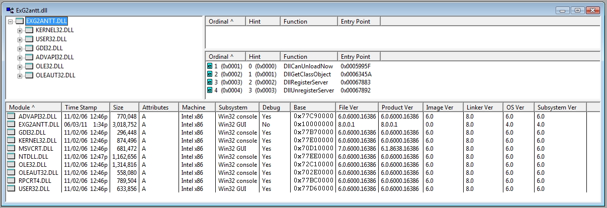
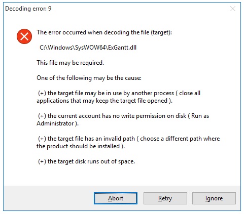


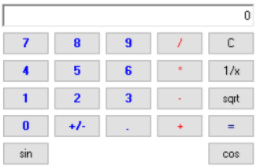
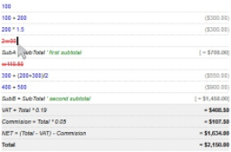
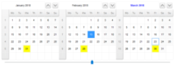
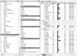
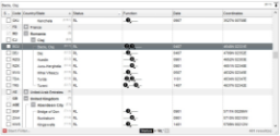
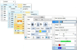
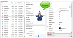
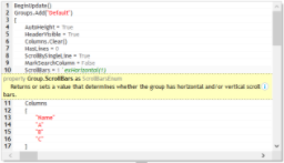
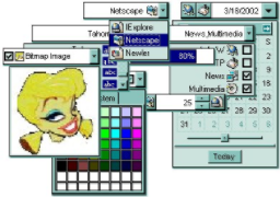
 ExEMail is an email component that enables applications to support full mail and file attachment transfers, providing SMTP RFC-compliant functionality with support for binary MIME attachments, HTML email, and SMTP authentication, and it does not require external email clients such as Outlook, Outlook Express, or Exchange to be installed.
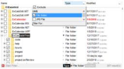
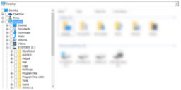
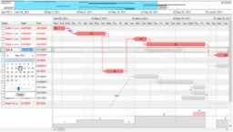
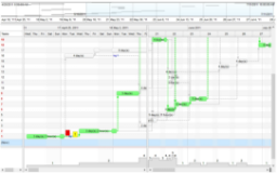
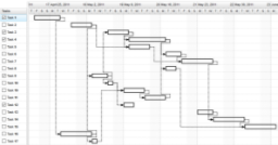
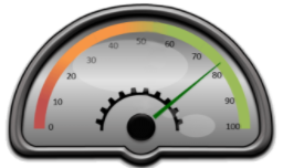

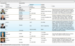
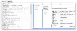
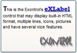
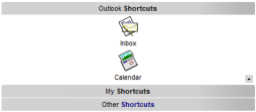
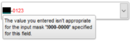
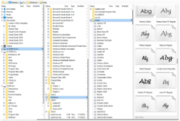
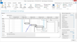
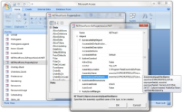
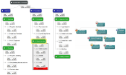
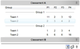
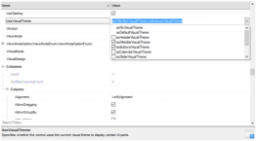
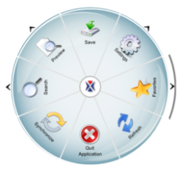
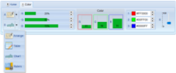
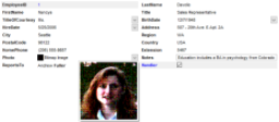
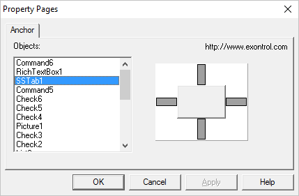
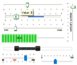
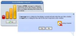

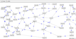
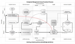
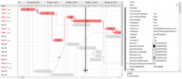
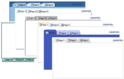
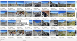
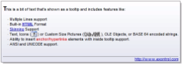
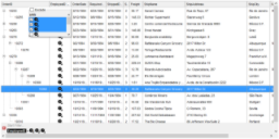
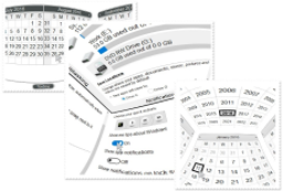
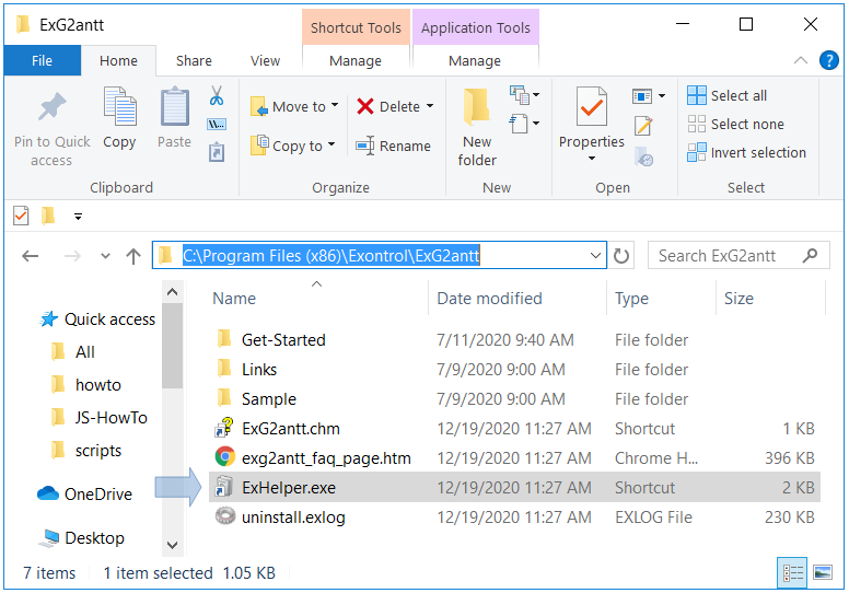
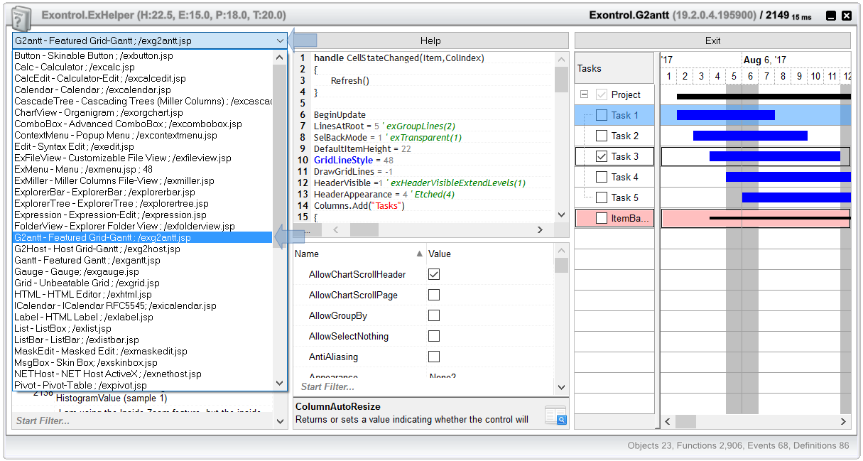
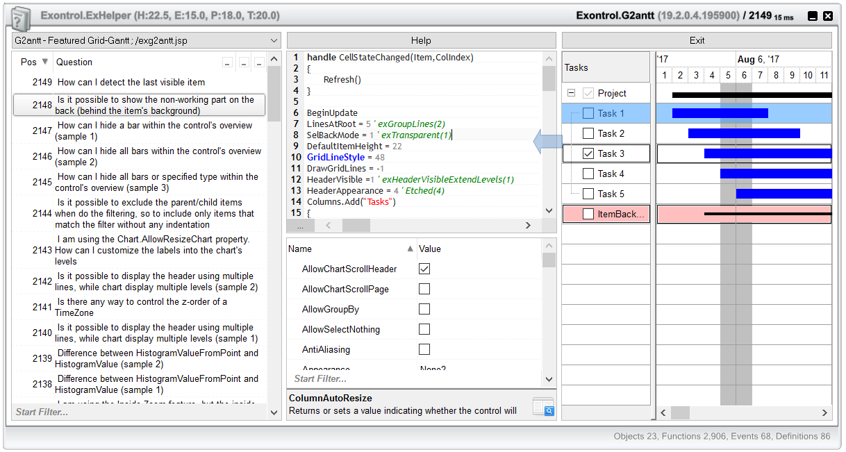
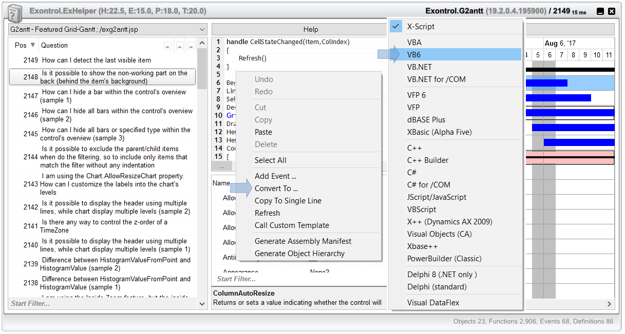
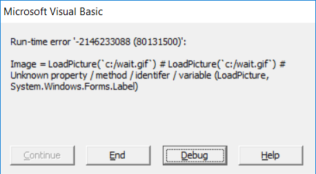
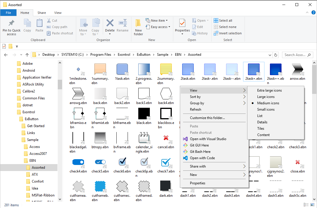
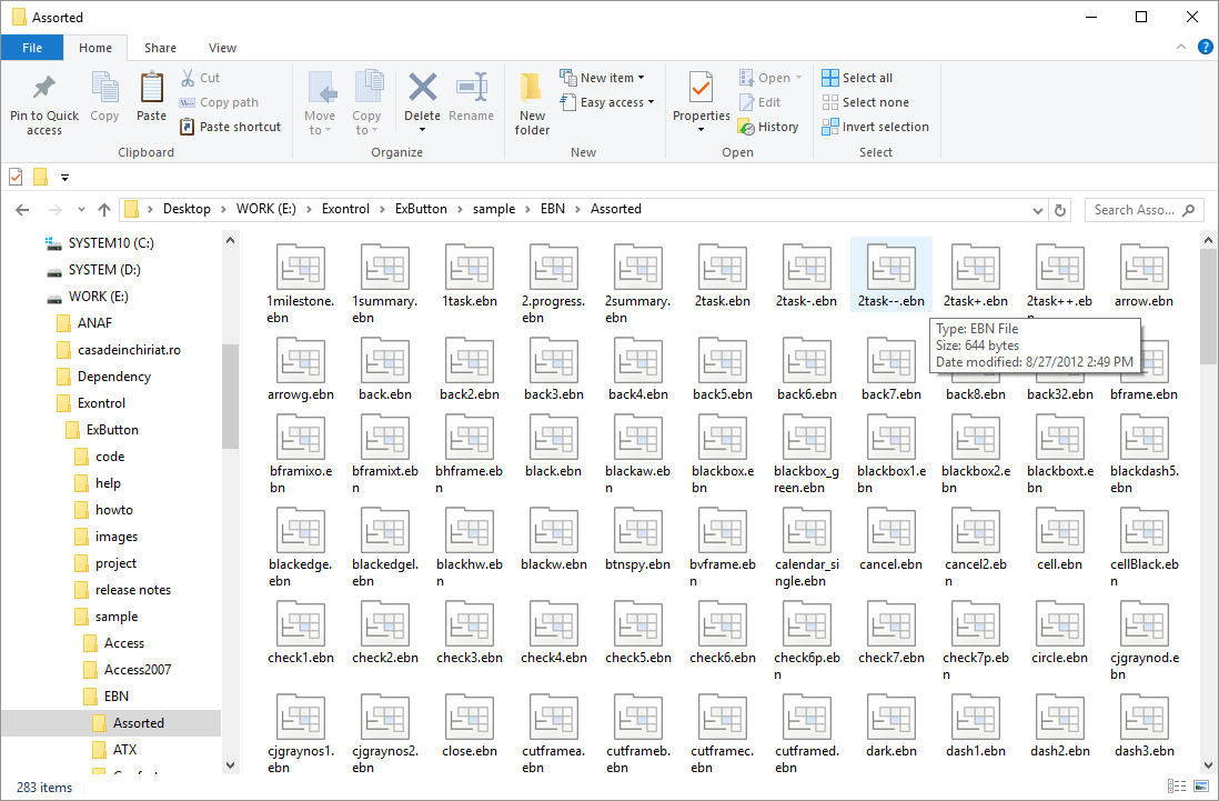
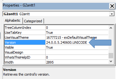
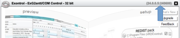
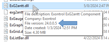
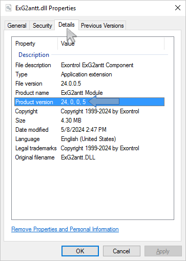
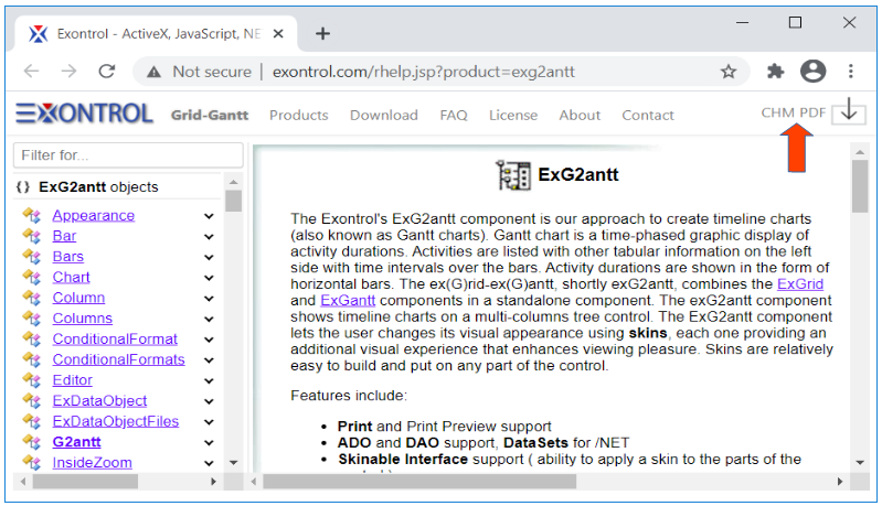
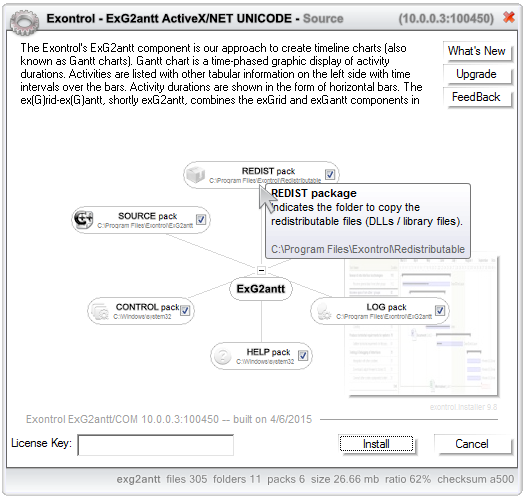
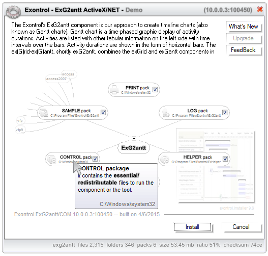
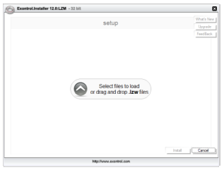
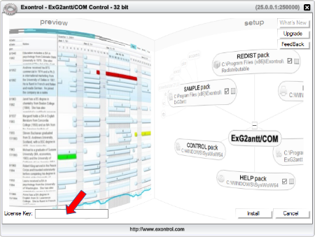


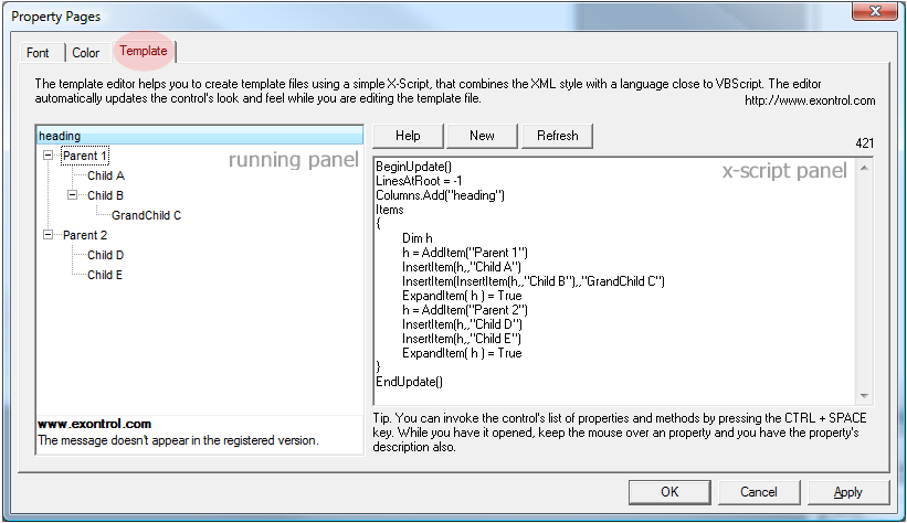


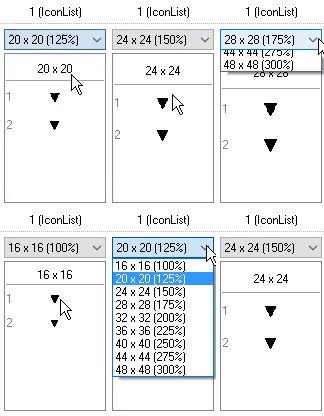
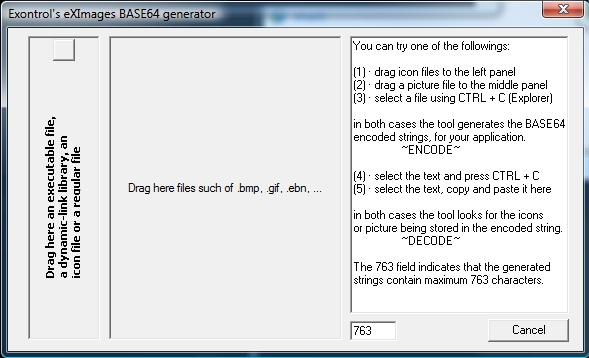
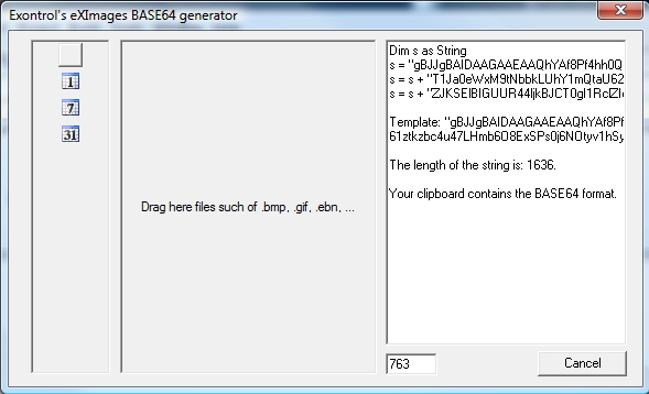
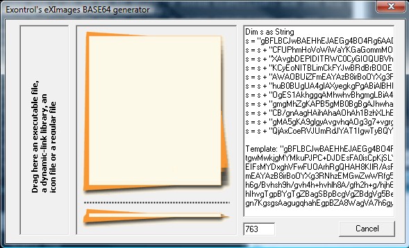
 . If you hover the cursor over the Load 64 Button its tooltip says: "Load
from the clipboard a ..."
. If you hover the cursor over the Load 64 Button its tooltip says: "Load
from the clipboard a ..." .
.
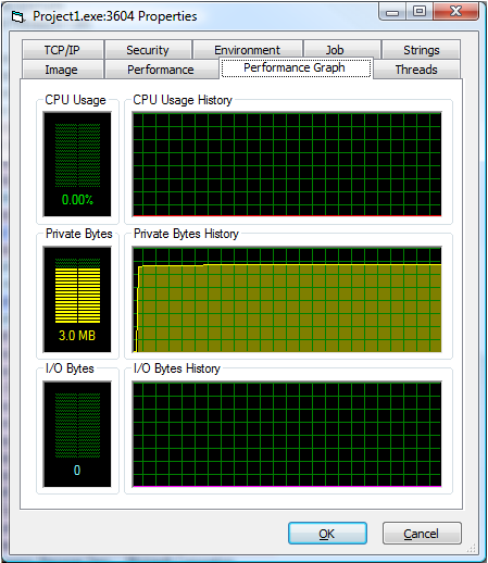
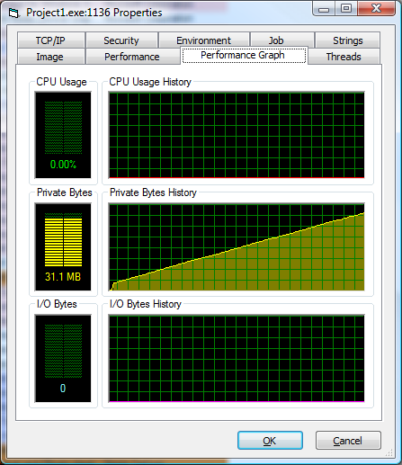
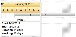
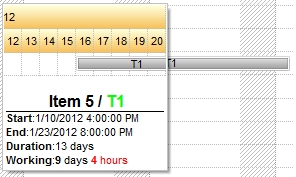
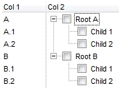
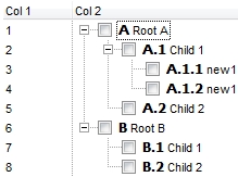





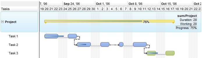
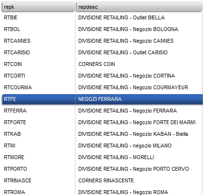
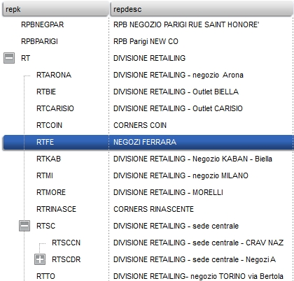
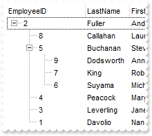
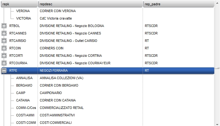
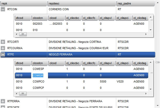
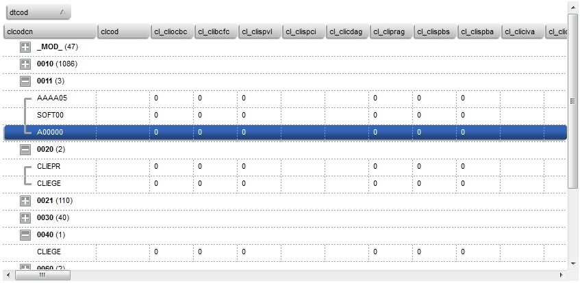
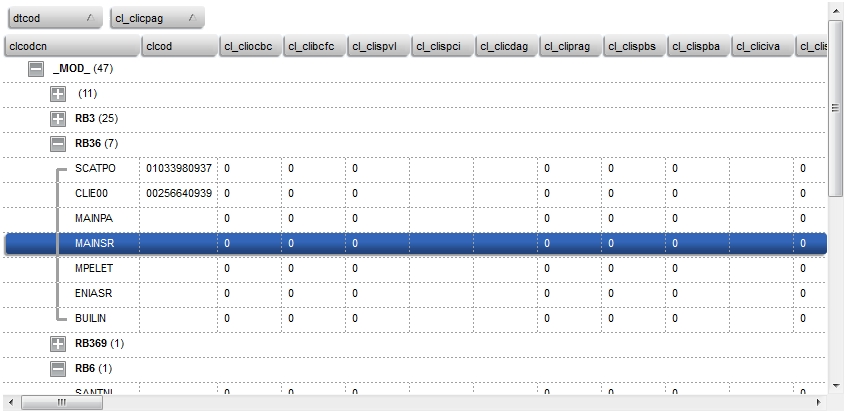
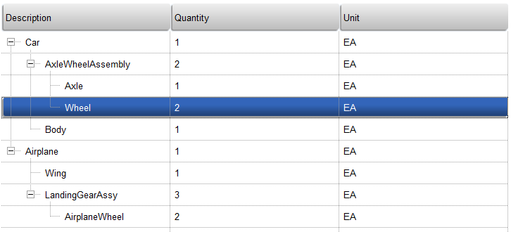
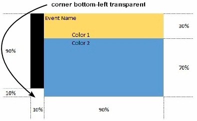
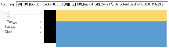
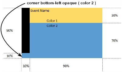
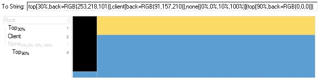

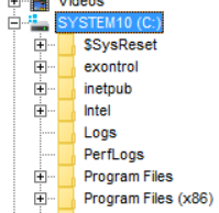 compared with