-

-
Products
-
COM Components
- Suite ExSuite is a complete developer solution offering a suite of UI components including combo, list, tree, grid, Gantt, gauge, and chart controls for advanced data visualization and application development.
- Agent ExDialog is a UI control that enables adding interactive dialog elements and images to applications or websites, enhancing user experience with customizable visual personalities.
- Button ExButton is an advanced Windows button control offering customizable skins, HTML captions, transparent graphics, a WYSIWYG skin builder, and complete visual control.
- CalcEdit ExCalcEdit is a calculator edit control for real-time arithmetic expression evaluation, instant calculation results, and enhanced data entry within software applications.
- Calculator ExCalc is a calculator component that provides arithmetic operations, customizable layouts, user-defined functions, and flat or drop-down calculator controls for seamless application integration.
- Calendar ExCalendar is a customizable calendar and date picker component featuring intuitive date selection, visual customization, tooltips, image support, and flexible date range handling.
- CascadeTree ExCascadeTree is a Miller Columns tree view component for visualizing hierarchical data, offering cascading lists, multi-column navigation, and efficient data exploration.
- ComboBox ExComboBox is an advanced combo box component combining a drop-down list and a single-line text box, allowing users to type a value or select from existing options.
- ContextMenu ExContextMenu is a GUI context menu component providing popup, shortcut, and right-click menus for fast access to context-specific commands and improved application usability.
- DataView ExRecord is a container control that displays a set of editors either manually defined or bound to database tables, enabling structured data entry and management.
- Edit ExEdit is an easy-to-use edit control with built-in HTML-like formatting and syntax highlighting, supporting custom tags for keywords and expressions for flexible text editing in applications.
- ExplorerBar ExplorerBar is a navigation component that reproduces the Windows XP Explorer Bar, designed for presenting large amounts of information with an intuitive interface and rich object model.
- ExplorerTree ExplorerTree is a navigation tree component that adds structured information browsing and easy navigation capabilities to applications for improved user interface organization.
- Expression Expression is a syntax editor component for defining, viewing, editing, and evaluating expressions within applications, enabling flexible expression handling and processing.
- FileView ExFileView is a file and folder view component that provides Windows Explorer-style functionality for displaying rich directory information and simulating a FolderView control within applications.
- FolderView ExFolderView is a folder tree-list view component that replicates the Windows Explorer left pane, providing hierarchical folder navigation and directory browsing within applications.
- Gantt ExGantt is a Gantt chart component for creating timeline and project scheduling visualizations, displaying activity durations as horizontal bars alongside tabular task information with customizable skins.
- Gauge ExGauge is a graphical component library for visually displaying and editing values such as levels or quantities using multi-layer views with interactive images and HTML captions.
- Graph ExGraph is a data visualization component supporting multiple chart types including line and radar charts, with printing and print preview capabilities and customizable skins for enhanced visual presentation.
- Grid ExGrid is a tree-grid component that combines grid, tree, and list views with data-bound or unbound support, offering flexible data visualization and advanced formatting features for modern application interfaces.
- Grid-Gantt ExG2antt is an editable tree-grid component with integrated Gantt chart functionality, combining grid and Gantt features in a single control with customizable skins for enhanced visualization and user experience.
- Grid-Gantt (Host) ExG2Host is a Grid-Gantt extension component with full database support (ADO, DAO, XML), enabling automatic loading and saving of hierarchical data and layout persistence for seamless data binding and synchronization.
- HTML ExHTML is a built-in HTML display and editing engine that enables rendering and editing of HTML-like content without relying on Internet Explorer, providing flexible UI layout management for text, controls, and graphics.
- ICalendar ExICalendar is a component library implementing the iCalendar data format (RFC 5545), enabling exchange of calendaring and scheduling information such as events, tasks, and free/busy data between applications.
- Label ExLabel is an HTML label component for forms and dialogs, enabling rich text display within application user interfaces.
- List ExList is an advanced list control for displaying and editing tabular data, offering customizable skins for enhanced visual appearance and flexible UI presentation.
- ListBar ExListBar is a navigation bar component modeled after Microsoft Outlook Bar, designed for displaying large amounts of information with horizontal or vertical orientation and an intuitive object model.
- MaskEdit ExMaskEdit is a masked edit control that enforces structured data entry in input fields, helping ensure consistent formatting for values such as phone numbers, dates, and other structured data.
- Menu ExMenu is a versatile menu component that simulates menu bars, popup menus, toolbars, option buttons, and pick lists, providing flexible UI navigation and interaction for applications.
- Miller ExMiller is a file and folder view component that uses Miller Columns visualization to display system directories and files in a cascading list structure for efficient navigation.
- NETHost ExNETHost is a component that enables embedding .NET Windows Forms user controls into COM-based applications, forms, and dialogs for seamless UI integration.
- OrgChart ExOrgChart is an organizational chart component for automatic generation of hierarchy diagrams, displaying nodes with HTML captions, icons, and images for clear visualization of structures and relationships.
- Pivot ExPivot is a pivot table tool for data summarization, enabling automatic sorting, counting, totaling, and averaging of tabular data with drag-and-drop field configuration.
- PopupMenu ExPopupMenu is a popup and menu bar component that enables shortcut menus, window menus, and menu buttons with a WYSIWYG editor for intuitive menu creation.
- Print ExPrint is an advanced printing component that adds print and print preview capabilities to user interfaces, enabling rendering of forms, dialogs, and UI controls such as grids, trees, lists, and calendars.
- PropertiesList ExPropertiesList is a properties grid control similar to Visual Studio's property editor, designed for efficient data input and compact, intuitive user interface property management.
- RadialMenu ExRadialMenu is a radial (pie) menu component inspired by Microsoft OneNote, offering customizable appearance and functionality through a tree-structured organization of tools and tool collections.
- Ribbon ExRibbon is a ribbon-style UI component similar to Microsoft Office Fluent interface, displaying graphical controls organized into tabbed toolbars for improved application navigation and usability.
- RolList ExRolList is an innovative list control that displays items on an elliptical shape, rotating content to keep items visible without traditional scrolling for a unique user interface experience.
- Scheduler ExSchedule is a scheduling component that enables appointment management and scheduling functionality within applications, providing structured planning and calendar-based organization.
- ScrollBar ExScrollBar is a customizable scrollbar component that simulates vertical and horizontal scrollbars, sliders, tracks, volume controls, and gauge interfaces for application UI design.
- ShellView ExShellView is a file list view component that replicates the Windows Explorer right pane, providing detailed shell-based file browsing within applications.
- SkinBox ExSkinBox is a skinnable message and input box component that supports HTML-formatted content and custom images for enhanced dialog presentation.
- Slider ExSlider is a skinnable slider component for forms and dialogs, enabling customizable slider controls for selecting values within applications.
- SplitBar ExSplitBar is a splitter component that enables dynamic resizing of docked controls by dragging a split bar between panels in horizontal or vertical layouts.
- StatusBar ExStatusBar is a fully customizable status bar component featuring CRD-based layout, skinning, HTML support, tooltips, icons, owner draw, and progress bar capabilities for rich application interfaces.
- Surface ExSurface is a visual layout component for organizing objects on a surface to create organigrams, diagrams, graphs, flowcharts, and other structured visual representations.
- Swimlane ExSwimLane is a swim lane diagram component for creating process flow visualizations that define roles, responsibilities, and workflows in horizontal or vertical layouts.
- Tab ExTab is a skin-based tab control for organizing interface content using tabs, similar to notebook dividers or file cabinet labels, enabling structured navigation within applications.
- Thumbnail ExThumbnail is a thumbnail view component that displays reduced-size previews of files and images, making it easier to browse and recognize visual content in applications.
- ToolBar ExToolBar is a customizable toolbar component that organizes buttons, icons, dropdowns, and editors into rows or columns, enabling quick access to application functions with skin-based appearance customization.
- ToolTip ExToolTip is a tooltip component that provides enhanced tooltip functionality for applications, displaying contextual information when users hover over interface elements.
- Tree ExTree is an advanced tree view component supporting single and multi-column tree structures, list, and listview modes for flexible hierarchical data display in applications.
- TreeCube ExTreeCube is a visualization library that provides fisheye and cube-map representations for components such as calendars and multi-column tree views, enhancing data exploration.
- XMLGrid ExXMLGrid is an XML-style grid and tree view component that provides high-performance data visualization with advanced formatting features and customizable skins for enhanced UI appearance.
-
NET Components
- Suite ExSuite/NET is a complete developer solution offering a suite of UI components including combo, list, tree, grid, Gantt, gauge, and chart controls for advanced data visualization and application development.
- Agent ExDialog/NET is a UI control that enables adding interactive dialog elements and images to applications or websites, enhancing user experience with customizable visual personalities.
- Button ExButton/NET is an advanced Windows button control offering customizable skins, HTML captions, transparent graphics, a WYSIWYG skin builder, and complete visual control.
- CalcEdit ExCalcEdit/NET is a calculator edit control for real-time arithmetic expression evaluation, instant calculation results, and enhanced data entry within software applications.
- Calculator ExCalc/NET is a calculator component that provides arithmetic operations, customizable layouts, user-defined functions, and flat or drop-down calculator controls for seamless application integration.
- Calendar ExCalendar/NET is a customizable calendar and date picker component featuring intuitive date selection, visual customization, tooltips, image support, and flexible date range handling.
- CascadeTree ExCascadeTree/NET is a Miller Columns tree view component for visualizing hierarchical data, offering cascading lists, multi-column navigation, and efficient data exploration.
- ComboBox ExComboBox/NET is an advanced combo box component combining a drop-down list and a single-line text box, allowing users to type a value or select from existing options.
- ContextMenu ExContextMenu/NET is a GUI context menu component providing popup, shortcut, and right-click menus for fast access to context-specific commands and improved application usability.
- DataView ExRecord/NET is a container control that displays a set of editors either manually defined or bound to database tables, enabling structured data entry and management.
- Edit ExEdit/NET is an easy-to-use edit control with built-in HTML-like formatting and syntax highlighting, supporting custom tags for keywords and expressions for flexible text editing in applications.
- ExplorerBar ExplorerBar/NET is a navigation component that reproduces the Windows XP Explorer Bar, designed for presenting large amounts of information with an intuitive interface and rich object model.
- ExplorerTree ExplorerTree/NET is a navigation tree component that adds structured information browsing and easy navigation capabilities to applications for improved user interface organization.
- Expression Expression/NET is a syntax editor component for defining, viewing, editing, and evaluating expressions within applications, enabling flexible expression handling and processing.
- FileView ExFileView/NET is a file and folder view component that provides Windows Explorer-style functionality for displaying rich directory information and simulating a FolderView control within applications.
- FolderView ExFolderView/NET is a folder tree-list view component that replicates the Windows Explorer left pane, providing hierarchical folder navigation and directory browsing within applications.
- Gantt ExGantt/NET is a Gantt chart component for creating timeline and project scheduling visualizations, displaying activity durations as horizontal bars alongside tabular task information with customizable skins.
- Gauge ExGauge/NET is a graphical component library for visually displaying and editing values such as levels or quantities using multi-layer views with interactive images and HTML captions.
- Graph ExGraph/NET is a data visualization component supporting multiple chart types including line and radar charts, with printing and print preview capabilities and customizable skins for enhanced visual presentation.
- Grid ExGrid/NET is a tree-grid component that combines grid, tree, and list views with data-bound or unbound support, offering flexible data visualization and advanced formatting features for modern application interfaces.
- Grid-Gantt ExG2antt/NET is an editable tree-grid component with integrated Gantt chart functionality, combining grid and Gantt features in a single control with customizable skins for enhanced visualization and user experience.
- HTML ExHTML/NET is a built-in HTML display and editing engine that enables rendering and editing of HTML-like content without relying on Internet Explorer, providing flexible UI layout management for text, controls, and graphics.
- ICalendar ExICalendar/NET is a component library implementing the iCalendar data format (RFC 5545), enabling exchange of calendaring and scheduling information such as events, tasks, and free/busy data between applications.
- Label ExLabel/NET is an HTML label component for forms and dialogs, enabling rich text display within application user interfaces.
- List ExList/NET is an advanced list control for displaying and editing tabular data, offering customizable skins for enhanced visual appearance and flexible UI presentation.
- ListBar ExListBar/NET is a navigation bar component modeled after Microsoft Outlook Bar, designed for displaying large amounts of information with horizontal or vertical orientation and an intuitive object model.
- MaskEdit ExMaskEdit/NET is a masked edit control that enforces structured data entry in input fields, helping ensure consistent formatting for values such as phone numbers, dates, and other structured data.
- Miller ExMiller/NET is a file and folder view component that uses Miller Columns visualization to display system directories and files in a cascading list structure for efficient navigation.
- NETHost ExNETHost/NET is a component that enables embedding .NET Windows Forms user controls into COM-based applications, forms, and dialogs for seamless UI integration.
- OrgChart ExOrgChart/NET is an organizational chart component for automatic generation of hierarchy diagrams, displaying nodes with HTML captions, icons, and images for clear visualization of structures and relationships.
- Pivot ExPivot/NET is a pivot table tool for data summarization, enabling automatic sorting, counting, totaling, and averaging of tabular data with drag-and-drop field configuration.
- Print ExPrint/NET is an advanced printing component that adds print and print preview capabilities to user interfaces, enabling rendering of forms, dialogs, and UI controls such as grids, trees, lists, and calendars.
- PropertiesList ExPropertiesList/NET is a properties grid control similar to Visual Studio's property editor, designed for efficient data input and compact, intuitive user interface property management.
- RadialMenu ExRadialMenu/NET is a radial (pie) menu component inspired by Microsoft OneNote, offering customizable appearance and functionality through a tree-structured organization of tools and tool collections.
- Ribbon ExRibbon/NET is a ribbon-style UI component similar to Microsoft Office Fluent interface, displaying graphical controls organized into tabbed toolbars for improved application navigation and usability.
- Scheduler ExSchedule/NET is a scheduling component that enables appointment management and scheduling functionality within applications, providing structured planning and calendar-based organization.
- ScrollBar ExScrollBar/NET is a customizable scrollbar component that simulates vertical and horizontal scrollbars, sliders, tracks, volume controls, and gauge interfaces for application UI design.
- ShellView ExShellView/NET is a file list view component that replicates the Windows Explorer right pane, providing detailed shell-based file browsing within applications.
- SkinBox ExSkinBox/NET is a skinnable message and input box component that supports HTML-formatted content and custom images for enhanced dialog presentation.
- Slider ExSlider/NET is a skinnable slider component for forms and dialogs, enabling customizable slider controls for selecting values within applications.
- SplitBar ExSplitBar/NET is a splitter component that enables dynamic resizing of docked controls by dragging a split bar between panels in horizontal or vertical layouts.
- StatusBar ExStatusBar/NET is a fully customizable status bar component featuring CRD-based layout, skinning, HTML support, tooltips, icons, owner draw, and progress bar capabilities for rich application interfaces.
- Surface ExSurface/NET is a visual layout component for organizing objects on a surface to create organigrams, diagrams, graphs, flowcharts, and other structured visual representations.
- Swimlane ExSwimlane/NET is a swim lane diagram component for creating process flow visualizations that define roles, responsibilities, and workflows in horizontal or vertical layouts.
- Tab ExTab/NET is a skin-based tab control for organizing interface content using tabs, similar to notebook dividers or file cabinet labels, enabling structured navigation within applications.
- Thumbnail ExThumbnail/NET is a thumbnail view component that displays reduced-size previews of files and images, making it easier to browse and recognize visual content in applications.
- ToolBar ExToolbar/NET is a customizable toolbar component that organizes buttons, icons, dropdowns, and editors into rows or columns, enabling quick access to application functions with skin-based appearance customization.
- ToolTip ExTooltip/NET is a tooltip component that provides enhanced tooltip functionality for applications, displaying contextual information when users hover over interface elements.
- Tree ExTree/NET is an advanced tree view component supporting single and multi-column tree structures, list, and listview modes for flexible hierarchical data display in applications.
- TreeCube ExTreeCube/NET is a visualization library that provides fisheye and cube-map representations for components such as calendars and multi-column tree views, enhancing data exploration.
- XMLGrid ExXMLGrid is an XML-style grid and tree view component that provides high-performance data visualization with advanced formatting features and customizable skins for enhanced UI appearance.
-
WPF Components
- Suite ExSuite/WPF is a complete developer solution offering a suite of UI components including combo, list, tree, grid, Gantt, gauge, and chart controls for advanced data visualization and application development.
- CalcEdit ExCalcEdit/WPF is a calculator edit control for real-time arithmetic expression evaluation, instant calculation results, and enhanced data entry within software applications.
- Calendar ExCalendar/WPF is a customizable calendar and date picker component featuring intuitive date selection, visual customization, tooltips, image support, and flexible date range handling.
- CascadeTree ExCascadeTree/WPF is a Miller Columns tree view component for visualizing hierarchical data, offering cascading lists, multi-column navigation, and efficient data exploration.
- ComboBox ExComboBox/WPF is an advanced combo box component combining a drop-down list and a single-line text box, allowing users to type a value or select from existing options.
- ContextMenu ExContextMenu/WPF is a GUI context menu component providing popup, shortcut, and right-click menus for fast access to context-specific commands and improved application usability.
- Edit ExEdit/WPF is an easy-to-use edit control with built-in HTML-like formatting and syntax highlighting, supporting custom tags for keywords and expressions for flexible text editing in applications.
- ExplorerBar ExplorerBar/WPF is a navigation component that reproduces the Windows XP Explorer Bar, designed for presenting large amounts of information with an intuitive interface and rich object model.
- ExplorerTree ExplorerTree/WPF is a navigation tree component that adds structured information browsing and easy navigation capabilities to applications for improved user interface organization.
- Expression Expression/WPF is a syntax editor component for defining, viewing, editing, and evaluating expressions within applications, enabling flexible expression handling and processing.
- FileView ExFileView/WPF is a file and folder view component that provides Windows Explorer-style functionality for displaying rich directory information and simulating a FolderView control within applications.
- Gantt ExGantt/WPF is a Gantt chart component for creating timeline and project scheduling visualizations, displaying activity durations as horizontal bars alongside tabular task information with customizable skins.
- Gauge ExGauge/WPF is a graphical component library for visually displaying and editing values such as levels or quantities using multi-layer views with interactive images and HTML captions.
- Graph ExGraph/WPF is a data visualization component supporting multiple chart types including line and radar charts, with printing and print preview capabilities and customizable skins for enhanced visual presentation.
- Grid ExGrid/WPF is a tree-grid component that combines grid, tree, and list views with data-bound or unbound support, offering flexible data visualization and advanced formatting features for modern application interfaces.
- Grid-Gantt ExG2antt/WPF is an editable tree-grid component with integrated Gantt chart functionality, combining grid and Gantt features in a single control with customizable skins for enhanced visualization and user experience.
- HTML ExHTML/WPF is a built-in HTML display and editing engine that enables rendering and editing of HTML-like content without relying on Internet Explorer, providing flexible UI layout management for text, controls, and graphics.
- List ExList/WPF is an advanced list control for displaying and editing tabular data, offering customizable skins for enhanced visual appearance and flexible UI presentation.
- ListBar ExListBar/WPF is a navigation bar component modeled after Microsoft Outlook Bar, designed for displaying large amounts of information with horizontal or vertical orientation and an intuitive object model.
- Miller ExMiller/WPF is a file and folder view component that uses Miller Columns visualization to display system directories and files in a cascading list structure for efficient navigation.
- OrgChart ExOrgChart/WPF is an organizational chart component for automatic generation of hierarchy diagrams, displaying nodes with HTML captions, icons, and images for clear visualization of structures and relationships.
- Pivot ExPivot/WPF is a pivot table tool for data summarization, enabling automatic sorting, counting, totaling, and averaging of tabular data with drag-and-drop field configuration.
- PropertiesList ExPropertiesList/WPF is a properties grid control similar to Visual Studio's property editor, designed for efficient data input and compact, intuitive user interface property management.
- RadialMenu ExRadialMenu/WPF is a radial (pie) menu component inspired by Microsoft OneNote, offering customizable appearance and functionality through a tree-structured organization of tools and tool collections.
- Ribbon ExRibbon/WPF is a ribbon-style UI component similar to Microsoft Office Fluent interface, displaying graphical controls organized into tabbed toolbars for improved application navigation and usability.
- Scheduler ExSchedule/WPF is a scheduling component that enables appointment management and scheduling functionality within applications, providing structured planning and calendar-based organization.
- Surface ExSurface/WPF is a visual layout component for organizing objects on a surface to create organigrams, diagrams, graphs, flowcharts, and other structured visual representations.
- Swimlane ExSwimlane/WPF is a swim lane diagram component for creating process flow visualizations that define roles, responsibilities, and workflows in horizontal or vertical layouts.
- Thumbnail ExThumbnail/WPF is a thumbnail view component that displays reduced-size previews of files and images, making it easier to browse and recognize visual content in applications.
- ToolBar ExToolbar/WPF is a customizable toolbar component that organizes buttons, icons, dropdowns, and editors into rows or columns, enabling quick access to application functions with skin-based appearance customization.
- Tree ExTree/WPF is an advanced tree view component supporting single and multi-column tree structures, list, and listview modes for flexible hierarchical data display in applications.
- TreeCube ExTreeCube/WPF is a visualization library that provides fisheye and cube-map representations for components such as calendars and multi-column tree views, enhancing data exploration.
- XMLGrid ExXMLGrid is an XML-style grid and tree view component that provides high-performance data visualization with advanced formatting features and customizable skins for enhanced UI appearance.
-
JS Components
- Calendar ExCalendar/JS is a customizable calendar and date picker component featuring intuitive date selection, visual customization, tooltips, image support, and flexible date range handling.
- ComboBox ExComboBox/JS is an advanced combo box component combining a drop-down list and a single-line text box, allowing users to type a value or select from existing options.
- Gantt ExGantt/JS is a Gantt chart component for creating timeline and project scheduling visualizations, displaying activity durations as horizontal bars alongside tabular task information with customizable skins.
- Gauge ExGauge/JS is a graphical component library for visually displaying and editing values such as levels or quantities using multi-layer views with interactive images and HTML captions.
- Graph ExGraph/JS is a data visualization component supporting multiple chart types including line and radar charts, with printing and print preview capabilities and customizable skins for enhanced visual presentation.
- ICalendar ExICalendar/JS is a component library implementing the iCalendar data format (RFC 5545), enabling exchange of calendaring and scheduling information such as events, tasks, and free/busy data between applications.
- Menu ExMenu/JS is a versatile menu component that simulates menu bars, popup menus, toolbars, option buttons, and pick lists, providing flexible UI navigation and interaction for applications.
- OrgChart ExOrgChart/JS is an organizational chart component for automatic generation of hierarchy diagrams, displaying nodes with HTML captions, icons, and images for clear visualization of structures and relationships.
- Pivot ExPivot/JS is a pivot table tool for data summarization, enabling automatic sorting, counting, totaling, and averaging of tabular data with drag-and-drop field configuration.
- RadialMenu ExRadialMenu/JS is a radial (pie) menu component inspired by Microsoft OneNote, offering customizable appearance and functionality through a tree-structured organization of tools and tool collections.
- Rollist ExRollist/JS is an innovative list control that displays items on an elliptical shape, rotating content to keep items visible without traditional scrolling for a unique user interface experience.
- Scheduler ExSchedule/JS is a scheduling component that enables appointment management and scheduling functionality within applications, providing structured planning and calendar-based organization.
- ScrollBar ExScrollBar/JS is a customizable scrollbar component that simulates vertical and horizontal scrollbars, sliders, tracks, volume controls, and gauge interfaces for application UI design.
- Surface ExSurface/JS is a visual layout component for organizing objects on a surface to create organigrams, diagrams, graphs, flowcharts, and other structured visual representations.
- Swimlane ExSwimlane/JS is a swim lane diagram component for creating process flow visualizations that define roles, responsibilities, and workflows in horizontal or vertical layouts.
- Tree ExTree/JS is an advanced tree view component supporting single and multi-column tree structures, list, and listview modes for flexible hierarchical data display in applications.
-
Tools
- ExHelper (how to tool) ExHelper is a developer tool that helps quickly find answers and source code examples for UI component usage, while allowing real-time code editing and instant result preview.
- ExInstaller (installer/uninstaller tool) ExInstaller is a software installation component and API used for installing, maintaining, and removing software products through packaged installation files.
- ExImages (BASE64 tool) ExImages is a Base64 encoder and decoder tool for converting images, icons, and picture files into Base64 strings for use in visual appearance and HTML image methods.
- ExEBN (skinning tool) ExEBN is a tool for viewing, creating, and editing EBN files, enabling management of UI element structures organized as hierarchical trees of parent and child elements.
- ExETB (skinning tool for eXTab) ExETB is a tool for viewing, creating, and editing ETB files used for defining skins for the ExTab component, where UI elements are structured in a hierarchical tree of parent and child relationships.
- ExCRD (layout tool) ExCRD (Exontrol Custom Row Designer) is a WYSIWYG layout design tool for creating custom cell, row, node, and column structures, generating CRD strings for flexible and readable UI layout definitions.
-
COM Components
- Download↓
-
FAQ
- General
- ABL - OpenEdge
- AutoIt - AutoItScript
- ASP.NET
- C++
- C++ Builder
- CICODE (Citect SCADA)
- Clarion
- DBASE Plus
- Delphi
- JavaScript (JS)
- JScript (/COM IE)
- LABView - National Instruments
- Microsoft Dynamics 365
- Microsoft Dynamics Ax - Axapta (X++)
- Microsoft Dynamics NAV (C/AL)
- Microsoft Office - Access/Excel/Word
- NET Framework (C#, VB/NET)
- PowerBuilder
- VB (VB6, VBA)
- VBScript
- VFP
- Visual DataFlex (Data Access)
- WPF
- Xbase++
- Get Started
- Testimonials
- Gallery
- General
- Contact
❮
❯
Improved Coding Experience with ExHelper/JS:
Easy Hierarchy Editing with Undo and Redo Support:
PDF Scaling Options, such as page-fit ([w] x [h]) and percentage (p%):
Graph availability for the eXPivot/JS version:
The following video demonstrates how eXGraph adds graphical functionality to eXPivot:
|
changes and additions for 2023, so far |
| Dec-21-2023 |
ExSuite/JS, 2.5 *NEW: ExGraph/JS is a component that offers excellent graphical data visualization. It has many different types and styles of charts. Easy to use, zoom, resize, scroll, overview, legend, cursor view, owner-draw, numerous chart types to different axes in the same view, multiple views, and much more are features of the ExGraph/JS package. The ExGraph/JS is a HTML standalone-component, written in JavaScript, that uses no third-party libraries. *Added: exontrol.D.P.PieRing defines the pie-ring primitive (slice of doughnut). The PieRing primitive requires startAngle (defines the angle (radians) to start the pie), sweepAngle (specifies the sweep angle in radians relative to the starting angle) and width(Specifies the width of the ring (if 0 the method defines an arc, if deep enough it defines a pie of an ellipse) (exontrol.common) *Fixed: Sometimes after horizontal and vertical scroll bars are shown both, they are continuously shown or hidden (exontrol.common) *Fixed: The alpha field of the rgba() syntax shows too many decimals (exontrol.C.C2S method) (exontrol.common) *Fixed: Rarely, the curved lines goes through (0,0) even if the range of points are not close to origin (exontrol.common) *Fixed: The properties of enum type may lock indefinitely the application if using integers instead of literals. For instance, scrollBars: "min,3" should translate to exBoth,exMinSBS, instead the app freezes (exontrol.common) *Fixed: Improves performances for methods of the exontrol.C(olor) and exontrol.S(hape) namespaces (exontrol.common) *Fixed: The 1-pixel frame-wide rectangle look thicker (exontrol.patch) *Fixed: Shows bezier/spline curves smoother (exontrol.bezier) *Fixed: The scrollBarsHome/ScrollBarsHome/SetScrollBarsHome(value) property/method has no effect (exontrol.surface) *Fixed: Prevents showing the resizing cursor over the margins of the overview-selection, while control's Locked property is true (exontrol.gantt) |
|
The following movie shows the first look of the newly eXGraph/JS component: 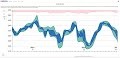 ExGraph/JS is a component that offers excellent graphical data visualization. It has many different types and styles of charts. Easy to use, zoom, resize, scroll, overview, legend, cursor view, owner-draw, numerous chart types to different axes in the same view, multiple views, and much more are features of the ExGraph/JS package. The ExGraph/JS is a HTML standalone-component, written in JavaScript, that uses no third-party libraries. The version of eXGraph for /COM, /NET and /WPF will be available in the near future.
|
|
| Dec-20-2023 |
ExG2antt, 23.0.0.6 *Fixed: Sometimes, the start/end time of the bar being moved by drag and drop may change, if the Items.ItemBar(exBarKeepWorkingCount) property is True *Fixed: The cell shows as unselected once the user selects a new option from the cell's drop down editor (while using the ENTER key, DropDownListType editor) *Fixed: Editor.AddItem(value,vbNullString,image) method fails |
|
ExScrollBar, 21.0.0.3 *Fixed: A GPF may occur on closing the form/window/dialog if one or more events are handled by AttachTemplate method *Fixed: The AttachTemplate method fails if using "handle" keyword on x64 version *Fixed: The expropertieslist/com fails if the user is trying to spy the control (x64 version only, AllowSpy property, browses the object by drag and drop) |
|
| Dec-18-2023 |
ExStatusBar, 17.0.0.1 *Added: Update the samples to support x64 configuration (/COM version) *Fixed: The AttachTemplate method fails if using "handle" keyword on x64 version *Fixed: The expropertieslist/com fails if the user is trying to spy the control (x64 version only, AllowSpy property, browses the object by drag and drop) |
|
ExTreeCube, 18.0.0.2 *Fixed: No control frame is shown in design-mode under MS Excel's spreadsheet *Fixed: The AttachTemplate method fails if using "handle" keyword on x64 version *Fixed: The expropertieslist/com fails if the user is trying to spy the control (x64 version only, AllowSpy property, browses the object by drag and drop) |
|
| Dec-13-2023 |
ExButton, 22.0.0.3 *Added: The control's tooltip is shown when the cursor hovers it no matter if the window that hosts the control is activated *Added: The <solidline> and <dotline> HTML tags support color in RGB format using the <solidline RRGGBB> or <dotline RRGGBB> syntax, which indicates the color to show the solid or dotted line *Fixed: The expropertieslist/com fails if the user is trying to spy the control (x64 version only, AllowSpy property, browses the object by drag and drop) |
|
ExRadialMenu, 17.0.0.4 *Added: The <solidline> and <dotline> HTML tags support color in RGB format using the <solidline RRGGBB> or <dotline RRGGBB> syntax, which indicates the color to show the solid or dotted line *Added: The `format` operator of expression properties supports formatting the date values, using d, dd, ddd, ddd (day of the month as digits, with or without leading zeros, abbreviated day of the week, day of the week as specified by the current locale ), m, mm, mmm, mmmm (month as digits, with or without leading zeros, abbreviated month, month as specified by the current locale), y, yy, yyy, yyyy (year represented only by the last digits, by a full four or five digits, depending on the calendar used) literals. For instance, the "date(value) format `mmm d, yyyy`" gets the value in MMM d, YYYY format using the current locale, such as "Jan 12, 2023" *Fixed: The expropertieslist/com fails if the user is trying to spy the control (x64 version only, AllowSpy property, browses the object by drag and drop) |
|
| Dec-11-2023 |
ExGrid, 18.0.0.6 *Added: TemplatePut method ( equivalent with TemplateDef property) allows defining inside variables for the Template feature ( available for /COM only, and useful to pass VFP arrays to any property that supports arrays, for instance Items.Selection ) *Added: Prevents expanding/collapsing any item, when the Layout property is called, and it includes the `collapse = ""` field. For instance, Layout property `multiplesort="C0:2 C1:1";collapse=""` sorts by first(0) column descending(2) and second(1) column ascending(1) ( SingleSort property is False ). *Fixed: The Background(exListOLEDropPosition), Background(exDragDropListOver),, Background(exDragDropListOver), Background(exDragDropListBetween), Background(exDragDropListTop), Background(exDragDropListBottom) visual appearance are not hidden, once the user leaves the control, while user performs the OLE Drag and Drop ( /COM version ) |
|
ExOrgChart, 20.0.0.6 *Added: Update the samples to support x64 configuration (/COM version) *Fixed: No control frame is shown in design-mode under MS Excel's spreadsheet *Fixed: Set the Appearance property on 0(None) by default. |
|
| Dec-07-2023 |
ExG2antt, 23.0.0.5 *Added: RemoveSelection method removes the selected links/bars from the chart if exists, else it removes the selected items (including the descendents). *Added: Items.RemoveSelection method removes the selected items (including the descendents) *Added: Enabling the Incremental Search Feature on any column with a locked-editor (ReadOnly property is exLocked or Editor.Locked property is True ) |
|
ExSlider, 21.0.0.3 *Added: Update the samples to support x64 configuration (/COM version) *Fixed: No control frame is shown in design-mode under MS Excel's spreadsheet *Fixed: The Background (exToolTipForeColor) property does not apply to the tooltip's title |
|
| Dec-06-2023 |
ExFileView, 17.0.0.3 *Added: The Images method supports the Microsoft ImageList ( mscomctl.ocx, MSComctlLib.ImageList type) object directly. Shortly, you can define the control's images by calling Images(ImageList1.Object). The ImageList1.Object returns the object of MSComctlLib.ImageList type. The Microsoft ImageList object is available for /COM on x86 and x64 machines (starting from Access 2016) *Added: FilterBarVisibleEnum.exFilterBarTop (0x2000) flag aligns the control's filter-bar to the top of the control. The filter-bar is displayed right-below the control's header-bar. By default, the control's filter-bar is aligned to the bottom (FilterBarPromptVisible property) *Fixed: Improves the conversion of the string to date, while using Regional settings (Windows System) for date like ddd.dd.mm.yyyy (Su.15.02.2021) |
|
ExHTML, 21.0.0.3 *Added: The control's tooltip is shown when the cursor hovers it no matter if the window that hosts the control is activated *Fixed: The AttachTemplate method fails if using "handle" keyword on x64 version *Fixed: The expropertieslist/com fails if the user is trying to spy the control (x64 version only, AllowSpy property, browses the object by drag and drop) |
|
| Dec-04-2023 |
ExGantt, 19.0.0.5 *Added: Ability to scroll the control's content using two-fingers on a touchpad (swipe up or down with two fingers, scrolls the control's up or down) *Fixed: The scroll bar's thumb minimum-size is equivalent with the size of the size of scroll's buttons. In other words, the size of the scroll's buttons specify the thumb minimum-size. Previously, the thumb's minimum-size was 6-pixels. *Fixed: Shows the top-horizontal grid-line for the first bottom-locked item, if the control's DrawGridLines property is exRowLines |
|
ExplorerBar, 19.0.0.5 *Added: The ShowToolTip method can be used to update the object's tooltip, title or position. For instance, ShowToolTip(`<null>`,`<null>`,,`+8`,`+8`) during MouseMove event, shows the tooltip of the object moved relative to its default position. *Added: The <solidline> and <dotline> HTML tags support color in RGB format using the <solidline RRGGBB> or <dotline RRGGBB> syntax, which indicates the color to show the solid or dotted line *Fixed: The ShowToolTip() method works improperly as it may show the tooltip to a different position |
|
| Nov-29-2023 |
ExCalcEdit, 18.0.0.2 *Added: Update the samples to support x64 configuration (/COM version) *Fixed: No control frame is shown in design-mode under MS Excel's spreadsheet *Added: Margin property defines the distance between text and inner border. |
|
ExCalendar, 21.0.0.5 *Added: The <solidline> and <dotline> HTML tags support color in RGB format using the <solidline RRGGBB> or <dotline RRGGBB> syntax, which indicates the color to show the solid or dotted line *Added: The `format` operator of expression properties supports formatting the date values, using d, dd, ddd, ddd (day of the month as digits, with or without leading zeros, abbreviated day of the week, day of the week as specified by the current locale ), m, mm, mmm, mmmm (month as digits, with or without leading zeros, abbreviated month, month as specified by the current locale), y, yy, yyy, yyyy (year represented only by the last digits, by a full four or five digits, depending on the calendar used) literals. For instance, the "date(value) format `mmm d, yyyy`" gets the value in MMM d, YYYY format using the current locale, such as "Jan 12, 2023" *Fixed: The ShowToolTip() method works improperly as it may show the tooltip to a different position |
|
| Nov-27-2023 |
ExComboBox, 17.0.1.0 *Added: The column is not clickable while the Column.AllowSort and Column.AllowDragging properties are false (also prevents changing the column's background color while cursor hovers a non-clickable column, Background(exCursorHoverColumn) property) *Fixed: Changing the SortBarColumnWidth property has no effect for /NET or /WPF version *Fixed: The "Do you want to save changes to the design of form ''? Yes, No, Cancel" message occurs in MS Access, every time the form is closed in design mode |
|
ExRibbon, 19.0.0.5 *Added: The Background(exScrollHoverAll/500) property specifies whether the hover-all feature is by default (0), always on (-1) or disabled(1). By default (Background(exScrollHoverAll) = 0), the left/top, right/bottom and thumb parts of the control' scrollbars are displayed in hover state while the cursor hovers any part of the scroll bar (hover-all feature). The hover-all feature is available on Windows 11 or greater, if only left/top, right/bottom, thumb, lower and upper-background parts of the scrollbar are visible, no custom visual-appearance is applied to any visible part. The hover-all feature is always on If Background(exScrollHoverAll) = -1. The Background(exScrollHoverAll) = 1 disables the hover-all feature. *Added: Show the Left/Top or Right/Bottom buttons of the control's scrollbar on Windows 11 or greater, while the cursor hovers the scrollbar's background. *Fixed: The scroll button's appearance is restored to normal instead of hover state when the mouse button is released |
|
| Nov-22-2023 |
ExRecord, 16.0.0.3 *Added: FontType-editors always shows the preview-font stamp *Added: The control's Font property specifies the font for items in a drop down type editors like DateType, CalculatorType *Added: TemplateDef/TemplatePut property allows defining inside variables for the Template feature ( available for /COM only, and useful to assign properties with multiple parameters, which is not supported in dBASE ) |
|
ExMaskEdit, 15.0.0.3 *Added: TemplateDef/TemplatePut property allows defining inside variables for the Template feature ( available for /COM only, and useful to assign properties with multiple parameters, which is not supported in dBASE ) *Fixed: The AttachTemplate method fails if using "handle" keyword on x64 version *Fixed: The expropertieslist/com fails if the user is trying to spy the control (x64 version only, AllowSpy property, browses the object by drag and drop) |
|
| Nov-20-2023 |
ExSkinBox, 18.0.0.2 *Added: Update the samples to support x64 configuration (/COM version) *Added: The <solidline> and <dotline> HTML tags support color in RGB format using the <solidline RRGGBB> or <dotline RRGGBB> syntax, which indicates the color to show the solid or dotted line *Fixed: The control's default-icon is shown at runtime on VC++ |
|
Expression, 20.0.0.2 *NEW: Ability to specify the size to show the icons within the control *Added: ImageSize property specifies the size of the control' icons. By default, the ImageSize property is 16. The control's Images collection is cleared if the ImageSize property is changed, so it is recommended to set the ImageSize property before calling the Images method. *Fixed: A GPF may occur on closing the form/window/dialog if one or more events are handled by AttachTemplate method |
|
| Nov-15-2023 |
ExPivot, 17.1.0.2 *Added: PowerBuilder 21.0 sample *Fixed: Improves the conversion of the string to date, while using Regional settings (Windows System) for date like ddd.dd.mm.yyyy (Su.15.02.2021) *Fixed: The Column.Def(exHeaderPaddingRight) property causes the pointer-cursor not to be shown while cursor hovers the column's drop-down filter button (Column.DisplayFilterButton property) |
|
ExTab, 19.0.0.1 *NEW: HOT tracking/hover of the pages *Added: HotBackColor property retrieves or sets a value that indicates the hot-tracking background color. *Added: HotForeColor property retrieves or sets a value that indicates the hot-tracking foreground color. |
|
| Nov-08-2023 |
ExG2antt, 23.0.0.3 *Added: Adjusts the height of the item into a drop down editor based on the control's DefaultItemHeight and the Font property (max) *Added: Shows the selection on the entire cell (full height), for editors like DropDownListType, CalculatorType, CheckListType or ColorListType *Fixed: The exBezierCurve histogram shows as exRoundCurve |
|
ExGrid, 18.0.0.5 *Added: Ability to scroll the control's content using two-fingers on a touchpad (swipe up or down with two fingers, scrolls the control's up or down) *Fixed: Any expression that includes the "in" operator fails. *Fixed: The Background(exDragDropListOver), Background(exDragDropListOver), Background(exDragDropListBetween), Background(exDragDropListTop), Background(exDragDropListBottom) visual appearance are not properly rendered on the control, when the user performs OLE Drag and Drop inside the control ( /COM Version ) *Fixed: The drop down FontType editor is too small for 4K resolution |
|
| Nov-06-2023 |
ExPopupMenu, 13.0.0.2 *Added: Update the samples to support x64 configuration (/COM version) *Fixed: No control frame is shown in design-mode under MS Excel's spreadsheet *Fixed: The Attach method is not supported in UNICODE configuration *Fixed: Clicking (Custom) property generates "Class Not Registered" error (Windows x64, 'Looking for object with CLSID:{7EBDAAE1-8120-11CF-899F-00AA00688B10}') |
|
ExMiller, 18.0.0.3 *Added: The Background(exScrollHoverAll/500) property specifies whether the hover-all feature is by default (0), always on (-1) or disabled(1). By default (Background(exScrollHoverAll) = 0), the left/top, right/bottom and thumb parts of the control' scrollbars are displayed in hover state while the cursor hovers any part of the scroll bar (hover-all feature). The hover-all feature is available on Windows 11 or greater, if only left/top, right/bottom, thumb, lower and upper-background parts of the scrollbar are visible, no custom visual-appearance is applied to any visible part. The hover-all feature is always on If Background(exScrollHoverAll) = -1. The Background(exScrollHoverAll) = 1 disables the hover-all feature. *Added: Show the Left/Top or Right/Bottom buttons of the control's scrollbar on Windows 11 or greater, while the cursor hovers the scrollbar's background. *Fixed: The scroll button's appearance is restored to normal instead of hover state when the mouse button is released |
|
| Nov-01-2023 |
ExEdit, 20.0.0.4 *Added: Update the samples to support x64 configuration (/COM version) *Fixed: No control frame is shown in design-mode under MS Excel's spreadsheet *Fixed: The AllowMark property highlights the blocks on the vertical scroll-bar only after control's text is changed. |
|
ExEditors, 13.0.0.2 *Added: Sets or gets the control's Font property in design mode, for the /NET version *Fixed: The BackColor/ForeColor properties of the /NET version are not serialized once the user changes in design mode (the control's background/foreground is set to the default value once the form is started) *Fixed: The BackColor/ForeColor properties of the /NET version are not copied in design mode, when the user copies the control in design-mode using CTRL + C (copy) and CTRL + V (paste) combination |
|
| 10-30-2023 |
ExTree, 19.0.0.6 *Added: The FilterBarCaption property supports the leafitemcount keyword that counts the number of leaf items being shown in the control. This function should be used when you are displaying hierarchies, else you can still uses itemcount or matchitemcount that are faster than leafitemcount function. For instance, FilterBarCaption property "allui + `<r>` + leafitemcount + ` item(s)`" displays all available UI filter columns, and aligned to the right the number of leaf items. *Added: The Background(exColumnsPositionSign) specifies the visual appearance for the position sign between columns, when the user changes the position of the column by drag and drop. By default, the Background(exColumnsPositionSign) property is 0, which indicates that the default position sign is shown when the user change the column's position by drag and drop. *Fixed: Sometimes, can't select by drag items if the ColumnAutoResize property is False *Fixed: The Items.ItemMinHeight and ItemMaxHeight properties are DPI compatible. |
|
ExplorerTree, 22.0.0.3 *Added: TemplateDef/TemplatePut property allows defining inside variables for the Template feature ( available for /COM only, and useful to assign properties with multiple parameters, which is not supported in dBASE ) *Fixed: A GPF may occur on closing the form/window/dialog if one or more events are handled by AttachTemplate method *Fixed: The Column.Def(exCellDrawPartsOrder) property works correctly for ex-html cells only (The cell's caption overwrites the cell's check, icons or picture) |
|
| 10-25-2023 |
ExPropertiesList, 23.0.0.5 *Added: The BackColor/ForeColor properties specifies the background/foreground colors of the control's filter-bar *Fixed: The DescriptionHeight property has no effect *Fixed: Vertically centers the prompt of the control's filter-bar |
|
ExCascadeTree, 16.0.0.3 *Added: New visual appearance for all internal icons to support high DPI resolution (100%, 125%, 150%, 175% , 200% and , 300%) *Fixed: The internal icons are stretched and look distorted when DPI scaling is not 100% *Fixed: Clicking (Custom) property generates "Class Not Registered" error (Windows x64, 'Looking for object with CLSID:{7EBDAAE1-8120-11CF-899F-00AA00688B10}') |
|
| 10-23-2023 |
ExG2antt, 23.0.0.2 *Added: The Editor.Option(exDropDownColumnAutoResize) property specifies whether the drop down list resizes automatically its visible columns to fit the drop down width. In other words, the Editor.Option(exDropDownColumnAutoResize) property specifies whether the drop down list shows or hides the horizontal scroll-bar (boolean expression) *Fixed: The Editor.Option(exDropDownBackColor) / Column.Editor.Option(exDropDownForeColor) properties changes the control's BackColor / ForeColor properties *Fixed: The cell shows HTML tags instead of HTML format if the cell's editor is of DropDownListType type and the drop down items include and display HTML format (Column.Def(exCellValueFormat) property is exHTML) *Fixed: The user can still type characters into a locked drop down-editor (ReadOnly property is exLocked or Editor.Locked property is True ) |
|
ExToolBar, 18.0.0.4 *Added: The Background(exScrollHoverAll/500) property specifies whether the hover-all feature is by default (0), always on (-1) or disabled(1). By default (Background(exScrollHoverAll) = 0), the left/top, right/bottom and thumb parts of the control' scrollbars are displayed in hover state while the cursor hovers any part of the scroll bar (hover-all feature). The hover-all feature is available on Windows 11 or greater, if only left/top, right/bottom, thumb, lower and upper-background parts of the scrollbar are visible, no custom visual-appearance is applied to any visible part. The hover-all feature is always on If Background(exScrollHoverAll) = -1. The Background(exScrollHoverAll) = 1 disables the hover-all feature. *Added: Show the Left/Top or Right/Bottom buttons of the control's scrollbar on Windows 11 or greater, while the cursor hovers the scrollbar's background. *Fixed: The scroll button's appearance is restored to normal instead of hover state when the mouse button is released |
|
| 10-18-2023 |
EXMLGrid, 18.0.0.3 *NEW: Support for "FileGroupDescriptor" and "FileContents" clipboard format, or ability to accept messages or attachments by drag and drop from the MS Outlook application (or any other applications that use these clipboard format) *Added: During the OLEDragDrop event the Data.Files.Count property returns the number of messages or attachments being dropped, while Data.Files(index) property returns the fully path-name of the file that contains the message or the attachment. The control automatically extracts the message/attachment's content to a temporarily file, as you would drop a file from Windows Explorer. *Fixed: The Data.Files(i) property returns only the first letter of the file rather than the full name of the dragged file (/COM version) |
|
ExListBar, 19.0.0.4 *Added: The ShowToolTip method can be used to update the object's tooltip, title or position. For instance, ShowToolTip(`<null>`,`<null>`,,`+8`,`+8`) during MouseMove event, shows the tooltip of the object moved relative to its default position. *Fixed: The ShowToolTip() method works improperly as it may show the tooltip to a different position *Added: The exFull flag (16 or 0x10) of HighLightItemEnum type specifies whether the item can be selected while cursor hovers its full-part, not only its icon or caption. The exFull flag can be combined with exIcon, exCaption or exUnion |
|
| 10-16-2023 |
ExList, 18.0.0.6 *NEW: The Expression of the ConditionalFormat/ComputedField/FormatColumn supports %C0, %C1, .... which indicates the caption of the cell as displayed, while the %0, %1, gets the value of the cell. The cell's value may be different than what the cell displays as a string. For instance, let's say a cell display HTML format. The %0 returns the html format including the HTML tags, while %C0 returns the cell's content as string without HTML tags. *Added: The Items.FormatCell or Column.FormatColumn property supports %C0, %C1, ... which indicates the content of the cell as string, on the column with the index 0, 1, and so on... For instance the, "%C0 + %C1" concatenates the first two cells, which is similar with a computed field per cell. In other words, you can have computed field per cells, using the Items.FormatCell, not only using the Column.ComputedField property which is applied to the entire column. |
|
ExSwimLane, 20.0.0.1 *Added: DPI-Aware Support *Added: New visual appearance for all internal icons to support high DPI resolution (100%, 125%, 150%, 175%, 200% and 300%) *Fixed: The internal icons are stretched and look distorted when DPI scaling is not 100% |
|
| 10-11-2023 |
ExSchedule, 22.0.0.3 *Added: Update the samples to support x64 configuration (/COM version) *Fixed: No control frame is shown in design-mode under MS Excel's spreadsheet *Fixed: The expropertieslist/com fails if the user is trying to spy the control (x64 version only, AllowSpy property, browses the object by drag and drop) *Fixed: The Group.Width property is ignored during the initialization procedure (for instance, you call the Width property right after adding a group) |
|
ExGauge, 23.0.0.3 *Added: The ShowToolTip method can be used to update the object's tooltip, title or position. For instance, ShowToolTip(`<null>`,`<null>`,,`+8`,`+8`) during MouseMove event, shows the tooltip of the object moved relative to its default position. *Fixed: The ShowToolTip() method works improperly as it may show the tooltip to a different position *Added: The control's tooltip is shown when the cursor hovers it no matter if the window that hosts the control is activated |
|
| 10-09-2023 |
ExGrid, 18.0.0.4 *Added: FilterPromptEnum.exFilterPromptWords Or FilterPromptEnum.exFilterPromptStartWith filters for items that starts with the exactly the word (not partially). *Added: FilterPromptEnum.exFilterPromptWords Or FilterPromptEnum.exFilterPromptEndWith filters for items that starts with the exactly the word (not partially). *Added: FilterPromptEnum.exFilterPromptCaseSensitive Or FilterPromptEnum.exFilterPromptPattern filter items using the giving pattern (case-sensitive). For instance, "a*" filters for all items that starts with lowercase "a" *Fixed: The FilterPromptEnum.exFilterPromptEndWith flag of FilterBarPromptType property filters more items than it should. |
|
ExG2Host, 19.0.0.4 *Added: The Chart.MarkTodayColor property shows the today marker using a solid color, if the skin identifier is present but the skin object is not found. For instance: .Chart.MarkTodayColor = RGB(255, 0, 0) Or &H7F000000 shows the today color in solid-red. *Added: The Chart.DrawGridLines on exRowLines, specifies that the Chart.MarkTimeZone function displays the zone on existing items only *Fixed: Shows the top-horizontal grid-line for the first bottom-locked item, if the control's DrawGridLines property is exRowLines |
|
| 10-04-2023 |
ExG2antt, 23.0.0.1 *NEW: Built-In Multiple-Columns Drop-Down Editor support *Added: The Editor.AddItem / Editor.InsertItem method allows using character (vertical broken bar, ALT + 221) to define captions for for multiple columns (available for DropDownType, DropDownListType and PickEditType editors). While the character is not escaped (such as "\ ") it specifies the separator of captions for each column. The | character (pipe, vertical bar, ALT + 126) defines the key or identifier of the item to add. In conclusion, the format of the Caption parameter (Editor.AddItem / Editor.InsertItem method) is "key|caption caption ... caption", which indicates an item with the giving key / identifier, which displays multiple captions. For instance, "<b>New York</b> City" defines the "New York City" item, "NYC|<b>New York</b> City" the "New York City" item with the "NYC" as key or identifier, "NYC|<b>New York</b> City 783.8 km 8.42 mil" defines the "New York City" item with the "NYC" as key or identifier and sub-captions 783.8 km and 8.42 mil (in separated columns) *Added: The Editor.Option(exDropDownColumnCaption) property specifies the HTML caption for each column within the drop down list, separated by character (vertical broken bar, ALT + 221). If the exDropDownColumnCaption option is empty, the header is not visible. For instance, "Col <b>1 Col <b>2" shows the drop down header, and defines the captions for the first two-columns (string expression) *Added: The Editor.Option(exDropDownColumnWidth) property specifies the width for each column within the drop down list, separated by character (vertical broken bar, ALT + 221). For instance, " 32" defines the width for the second-column only (string expression) *Added: The Editor.Option(exDropDownColumnPosition) property specifies the position for each column within the drop down list, separated by character (vertical broken bar, ALT + 221). For instance, " 0 1" indicates that the second-column is dislayed first, and the third-column is displayed on second-position (string expression) |
|
ExRadialMenu, 17.0.0.3 *Added: The control's tooltip is shown when the cursor hovers it no matter if the window that hosts the control is activated *Added: The ShowToolTip method can be used to update the object's tooltip, title or position. For instance, ShowToolTip(`<null>`,`<null>`,,`+8`,`+8`) during MouseMove event, shows the tooltip of the object moved relative to its default position. *Fixed: The ShowToolTip() method works improperly as it may show the tooltip to a different position |
|
| 10-02-2023 |
ExSuite/JS, 2.4 *NEW: Ability to resize the chart using the left/right margins of the overview-selection (exontrol.gantt) *Added: Properties of Enum type support partial literals separated by comma. For instance, Chart.OverviewVisible = "scroll,margin" is equivalent with 24832(0x6100) equivalent of exOverviewAllowVerticalScroll | exOverviewShowMargins | exOverviewShowSelMargins (exontrol.common) *Added: shapes option supports the "select-overview-resize" part, that defines the visual-appearance to display left/right resize-margins of the overview-selection (exontrol.gantt) *Added: shapes option supports the "selectout-overview" part, that defines the visual-appearance to display the left/right parts outside of the overview-selection (exontrol.gantt) *Added: shapes option supports the "selectunit-overview", that defines the visual-appearance to display the selected unit within the control's overview (exontrol.gantt) *Added: shapes option supports the "unavailableunit-overview", that defines the visual-appearance to display unavailable-units within the control's overview (exontrol.gantt) *Added: allowActions option supports "overview-selection-resize" action, that resizes the chart using the left/right margins of the overview-selection. The "overview-selection-resize" action allows the [unsmooth] flat, the chart is resized and moved unit by unit rather than pixel by pixel (exontrol.gantt) *Added: HeaderEnabled/GetHeaderEnabled()/SetHeaderEnabled(value) {boolean}, enables or disables the control's header (includes the control's sortbar or floatbar). While disabled the user can't move, resize, sort or drag and drop the columns by drag and drop (exontrol.tree) *Added: Column.Values/GetValues()/SetValues(values) {any}, specifies a list of predefined values that the current column can display. While editing the column, the user can select a value from this predefined values only (exontrol.tree) *Added: Column.EditOptions/GetEditOptions()/SetEditOptions(value) {object}, specifies the options to apply on cell's editor. For instance, you can specify the type of the <input> element to edit a column of date-type (exontrol.tree) *Added: EditOptions.client {string}, specifies a collection of up to four expressions that can define a different client area to show the editor. A string expression of "[expression,expression,expression,expression]" type, that determines the x, y, width and height of the new editor. The client field must starts with "[" and ends with "]", else it has no effect (exontrol.tree) *Added: EditOptions.create {callback}, indicates a function of callback(oHE) type that's invoked once the inner HTML editor is created (by default of HTMLInputElement or HTMLSelectElement type) (exontrol.tree) *Added: Parent/GetParent()/SetParent(value) {object}, specifies the custom caption and image to be displayed on the "parent" section, as an object of {caption,image} type (if parent is not specified or the caption or image is missing the caption, image of the browsed item is displayed instead) (exontrol.radialmenu) *Added: Item.Parent/GetParent() {Item}, retrieves the item's parent (exontrol.radialmenu) *Fixed: The <%loc_*%> fields (<%loc_sdate%>, <%loc_ldate%>, ...), displays undefined (exontrol.common) *Fixed: Sometime, the current drag and drop operation is canceled if a allowActions property includes an action with Long flag (Long", specifies that the action requires a "long" click or touch before it begins) (exontrol.common) *Fixed: The horizontal/vertical lines look thicker (exontrol.patch) *Fixed: The popup-menu is very small and displayed into the top-left corner of the control (exontrol.menu) *Fixed: The day's grid-lines are hidden while the cursor hovers the date, while using shapes option includes "gridline(d)" (exontrol.calendar) *Fixed: Sometime, the click-date (exact-date) of p2UL() method returns wrong value while the cursor hovers the first or last visible date of the view (GV object) (exontrol.gantt) *Fixed: The right margin of the overview-selection shows the time as last visible date + 1 (exontrol.gantt) *Fixed: TypeError: Cannot use 'in' operator to search for 'id' in link-cp-all (exontrol.schedule) |
|
ExCascadeTree, 16.0.0.2 *Added: The Background(exTreeLinesColor) method defines the color to show the tree-lines (connecting lines from the parent to the children) *Fixed: The FilterBarBackColor property does not support EBN objects (The last 7 bits in the high significant byte of the color to indicates the identifier of the skin being used. Use the Add method to add new skins to the control. If you need to remove the skin appearance from a part of the control you need to reset the last 7 bits in the high significant byte of the color being applied to the background's part) *Fixed: The Background (exToolTipForeColor) property does not apply to the tooltip's title |
|
|
ExContextMenu, 17.0.0.3 *Added: The Background(exScrollHoverAll/500) property specifies whether the hover-all feature is by default (0), always on (-1) or disabled(1). By default (Background(exScrollHoverAll) = 0), the left/top, right/bottom and thumb parts of the control' scrollbars are displayed in hover state while the cursor hovers any part of the scroll bar (hover-all feature). The hover-all feature is available on Windows 11 or greater, if only left/top, right/bottom, thumb, lower and upper-background parts of the scrollbar are visible, no custom visual-appearance is applied to any visible part. The hover-all feature is always on If Background(exScrollHoverAll) = -1. The Background(exScrollHoverAll) = 1 disables the hover-all feature. *Added: Show the Left/Top or Right/Bottom buttons of the control's scrollbar on Windows 11 or greater, while the cursor hovers the scrollbar's background. *Fixed: The scroll button's appearance is restored to normal instead of hover state when the mouse button is released |
|
| 09-27-2023 |
ExG2Host, 19.0.0.3 *Added: Ability to scroll the control's content using two-fingers on a touchpad (swipe up or down with two fingers, scrolls the control's up or down) *Fixed: The column's position can be changed by drag and drop as soon as the cursor surpasses the control's columns section rather than control's entire client area *Fixed: The Note.PartText fails for /NET and /WPF versions. |
|
ExSurface, 19.1.0.4 *Fixed: The FitToClient method does not work if the Coord property is exCartesian + exAllowPositiveOnly, and Zoom property is different than 100% *Fixed: Can't scroll to origin while the Coord property is exCartesian + exAllowPositiveOnly, and Zoom property is different than 100% *Fixed: The lines of the link between objects/elements are not shown contiguously if the link's width is greater than 4 |
|
| 09-25-2023 |
ExGantt, 19.0.0.4 *Added: FilterPromptEnum.exFilterPromptWords Or FilterPromptEnum.exFilterPromptStartWith filters for items that starts with the exactly the word (not partially). *Added: FilterPromptEnum.exFilterPromptWords Or FilterPromptEnum.exFilterPromptEndWith filters for items that starts with the exactly the word (not partially). *Added: FilterPromptEnum.exFilterPromptCaseSensitive Or FilterPromptEnum.exFilterPromptPattern filter items using the giving pattern (case-sensitive). For instance, "a*" filters for all items that starts with lowercase "a" |
|
ExplorerBar, 19.0.0.4 *Added: The Background(exScrollHoverAll/500) property specifies whether the hover-all feature is by default (0), always on (-1) or disabled(1). By default (Background(exScrollHoverAll) = 0), the left/top, right/bottom and thumb parts of the control' scrollbars are displayed in hover state while the cursor hovers any part of the scroll bar (hover-all feature). The hover-all feature is available on Windows 11 or greater, if only left/top, right/bottom, thumb, lower and upper-background parts of the scrollbar are visible, no custom visual-appearance is applied to any visible part. The hover-all feature is always on If Background(exScrollHoverAll) = -1. The Background(exScrollHoverAll) = 1 disables the hover-all feature. *Added: Show the Left/Top or Right/Bottom buttons of the control's scrollbar on Windows 11 or greater, while the cursor hovers the scrollbar's background. *Fixed: The scroll button's appearance is restored to normal instead of hover state when the mouse button is released |
|
| 09-20-2023 |
ExFileView, 17.0.0.2 *Added: ExFileView.pdf (include the control's documentation in PDF format) *Fixed: Scolls the control's header on the fly, when user scrolls the control's content by drag and drop (AutoDrag property on exAutoDragScroll) *Fixed: The "Do you want to save changes to the design of form ''? Yes, No, Cancel" message occurs in MS Access, every time the form is closed in design mode |
|
ExHTML, 21.0.0.2 *Added: Update the samples to support x64 configuration (/COM version) *Fixed: A GPF may occur on closing the form/window/dialog if one or more events are handled by AttachTemplate method *Fixed: The Text property retrieves just the first visible line, if WordWrap property is True |
|
| 09-18-2023 |
ExCalendar, 21.0.0.4 *Added: The ShowToolTip method can be used to update the object's tooltip, title or position. For instance, ShowToolTip(`<null>`,`<null>`,,`+8`,`+8`) during MouseMove event, shows the tooltip of the object moved relative to its default position. *Added: The control's tooltip is shown when the cursor hovers it no matter if the window that hosts the control is activated *Fixed: The expropertieslist/com fails if the user is trying to spy the control (x64 version only, AllowSpy property, browses the object by drag and drop) |
|
ExCalcEdit, 18.0.0.1 *Added: DPI-Aware Support *Added: New visual appearance for all internal icons to support high DPI resolution (100%, 125%, 150%, 175%, 200% and 300%) *Fixed: The internal icons are stretched and look distorted when DPI scaling is not 100% |
|
| 09-13-2023 |
ExComboBox, 17.0.0.9 *Added: The Items.CellMerge(Item,Column) supports a string value that holds the list of identifiers separated by comma. For instance, Items.CellMerge(Item,0) = "1,2,3", specifies that the cell on column 0, merges with cells of columns 1, 2, 3. The syntax is equivalent with Items.CellMerge(Item,0) = 1; Items.CellMerge(Item,0) = 2; Items.CellMerge(Item,0) = 3; *Fixed: Scolls the control's header on the fly, when user scrolls the control's content by drag and drop (AutoDrag property on exAutoDragScroll) *Fixed: The control's sort-bar displays no columns, if the SortBarColumnWidth property is positive (indicates the maximum width to display the column within the control's sort bar) |
|
ExRibbon, 19.0.0.4 *Added: The ShowToolTip method can be used to update the object's tooltip, title or position. For instance, ShowToolTip(`<null>`,`<null>`,,`+8`,`+8`) during MouseMove event, shows the tooltip of the object moved relative to its default position. *Fixed: The ShowToolTip() method works improperly as it may show the tooltip to a different position *Fixed: The AttachTemplate method fails if using "handle" keyword on x64 version |
|
| 09-11-2023 |
The following movie shows the Predecessor/Successor feature feature:  Tasks may have multiple predecessors or multiple successors. Before you begin establishing dependencies, it�s important to understand that there are four types: Finish to Start (FS), the predecessor ends before the successor can begin, Start to Start (SS), the predecessor begins before the successor can begin, Finish to Finish (FF), the predecessor ends before the successor can end, Start to Finish (SF), the predecessor begins before the successor can end. The Predecessor/Successor columns show the bar's predecessor/successor based on its incoming/outgoing links. The control allows you to highlight the selected link, to add or remove the links based on the dependencies you type. Tasks may have multiple predecessors or multiple successors. Before you begin establishing dependencies, it�s important to understand that there are four types: Finish to Start (FS), the predecessor ends before the successor can begin, Start to Start (SS), the predecessor begins before the successor can begin, Finish to Finish (FF), the predecessor ends before the successor can end, Start to Finish (SF), the predecessor begins before the successor can end. The Predecessor/Successor columns show the bar's predecessor/successor based on its incoming/outgoing links. The control allows you to highlight the selected link, to add or remove the links based on the dependencies you type.
|
|
ExSuite/JS, 2.3 *NEW: Visual / Content customization for start / end margins of the bar being created, resized or moved (chart.dateTickerLabel option) (exontrol.gantt) *NEW: Predecessor/Successor columns support, or ability to display and edit the links of the bar, using the bar's predecessor/successor(s) fields (exontrol.gantt) *Added: ItemBar.Predecessor/GetPredecessor()/SetPredecessor(value) {string}, defines the list of bar's predecessors separated by comma. The bar's predecessor is defined in INDEX1["SF"|"FS"|"FF"|"SS"][KEY][:["W"]LAG|:LAG["W"]] format, where INDEX1 is the 1-based index of the item that hosts the bar followed by the type of the link which can be one any of SF(Start-Finish), FS(Finish-Start), SS(Start-Start) or FF(Finish-Finish) sequence (FS if missing), continues with the KEY of the bar (empty is not used), and ends with the LAG of the link (specifies the delay the activity is postponed by the link). The "W" indicates a working-lag for the link (specifies the delay in working-units the activity is postponed by the link). For instance, "2FSZ" specifies that the current item-bar is linked with the "Z" bar of the second item (item with the index 1) using a Finish-Start link. The "1SF:-2" adds a Start-Finish link with the bar '' of the first-item, using a lag of -2 days. Changing the ItemBar(exBarPredecessor) property updates the links related to the current bar (exontrol.gantt) *Added: ItemBar.Successor/GetSuccessor()/SetSuccessor(value) {string}, defines the list of bar's successors separated by comma. The bar's successor is defined in INDEX1["SF"|"FS"|"FF"|"SS"][KEY][:["W"]LAG|:LAG["W"]] format, where INDEX1 is the 1-based index of the item that hosts the bar followed by the type of the link which can be one any of SF(Start-Finish), FS(Finish-Start), SS(Start-Start) or FF(Finish-Finish) sequence (FS if missing), continues with the KEY of the bar (empty is not used), and ends with the LAG of the link (specifies the delay the activity is postponed by the link). The "W" indicates a working-lag for the link (specifies the delay in working-units the activity is postponed by the link). For instance, "3SFy" specifies that the current item-bar is linked with the "y" bar of the third item (item with the index 1) using a Start-Finish link. Changing the ItemBar(exBarSuccessor) property updates the links related to the current bar (exontrol.gantt) *Added: The `format` operator of expression properties supports formatting the date values, using d, dd, ddd, ddd (day of the month as digits, with or without leading zeros, abbreviated day of the week, day of the week as specified by the current locale ), m, mm, mmm, mmmm (month as digits, with or without leading zeros, abbreviated month, month as specified by the current locale), y, yy, yyy, yyyy (year represented only by the last digits, by a full four or five digits, depending on the calendar used) literals. For instance, the "date(value) format `mmm d, yyyy`" gets the value in MMM d, YYYY format using the current locale, such as "Jan 12, 2023" (exontrol.common) *Added: The chart.dateTickerLabel option supports <%=formula%> expression to customize the label to be shown for start and/or end margins of the bar being created, moved or resized. The expression (after the = character) supports keywords such as "value" that defines the DATE being displayed (could be start or end), "start" that defines the start-margin of the bar as a DATE type and "end" that defines the end-margin of the bar as a DATE type. For instance, "<%=shortdate(value=end?value-1:value)%>" displays the end-margin with one day before, or the "<%mmm%> <%d%><fgcolor 808080><%=value=end?` (`+(end - start) + `)`:``%>" displays the month, the day and for the end-margin includes the number of days of the bar being created, resized or moved. The "<%=value=start?``:value%>" specifies that only end-margin of the bar is being shown (exontrol.gantt) *Added: Chart.DateTickerLabelVAlign/GetDateTickerLabelVAlign()/SetDateTickerLabelVAlign(value) {number}, specifies the vertical alignment of the date label, while create, resize or move the bar (exontrol.gantt) *Added: Chart.DateTickerLabelHMargin/GetDateTickerLabelHMargin()/SetDateTickerLabelHMargin(value) {number}, indicates the distance between the date-label and the bar, while create, resize or move it (exontrol.gantt) *Added: "exdatelabel" indicates the class-name for start/end margins to show by chart.dateTickerLabel option (exontrol.gantt) *Added: Link.Type/GetType()/SetType(value) {number}, specifies the link's type as one of the following values 1(SF, S(tart)-F(inish), 2(FS, F(inish)-S(tart)), 4(FF, F(inish)-F(inish)) or 8(SS, S(tart)-S(tart)) (exontrol.gantt) *Added: resTLB(), resets the critical-path, temporarily shapes for bars and visual-appearances for links (exontrol.gantt) *Added: background.psLinkEditSel {DisplayLinkType}, specifies the visual-appearance to apply on links being selected within an editable predecessor/successor column (exontrol.gantt) *Added: background.psBarShapeEditSel {object}, specifies the shape to apply on incoming/outgoing bars of the links being selected within an editable predecessor/successor column (exontrol.gantt) *Fixed: The first or last <br> sequences of HTML captions are ignored (exontrol.common) *Fixed: The create-bar shows as an horizontal-line, if the Chart.Bar("Task").Height is -1 (if negative, the bar's height is identical with the item's height) (exontrol.gantt) *Fixed: Prevents showing the window's vertical scroll bar when the user creates, resizes or moves the bar, while chart.dateTickerLabel options is set (exontrol.gantt) |
|
|
ExGrid, 18.0.0.3 *NEW: Multiple improvements for expandable-columns ( Column.ExpandColumns property ) *Fixed: The Column.Visible property is ignored, if the column is being displayed by another expandable column (Column.ExpandColumns property). For instance, Column.Visible property on False, hides all child-columns *Fixed: The Column.Expanded property on False is ignored while adding a column *Fixed: Prevents splitting the expanded-column, when user drag and drop the column to a new position |
|
|
ExThumbnail, 19.0.0.3 *Added: The ShowToolTip method can be used to update the object's tooltip, title or position. For instance, ShowToolTip(`<null>`,`<null>`,,`+8`,`+8`) during MouseMove event, shows the tooltip of the object moved relative to its default position. *Added: The control's tooltip is shown when the cursor hovers it no matter if the window that hosts the control is activated *Fixed: The ShowToolTip() method works improperly as it may show the tooltip to a different position |
|
| 09-06-2023 |
ExG2antt, 22.0.1.6 *NEW: Visual / Content customization for start / end margins of the bar being created, resized or moved (Chart.DateTickerLabel property) *Added: The Chart.DateTickerLabel property supports <%=formula%> expression to customize the label to be shown for start and/or end margins of the bar being created, moved or resized. The expression (after the = character) supports keywords such as "value" that defines the DATE being displayed (could be start or end), "start" that defines the start-margin of the bar as a DATE type and "end" that defines the end-margin of the bar as a DATE type. For instance, "<%=shortdate(value=end?value-1:value)%>" displays the end-margin with one day before, or the "<%mmm%> <%d%><fgcolor 808080><%=value=end?` (`+(end - start) + `)`:``%>" displays the month, the day and for the end-margin includes the number of days of the bar being created, resized or moved. The "<%=value=start?``:value%>" specifies that only end-margin of the bar is being shown. *Added: The Background(exDateTickerLabelBack) property specifies the visual appearance to display the background of the date label, while create, resize or move a bar (valid while Chart.DrawDateTicker property is True and Chart.DateTickerLabel property is not empty)). The background of the date label is not applied if -1. *Added: The Background(exDateTickerLabelFore) property specifies the label's foreground color, while create, resize or move a bar (valid while Chart.DrawDateTicker property is True and Chart.DateTickerLabel property is not empty) *Added: The Background(exDateTickerLabelHAlign) property specifies the horizontal alignment of the date label, while create, resize or move a bar as a value of 0(left - alignment, default), 1(center - alignment) and 2(right - alignment) *Added: The Background(exDateTickerLabelVAlign) property specifies the vertical alignment of the date label, while create, resize or move a bar as a value of 0(top - alignment, right-below the header, default), 1(center - follow the creating, resizing or moving the bar) *Added: The Background(exDateTickerLabelHMargin) property specifies the distance between the date-label and the bar, while create, resize or move a bar *Fixed: The date-label that shows the start of the creating bar is not moved once the cursor is moved to the left (valid while Chart.DrawDateTicker property is True and Chart.DateTickerLabel property is not empty) |
|
ExOrgChart, 20.0.0.5 *Added: The Background(exScrollHoverAll/500) property specifies whether the hover-all feature is by default (0), always on (-1) or disabled(1). By default (Background(exScrollHoverAll) = 0), the left/top, right/bottom and thumb parts of the control' scrollbars are displayed in hover state while the cursor hovers any part of the scroll bar (hover-all feature). The hover-all feature is available on Windows 11 or greater, if only left/top, right/bottom, thumb, lower and upper-background parts of the scrollbar are visible, no custom visual-appearance is applied to any visible part. The hover-all feature is always on If Background(exScrollHoverAll) = -1. The Background(exScrollHoverAll) = 1 disables the hover-all feature. *Added: Show the Left/Top or Right/Bottom buttons of the control's scrollbar on Windows 11 or greater, while the cursor hovers the scrollbar's background. *Fixed: The scroll button's appearance is restored to normal instead of hover state when the mouse button is released |
|
| 09-04-2023 |
Expression, 20.0.0.1 *Added: DPI-Aware Support *Added: New visual appearance for all internal icons to support high DPI resolution (100%, 125%, 150%, 175%, 200% and 300%) *Fixed: The internal icons are stretched and look distorted when DPI scaling is not 100% |
|
ExTreeCube, 18.0.0.1 *NEW: Ability to specify the size to show the icons within the control *Added: ImageSize property specifies the size of the control' icons. By default, the ImageSize property is 16. The control's Images collection is cleared if the ImageSize property is changed, so it is recommended to set the ImageSize property before calling the Images method. *Fixed: A GPF may occur on closing the form/window/dialog if one or more events are handled by AttachTemplate method |
|
| 08-30-2023 |
ExG2antt, 22.0.1.5 *Added: The Chart.StartPrintDate and Chart.EndPrintDate properties specify the start/end margins for the chart while using the CopyTo method. Currently, the Chart.StartPrintDate and Chart.EndPrintDate properties are used to specify the chart's start/end margins when using CopyTo method and when printing the control's content using the eXPrint component. *Fixed: The Editor.Locked property is ignored for MaskType editors (Editor.EditType property) *Fixed: The cell's date can't be changed, while using the DateType editor and Regional settings (Windows System) for date like ddd.dd.mm.yyyy (Su.15.02.2021) |
|
ExToolBar.CRD, 17.0.0.4 *Added: The ShowToolTip method can be used to update the object's tooltip, title or position. For instance, ShowToolTip(`<null>`,`<null>`,,`+8`,`+8`) during MouseMove event, shows the tooltip of the object moved relative to its default position. *Added: The <solidline> and <dotline> HTML tags support color in RGB format using the <solidline RRGGBB> or <dotline RRGGBB> syntax, which indicates the color to show the solid or dotted line *Fixed: The ShowToolTip() method works improperly as it may show the tooltip to a different position |
|
| 08-28-2023 |
ExSuite/JS, 2.2 *NEW: onanchorclick event, occurs when an anchor element is clicked. An anchor is a piece of text or some other object (for example an image) which marks the beginning and/or the end of a hypertext link. The <a> element is used to mark that piece of text (or inline image), and to give its hypertextual relationship to other documents. The AnchorClick event is fired only if prior clicking the control it shows the hand cursor (exontrol.calendar, exontrol.combobox, exontrol.gantt, exontrol.gauge, exontrol.tree, exontrol.menu, exontrol.orgchart, exontrol.pivot, exontrol.schedule, exontrol.surface, exontrol.swimlane) *Added: The <solidline> and <dotline> HTML tags support color in RGB format using the <solidline RRGGBB> or <dotline RRGGBB> syntax, which indicates the color to show the solid or dotted line (exontrol.common) *Added: Element.AutoSize/GetAutoSize()/SetAutoSize(value) {boolean}, resizes the element to fit its content (exontrol.surface) *Added: Element.Resizable/GetResizable()/SetResizable(value) {boolean}, specifies whether the user can resize the element by drag and drop (exontrol.surface) *Added: Ability to specify the size to show the link's arrow using the arrowSize option (exontrol.surface, exontrol.gantt, exontrol.orgchart) *Added: Ability to define a custom-shape to draw the link's arrow using the arrowShape option, as an object of exontrol.Def.Shape type (exontrol.surface, exontrol.gantt, exontrol.orgchart) *Added: The ExRadialMenu/JS component supports/inherits all objects, properties, members, methods and events of the ExGauge/JS component (exontrol.radialmenu) *Added: The content, image and caption fields are available for displayParent options to specify where the image and the caption of the browsing item are displayed on the parent layer (exontrol.radialmenu) *Added: The visible field of the displayParent option supports 16 (0x10) which indicates that the only the browsing item's image or caption is displayed (exontrol.radialmenu) *Added: The disabled field of "parent", "items" and "subitems" shapes defines the shape to apply on disabled items. For instance, exontrol.Shapes.RadialMenu.items.disabled = {opacity: 0.5, fillColor: 'gray'} specifies that all disabled items should show in gray on a semi-transparent background (exontrol.radialmenu) *Fixed: The color of the link's caption depends on arrow's color rather than link's color itself (exontrol.common) *Fixed: The control is not refreshed once a property is changed at runtime (exontrol.gauge, exontrol.radialmenu) *Fixed: The control is not updated if the Add or Remove method of the Item object is called (exontrol.radialmenu) *Fixed: The Escape key advances to the parent item, even if the control's Locked property is True (exontrol.radialmenu) *Fixed: Re-define the CV.Node to Node, CV.NodeOptions to NodeOptions, CV.NodeTypeEnum to NodeTypeEnum, CV.Layout to Layout (exontrol.orgchart) |
|
ExPivot, 17.1.0.1 *NEW: Ability to export the control's data as an array using the Export method *Added: If the Destination argument of Export method is "array", the Export method returns the control's data as a safe two-dimensional array. For instance Export("array","vis") method exports the control's data as it is displayed into a two-dimensional array (zero-based). The result includes the columns headers into the first list, while the rest of lines contains the control's visible data. For instance, Export("array", "vis")(1, 5) returns the value of the cell on the second column and fifth row. |
|
|
ExTexture, 4.0.0.1 *Added: The Click event occurs ONLY if the user presses and releases the left mouse button on the same location, inside the control. If any mouse movement is detected between press/release no Click event is fired. Previously, the Click event is fired once the user releases the left mouse button over the control. You can use the MouseUp(1) event to notify your application once the user releases the left mouse button within the control *Fixed: A Click event occurs right after DblClick event *Fixed: In MS Access, the control loses its data once the Visible property is set on False or when the control is hosted to a tab control, and user changes the pages |
|
| 08-23-2023 |
ExShellView, 18.0.0.1 *Added: ColumnNames property defines a list of column's name replacements, separated by comma as "Name1(NewName1),..". For instance "Name(Ime),Date modified(Datum),Type(Tip),Size(Velikost)" changes the name for Name, Date modified, Type and Size columns. *Added: AllowContextMenu property enables or disables the control's context-menu. The AllowContextMenu property can disable using the context menu for list-view section or header portion. *Added: TemplatePut method ( equivalent with TemplateDef property) allows defining inside variables for the Template feature ( available for /COM only ) |
|
ExFolderView, 17.0.0.3 *Added: TemplatePut method ( equivalent with TemplateDef property) allows defining inside variables for the Template feature ( available for /COM only ) *Fixed: On Windows 64 the System.OverflowException: 'Arithmetic operation resulted in an overflow.' may occur for /NET assembly version, when calling a property of exshellfolder object *Fixed: Can't change the height of the font for the drop-down version of the control |
|
| 08-21-2023 |
ExEdit, 20.0.0.3 *Fixed: The Picture property is applied on the top-left panel only (now it is applied to the entire framework, under the split bars) *Fixed: Cannot convert string '8,8,8,8' in attribute 'Margin' to object of type 'System.Windows (/WPF assembly) *Fixed: No line-numbers are shown while the LineNumberWidth property is negative. |
|
ExMiller, 18.0.0.2 *Added: New visual appearance for all internal icons to support high DPI resolution (100%, 125%, 150%, 175%, 200% and 300%) *Fixed: The internal icons are stretched and look distorted when DPI scaling is not 100% *Added: The Background(exTreeLinesColor) method defines the color to show the tree-lines (connecting lines from the parent to the children) |
|
| 08-16-2023 |
ExSwimLane, 19.0.0.6 *Fixed: Sometimes, the FitToClient() method does not zoom the control's content to fit its content *Fixed: Can't scroll to origin while the Coord property is exCartesian + exAllowPositiveOnly, and Zoom property is different than 100% *Fixed: The caption of a straight link may be hidden based on elements positions |
|
ExList, 18.0.0.5 *NEW: The Expression of the ConditionalFormat/ComputedField/FormatColumn supports %C0, %C1, .... which indicates the caption of� the cell as displayed, while the %0, %1, gets the value of the cell. The cell's value may be different than what the cell� displays as a string. For instance, let's say a cell display HTML format. The %0 returns the html format including the HTML tags,� while %C0 returns the cell's content as string without HTML tags. *Added: The Items.FormatCell or Column.FormatColumn property supports %C0, %C1, ... which indicates the content of the cell as string, on the column with the index 0, 1, and so on... For instance the, "%C0 + %C1" concatenates the first two cells, which is similar with a computed field per cell. In other words, you can have computed field per cells, using the Items.FormatCell, not only using the Column.ComputedField property which is applied to the entire column. |
|
| 08-09-2023 |
ExMenu, 17.0.0.2 *Added: SendCommand property specifies whether the control sends the WM_COMMAND to the parent-window once the user selects an item, open or close a popup-menu. The SendCommand property supports the following flags: 1 for Select event, 2 for OpenPopup event and 4 for ClosePopup event. The WPARAM parameter caries the identifier of the item, while LPARAM parameter of the WM_COMMAND message indicates the handle of the control (HWND for Select event), 2 ( for OpenPopup event ) and 3 ( for ClosePopup event ) *Fixed: The control may fail if using on VC++ dialogs, once a popup menu is shown. *Fixed: The AttachTemplate method fails if using "handle" keyword on x64 version |
|
ExRadialMenu, 17.0.0.2 *Added: TemplateDef/TemplatePut property allows defining inside variables for the Template feature ( available for /COM only, and useful to assign properties with multiple parameters, which is not supported in dBASE ) *Fixed: The Background (exToolTipForeColor) property does not apply to the tooltip's title *Fixed: A GPF may occur on closing the form/window/dialog if one or more events are handled by AttachTemplate method |
|
| 08-07-2023 |
ExG2Host, 19.0.0.2 *Added: FilterPromptEnum.exFilterPromptWords Or FilterPromptEnum.exFilterPromptStartWith filters for items that starts with the exactly the word (not partially). *Added: FilterPromptEnum.exFilterPromptWords Or FilterPromptEnum.exFilterPromptEndWith filters for items that starts with the exactly the word (not partially). *Added: FilterPromptEnum.exFilterPromptCaseSensitive Or FilterPromptEnum.exFilterPromptPattern filter items using the giving pattern (case-sensitive). For instance, "a*" filters for all items that starts with lowercase "a" |
|
ExPrint, 21.0.0.3 *Added: The control's tooltip is shown when the cursor hovers it no matter if the window that hosts the control is activated *Added: The ItemCaption(exSetupPrinter) property changes the caption for the "Printer..." button within the page-setup dialog *Added: The <solidline> and <dotline> HTML tags support color in RGB format using the <solidline RRGGBB> or <dotline RRGGBB> syntax, which indicates the color to show the solid or dotted line |
|
| 08-02-2023 |
ExCalcEdit, 18.0.0.1 *Added: DPI-Aware Support *Added: New visual appearance for all internal icons to support high DPI resolution (100%, 125%, 150%, 175%, 200% and 300%) *Fixed: The internal icons are stretched and look distorted when DPI scaling is not 100% |
|
ExplorerTree, 22.0.0.2 *NEW: Ability to specify the size to show the icons/images/check-boxes/radio-buttons within the control *Added: ImageSize property specifies the size of control' icons/check-boxes/radio-buttons. By default, the ImageSize property is 16. The control's Images collection is cleared if the ImageSize property is changed, so it is recommended to set the ImageSize property before calling the Images method. The ImageSize property specifies the size to show the icons using the Column.HeaderImage, Items.CellImage or Items.CellImages property, the cell's check-box or radio-button using the Column.Def(exCellHasCheckBox), Column.Def(exCellHasRadioButton), Items.CellHasCheckBox, Items.CellHasRadioButton property, the default-size of <img>number[:width]</img> tags within ex-html captions, unless the width is not specified, the size of expand/collapse glyphs, sorting icon (ascending or descending), drop-down or close filter button. The ImageSize property defines the size (width/height) of the icons within the control's Images collection. For instance, if the ICO file to load includes different types the one closest with the size specified by ImageSize property is loaded by Images method. The ImageSize property does NOT change the height for the control's font(Font), sort-bar (SortBarHeight), header (HeaderHeight), item(DefaultItemHeight) or filter-bar(FilterBarHeight) |
|
| 07-31-2023 |
ExTree, 19.0.0.5 *Added: Shows the drop down filter and tooltip panels to the nearest monitor relative to the cursor position. *Added: The Background(exTreeGlyphOpen)/Background(exTreeGlyphClose) specifies the visual appearance for the +/- buttons when it is collapsed/expanded. This option is valid while HasButtons property is exPlus ( by default ), and any of Background(exTreeGlyphOpen)/Background(exTreeGlyphClose) is not-zero *Added: The Background(exFooterFilterBarButton) property on -1 hides permanently the close button of the control's filter bar. *Fixed: Disables the default beep being played when the user presses the Enter, Escape or CTRL + F key on control's filter bar |
|
ExPropertiesList, 23.0.0.4 *NEW: Ability to specify the size to show the icons/images/check-boxes/radio-buttons within the control *Added: ImageSize property specifies the size of control' icons/check-boxes/radio-buttons. By default, the ImageSize property is 16. The control's Images collection is cleared if the ImageSize property is changed, so it is recommended to set the ImageSize property before calling the Images method. *Added: FilterBarFont property retrieves or sets the font for control's filter bar |
|
| 07-26-2023 |
ExG2antt, 22.0.1.4 *Added: The ShowToolTip method can be used to update the object's tooltip, title or position. For instance, ShowToolTip(`<null>`,`<null>`,,`+8`,`+8`) during MouseMove event, shows the tooltip of the object moved relative to its default position. *Added: The Bar.Def(exCellToolTip), Bar.Def(exBarHistLegend), Items.ItemBar(,,exBarToolTip), Items.ItemBar(,,exBarHistLegend) property supports %CS0, %CS1, ... and %CD0, %CD1, ... keywords which indicates the state of the cell ( Items.CellState property ), and cell's extra data ( Items.CellData property ) on the column with the index 0, 1, ... *Fixed: Calling the ShowToolTip() method during the ToolTip event may flicker |
|
ExListBar, 19.0.0.3 *Added: Update the samples to support x64 configuration (/COM version) *Added: The Handle parameter of the Images() method supports a string expression that specifies the ICO file to add. The ICO file format is an image file format for computer icons in Microsoft Windows. ICO files contain one or more small images at multiple sizes and color depths, such that they may be scaled appropriately. For instance, Images("c:\temp\copy.ico") method adds the sync.ico file to the control's Images collection (string, loads the icon using its path) *Fixed: No control frame is shown in design-mode under MS Excel's spreadsheet |
|
| 07-24-2023 |
EXMLGrid, 18.0.0.2 *NEW: Ability to specify the size to show the icons within the control *Added: DPI-Aware support *Added: ImageSize property specifies the size of the control' icons. By default, the ImageSize property is 16. The control's Images collection is cleared if the ImageSize property is changed, so it is recommended to set the ImageSize property before calling the Images method. For instance, if the ICO file to load includes different types the one closest with the size specified by ImageSize property is loaded by Images method. |
|
ExToolBar, 18.0.0.3 *Added: The control's tooltip is shown when the cursor hovers it no matter if the window that hosts the control is activated *Added: Update the samples to support x64 configuration (/COM version) *Fixed: No control frame is shown in design-mode under MS Excel's spreadsheet |
|
| 07-21-2023 |
ExCascadeTree, 16.0.0.1 *NEW: Z-Events support (Standard .NET event patterns) *Added: Every event of the control (/NET assembly) provides a Z-Event alternative, of "void OnEventRaised(object sender, EventArgs args)" type. The .NET convention is for an event (Z-event) signature to have a void return and 2 parameters. The first parameter is of type System.Object and is the sender of the event. The second parameter must be of type System.EventArgs or derived from System.EventArgs and contains data passed between sender and receiver. For instance, the "DblClick(object sender, short Shift, int X, int Y)" event is equivalent to "ZDblClick(object sender, ZDblClickArgs e)", where "ZDblClickArgs" type is derived from System.EventArgs and includes definitions for Shift, X and Y properties *Fixed: "Warning: The <event-name> event is a .NET event that does not follow the .NET convention for event signatures (OpenEdge, ABL code)". To prevent this warning, under OpenEdge environment you must use the Z-event alternatives |
|
ExContextMenu, 17.0.0.2 *Added: Update the samples to support x64 configuration (/COM version) *Fixed: No control frame is shown in design-mode under MS Excel's spreadsheet *Fixed: The AttachTemplate method fails if using "handle" keyword on x64 version |
|
| 07-19-2023 |
ExSurface, 19.1.0.3 *Added: PositionToPoint(x,y) method converts the surface position to screen coordinates *Added: PointToPosition(x,y) method converts the screen coordinates to surface position *Fixed: Shows the link's arrow more accurate when the link's width is greater than 1 (LinksWidth property, Link.Width property) |
|
ExSchedule, 22.0.0.2 *Added: TemplateDef/TemplatePut property allows defining inside variables for the Template feature ( available for /COM only, and useful to assign properties with multiple parameters, which is not supported in dBASE ) *Added: The UNTIL and COUNT rules can be used together within the Event.Repetitive property (RFC 5545) *Fixed: The BySetPos rule ignores the occurrences within the first interval of dates. For instance "FREQ=WEEKLY;BYDAY=MO,SU;BYSETPOS=1;DTSTART=20120229;COUNT=4" returns "3/5/2012, 3/12/2012, 3/19/2012, 3/26/2012" while it should return "3/4/2012, 3/5/2012, 3/12/2012, 3/19/2012". The week Feb 27, Mar 4 contains Feb 27(Mo) and Mar 4(Su), but since Feb 27 is before Feb 29 (DTSTART) it is ignored, so BYSETPOS=1 gets Mar 4(Su) (3/4/2012) |
|
| 07-05-2023 |
ExPivot, 17.0.0.2 *NEW: Show the column's drop down filter bar button differently, while the column has a filter applied *Added: The Background(exHeaderFilterBarActive) property specifies the visual appearance of the drop down filter bar button, while filter is applied to the column *Added: The Background(exPivotBarTotal) property specifies the visual appearance of the Total button within the control's pivot bar |
|
ExScrollBar, 21.0.0.2 *Added: The Background(exScrollHoverAll/500) property specifies whether the hover-all feature is by default (0), always on (-1) or disabled(1). By default (Background(exScrollHoverAll) = 0), the left/top, right/bottom and thumb parts of the control' scrollbars are displayed in hover state while the cursor hovers any part of the scroll bar (hover-all feature). The hover-all feature is available on Windows 11 or greater, if only left/top, right/bottom, thumb, lower and upper-background parts of the scrollbar are visible, no custom visual-appearance is applied to any visible part. The hover-all feature is always on If Background(exScrollHoverAll) = -1. The Background(exScrollHoverAll) = 1 disables the hover-all feature. *Added: Show the Left/Top or Right/Bottom buttons of the control's scrollbar on Windows 11 or greater, while the cursor hovers the scrollbar's background. *Fixed: The scroll button's appearance is restored to normal instead of hover state when the mouse button is released |
|
| 07-03-2023 |
ExG2antt, 22.0.1.3 *Fixed: Sometimes, the column's partial-check feature does not work correctly (Column.PartialCheck, Column.Def(exCellHasCheckBox)) *Fixed: Sometimes, the user can't scroll to the last visible date, when using any of Chart.ScrollRange, Chart.ShowNonworkingUnits, Chart.NonworkingHours, Level.Count ( != 1) properties *Fixed: The locked-items are displayed normally only when the cursor hovers them else they are shown bolder (ShowLockedItems property, Items.LockedItemCount property) |
|
ExOrgChart, 20.0.0.4 *Added: The ShowToolTip method can be used to update the object's tooltip, title or position. For instance, ShowToolTip(`<null>`,`<null>`,,`+8`,`+8`) during MouseMove event, shows the tooltip of the object moved relative to its default position. *Fixed: The ShowToolTip() method works improperly as it may show the tooltip to a different position *Fixed: The expropertieslist/com fails if the user is trying to spy the control (x64 version only, AllowSpy property, browses the object by drag and drop) |
|
| 06-28-2023 |
ExPlorerBar, 19.0.0.3 *Added: The exFull flag (16 or 0x10) of HighLightItemEnum type specifies whether the item can be selected while cursor hovers its full-part, not only its icon or caption. The exFull flag can be combined with exIcon, exCaption or exUnion *Added: The Handle parameter of the Images() method supports a string expression that specifies the ICO file to add. The ICO file format is an image file format for computer icons in Microsoft Windows. ICO files contain one or more small images at multiple sizes and color depths, such that they may be scaled appropriately. For instance, Images("c:\temp\copy.ico") method adds the sync.ico file to the control's Images collection (string, loads the icon using its path) *Fixed: The AttachTemplate method fails if using "handle" keyword on x64 version |
|
ExLabel, 20.0.0.2 *Added: Update the samples to support x64 configuration (/COM version) *Fixed: No control frame is shown in design-mode under MS Excel's spreadsheet *Fixed: The expropertieslist/com fails if the user is trying to spy the control (x64 version only, AllowSpy property, browses the object by drag and drop) |
|
| 06-27-2023 |
The following movie shows the expandable HTML captions feature:  The
expandable-captions allow you to expand(show)/collapse(hide) different
information using "<a ;exp=>" or "<a ;e64=>"
anchor ex-HTML tag. The exp/e64 field of the anchor stores the information to
show once the user collapses/expands the caption. Any ex-HTML caption can be
transformed to an expandable-caption, by inserting the anchor ex-HTML tag. For
instance, "<solidline><b>Header</b></solidline><br>Line1<r><a
;exp=show lines>+</a><br>Line2<br>Line3" shows the
Header in underlined and bold on the first line and Line1, Line2, Line3 on the
rest. The "show lines" is shown instead of Line1, Line2, Line3 once
the user clicks the + sign. The feature will be available for almost all components that provide the
AnchorClick event, such as eXSwimlane, eXSurface,
eXHTML, eXG2antt, and so on
(/COM, /NET, /WPF and Javascript as well) The
expandable-captions allow you to expand(show)/collapse(hide) different
information using "<a ;exp=>" or "<a ;e64=>"
anchor ex-HTML tag. The exp/e64 field of the anchor stores the information to
show once the user collapses/expands the caption. Any ex-HTML caption can be
transformed to an expandable-caption, by inserting the anchor ex-HTML tag. For
instance, "<solidline><b>Header</b></solidline><br>Line1<r><a
;exp=show lines>+</a><br>Line2<br>Line3" shows the
Header in underlined and bold on the first line and Line1, Line2, Line3 on the
rest. The "show lines" is shown instead of Line1, Line2, Line3 once
the user clicks the + sign. The feature will be available for almost all components that provide the
AnchorClick event, such as eXSwimlane, eXSurface,
eXHTML, eXG2antt, and so on
(/COM, /NET, /WPF and Javascript as well)
|
| 06-26-2023 |
ExGantt, 19.0.0.3 *NEW: Multiple improvements for expandable-columns ( Column.ExpandColumns property ) *Fixed: The Column.Visible property is ignored, if the column is being displayed by another expandable column (Column.ExpandColumns property). For instance, Column.Visible property on False, hides all child-columns *Fixed: The Column.Expanded property on False is ignored while adding a column *Fixed: Prevents splitting the expanded-column, when user drag and drop the column to a new position |
|
ExThumbnail, 19.0.0.2 *Added: Update the samples to support x64 configuration (/COM version) *Fixed: No control frame is shown in design-mode under MS Excel's spreadsheet *Fixed: The expropertieslist/com fails if the user is trying to spy the control (x64 version only, AllowSpy property, browses the object by drag and drop) |
|
| 06-21-2023 |
ExFileView, 17.0.0.1 *NEW: Overlay-Icons support *Fixed: Changing the BrowseFolderPath property fails, if the ExploreFromHere property is set on "" or "::{20d04fe0-3aea-1069-a2d8-08002b30309d}" (My Computer) *Fixed: The vertical-scroll bar is not shown/hidden once the column gets resized (Def(exCellSingleLine) property) |
|
ExHTML, 21.0.0.1 *NEW: Ability to specify the size to show the icons within the control *Added: ImageSize property specifies the size of control' icons. By default, the ImageSize property is 16. The control's Images collection is cleared if the ImageSize property is changed, so it is recommended to set the ImageSize property before calling the Images method. The ImageSize property defines the size (width/height) of the icons within the control's Images collection. For instance, if the ICO file to load includes different types the one closest with the size specified by ImageSize property is loaded by Images method. The ImageSize property does NOT change the height for the control's font(Font) *Fixed: The ShowToolTip() method works improperly as it may show the tooltip to a different position |
|
| 06-19-2023 |
ExGrid, 18.0.0.2 *Added: Prevents resizing an item with Items.ItemAllowSizing property on True, while Items.ItemMinHeight and Items.ItemMaxHeight provides no range ( for instance are both are equal ). In the same manner the resize-cursor does not shows up once the cursor hovers the resize part of the item. *Fixed: The Items.ItemMaxHeight property on 0, is ignored while the item contains a cell with Items.CellSingleLine property on False. *Fixed: The Items.ItemMinHeight and Items.ItemMaxHeight properties are ignored if resizing all items, using the ItemsAllowSizing property on exResizeAllItems. *Fixed: The control's list is not updated with new items once the Requery method of DataSource (ADO) is called |
|
ExGauge, 23.0.0.2 *Added: Update the samples to support x64 configuration (/COM version) *Fixed: No control frame is shown in design-mode under MS Excel's spreadsheet *Fixed: The expropertieslist/com fails if the user is trying to spy the control (x64 version only, AllowSpy property, browses the object by drag and drop) |
|
|
ExHelper, 26.0.0.1 *Added: The tool saves the context for each control separately, so when the exhelper tool starts it loads automatically the previously saved-context for the running component *Added: Load and run automatically a component if passing its name as an argument, such as exhelper.exe exg2antt, which specifies that the exhelper starts using the exg2antt component. *Fixed: Disable "The current script-code is about to be changed, so your changes will be lost. Do you want to save the changes?" message-box. If changed the current-template is automatically copied to the clipboard when selecting a new component. |
|
| 06-14-2023 |
ExCalendar, 21.0.0.3 *Added: Update the samples to support x64 configuration (/COM version) *Fixed: No control frame is shown in design-mode under MS Excel's spreadsheet *Fixed: The AttachTemplate method fails if using "handle" keyword on x64 version |
|
ExSlider, 21.0.0.2 *Added: PowerBuilder 21.0 sample *Fixed: Clicking (Custom) property generates "Class Not Registered" error (Windows x64, 'Looking for object with CLSID:{7EBDAAE1-8120-11CF-899F-00AA00688B10}') *Fixed: A GPF may occur on closing the form/window/dialog if one or more events are handled by AttachTemplate method |
|
| 06-12-2023 |
ExButton, 22.0.0.2 *Fixed: Prevents beeping if ENTER, ESCAPE or CTRL + A key is pressed in X, Y, CX or CY fields *Fixed: No control frame is shown in design-mode under MS Excel's spreadsheet *Fixed: The AttachTemplate method fails if using "handle" keyword on x64 version |
|
ExG2Host, 19.0.0.1 *NEW: Multiple improvements for expandable-columns ( Column.ExpandColumns property ) *Added: The HostEvent(-EventID) event (negative event) occurs once the host-control (exg2antt) fires an event and after the control itself handles the event. The HostEvent(EventID) event occurs once the host-control (exg2antt) fires an event and before the control itself to handle the event. For instance, the HostEvent(-exHostCreateBar) event occurs once the user created the new-task by drag and drop. During the HostEvent(-exHostCreateBar) event you can access the newly created bar using the HostEventParam(0) that returns the handle of the item that hosts the item-bar, and HostDef(exNewTaskID) gets the key of the newly created bar. For instance, G2Host2.Host.Items.ItemBar(G2Host2.HostEventParam(0), G2Host1.HostDef(exNewTaskID), 33) = RGB(255, 0, 0) changes the color for the newly created bar. *Fixed: The Column.Visible property is ignored, if the column is being displayed by another expandable column (Column.ExpandColumns property). For instance, Column.Visible property on False, hides all child-columns |
|
| 06-07-2023 |
ExSuite/JS, 2.1 *NEW: Cut, copy, and paste support (exontrol.surface, exontrol.swimlane, exontrol.schedule) *Added: Cut(), moves the selection to the Clipboard (exontrol.surface, exontrol.swimlane, exontrol.schedule) *Added: Copy(), copies the selection to the Clipboard (exontrol.surface, exontrol.swimlane, exontrol.schedule) *Added: Paste(), pastes the contents of the Clipboard onto the view (exontrol.surface, exontrol.swimlane, exontrol.schedule) *NEW: Undo/Redo support (exontrol.schedule) *Added: AllowUndoRedo/GetAllowUndoRedo()/SetAllowUndoRedo(value) {boolean}, enables or disables the Undo/Redo feature. By default the Undo/Redo feature is disabled (exontrol.schedule) *Added: UndoRedoQueueLength/GetUndoRedoQueueLength()/SetUndoRedoQueueLength(value) {number}, gets or sets the maximum number of Undo/Redo actions that may be stored to the control's queue. By default the UndoRedoQueueLength property is -1 (exontrol.schedule) *Added: CanUndo() {boolean}, indicates whether the control can perform an Undo operation (exontrol.schedule) *Added: CanRedo() {boolean}, indicates whether the control can perform a Redo operation (exontrol.schedule) *Added: The control fires the onchange("undo-redo") event once the control's Undo/Redo queue is updated, Undo or Redo method is invoked (exontrol.schedule) *Added: StartBlockUndoRedo(), records all next Undo/Redo operations into a block until the EndBlockUndoRedo method is called. You can use the StartBlockUndoRedo / EndBlockUndoRedo methods to group multiple Undo/Redo operations into a single-block. (exontrol.schedule) *Added: EndBlockUndoRedo(), ends recording the Undo/Redo operations as a block (exontrol.schedule) *Added: BlockUndoRedo(callback, thisArg), records the Undo/Redo operations as a block. The BlockUndoRedo() method calls StartBlockUndoRedo / EndBlockUndoRedo methods (exontrol.schedule) *Added: Undo(), restores the last UI operation that has taken place. For instance, if an event (calendar appointment) has been moved, Undo means moves back the event (calendar appointment) to its position before move. The Undo and Redo features let you remove or repeat single or multiple UI actions, but all actions must be undone or redone in the order you did or undid them you can't skip actions (exontrol.schedule) *Added: Redo(), redoes the last action that was undone (reverses the Undo method) (exontrol.schedule) *Added: UndoListAction([action], [count]) {string}, gets the Undo actions that can be performed (exontrol.schedule) *Added: RedoListAction([action], [count]) {string}, gets the Redo actions that can be performed (exontrol.schedule) *Added: UndoRemoveAction([action], [count]), removes the last actions from the Undo queue (exontrol.schedule) *Added: RedoRemoveAction([action], [count]), removes the first actions from the Undo queue (exontrol.schedule) *Added: GroupUndoRedoActions([count]), groups the next to current Undo/Redo actions into a single block (exontrol.schedule) *Added: Event.StartUpdateEvent(), starts changing properties of the event (calendar appointment), so Event.EndUpdateEvent method adds programmatically updated properties to undo/redo queue. You can use the StartBlockUndoRedo / EndBlockUndoRedo methods to group multiple Undo/Redo operations into a single-block. The AllowUndoRedo property specifies whether the control supports undo/redo operations for objects (event (calendar appointment)s, links, ...). No entry is added to the Undo/Redo queue if no property is changed for the current event (calendar appointment) (exontrol.schedule) *Added: Event.EndUpdateEvent(startUpdateEvent), adds programmatically updated properties of the event (calendar appointment) to undo/redo queue (exontrol.schedule) *Added: Event.UpdateEvent(callback, thisArg), records the changes of event (calendar appointment)'s properties into control's Undo/Redo queue. The UpdateEvent() method calls StartBlockUndoRedo / EndBlockUndoRedo methods (exontrol.schedule) *Added: Event.EnsureVisible(), expands the parent-event (calendar appointment)s and scrolls the control's content so the event (calendar appointment) fits the control's client area (exontrol.schedule) *Added: Clear(), clears the events, groups and mark-zones (exontrol.schedule) *Fixed: Prevent showing the grouping events when the control has no group of events (Groups collection is empty) (exontrol.schedule) *Fixed: Rename the Schedule.prototype.SurfaceView to Schedule.prototype.ScheduleView (The ScheduleView() method gets the schedule-view by name which was previously created by the AddScheduleView() method) (exontrol.schedule) *Fixed: The elements of the pools are not properly restored on "undo" operation if previously a header of the pool has been resized (exontrol.swimlane) |
|
ExSwimLane, 19.0.0.5 *Fixed: The CopyTo method shows a single element if there are elements with the Shape property of exShapeCircle, exShapeRhomb or exShapeRound *Fixed: An infinite loop may occur if calling the Arrange method while DefArrange(exDefArrangeDir) = 1 (vertical arrangement) *Fixed: Clicking (Custom) property generates "Class Not Registered" error (Windows x64, 'Looking for object with CLSID:{7EBDAAE1-8120-11CF-899F-00AA00688B10}') |
|
| 06-05-2023 |
ExG2antt, 22.0.1.2 *Added: FilterBarVisibleEnum.exFilterBarTop (0x2000) flag aligns the control's filter-bar to the top of the control. The filter-bar is displayed right-below the control's header-bar. By default, the control's filter-bar is aligned to the bottom (FilterBarPromptVisible property) *Added: The frame around the the focus cell gets inflated based on Column.Def(exCellPaddingLeft), Column.Def(exCellPaddingRight), Column.Def(exCellPaddingTop), Column.Def(exCellPaddingBottom) (ShowFocusRect property, Background(exShowFocusRect)) *Added: The Images method supports the Microsoft ImageList ( mscomctl.ocx, MSComctlLib.ImageList type) object directly. Shortly, you can define the control's images by calling Images(ImageList1.Object). The ImageList1.Object returns the object of MSComctlLib.ImageList type. The Microsoft ImageList object is available for /COM on x86 and x64 machines (starting from Access 2016) *Fixed: The vertical grid lines overrides the frame around the focus cell (ShowFocusRect property, DrawGridLines property) |
|
ExRibbon, 19.0.0.3 *Added: Update the samples to support x64 configuration (/COM version) *Fixed: No control frame is shown in design-mode under MS Excel's spreadsheet *Fixed: The expropertieslist/com fails if the user is trying to spy the control (x64 version only, AllowSpy property, browses the object by drag and drop) |
|
| 05-31-2023 |
ExComboBox, 17.0.0.8 *Fixed: The HeaderSingleLine property is ignored if the control's header displays multiple levels of columns (Column.LevelKey property) *Fixed: The vertical-scroll bar is not shown/hidden once the column gets resized (Def(exCellSingleLine) property) *Added: The state of the newly inserted child-item is automatically set on 1, if the column-partial check feature is enabled and the parent-item's state is 1 (Items.CellState, Column.PartialCheck) |
|
ExCalc, 16.0.0.1 *NEW: Ability to specify the size to show the icons within the control *Added: ImageSize property specifies the size of the control' icons. By default, the ImageSize property is 16. The control's Images collection is cleared if the ImageSize property is changed, so it is recommended to set the ImageSize property before calling the Images method. The ImageSize property defines the size (width/height) of the icons within the control's Images collection. For instance, if the ICO file to load includes different types the one closest with the size specified by ImageSize property is loaded by Images method. The ImageSize property does NOT change the height for the control's font. *Added: TemplateDef/TemplatePut property allows defining inside variables for the Template feature ( available for /COM only, and useful to assign properties with multiple parameters, which is not supported in dBASE ) |
|
| 05-29-2023 |
ExPivot, 17.0.0.1 *NEW: Z-Events support (Standard .NET event patterns) *Added: Every event of the control (/NET assembly) provides a Z-Event alternative, of "void OnEventRaised(object sender, EventArgs args)" type. The .NET convention is for an event (Z-event) signature to have a void return and 2 parameters. The first parameter is of type System.Object and is the sender of the event. The second parameter must be of type System.EventArgs or derived from System.EventArgs and contains data passed between sender and receiver. For instance, the "DblClick(object sender, short Shift, int X, int Y)" event is equivalent to "ZDblClick(object sender, ZDblClickArgs e)", where "ZDblClickArgs" type is derived from System.EventArgs and includes definitions for Shift, X and Y properties *Fixed: "Warning: The <event-name> event is a .NET event that does not follow the .NET convention for event signatures (OpenEdge, ABL code)". To prevent this warning, under OpenEdge environment you must use the Z-event alternatives |
|
ExToolBar.CRD, 17.0.0.3 *Added: The control's tooltip is shown when the cursor hovers it no matter if the window that hosts the control is activated *Fixed: The AttachTemplate method fails if using "handle" keyword on x64 version *Fixed: The expropertieslist/com fails if the user is trying to spy the control (x64 version only, AllowSpy property, browses the object by drag and drop) |
|
| 05-24-2023 |
ExTree, 19.0.0.4 *Added: Shows the hand cursor when the cursor hovers the open-filter button of the column's header or close button of the control's filter bar *Fixed: The drop down filter panel is closed as soon as it shows up, if it is displayed over the current cursor location *Fixed: Corrects the shadow effect for drop down panels like filters, editors, tooltips,... on systems with DPI setting not-100% *Fixed: The user can't use the column's filter button being shown in the control's columns floating bar ( ColumnsFloatBarVisible property ) |
|
ExTreeCube, 17.0.0.3 *Fixed: Clicking (Custom) property generates "Class Not Registered" error (Windows x64, 'Looking for object with CLSID:{7EBDAAE1-8120-11CF-899F-00AA00688B10}') *Fixed: The BackColor/ForeColor properties of the /NET version are not serialized once the user changes in design mode (the control's background/foreground is set to the default value once the form is started) *Fixed: The BackColor/ForeColor properties of the /NET version are not copied in design mode, when the user copies the control in design-mode using CTRL + C (copy) and CTRL + V (paste) combination |
|
| 05-22-2023 |
ExFolderView, 17.0.0.2 *NEW: Ability to executes x-script code ( including events ), from a string, file or a safe array of bytes. This feature allows you to load the control's visual appearance and behavior, without having to write any line of code. The x-script code can save EBNs, icons, pictures into BASE64 encoded strings, and so everything can be put into a single file, that should be invoked by AttachTemplate method. This feature allows you to run any x-script code for any configuration of the component (/COM, /NET or /WPF). *Added: AttachTemplate method executes the giving x-script code, and attach events if found. The x-script code can contain handle keyword that defines a handler for the specified event. For instance, the AttachTemplate("handle Click() { print(Version) }") sends the control's Version property to the debugger for display. All you need is to open the DebugView tool, and click the control. *Added: TemplateDef property allows defining inside variables for the Template feature ( available for /COM only, and useful to assign properties with multiple parameters, which is not supported in dBASE ) |
|
ExShellView, 17.0.0.2 *NEW: Ability to executes x-script code ( including events ), from a string, file or a safe array of bytes. This feature allows you to load the control's visual appearance and behavior, without having to write any line of code. The x-script code can save EBNs, icons, pictures into BASE64 encoded strings, and so everything can be put into a single file, that should be invoked by AttachTemplate method. This feature allows you to run any x-script code for any configuration of the component (/COM, /NET or /WPF). *Added: AttachTemplate method executes the giving x-script code, and attach events if found. The x-script code can contain handle keyword that defines a handler for the specified event. For instance, the AttachTemplate("handle Click() { print(Version) }") sends the control's Version property to the debugger for display. All you need is to open the DebugView tool, and click the control. *Added: TemplateDef property allows defining inside variables for the Template feature ( available for /COM only, and useful to assign properties with multiple parameters, which is not supported in dBASE ) |
|
| 05-17-2023 |
ExSkin, 8.0.0.1 *Added: Update the samples to support x64 configuration (/COM version) *Added: The control's tooltip is shown when the cursor hovers it no matter if the window that hosts the control is activated *Added: ExSkin.pdf (include the control's documentation in PDF format) |
|
ExNETHost, 12.0.0.1 *Added: Update the samples to support x64 configuration (/COM version) *Fixed: No control frame is shown in design-mode under MS Excel's spreadsheet |
|
|
ExEMail, 10.0.0.1 *Added: Update the samples to support x64 configuration (/COM version) *Fixed: A GPF occurs if the control is using on MS Access (x64 version), Microsoft VFP Advanced (x64 version) |
|
| 05-15-2023 |
ExICalendar, 14.0.0.3 *Added: TemplateDef/TemplatePut property allows defining inside variables for the Template feature ( available for /COM only, and useful to assign properties with multiple parameters, which is not supported in dBASE ) *Fixed: The BySetPos rule ignores the occurrences within the first interval of dates. For instance "FREQ=WEEKLY;BYDAY=MO,SU;BYSETPOS=1;DTSTART=20120229;COUNT=4" returns "3/5/2012, 3/12/2012, 3/19/2012, 3/26/2012" while it should return "3/4/2012, 3/5/2012, 3/12/2012, 3/19/2012". The week Feb 27, Mar 4 contains Feb 27(Mo) and Mar 4(Su), but since Feb 27 is before Feb 29 (DTSTART) it is ignored, so BYSETPOS=1 gets Mar 4(Su) (3/4/2012) *Fixed: The AttachTemplate method fails if using "handle" keyword on x64 version |
|
ExRollist, 15.0.0.1 *NEW: Ability to specify the size to show the icons within the control *Added: ImageSize property specifies the size of the control' icons. By default, the ImageSize property is 16. The control's Images collection is cleared if the ImageSize property is changed, so it is recommended to set the ImageSize property before calling the Images method. *Fixed: The AttachTemplate method fails if using "handle" keyword on x64 version |
|
| 05-10-2023 |
ExPropertiesList, 23.0.0.3 *Added: Update the samples to support x64 configuration (/COM version) *Added: TemplateDef/TemplatePut property allows defining inside variables for the Template feature ( available for /COM only, and useful to assign properties with multiple parameters, which is not supported in dBASE ) *Fixed: No control frame is shown in design-mode under MS Excel's spreadsheet |
|
ExMaskEdit, 15.0.0.1 *NEW: Ability to specify the size to show the icons within the control *Added: ImageSize property specifies the size of the control' icons. By default, the ImageSize property is 16. The control's Images collection is cleared if the ImageSize property is changed, so it is recommended to set the ImageSize property before calling the Images method. *Fixed: A GPF may occur on closing the form/window/dialog if one or more events are handled by AttachTemplate method |
|
| 05-08-2023 |
ExG2antt, 22.0.1.1 *Added: ExG2antt.pdf (include the control's documentation in PDF format) *Added: The column is not clickable while the Column.AllowSort and Column.AllowDragging properties are false (also prevents changing the column's background color while cursor hovers a non-clickable column, Background(exCursorHoverColumn) property) *Fixed: A "Stack overflow" exception may occur if Refresh method is called during the LayoutChanged event (exhelper minimized, 1721) *Fixed: The Background(exListOLEDropPosition) property specifies the visual-appearance (including EBN files) of the item while the OLE drag and drop cursor hovers it (previously the item's highlight-appearance was always 2-pixels tall) |
|
ExMiller, 18.0.0.1 *NEW: Ability to specify the size to show the icons/images/check-boxes/radio-buttons within the control *Added: ImageSize property specifies the size of control' icons/check-boxes/radio-buttons. By default, the ImageSize property is 16. The control's Images collection is cleared if the ImageSize property is changed, so it is recommended to set the ImageSize property before calling the Images method. The ImageSize property defines the size (width/height) of the icons within the control's Images collection. For instance, if the ICO file to load includes different types the one closest with the size specified by ImageSize property is loaded by Images method. |
|
| 05-03-2023 |
ExSuite/JS, 2.0 *NEW: Undo/Redo support (exontrol.surface, exontrol.swimlane) *Added: AllowUndoRedo/GetAllowUndoRedo()/SetAllowUndoRedo(value) {boolean}, enables or disables the Undo/Redo feature. By default the Undo/Redo feature is disabled (exontrol.surface, exontrol.swimlane) *Added: UndoRedoQueueLength/GetUndoRedoQueueLength()/SetUndoRedoQueueLength(value) {number}, gets or sets the maximum number of Undo/Redo actions that may be stored to the control's queue. By default the UndoRedoQueueLength property is -1 (exontrol.surface, exontrol.swimlane) *Added: CanUndo() {boolean}, indicates whether the control can perform an Undo operation (exontrol.surface, exontrol.swimlane) *Added: CanRedo() {boolean}, indicates whether the control can perform a Redo operation (exontrol.surface, exontrol.swimlane) *Added: The control fires the onchange("undo-redo") event once the control's Undo/Redo queue is updated, Undo or Redo method is invoked (exontrol.surface, exontrol.swimlane) *Added: StartBlockUndoRedo(), records all next Undo/Redo operations into a block until the EndBlockUndoRedo method is called. You can use the StartBlockUndoRedo / EndBlockUndoRedo methods to group multiple Undo/Redo operations into a single-block. (exontrol.surface, exontrol.swimlane) *Added: EndBlockUndoRedo(), ends recording the Undo/Redo operations as a block (exontrol.surface, exontrol.swimlane) *Added: BlockUndoRedo(callback, thisArg), records the Undo/Redo operations as a block. The BlockUndoRedo() method calls StartBlockUndoRedo / EndBlockUndoRedo methods (exontrol.surface, exontrol.swimlane) *Added: Undo(), restores the last UI operation that has taken place. For instance, if an element has been moved, Undo means moves back the element to its position before move. The Undo and Redo features let you remove or repeat single or multiple UI actions, but all actions must be undone or redone in the order you did or undid them � you can't skip actions (exontrol.surface, exontrol.swimlane) *Added: Redo(), redoes the last action that was undone (reverses the Undo method) (exontrol.surface, exontrol.swimlane) *Added: UndoListAction([action], [count]) {string}, gets the Undo actions that can be performed (exontrol.surface, exontrol.swimlane) *Added: RedoListAction([action], [count]) {string}, gets the Redo actions that can be performed (exontrol.surface, exontrol.swimlane) *Added: UndoRemoveAction([action], [count]), removes the last actions from the Undo queue (exontrol.surface, exontrol.swimlane) *Added: RedoRemoveAction([action], [count]), removes the first actions from the Undo queue (exontrol.surface, exontrol.swimlane) *Added: GroupUndoRedoActions([count]), groups the next to current Undo/Redo actions into a single block (exontrol.surface, exontrol.swimlane) *Added: Element.StartUpdateElement(), starts changing properties of the element, so Element.EndUpdateElement method adds programmatically updated properties to undo/redo queue. You can use the StartBlockUndoRedo / EndBlockUndoRedo methods to group multiple Undo/Redo operations into a single-block. The AllowUndoRedo property specifies whether the control supports undo/redo operations for objects (elements, links, ...). No entry is added to the Undo/Redo queue if no property is changed for the current element (exontrol.surface, exontrol.swimlane) *Added: Element.EndUpdateElement(startUpdateElement), adds programmatically updated properties of the element to undo/redo queue (exontrol.surface, exontrol.swimlane) *Added: Element.UpdateElement(callback, thisArg), records the changes of element's properties into control's Undo/Redo queue. The UpdateElement() method calls StartBlockUndoRedo / EndBlockUndoRedo methods (exontrol.surface, exontrol.swimlane) *Added: Link.StartUpdateLink(), starts changing properties of the link, so Link.EndUpdateLink method adds programmatically updated properties to undo/redo queue. You can use the StartBlockUndoRedo / EndBlockUndoRedo methods to group multiple Undo/Redo operations into a single-block. The AllowUndoRedo property specifies whether the control supports undo/redo operations for objects (links, links, ...). No entry is added to the Undo/Redo queue if no property is changed for the current link (exontrol.surface, exontrol.swimlane) *Added: Link.EndUpdateLink(startUpdateLink), adds programmatically updated properties of the link to undo/redo queue (exontrol.surface, exontrol.swimlane) *Added: Link.UpdateLink(callback, thisArg), records the changes of link's properties into control's Undo/Redo queue. The UpdateLink() method calls StartBlockUndoRedo / EndBlockUndoRedo methods (exontrol.surface, exontrol.swimlane) *Added: Smoothless(callback, thisArg), performs the callback with no smooth-transition (exontrol.surface, exontrol.swimlane) *Added: position {number} option for Surface.ElementOptions, specifies the element's position. An element with a 0-position is displayed on the background, while an element with a greater position is displayed on top (exontrol.surface, exontrol.swimlane) *Added: Element.EnsureVisible(), expands the parent-elements and scrolls the control's content so the element fits the control's client area (exontrol.surface, exontrol.swimlane) *Added: Link.EnsureVisible(), scrolls the control's content to ensure that the link fits the control's visible area (expands its from/to elements if case) (exontrol.surface, exontrol.swimlane) *Added: Clear(), clears the elements and links of the surface (exontrol.surface) *Added: Clear(), clears the pools, elements and links of the surface (exontrol.swimlane) *Added: Pool.StartUpdatePool(), starts changing properties of the pool, so Pool.EndUpdatePool method adds programmatically updated properties to undo/redo queue. You can use the StartBlockUndoRedo / EndBlockUndoRedo methods to group multiple Undo/Redo operations into a single-block. The AllowUndoRedo property specifies whether the control supports undo/redo operations for objects (pools, links, ...). No entry is added to the Undo/Redo queue if no property is changed for the current pool (exontrol.swimlane) *Added: Pool.EndUpdatePool(startUpdatePool), adds programmatically updated properties of the pool to undo/redo queue (exontrol.swimlane) *Added: Pool.UpdatePool(callback, thisArg), records the changes of pool's properties into control's Undo/Redo queue. The UpdatePool() method calls StartBlockUndoRedo / EndBlockUndoRedo methods (exontrol.swimlane) *Added: Pool.EnsureVisible(), scrolls the control's content so the pool fits the control's client area (exontrol.swimlane) *Added: The Pools.Add([oPoolOpts]) {exontrol.Swimlane.Pool} method adds a pool that covers all visible-elements (collapsed child-elements or hidden-elements are excluded) if the oPoolOpts parameter is missing or oPoolOpts.client field is not provided (exontrol.swimlane) *Fixed: Prevents child-elements to change its parents by drag and drop if there is a parent-element selected. For instance, moving all elements by drag and drop removes the hierarchies (exontrol.surface, exontrol.swimlane) *Fixed: The pool being created by drag and drop is not removed if user presses ESC key (exontrol.swimlane) *Fixed: The link's caption is not properly positioned when link displays custom path (exontrol.surface) *Fixed: Non-selected child elements gets resized if a selected-element gets resized by drag and drop (exontrol.surface) |
|
ExEdit, 20.0.0.2 *NEW: Support for "FileGroupDescriptor" and "FileContents" clipboard format, or ability to accept messages or attachments by drag and drop from the MS Outlook application (or any other applications that use these clipboard format) *Added: During the OLEDragDrop event the Data.Files.Count property returns the number of messages or attachments being dropped, while Data.Files(index) property returns the fully path-name of the file that contains the message or the attachment. The control automatically extracts the message/attachment's content to a temporarily file, as you would drop a file from Windows Explorer. *Fixed: The Data.Files(i) property returns only the first letter of the file rather than the full name of the dragged file (/COM version) |
|
|
ExRecord, 16.0.0.2 *NEW: Ability to specify the size to show the icons within the control *Added: ImageSize property specifies the size of the control' icons. By default, the ImageSize property is 16. The control's Images collection is cleared if the ImageSize property is changed, so it is recommended to set the ImageSize property before calling the Images method. |
|
| 04-26-2023 |
ExG2Host, 18.0.0.4 *Fixed: The Items.ItemBar property returns long expression for exBarColor, exBarBackColor, exBarForeColor, exSummaryBarBackColor, exBarPercentColor, exBarNonWorkingColor, exBarOverviewColor and exBarFrameColor (previously it returns unsigned-long, which is not supported on VB) *Fixed: The drop down FontType editor is too small for 4K resolution *Fixed: The Items.ItemBar(exBarMinStart/exBarMaxStart/exBarMinEnd/exBarMaxEnd) property returns a numeric-value (VT_R8) instead of date value (VT_DATE). |
|
ExSkinBox, 18.0.0.1 *NEW: Ability to specify the size to show the icons within the control *Added: ImageSize property specifies the size of the control' icons. By default, the ImageSize property is 16. The control's Images collection is cleared if the ImageSize property is changed, so it is recommended to set the ImageSize property before calling the Images method. *Added: ReplaceIcon method adds a new icon, replaces an icon or clears the control's image list. |
|
| 04-24-2023 |
ExList, 19.0.0.5 *Added: The Background(exFooterFilterBarButton) property on -1 hides permanently the close button of the control's filter bar. *Fixed: Disables the default beep being played when the user presses the Enter, Escape or CTRL + F key on control's filter bar *Fixed: Can't select the focus-item with the arrow keys, if it selectable while the view displays a single item and the SingleSel property is False. |
|
ExScrollBar, 21.0.0.1 *NEW: Ability to specify the size to show the icons within the control *Added: ImageSize property specifies the size of the control' icons. By default, the ImageSize property is 16. The control's Images collection is cleared if the ImageSize property is changed, so it is recommended to set the ImageSize property before calling the Images method. *Added: TemplateDef/TemplatePut property allows defining inside variables for the Template feature ( available for /COM only, and useful to assign properties with multiple parameters, which is not supported in dBASE ) |
|
| 04-19-2023 |
ExOrgChart, 20.0.0.3 *NEW: Ability to specify the size to show the icons within the control *Added: ImageSize property specifies the size of the control' icons. By default, the ImageSize property is 16. The control's Images collection is cleared if the ImageSize property is changed, so it is recommended to set the ImageSize property before calling the Images method. *Fixed: The AttachTemplate method fails if using "handle" keyword on x64 version |
|
ExGantt, 19.0.0.2 *Added: Prevents resizing an item with Items.ItemAllowSizing property on True, while Items.ItemMinHeight and Items.ItemMaxHeight provides no range ( for instance are both are equal ). In the same manner the resize-cursor does not shows up once the cursor hovers the resize part of the item. *Fixed: The Items.ItemMaxHeight property on 0, is ignored while the item contains a cell with Items.CellSingleLine property on False. *Fixed: The Items.ItemMinHeight and Items.ItemMaxHeight properties are ignored if resizing all items, using the ItemsAllowSizing property on exResizeAllItems. *Fixed: The column's position can be changed by drag and drop as soon as the cursor surpasses the control's columns section rather than control's entire client area |
|
| 04-17-2023 |
ExTab, 18.0.0.1 *NEW: Ability to specify the size to show the icons within the control *Added: ImageSize property specifies the size of the control' icons. By default, the ImageSize property is 16. The control's Images collection is cleared if the ImageSize property is changed, so it is recommended to set the ImageSize property before calling the Images method. *Fixed: The focus of the X, Y, CX or CY fields is lost once the user presses the Enter key |
|
ExSplitBar, 17.0.0.3 *Added: TemplateDef/TemplatePut property allows defining inside variables for the Template feature ( available for /COM only, and useful to assign properties with multiple parameters, which is not supported in dBASE ) *Fixed: The AttachTemplate method fails if using "handle" keyword on x64 version *Fixed: The control itself is not resized if hosted by another splitbar control using the AddObjectRB method on VC++ |
|
| 04-12-2023 |
ExPopupMenu, 13.0.0.1 *Added: DPI-Aware Support *Added: New visual appearance for all internal icons to support high DPI resolution (100%, 125%, 150%, 175%, 200% and 300%) *Fixed: The internal icons are stretched and look distorted when DPI scaling is not 100% |
|
ExEditors, 13.0.0.1 *NEW: Ability to specify the size to show the icons/images/check-boxes/radio-buttons within the control *Added: ImageSize property specifies the size of control' icons/check-boxes/radio-buttons. By default, the ImageSize property is 16. The control's Images collection is cleared if the ImageSize property is changed, so it is recommended to set the ImageSize property before calling the Images method. |
|
| 04-10-2023 |
The following movie shows the undo/redo feature:  You can undo and redo your last design actions on the surface. To undo an action, press Ctrl + Z. To redo an undone action, press Ctrl + Y. The Undo and Redo features let you remove or repeat single or multiple UI actions, but all actions must be undone or redone in the order you did or undid them � you can�t skip actions. For example, if you change the shape of three elements and then decide you want to undo the first change you made, you must undo all three changes.
The feature will be available for eXSurface, eXSwimlane
and eXSchedule /COM, /NET, /WPF and Javascript
You can undo and redo your last design actions on the surface. To undo an action, press Ctrl + Z. To redo an undone action, press Ctrl + Y. The Undo and Redo features let you remove or repeat single or multiple UI actions, but all actions must be undone or redone in the order you did or undid them � you can�t skip actions. For example, if you change the shape of three elements and then decide you want to undo the first change you made, you must undo all three changes.
The feature will be available for eXSurface, eXSwimlane
and eXSchedule /COM, /NET, /WPF and Javascript
|
| 04-05-2023 |
ExTree, 19.0.0.3 *Added: Background(exSelForeColorHide) / Background(exSelBackColorHide) property specifies the selection's foreground and background colors when the control has no focus. This has effect while the control's HideSelection property is False *Added: AllowSelectNothing property specifies whether the current selection is erased, once the user clicks outside of the items section. For instance, if the control's SingeSel property is True, and AllowSelectNothing property is True, you can un-select the single-selected item if pressing the CTRL + Space, or by CTRL + click. *Added: SelectOnRelease property indicates whether the selection occurs when the user releases the mouse button. By default, the selection occurs, as soon as the user clicks an object. The SelectOnRelease property has no effect if the SingleSel property is False, and SelectByDrag property is True. *Fixed: Hides the hot-tracking item as soon as control's content is scrolled ( rotating the mouse wheel for instance ), selection is changed ( any of arrow key is pressed for instance ). |
|
ExToolTip, 17.0.0.1 *NEW: Ability to specify the size to show the icons within the control *Added: ImageSize property specifies the size of the control' icons. By default, the ImageSize property is 16. The control's Images collection is cleared if the ImageSize property is changed, so it is recommended to set the ImageSize property before calling the Images method. *Fixed: The AttachTemplate method fails if using "handle" keyword on x64 version |
|
| 04-03-2023 |
ExSuite/JS, 10.9 *NEW: Clear-button support (exontrol.combobox) *Added: The ShowClearButton/GetShowClearButton()/SetShowClearButton(value) {number} shows or hides the control's clear-button. The clear button clears the control's label and selection. The clear-button is displayed next to drop down button, and can be hidden, always visible or visible only if there is a selection or get hovered. The ShowClearButton property supports the following values: -1 (the clear-button is always shown), 0 (the clear-button is not visible). The ShowClearButton property supports the following flags: 1 (the clear-button is visible only if the control's label is not empty or there are selected-items), 2(the clear-button is visible only if the pointer hovers the combobox). For instance, the ShowClearButton property on 3 (1 OR 2) specifies that the clear-button is shown only if required (the control's label is not empty) and the pointer hovers the control's label (exontrol.combobox) *Added: The "clear" part of shapes/Shapes/GetShapes/SetShapes {string} option, defines the visual-appearance to show the clear button (exontrol.combobox) *Added: The "clear" part of cursors/Cursors/GetCursors/SetCursors(value) {string} option defines the mouse-cursor when the mouse pointer hovers the clear button (exontrol.combobox) *Added: onclear() event occurs once the user clicks the clear button (showClearButton option). The onclear event has no parameters (exontrol.combobox) *Added: The exontrol.Gantt.DefCBCap {string} field shows or hides the bar's margins (start/end) on combobox's label (exontrol.gantt, exontrol.combobox) *Added: The label of the date's header (HeaderDayLongLabel, HeaderDayShortLabel property) is centered relative to the view, instead of the full date (exontrol.schedule) *Added: selection/Selection {any}, defines the control's selection (exontrol.schedule) *Fixed: The drop down portion is not aligned to the drop-down button if exontrol.combobox.def.js file is not included (exontrol.combobox) *Fixed: The control's drop-down looks disabled and can't be clicked if exontrol.combobox.def.js is not included (exontrol.combobox) *Fixed: Resets the control's label if the host/Host/SetHost(value) method is called again (for instance, changes the control's drop-down host resets the previously label) (exontrol.combobox) *Fixed: Prevent showing the hierarchy lines within the combobox's label (exontrol.tree, exontrol.combobox) *Fixed: Can't scroll to date if user clicks the overview map while control's scale is set on minutes or seconds (exontrol.gantt) *Fixed: TypeError: Cannot read properties of null (reading 'copy') during drawSC prototype of OV (exontrol.gantt) *Fixed: TypeError: Cannot read properties of null (reading 'getTime') during rurScrollS method of OV object (the exception occurs if the user is trying to scroll the overview section of the control while the chart-panel is not visible) (exontrol.gantt) *Fixed: Resets the active-objects of the control once the ex-control is removed from the HTML canvas element, using the SetCanvas(null) method (for instance, the HTML canvas element may flicker if hosting different ex-control(s)) (exontrol.common) *Fixed: TypeError: Cannot read properties of null (reading 'drawHTMLText') from ctxTfi prototype (exontrol.tree, exontrol.calendar, exontrol.schedule) *Fixed: The HTML canvas element still displays parts of the pivot control when Pivot.oCW.SetCanvas(null) method is called to remove the control from the HTML canvas element (exontrol.pivot) |
|
ExG2antt, 22.0.1.0 *Added: The Bar.OverviewColor property specifies the color to show this type of bar within the control's overview panel. By default, the Bar.OverviewColor property is 0, which indicates that the Items.ItemBar(exBarOverviewColor), Items.ItemBar(exBarColor) or Bar.Color determines the color to display the bar. If the Bar.OverviewColor property is 0 it indicates the color to show all bars of this type. If the Bar.OverviewColor property is -1, no bar of this type is represented in the�control's overview.� *Added: The Items.ItemBar(exBarOverviewColor) property on -1, prevents the bar to be shown within the control's overview panel (hides it) *Added: Shows the nonworking-part of the item behind the item's background, if the Chart.GridLineStyle property includes the exGridLinesBehind flag (prevents overriding the item's background if the Chart.NonworkingDaysPattern or Chart.NonworkingHoursPattern property is exPatternSolid) *Added: The control's tooltip is shown when the cursor hovers it no matter if the window that hosts the control is activated |
|
|
ExStatusBar, 16.0.0.1 *NEW: Ability to specify the size to show the icons within the control *Added: ImageSize property specifies the size of the control' icons. By default, the ImageSize property is 16. The control's Images collection is cleared if the ImageSize property is changed, so it is recommended to set the ImageSize property before calling the Images method. *Added: TemplateDef/TemplatePut property allows defining inside variables for the Template feature ( available for /COM only, and useful to assign properties with multiple parameters, which is not supported in dBASE ) |
|
| 03-29-2023 |
ExComboBox, 17.0.0.7 *Added: The Description(exFilterBarExclude) allows ex-html format (ability to replace the "Exclude" field with your custom ex-html string) *Fixed: The Items.ItemHasChildren property returns 1, instead of True(-1) value *Fixed: FormatAnchor(False) = vbNullString fails (vbNullString is a special VB constant that denotes a null string. The "" literal is an empty string) |
|
ExLabel, 20.0.0.1 *NEW: Ability to specify the size to show the icons within the control *Added: ImageSize property specifies the size of the control' icons. By default, the ImageSize property is 16. The control's Images collection is cleared if the ImageSize property is changed, so it is recommended to set the ImageSize property before calling the Images method. *Fixed: The AttachTemplate method fails if using "handle" keyword on x64 version |
|
| 03-27-2023 |
ExGrid, 18.0.0.1 *NEW: Data Binding support for /WPF assembly *Added: DataSource property gets or sets the data source that the control is displaying data for. The DataContext/DataSource support of the control allows you to use the data-binding feature of the /WPF environment for our /WPF ex-controls. The DataSource property specifies the sub-set of DataContext the control should get data from. The DataSource property can be: DataTable, DataView, DataSet, DataViewManager, any component that implements the IListSource interface, or any component that implements the IList interface. The DataContext is the source of all entities mapped over a database connection. Once the DataSource property is set, the control automatically gets data based on the DataContext property. *Fixed: The Items.CellState property can not be changed during the Open event of a Form ( MS Access ) *Fixed: The abc font name displays three-dots if Editor.EditType property is FontType |
|
Expression, 19.0.0.1 *NEW: Support for "FileGroupDescriptor" and "FileContents" clipboard format, or ability to accept messages or attachments by drag and drop from the MS Outlook application (or any other applications that use these clipboard format) *Added: During the OLEDragDrop event the Data.Files.Count property returns the number of messages or attachments being dropped, while Data.Files(index) property returns the fully path-name of the file that contains the message or the attachment. The control automatically extracts the message/attachment's content to a temporarily file, as you would drop a file from Windows Explorer. *Fixed: The Data.Files(i) property returns only the first letter of the file rather than the full name of the dragged file (/COM version) |
|
| 03-22-2023 |
ExListBar, 19.0.0.2 *Added: TemplateDef/TemplatePut property allows defining inside variables for the Template feature ( available for /COM only, and useful to assign properties with multiple parameters, which is not supported in dBASE ) *Fixed: The AttachTemplate method fails if using "handle" keyword on x64 version *Fixed: The expropertieslist/com fails if the user is trying to spy the control (x64 version only, AllowSpy property, browses the object by drag and drop) |
|
ExPlorerBar, 19.0.0.2 *Added: Update the samples to support x64 configuration (/COM version) *Fixed: No control frame is shown in design-mode under MS Excel's spreadsheet *Fixed: The expropertieslist/com fails if the user is trying to spy the control (x64 version only, AllowSpy property, browses the object by drag and drop) |
|
| 03-20-2023 |
ExPlorerTree, 22.0.0.1 *NEW: DPI-Aware Support *Added: New visual appearance for all internal icons to support high DPI resolution (100%, 125%, 150%, 175%, 200% and 300%) *Fixed: The internal icons are stretched and look distorted when DPI scaling is not 100% *Fixed: The Visual Studio 2022 (64-bit IDE) crashes if you try to place the /NET assembly in the form (design mode) |
|
ExRadialMenu, 17.0.0.1 *Added: Update the samples to support x64 configuration (/COM version) *Fixed: No control frame is shown in design-mode under MS Excel's spreadsheet *Fixed: The AttachTemplate method fails if using "handle" keyword on x64 version |
|
| 03-15-2023 |
EXMLGrid, 18.0.0.1 *Added: New visual appearance for all internal icons to support high DPI resolution (100%, 125%, 150%, 175%, 200% and 300%) *Fixed: The internal icons are stretched and look distorted when DPI scaling is not 100% *Fixed: A GPF may occur on closing the form/window/dialog if one or more events are handled by AttachTemplate method |
|
ExToolBar, 18.0.0.2 *Added: TemplateDef/TemplatePut property allows defining inside variables for the Template feature ( available for /COM only, and useful to assign properties with multiple parameters, which is not supported in dBASE ) *Fixed: The AttachTemplate method fails if using "handle" keyword on x64 version *Fixed: The expropertieslist/com fails if the user is trying to spy the control (x64 version only, AllowSpy property, browses the object by drag and drop) |
|
| 03-13-2023 |
ExCascadeTree, 15.0.0.2 *Added: GridLinesStyleEnum.exGridlinesGeometric flag. The control's gridlines are drawn using a geometric pen. A geometric pen can have any width and can have any of the attributes of a brush, such as dithers and patterns (a cosmetic pen can only be a single pixel wide and must be a solid color, but cosmetic pen are generally faster than geometric pens. *Fixed: A GPF may occur if re-loading data using expandable columns (Column.ExpandColumns property) *Fixed: Expand/collapse glyphs are DPI aware |
|
ExContextMenu, 17.0.0.1 *NEW: Ability to specify the size to show the icons/images/check-boxes/radio-buttons within the control *Added: ImageSize property specifies the size of control' icons/check-boxes/radio-buttons. By default, the ImageSize property is 16. The control's Images collection is cleared if the ImageSize property is changed, so it is recommended to set the ImageSize property before calling the Images method. The ImageSize property defines the size (width/height) of the icons within the control's Images collection. For instance, if the ICO file to load includes different types the one closest with the size specified by ImageSize property is loaded by Images method. The ImageSize property does NOT change the height for the control's font(Font) |
|
|
ExTexture, 3.0.0.1 *NEW: x64 support *Added: The Version property includes the SpecialBuild number of the assembly so it provides information like Major.Minor.Build.Revison.SpecialBuild.Type. *Fixed: Prevents a memory leak when loading icons, pictures, from BASE64 encoded strings (Images method, HTMLPicture picture) *Fixed: Prevents "Do you want to save ..." / "Save changes...' input box, when the user opens the form in design mode, and close it |
|
| 03-09-2023 |
ExSchedule, 22.0.0.1 *NEW: Ability to specify the size to show the icons within the control *Added: ImageSize property specifies the size of the control' icons. By default, the ImageSize property is 16. The control's Images collection is cleared if the ImageSize property is changed, so it is recommended to set the ImageSize property before calling the Images method. *Fixed: The Data.Files(i) property returns only the first letter of the file rather than the full name of the dragged file (/COM version) |
|
ExRibbon, 19.0.0.2 *Added: New visual appearance for all internal icons to support high DPI resolution (100%, 125%, 150%, 175% , 200% and , 300%) *Added: TemplateDef/TemplatePut property allows defining inside variables for the Template feature ( available for /COM only, and useful to assign properties with multiple parameters, which is not supported in dBASE ) *Fixed: The internal icons are stretched and look distorted when DPI scalling is not 100% |
|
| 03-06-2023 |
ExMenu, 17.0.0.1 *NEW: Ability to specify the size to show the icons within the control *Added: ImageSize property specifies the size of the control' icons. By default, the ImageSize property is 16. The control's Images collection is cleared if the ImageSize property is changed, so it is recommended to set the ImageSize property before calling the Images method. *Fixed: A GPF may occur on closing the form/window/dialog if one or more events are handled by AttachTemplate method |
|
ExMiller, 17.0.0.3 *Added: Update the samples to support x64 configuration (/COM version) *Fixed: No control frame is shown in design-mode under MS Excel's spreadsheet *Fixed: The expropertieslist/com fails if the user is trying to spy the control (x64 version only, AllowSpy property, browses the object by drag and drop) |
|
| 03-01-2023 |
ExG2antt, 22.0.0.9 *Added: The Items.CellMerge(Item,Column) supports a string value that holds the list of identifiers separated by comma. For instance, Items.CellMerge(Item,0) = "1,2,3", specifies that the cell on column 0, merges with cells of columns 1, 2, 3. The syntax is equivalent with Items.CellMerge(Item,0) = 1; Items.CellMerge(Item,0) = 2; Items.CellMerge(Item,0) = 3; *Fixed: The "Do you want to save changes to the design of form ''? Yes, No, Cancel" message occurs in MS Access, every time the form is closed in design mode *Fixed: A GPF occurs once the user selects a new unit-scale from the control's overview zoom, if the Chart.ScrollRange property is set. *Fixed: Prevents highlighting Today zone (Chart.MarkTodayColor property) if it does not fit the Chart.ScrollRange property |
|
ExThumbnail, 19.0.0.1 *NEW: Ability to specify the size to show the icons within the HTML captions *Added: ImageSize property specifies the size to display the icons within the HTML captions. By default, the ImageSize property is 16. The control's Images collection is cleared if the ImageSize property is changed, so it is recommended to set the ImageSize property before calling the Images method. *Fixed: The Data.Files(i) property returns only the first letter of the file rather than the full name of the dragged file (/COM version) |
|
| 02-27-2023 |
ExSurface, 19.1.0.2 *NEW: Cartesian coordinates *Added: Coord property specifies the type of coordinates the elements display within the surface. For instance, Coord property on exCartesian | exAllowPositiveOnly shows only positive Cartesian coordinates (only the right-up panel relative to origin is displayed). The exAllowPositiveOnly flag prevents element with negative values when the user moves the elements/pools by drag and drop. *Fixed: Prevents showing the link's arrow smaller when multiple links are connected to the same element (ShowLinks property includes exShowExtendedLinks flag) |
|
ExPropertiesList, 23.0.0.2 *Fixed: The Click event is fired if the user clicks the control's scroll-bar and releases it inside the control *Fixed: A GPF may occur on closing the form/window/dialog if one or more events are handled by AttachTemplate method *Fixed: The internal icons are stretched and look distorted when DPI scaling is not 100% |
|
| 02-22-2023 |
ExSwimLane, 19.0.0.4 *Fixed: The FitToClient() method always includes the origin (0,0) point *Fixed: A custom-path link may be selected as it would be rectangular *Fixed: The user can't select a link (of exLinkStraight type) almost vertical |
|
ExPrint, 21.0.0.2 *Added: Update the samples to support x64 configuration (/COM version) *Fixed: No control frame is shown in design-mode under MS Excel's spreadsheet *Fixed: The AttachTemplate method fails if using "handle" keyword on x64 version |
|
| 02-20-2023 |
ExG2Host, 18.0.0.3 *Added: Prevents resizing an item with Items.ItemAllowSizing property on True, while Items.ItemMinHeight and Items.ItemMaxHeight provides no range ( for instance are both are equal ). In the same manner the resize-cursor does not shows up once the cursor hovers the resize part of the item. *Fixed: The Items.ItemMaxHeight property on 0, is ignored while the item contains a cell with Items.CellSingleLine property on False. *Fixed: The Items.ItemMinHeight and Items.ItemMaxHeight properties are ignored if resizing all items, using the ItemsAllowSizing property on exResizeAllItems. *Fixed: The abc font name displays three-dots if Editor.EditType property is FontType |
|
ExOrgChart, 20.0.0.2 *Added: New visual appearance for all internal icons to support high DPI resolution (100%, 125%, 150%, 175%, 200% and 300%) *Fixed: The internal icons are stretched and look distorted when DPI scaling is not 100% *Fixed: The Visual Studio 2022 (64-bit IDE) crashes if you try to place the /NET assembly in the form (design mode) |
|
| 02-15-2023 |
ExShellView, 17.0.0.1 *NEW: Template support (The Template/x-script code is a simple way of calling control/object's properties, methods/events using strings. Exontrol owns the x-script implementation in its easiest way and it does not require any VB engine to get executed. Our simple rule is using the component alone without any other dependency than the Windows system) *Added: Template property, applies the giving x-script code *Added: ExecuteTemplate property, executes a template and returns the result |
|
ExGauge, 23.0.0.1 *NEW: Ability to specify the size to show the icons within the control *Added: ImageSize property specifies the size of the control' icons. By default, the ImageSize property is 16. The control's Images collection is cleared if the ImageSize property is changed, so it is recommended to set the ImageSize property before calling the Images method. The ImageSize property specifies the size to show the icons using the Column.HeaderImage, Items.CellImage or Items.CellImages property, the cell's check-box or radio-button using the Column.Def(exCellHasCheckBox), Column.Def(exCellHasRadioButton), Items.CellHasCheckBox, Items.CellHasRadioButton property, the default-size of <img>number[:width]</img> tags within ex-html captions, unless the width is not specified, the size of expand/collapse glyphs, sorting icon (ascending or descending), drop-down or close filter button. The ImageSize property defines the size (width/height) of the icons within the control's Images collection. For instance, if the ICO file to load includes different types the one closest with the size specified by ImageSize property is loaded by Images method. The ImageSize property does NOT change the height for the control's font. *Fixed: The AttachTemplate method fails if using "handle" keyword on x64 version |
|
| 02-13-2023 |
ExGrid, 17.2.0.7 *Fixed: Prevents showing the "This application is about to initialize ActiveX controls that might be unsafe. If you trust the source of this file, select OK and the controls will be initialized using your current workspace settings." warning message while the control is running into MS Office forms or user-forms. *Fixed: The control shows the dragging column in black, even the control's header shows the columns in white (ForeColorHeader property) *Fixed: The control's ForeColorHeader property is not applied on the control's columns-float bar (the columns into the columns-float bar are always displayed in black) *Fixed: The Layout property of the control does not update/clear the control's filter, if Column's FilterType is specified. |
|
ExFileView, 16.0.0.7 *Added: Improves the speed to scroll/display the control on 4K applications. *Added: The Description(exFilterBarExclude) allows ex-html format (ability to replace the "Exclude" field with your custom ex-html string) *Fixed: Display shortcut folders as folders, instead of files (ability to expand shortcut folders) |
|
| 02-08-2023 |
ExHTML, 20.0.0.2 *NEW: Support for "FileGroupDescriptor" and "FileContents" clipboard format, or ability to accept messages or attachments by drag and drop from the MS Outlook application (or any other applications that use these clipboard format) *Added: During the OLEDragDrop event the Data.Files.Count property returns the number of messages or attachments being dropped, while Data.Files(index) property returns the fully path-name of the file that contains the message or the attachment. The control automatically extracts the message/attachment's content to a temporarily file, as you would drop a file from Windows Explorer. *Fixed: The Data.Files(i) property returns only the first letter of the file rather than the full name of the dragged file (/COM version) |
|
ExDialog, 13.0.0.1 *Added: Update the samples to support x64 configuration (/COM version) *Added: Excel sample *Fixed: No control frame is shown in design-mode under MS Excel's spreadsheet |
|
| 02-06-2023 |
ExPivot, 16.0.0.8 *Added: Sets or gets the control's Font property in design mode, for the /NET version *Fixed: The BackColor/ForeColor properties of the /NET version are not serialized once the user changes in design mode (the control's background/foreground is set to the default value once the form is started) *Fixed: The BackColor/ForeColor properties of the /NET version are not copied in design mode, when the user copies the control in design-mode using CTRL + C (copy) and CTRL + V (paste) combination |
|
ExList, 18.0.0.4 *Added: Shows the hand cursor when the cursor hovers the open-filter button of the column's header or close button of the control's filter bar *Fixed: The drop down filter panel is closed as soon as it shows up, if it is displayed over the current cursor location *Fixed: Corrects the shadow effect for drop down panels like filters, editors, tooltips,... on systems with DPI setting not-100% *Fixed: The user can't use the column's filter button being shown in the control's columns floating bar ( ColumnsFloatBarVisible property ) |
|
| 02-01-2023 |
ExG2antt, 22.0.0.8 *Fixed: The control's sort-bar displays no columns, if the SortBarColumnWidth property is positive (indicates the maximum width to display the column within the control's sort bar) *Fixed: Changing the SortBarColumnWidth property has no effect for /NET or /WPF version *Fixed: Prevents saving the PercentFormat="<b>%p%</b>" into XML format (the "<b>%p%</b>" is the default format to display the bar's percent) *Fixed: The Items.ItemBar(exBarPercent) = value takes the absolute value instead positive value (for instance Items.ItemBar(exBarPercent) = -1 sets the bar's percent to 100% instead of 0%) |
|
ExEdit, 20.0.0.1 *NEW: Ability to specify the size to show the icons/images within the control *Added: ImageSize property specifies the size of control' icons/images. By default, the ImageSize property is 16. The control's Images collection is cleared if the ImageSize property is changed, so it is recommended to set the ImageSize property before calling the Images method. The ImageSize property does NOT change the line's height, control's font and so on. *Fixed: A GPF may occur on closing the form/window/dialog if one or more events are handled by AttachTemplate method |
|
| 01-30-2023 |
ExTree, 19.0.0.2 *NEW: FilterBarCaption property supports expressions, and UI Column's Filter *Added: The FilterBarCaption property supports expressions, so its evaluated value defines the HTML caption to be displayed on the control's filter bar. By default, the FilterBarCaption property is empty, so the control's automatically computes the filter bar's label based on the filter of each column. If no filter is selected, no filter label is generated. The FilterBarCaption property supports the following predefined keywords: value or current ( defines the control's current filter label, as it is displayed ), itemcount keyword returns the number of all items within the control, visibleitemcount keyword indicates the number of visible items within the control ( negative value indicates that the control has a filter applied, equivalent with the Items.VisibleItemCount property ), matchitemcount keyword indicates the number of items that currently matches the control's filter ( negative value indicates that the control has a filter applied, equivalent with the Items.MatchItemCount property ), promptpattern keyword specifies the currently pattern for the filter's prompt ( this is eligible, if the FilterBarPromptVisible property includes the exFilterBarPromptVisible flag ), available keyword returns a list of columns that are currently not filtered, but available to be filtered for ( Column.DisplayFilterButton property on True ) as a HTML string, allui keyword returns a HTML caption that includes all columns with Column.DisplayFilterButton property on True, including the value for each column's filter if it is filtered, all keyword returns a HTML caption that includes all columns including the value for each column's filter if it is filtered. For instance, FilterBarCaption = "`<r>` + value" aligns the filter bar's label to the right, the "value replace `[` with `<fgcolor=808080>[` replace `]` with `]</fgcolor>`" shows the column's name with a different color, "`<b><r>` + value + `</b><fgcolor=808080>` + ( matchitemcount < 0 ? ( ( len(value) ? `<br>` : `` ) + `<r>` + abs(matchitemcount + 1) + ` result(s)` ) : ``)" displays the number of results in the control's filter bar and so on. *Added: Ability to clear / select new filter value from the column's filter panel, if the user clicks the column's caption of the control's filter bar. The value, current, available, allui or all keyword of the FilterBarCaption property returns a HTML caption that includes the column's caption between [<b> and </b>] if the column is currently filtered ( shows as bold between brackets ), between <fgcolor=C0C0C0>[<s> and </s>]<fgcolor> if the column is not currently filtered ( shows in strikeout as gray between brackets ). The all, allui and available keywords uses the <fgcolor> </fgcolor> sequence (uncolored space) to separate the parts on the control's filter description. You can use predefined functions like replace to change the appearance of the column in the control's filter bar. For instance, "all replace `<s>` with `` replace `</s>` with ``" removes the strikeout effect for available and not-filtered columns, "allui replace `[<b>` with `<bgcolor=000000><fgcolor=FFFFFF><b> ` replace `</b>]` with ` </b></fgcolor></bgcolor>`" shows the filtered columns on white on a black background, "value + `<r>` + available replace `<fgcolor=C0C0C0>` with `<fgcolor=FF0000>`" shows the currently filter on the left, while the available filter on the right in red,� *Added: The Items.MatchItemCount property retrieves the number of items that match the filter. If negative it indicates that a filter is applied, and its absolute value minus 1 specifies the count of items that match the filter criteria. If zero, no items are loaded into the control, and so no filter is applied. If positive, it indicates the total number of items within the control equivalent with the Items.ItemCount property.� *Added: Items.VisibleItemCount property returns negative value, if the control has a filter applied. The negative value represents a formula of -( count + 1 ), where count indicates the number of matching items. For instance, if the Items.VisibleItemCount property returns -1, the count of matching items is 0, if -2, 1 matching item, if -3, 2 matching items, and so on. |
|
ExFolderView, 17.0.0.1 *NEW: Template support (The Template/x-script code is a simple way of calling control/object's properties, methods/events using strings. Exontrol owns the x-script implementation in its easiest way and it does not require any VB engine to get executed. Our simple rule is using the component alone without any other dependency than the Windows system) *Added: Template property, applies the giving x-script code *Added: ExecuteTemplate property, executes a template and returns the result |
|
| 01-25-2023 |
ExGantt, 19.0.0.1 *NEW: Data Binding support for /WPF assembly *Added: DataSource property gets or sets the data source that the control is displaying data for. The DataContext/DataSource support of the control allows you to use the data-binding feature of the /WPF environment for our /WPF ex-controls. The DataSource property specifies the sub-set of DataContext the control should get data from. The DataSource property can be: DataTable, DataView, DataSet, DataViewManager, any component that implements the IListSource interface, or any component that implements the IList interface. The DataContext is the source of all entities mapped over a database connection. Once the DataSource property is set, the control automatically gets data based on the DataContext property. *Added: DataTaskBegin property gets or sets the specific field in the data source to indicate the starting point of each added task. If missing or empty, no tasks are loaded during binding. *Added: DataTaskEnd property gets or sets the specific field in the data source to indicate the ending point of each added task. If missing or empty, no tasks are loaded during binding. If the DataTaskEnd points to a DateTime object, it indicates the ending date of the newly bar, else, it indicates the duration of the task to be added. If the DataTaskEnd is equal with DataTaskBegin, a one-day task is added for each record found, during binding. |
|
ExSlider, 21.0.0.1 *NEW: Ability to specify the size to show the icons within the control *Added: ImageSize property specifies the size of the control' icons. By default, the ImageSize property is 16. The control's Images collection is cleared if the ImageSize property is changed, so it is recommended to set the ImageSize property before calling the Images method. *Fixed: On some machines, the format keyword (within expression properties) provides more than 2 decimals for French(Canada) regional settings (for instance "12.3456 format ``" displays 12.3456 instead of 12.35) |
|
| 01-23-2023 |
ExCalendar, 21.0.0.2 *NEW: Ability to specify the size to show the icons within the control *Added: ImageSize property specifies the size of the control' icons. By default, the ImageSize property is 16. The control's Images collection is cleared if the ImageSize property is changed, so it is recommended to set the ImageSize property before calling the Images method. The ImageSize property specifies the size to show the icons using the Column.HeaderImage, Items.CellImage or Items.CellImages property, the cell's check-box or radio-button using the Column.Def(exCellHasCheckBox), Column.Def(exCellHasRadioButton), Items.CellHasCheckBox, Items.CellHasRadioButton property, the default-size of <img>number[:width]</img> tags within ex-html captions, unless the width is not specified, the size of expand/collapse glyphs, sorting icon (ascending or descending), drop-down or close filter button. The ImageSize property defines the size (width/height) of the icons within the control's Images collection. For instance, if the ICO file to load includes different types the one closest with the size specified by ImageSize property is loaded by Images method. Also, the ImageSize property defines the size to show the drop-down's check-box field. The ImageSize property does NOT change the height for the control's font. *Added: Background(exMarkerColor) property specifies the color or the visual appearance to apply on dates with Marker property set |
|
ExRollist, 14.0.0.1 *Added: DPI-Aware Support *Added: New visual appearance for all internal icons to support high DPI resolution (100%, 125%, 150%, 175% , 200% and , 300%) *Fixed: The internal icons are stretched and look distorted when DPI scalling is not 100% |
|
| 01-18-2023 |
ExGrid, 17.2.0.6 *Fixed: Can't move the column to be the last-visible column, while all columns are visible (ColumnAutoResize property on False) *Fixed: Move slightly the last partially visible column, changes its position. *Fixed: Dropping the column after the last visible column, ends up one-column to the right after the dropped position. *Fixed: The exFilterExclude flag is not serialized by control's Layout property. The exFilterExclude flag indicates whether the column's filter is reversed. |
|
ExRecord, 16.0.0.1 *Added: DPI-Aware Support *Added: New visual appearance for all internal icons to support high DPI resolution (100%, 125%, 150%, 175% , 200% and , 300%) *Fixed: The internal icons are stretched and look distorted when DPI scalling is not 100% |
|
| 01-16-2023 |
ExComboBox, 17.0.0.6 *Added: Improves the speed to scroll/display the control on 4K applications. *Added: The 0x200(exGridLinesGeometric) flag draws the grid lines using a geometric pen (geometric pens are generally slower than cosmetic pens) *Fixed: Scrolling is slower if the control displays grid-lines (DrawGridLines property) *Fixed: The x64 installer version of /COM configuration does not work |
|
ExPlorerBar, 19.0.0.1 *Added: DPI-Aware Support *Added: New visual appearance for all internal icons to support high DPI resolution (100%, 125%, 150%, 175%, 200% and 300%) *Fixed: The internal icons are stretched and look distorted when DPI scaling is not 100% |
|
| 01-11-2023 |
ExSkinBox, 17.0.0.1 *NEW: Icons support *Added: Images method sets the control's image list at runtime. The Images method can load icons from ICO files, BASE64 encode-strings, Microsoft ImageList control, Picture (IPictureDisp implementation, that holds the icon to add) or from another Image List Control (the Handle should be of HIMAGELIST type) *Fixed: Clicking (Custom) property generates "Class Not Registered" error (Windows x64, 'Looking for object with CLSID:{7EBDAAE1-8120-11CF-899F-00AA00688B10}') |
|
ExMenu, 16.0.0.1 *Added: DPI-Aware Support *Added: New visual appearance for all internal icons to support high DPI resolution (100%, 125%, 150%, 175%, 200% and 300%) *Fixed: The internal icons are stretched and look distorted when DPI scaling is not 100% |
|
| 01-09-2023 |
ExG2antt, 22.0.0.7 *Added: The Chart.HistogramValue(Chart.DateFromPoint(-1, -1)) property returns the cumulated histogram-value at specified date, while Chart.HistogramValueFromPoint property returns the histogram-value from the cursor. In the same manner, the Chart.HistogramValue("min") and Chart.HistogramValue("max") properties return the minimum and maximum cumulated histogram-values. *Added: The Chart.HistogramValueFromPoint property returns the histogram-value from cursor, even if the Bar.ShowHistogramValues property has not been specified *Fixed: The Chart.OverlaidOnMoving property has no effect *Fixed: The Chart.HistogramValueFromPoint property returns no value if the histogram displays groups of items (exHistogramNoGrouping flag is missing from Chart.HistogramView property) |
|
ExButton, 22.0.0.1 *NEW: Ability to specify the size to show the icons within the control *Added: ImageSize property specifies the size of the control' icons. By default, the ImageSize property is 16. The control's Images collection is cleared if the ImageSize property is changed, so it is recommended to set the ImageSize property before calling the Images method. The ImageSize property defines the size (width/height) of the icons within the control's Images collection. For instance, if the ICO file to load includes different types the one closest with the size specified by ImageSize property is loaded by Images method. The ImageSize property does NOT change the height for the control's font. *Added: Update the samples to support x64 configuration (/COM version) |
|
| 01-04-2023 |
ExList, 18.0.0.3 *Added: Background(exSelForeColorHide) / Background(exSelBackColorHide) property specifies the selection's foreground and background colors when the control has no focus. This has effect while the control's HideSelection property is False *Added: AllowSelectNothing property specifies whether the current selection is erased, once the user clicks outside of the items section. For instance, if the control's SingeSel property is True, and AllowSelectNothing property is True, you can un-select the single-selected item if pressing the CTRL + Space, or by CTRL + click. *Added: SelectOnRelease property indicates whether the selection occurs when the user releases the mouse button. By default, the selection occurs, as soon as the user clicks an object. The SelectOnRelease property has no effect if the SingleSel property is False, and SelectByDrag property is True. *Fixed: Hides the hot-tracking item as soon as control's content is scrolled ( rotating the mouse wheel for instance ), selection is changed ( any of arrow key is pressed for instance ). |
|
ExRibbon, 18.0.0.3 *Added: TemplateDef/TemplatePut property allows defining inside variables for the Template feature ( available for /COM only, and useful to assign properties with multiple parameters, which is not supported in dBASE ) *Fixed: A GPF may occur on closing the form/window/dialog if one or more events are handled by AttachTemplate method |